Group Fields in Dynamic Form Layouts

When creating or editing a layout for a dynamic form, you can group the form's fields so that they are displayed together as a single entity in the layout. You can configure a group so that it's hidden or visible, or collapsed or expanded when rendered on the page.

For example, you might create an address group that contains the name, address, city, state, country, and postal code fields. You can then apply conditions to the group that control when the group is displayed. A group also makes it easy to add several fields to a different layout in one step, rather than adding them individually.

You can define properties for a group (for example, a group label, or if the group is rendered as collapsed) and for individual fields in a group (for example, to specify column spans for fields to create complex dynamic form layouts).

To group fields in a dynamic form layout:

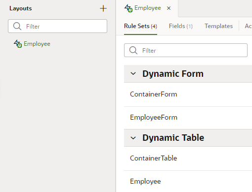
  1. Open the Rule Sets tab for the dynamic form you want to work with. You can select a standalone dynamic form or one that's part of a dynamic container.

    To do this, select a layout in the Navigator's Layouts tab, then find the dynamic form in the Rule Sets tab (as shown here); click the form on a rendered page in the canvas area; or select the form from the Properties pane.
    Description of employee-ruleset.png follows
    Description of the illustration employee-ruleset.png

  2. Open the form you want to edit.

    Use the Duplicate icon icon in the toolbar if you want to duplicate the current layout.

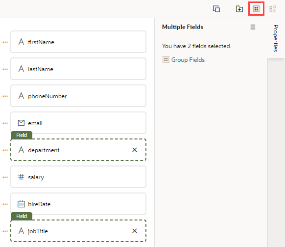
  3. In the layout diagram, select the fields that you want to group together, either by holding down the CMD key (on macOS) or the Ctrl key (on Windows).
  4. Click Group Fields in the Properties pane, or Group Fields icon in the toolbar.


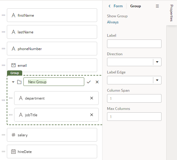
    The selected fields are grouped under a new folder in the layout diagram:
    Description of group_fields_name.png follows
    Description of the illustration group_fields_name.png

  5. Enter a name for the new group. Click Check mark icon to save the group name.
  6. (Optional) Set properties for the group in the Properties pane.
    • Click Always to set conditions that determine when the group is displayed in a layout. The default setting is to always display the group.
    • Use the Label property to set a label that will be displayed in the form for the grouped fields.
    • Use the Direction property to set the layout direction of the grouped fields.
    • Use the Group Collapsible property to specify if the group is collapsed or expanded by default when the page is rendered. You can choose "Not Collapsible" to make the group not collapsible. The default behavior for a group if you don't select an option is "Not Collapsible".
    • Use the Label Edge property to set how the label is aligned with the component.
    • Use the Column Span property to set the field's column span in the layout.
    • Use the Max Columns property to set the maximum number of columns.

After a group is created, you can still use the handles for fields to drag them into and out of a group.

Note:

If you want to use a translation bundle for a string you enter in the Label property, you currently need to manually enter the translation expression in the Label field in the Properties pane, and edit the layout's json file (layout.json) to add the import element for its translation bundle. For example, if the label was Address Group, and the name of the translation bundle was test_bundle, you would add [[$dynLayout.translations.test_bundle.AddressGroup()]] in the Label field:


You would also need to manually add the import for the translation bundle to the json file (in this example, test_bundle):

"imports": {
    "translations": {
      "self": [
        "test_bundle"
      ]
    }
  }

For details, see Work With Translations.