Responsive App Display Logic Example

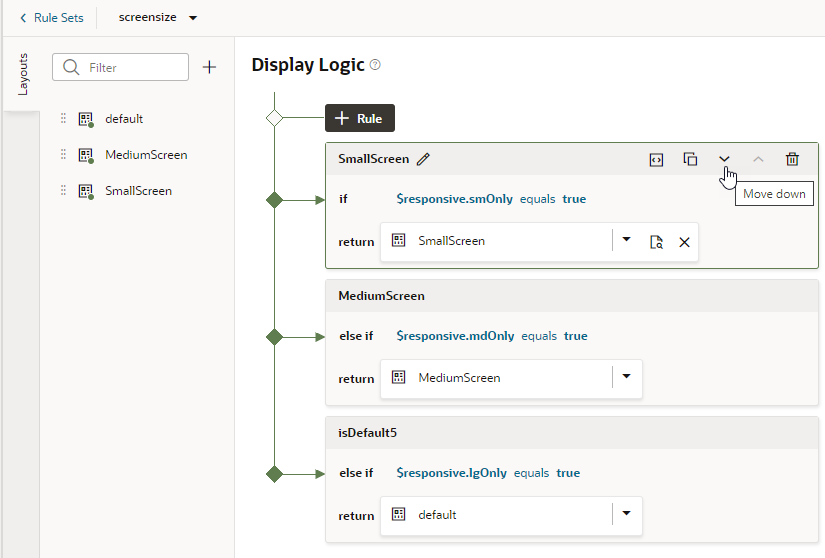
The following example shows how to configure display logic for responsive apps. Suppose you want a dynamic component that shows different fields based on the device's screen size, say, small, medium, and large screens. You’d then create a rule that checks the current user's device screen size and applies the layout that contains the desired fields for that screen size.

To illustrate, consider a dynamic form that displays the following employee fields in the default layout: Id, Name, Department, Email, and Hire Date. If the user's device screen is small, you might want the page to show a particular layout (say, the SmallScreen layout) with only the Name and Email fields. If the user's device screen is medium, you might want the page to show another layout (for example, the MediumScreen layout) with the Name, Department, and Email fields. If the user's device screen is large, you might show the default layout.

To configure a rule set for responsive logic:

  1. Update the default rule to show the default layout when the device's screen size is large:
    1. In the Rule Set's Display Logic section, click Click to add condition.
    2. Choose lgOnly under Responsive in the Attributes drop-down list, select === from the Operators list, then remove one of the equal signs, and select true as the Value.
    3. Click Done.
  2. Duplicate the existing rule as required and use it as the basis to create more rules, in our case, the MediumScreen and SmallScreen rules. During this step, you have the option of creating copies of a particular layout which you can then update to show the fields you want when the device screen is small and when it is medium.
    1. Click the Duplicate icon (Duplicate icon), then enter a name for the new rule in the Duplicate Rule dialog box.

      To also create a copy of the layout to use as a starting point, make sure that check box is selected. Click Duplicate.

    2. Edit the new rule and define its conditions. To continue our example, you might use the mdOnly attribute to show the MediumScreen layout when the current user's screen size is medium and the smOnly attribute to show the SmallScreen layout when the current user's screen size is small.
    3. As part of configuring the new rules, click the newly created layouts in the Layouts tab (MediumScreen and SmallScreen), then select the fields you want to show when the device screen is small (Name and Email) and when it is medium (Name, Department, and Email).
  3. Use the Move Up and Move Down buttons to make sure you have the rules in the order you want them evaluated.
  4. Test your application using different screen sizes in the Page Designer toolbar. For example, use iPhone to test the display logic on a small screen, iPad to test a medium-sized screen's display, and desktop to test a large screen's display.