How Do Quick Starts Work?
A quick start, as the name suggests, provides a way for you to build the basics of your application quickly. It's a wizard that walks you through complex processes, helping you do the tasks required to quickly build your application's functionality.
A variety of Quick Starts are available to help you perform some of the tasks required to add common application functions and behavior, for example, binding a table or a list in a page to a data source or adding a page to create new records. To add functionality, you need to create the artifacts that perform that function. And depending on how complex the behavior is, adding a functionality might involve creating several variables, types, action chains, and page events. If there's a quick start for your task, you can use it to quickly create many of the artifacts for you.
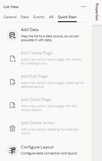
So how would you know if a quick start is available for what you want to do? Just look for the Quick Starts tab in a selected component's Properties pane when designing pages in the Page Designer. The Quick Starts tab will display a list of tasks that are typically used to add functionality or behavior to the selected component. These tasks are based on common tasks that developers typically do when creating applications. For example, here's a list of quick start tasks available for you when you are working with a List View component:
Description of the illustration page-designer-quickstarts.png
You'd start, for example, with the Add Data quick start to populate the list with data from your data source (typically, a GET MANY REST endpoint). Once that's done, other quick starts that let you generate other pages or set up functionality are enabled for you.
Tip:
If you cannot find the endpoint you want in the quick start or prefer to manually set up your endpoint, click the Manual Setup of Endpoint icon (Control the Layout
It's possible to customize the fields you want to show as part of a component on a page. The steps to customize fields in a layout are the same, whether you’re selecting endpoint attributes from a service connection or a business object in your application.
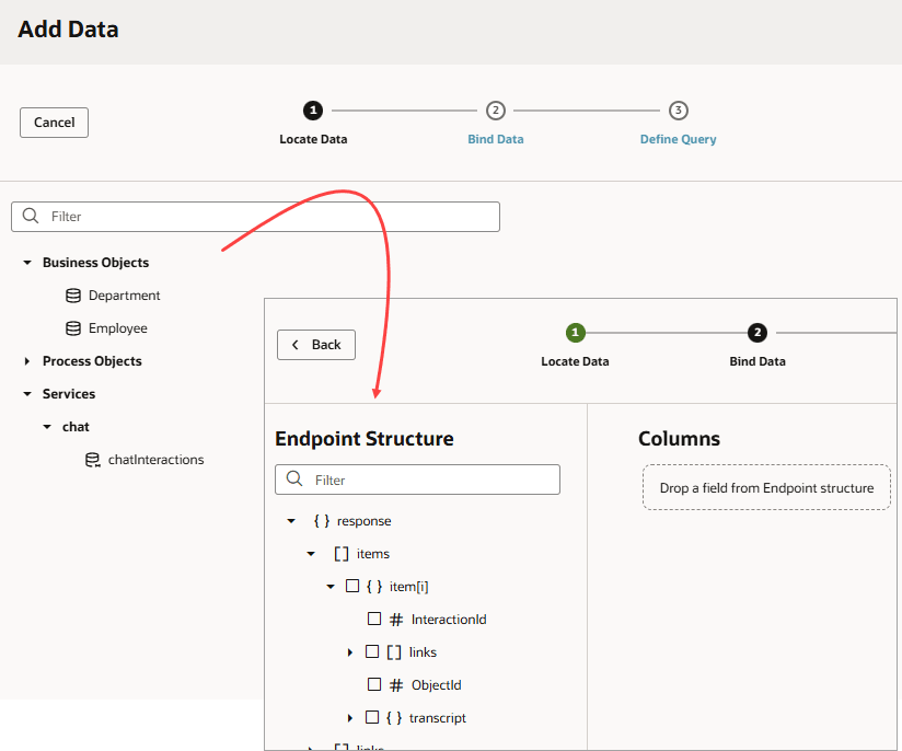
When you use collection components such as a table or list view to display data, you're binding the component to an endpoint, exposed by a service connection or a business object. The easiest way to do this is by using quick starts—and if you’re looking to customize the layout, you can use the Bind Data page of the wizard to select only the fields you want to display.
Here's an example of what you’ll see in a quick start when you’ve got business objects and a service connection as the source of your data. When you bind data, you’ll see the attributes of the source you select – this is where you can customize your collection component’s layout:
Description of the illustration custom-layout.png
Quick starts automatically create the variables and types you need for a particular functionality, but if you decide to add an endpoint attribute that you didn't include originally, you'll need to modify the type (using the Edit From Endpoint link next to the type on the Types tab), then modify the UI. In this case, it might be simpler to delete the table or list view and start over with the quick start.