Style and Theme VB Studio Applications
All styling in VB Studio applications happens manually in CSS. There are no declarative features for changing the display of text or images. Because all VB Studio applications are just JET applications, they use JET themes to style the applications.
VB Studio applications created with version 20.10 or later, by default, use the Redwood theme. Redwood is the Oracle standard for application look and feel. It includes components such as Waterfall Layout and Action Cards that enrich user experience, besides a collection of icons that you can readily leverage in your apps.
Because Redwood achieves its look and feel through hundreds of custom properties (also called CSS variables), you can override these variables to customize the default look and feel for your requirements.
Note:
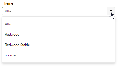
Styling applications is supported only for web applications that use the Redwood theme. If you’re styling applications that use the Alta theme, note that support for Alta themes has been deprecated since JET 10.When you style your VB Studio or JET applications, it's important to use theming correctly. Otherwise, you run the risk of finding that your re-styling breaks when you upgrade your platform versions. For more information about theming your application, see "Use CSS and Themes in Oracle JET Apps" in Developing Oracle JET Apps Using MVVM Architecture. To get the latest version, go to https://www.oracle.com/webfolder/technetwork/jet/index.html, click Help and Support, then scroll to the bottom and click Theming.
Transition Your App's Theme to Redwood
VB Studio applications created with version 20.07 or earlier, by default, use JET's Alta theme as the base UI theme. If your app uses the Alta theme, we strongly urge you to transition your app to use the Redwood theme before support for the Alta theme ends.
For more information on Alta deprecation, see Deprecated Features.
To move your web app's theme from Alta to Redwood:
- Override the default Redwood styles to suit your needs.
- Override the appearance of specific component instances. For example, if you've made a
divelement clickable, you may want to add a class calledclickableto thedivand define the CSS for the class so that the element is highlighted, the cursor changes to a pointer when you hover over it, and so on.
Customize a Web App's Appearance
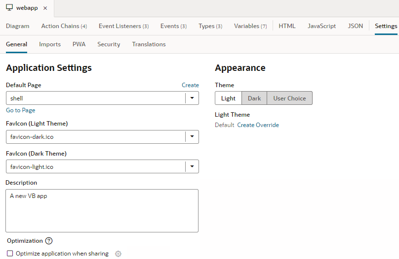
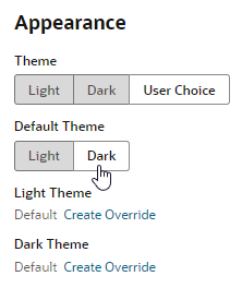
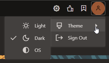
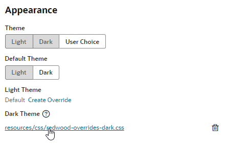
Web apps, by default, display against a light background with dark text. For web apps created with version 24.07 or later, you can customize the app's theme to show its components against a dark background, even let your users choose between a Light and Dark theme. The application's UI automatically adjusts to the theme you (or your end-user) chooses.
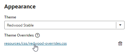
You can also use CSS variables to override the app's default look and feel, which is based on the Redwood base theme. The Redwood theme provides the Oracle look and feel for your app and inherits future updates to the Redwood theme, but these changes can potentially bleed into an app's custom theme. When you use CSS overrides to customize the default theme, the base theme switches to Redwood Stable, which is meant to minimize changes bleeding into a custom theme. With this option, your app uses the Stable CSS file as the base theme, but you override some variables in a separate CSS file to customize the base theme's look and feel.
The advantage of overriding CSS variables in a separate file is that you won't need to rebuild your web app with each new version of JET. Whenever the default Redwood theme changes, those updates will be picked up by your application's CSS files without requiring changes.
- Follow these steps to switch a web app's theme and optionally override CSS variables for apps created with version 24.07 or later:
- Follow these steps to override CSS variables for apps created with version 24.01 or earlier that use the Redwood theme:
Add a Custom Style to a Component
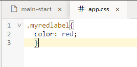
When you want to customize the appearance of specific component instances, you create a style class and define the style in your app's stylesheet, then assign that class to the specific component instance you want to override.
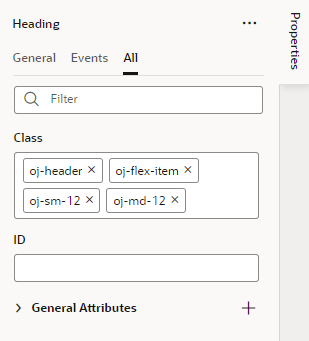
Some style classes are predefined in the app and are automatically applied to components when you add them to a page. Specific predefined style classes are applied to many Oracle JET components to ensure they display correctly and consistently. For example, if you look at the HTML for a Header component in a page's Code editor, you might see the following style classes applied to an h1 element: oj-flex-item oj-sm-12 oj-md-12. Predefined style classes used by Oracle JET components are prepended with oj-.
Note:
As a general rule, you should not override or modify the predefined classes or remove them from components. When defining and adding a custom class to a component, you should exercise caution to ensure that your class does not conflict with the predefined classes already applied to the component.You can define your custom style classes in the app.css stylesheet of your app. An empty app.css stylesheet is created in your app by default and the link included in the header of the app's pages. You can apply classes to components in the Properties pane in the Page Designer's Design view or in the page's Code editor.
To add a custom style to a component:
