Configure How Variables are Customized in the Properties Pane
You can customize variables and constants when developing an App UI, so that users extending the page have a more intuitive experience when configuring values in the Page Designer’s Properties pane.
When a page is open in the Page Designer, the page’s extendable variables and constants are listed in the Constants tab in the Properties pane. Users extending the page can set the values of those variables and constants, usually displayed as text fields in the Page Designer’s Properties pane. For example, here’s how a constant used to store a date displays by default in the Properties pane:
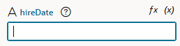
Description of the illustration constant-text-picker.png
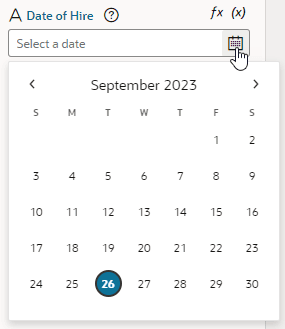
In some cases, a different UI component can make editing the variable or constant more intuitive. In the case of the constant that stores a date, displaying a date picker instead of a text field can improve the experience when a user edits its value in the Page Designer:
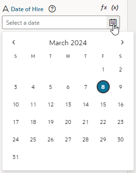
Description of the illustration constants-rich-picker.png
To customize the UI component displayed for a variable or constant in the Properties pane, you use the Design Time tab in the Variables editor. You can also edit the JSON directly in the JSON editor.
Note: Some UI customization options are not available in the Design Time tab. You’ll need to edit the JSON directly to configure these advanced options. See the Customizing the JSON section below for a full list of customization options.
Customize Variables and Constants in the Variables Editor
To customize the UI component displayed in the Page Designer:
- Open the Variables editor.
- Select the variable or constant you want to customize.
- Select the Design Time tab in the Properties pane.
-
Select properties to customize how the component for editing the variable will look in the Page Designer.
The properties you see in the Design Time tab will depend upon the variable’s type, and the Subtype property you select in the tab. For example, if Date is selected as the Subtype, you’ll see fields for setting Minimum and Maximum limits for the date:
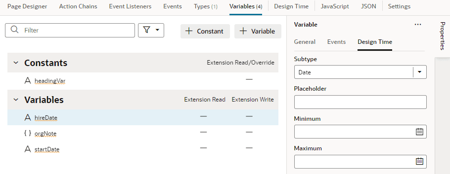
Here are steps for some common customization options for string- and number-type variables and constants:
| Customization Option | Steps in Design Time Tab | Result in Page Designer |
|---|---|---|
| To display a color picker: | For a string-type variable or constant:
|
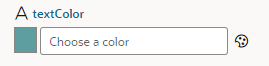 |
| To display a date or date-and-time picker: | For a string-type variable or constant:
|
 |
| To display an endpoint picker: | For a string-type variable or constant:
NoteThe Placeholder field does not take effect in the Properties pane when you use the Endpoint subtype. |
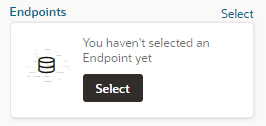 Clicking Select launches a Configure Endpoint wizard in which fragment users can select a suitable endpoint and choose its URI parameters. If you cannot find the endpoint you want or prefer to manually set up your endpoint, click the Manual Setup of Endpoint icon (  ) in the wizard, then select from the available endpoints and confgure its URI parameters. ) in the wizard, then select from the available endpoints and confgure its URI parameters. |
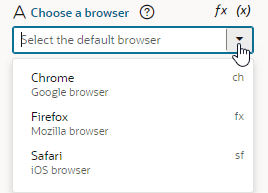
| To display a drop-down menu containing an array of possible values: |
|
 |
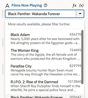
| To display a drop-down list of values retrieved from a service, such as a REST endpoint: | For a string-type variable or constant:
|
 |
| To display a time picker: | For a string-type variable or constant:
|
 |
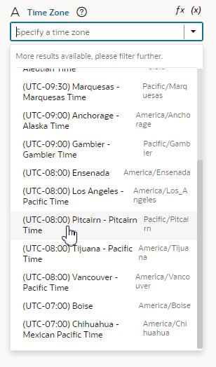
| To display a drop-down menu with a list of time zones: | For a string-type variable or constant:
|
 |
| To limit the input values to a number in a range: | For a number-type variable or constant:
|
 |
 next to
  , update the values, and click Save. Click
  to delete a value.
  next to the value and drop it where you want it.
 When you set properties in the Design Time tab, the metadata in the JSON file is automatically updated. You can open the JSON editor to view the metadata. For example, here’s what you might see for a constant that is customized to use a date picker:
"constants": {
    "hireDate": {
        "type": "string",
**   "@dt": {
        "subtype": "date",
        "label": "Date of Hire",
        "valueOptions": {
            "placeholder": "Select a date"
        }**
        }
    }
},
Customize the JSON with Metadata
While you can use a constant’s Design Time tab for some customization options, you’ll need to edit the JSON directly for advanced options. To do this:
- Open the JSON editor.
- Update the variable or constant’s definition by setting the
@dtelement, then use thesubtypeproperty to specify the component you want displayed in the Page Designer. The JSON editor displays a hint to help you select the value for thesubtypeproperty.
For example, here’s how you can show a component for selecting a business object by setting the subtype property to businessObject:
"constants": {
    "relatedObject": {
        "type": "string",
        "@dt": {
            "subtype": "businessObject",
            "label": "Related Object"
        },
        "description": "Description of related object"
    }
},
Use the label property to change the constant’s display name in the Properties pane.
Property Options for Variable Metadata
The following table describes the metadata properties that can be used to customize how variables are displayed in the Properties pane.
| Property | Type | Description |
|---|---|---|
label |
string |
Use this property to specify a user-friendly name for the variable. |
subtype |
Available subtypes:
|
Use this property to create a more specific type of customizer for simple types. For example, you can choose “date” to use a date picker component for a string type. |
valueOptions |
object |
The valueOptions available to you depend on the selected subtype. When no subtype is selected, the only valueOptions is placeholder. See the tables below for a list of valueOptions properties. |
Properties for valueOptions
Depending on the subtype you select for the variable, you can use the following properties to further customize the components used for editing fields in the Page Designer.
| Property | Description | Usage |
|---|---|---|
| fields | Use this to customize the display/editing of object values. Instead of displaying a simple single text area for the whole value, the Properties pane will display individual customizers for the various fields of the object. | Property type: array You can specify an array of fields of the associated variable or constant that you want displayed in-line in the Properties pane when editing the object's values. You can customize how each field is displayed by using label, description, subtype, and valueOptions. When using the fields property, each field must have the ID of the object field it maps to. The order of fields in the array is the order they will be displayed in the Properties pane. This property is only supported for displaying the first level of object fields. A variable described with the following metadata: "variables": { would look similar to this in the Properties pane: 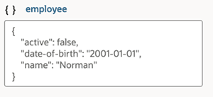 The fields property can be used to customize how the object is displayed: "variables": { The customized object would look similar to this in the Properties pane: 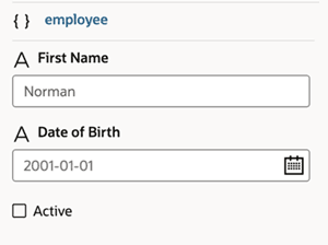 |
| maximum | Use this property to specify the inclusive top limit of a range when specifying a value in the Properties pane. | Property type: number | string This property is suitable for numbers and date/time formats. An example of values for the maximum property: { For further details about the JET 'maximum' metadata property, see JET component metadata properties in the Oracle JET JavaScript Extension Toolkit documentation. It's recommended to use the Design Time tab for configuration. |
| minimum | Use this property to specify the inclusive bottom limit of a range when specifying a value in the Properties pane. | Property type: number | string This property is suitable for numbers and date/time formats. An example of values for the minimum property: { For further details about the JET 'minimum' metadata property, see JET component metadata properties in the Oracle JET JavaScript Extension Toolkit documentation. It's recommended to use the Design Time tab for configuration. |
| placeholder | Use this property to specify a user-friendly hint text. | Property type: string This property can be used in Properties pane customizers that have placeholder support, for example, JET Input type customizers. An example of configuring a value for the placeholder property: { If a default value is supplied by the constant, then that default value is used as the default placeholder. If both a placeholder value is used and the default value is specified, then the placeholder will be used. |
| service | Use this property to fetch possible values from a service for an List of Values (LOV) picker. | Property type: object When using the lov subtype to display a drop-down list of values, you use service to retrieve the values from a service, such as a REST endpoint, and configure additional properties beyond those available in the Design Time tab. With the service endpoint already set up in VB Studio and available to the App UI, you can then use @dt metadata to call the service and fetch items to populate the drop-down list. The service response must be in JSON format, and the response items in an array. It's recommended to use the Design Time tab for configuration. |
| translatable | Use this to specify if translation helpers should be present for the property. | Property type: boolean Translation is only available for string types. An example of configuring a value for the translatable property: { |
| values | Use this property to specify an array of possible values for the field. | Property type: object This property can be used with the enum subtype. Values must include value, and can optionally include label and description. "subtype": "enum",The example above displays in the Properties pane as shown here: For further details about the JET 'minimum' metadata property, see JET component metadata properties in the Oracle JET JavaScript Extension Toolkit documentation. |