Install a Web Component from the Component Exchange
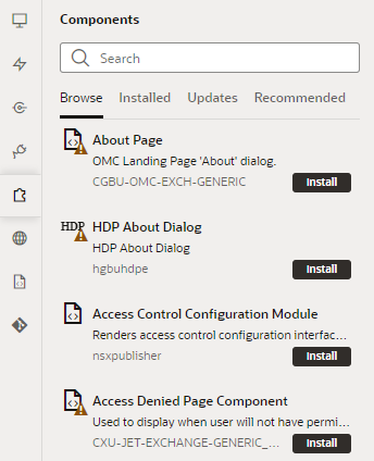
A Component Exchange is a repository of web components that can be installed in your VB Studio instance.
Your administrator specifies the Component Exchange that is associated with your VB Studio instance. All developers in the instance are able to use the same set of components. The exchange contains a set of default components that have been provided by Oracle, and any components that other developers have published to your exchange.
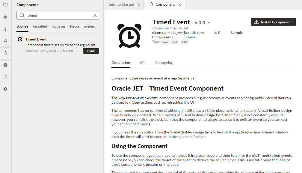
- Browse: Use to search the Component Exchange for components that can be installed, to open a component's details page, and to install components.
- Installed: Use to view a list of installed components. The tab displays details about each component, and components are badged to indicate warnings or available updates.
- Updates: Use to view a list of available updates and to update components to the latest version.
- Recommended: Use to view suggested components based on what you've installed. For example, if you installed the Input text with type-ahead component, other components in the
oj-sampleJET pack might be recommended. By default, components in the Dynamic UI pack are always listed.
To add a component from the Component Exchange:
Note:
If the component you installed does not show in the Components palette, open it from the Components pane and check VB Characteristics to see why. For example:- If you installed a Redwood pattern that's meant to be a page template (for example, the Data Authoring Page Template), you'll find it in the Create Page dialog, not in the Components palette.
- If you installed a deprecated component (indicated by the
 badge), it will likely show in the Components palette, but you'll need to select Show Deprecated in the Components Menu to be able to see it.
Some components (like
oj-dynamic-), in addition to being deprecated, may be legacy components that have been replaced by variants. While these legacy components can still be installed, they won't show in the Components palette because they cannot be readily dragged and dropped onto pages. You'll need to use the Page Designer's Code view to use these components in your pages.


