Add and Configure the Second Panel and Chart for the KPI_1 Dashboard Grid
- Add a dashboard panel and pie chart to the KPI_1 dashboard grid.
- If not already there, switch to the Design mode.
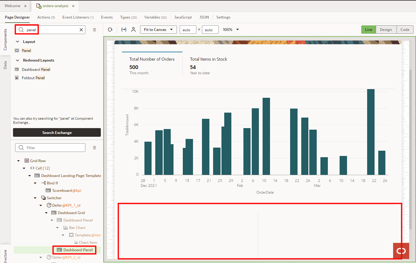
- In the Components pane, search for panel.
- Click Dashboard Panel and in the Structure view, drag it over Dashboard Grid, then drop it.
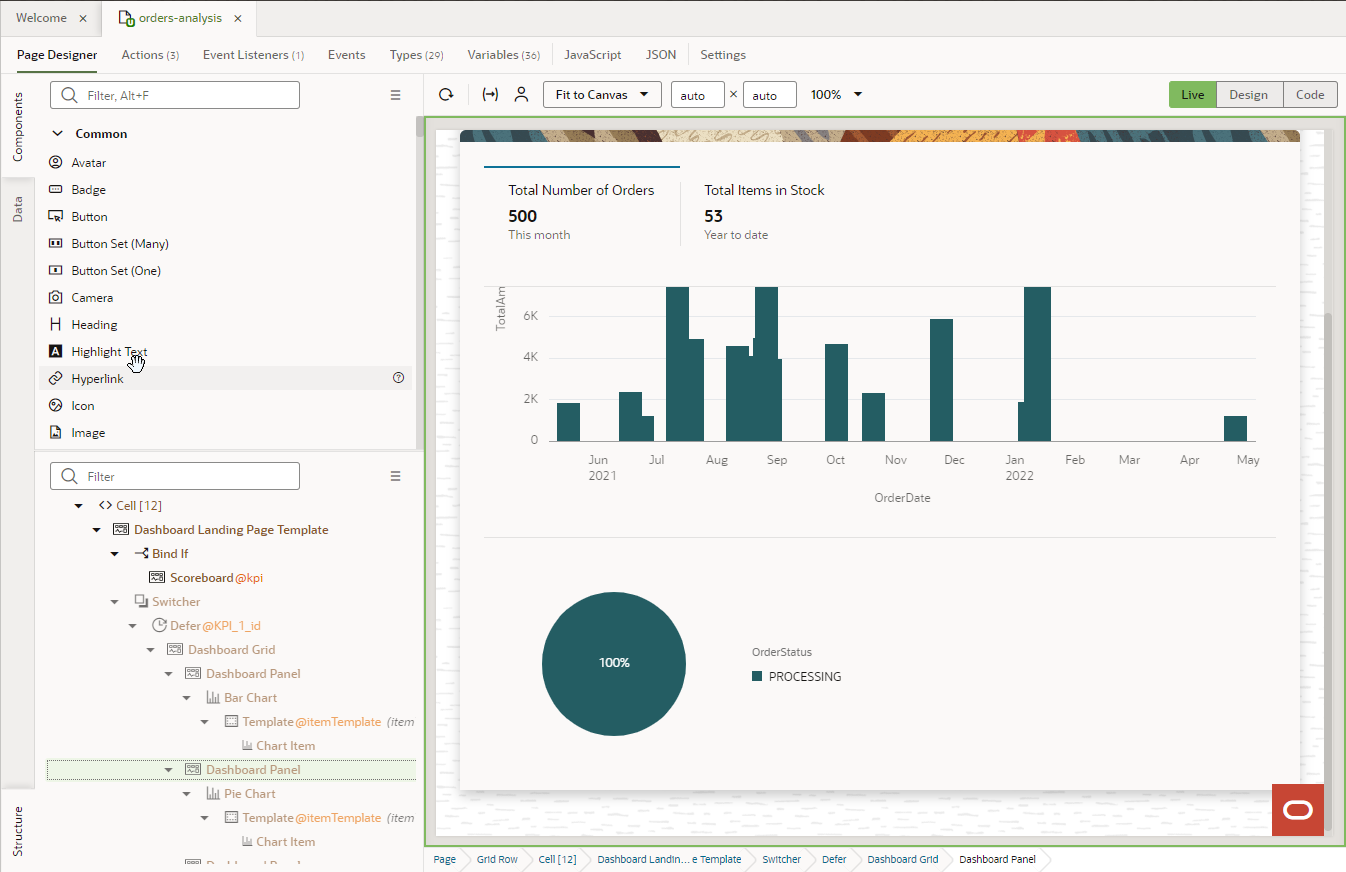
- If the Slot dialog box appears, click Default. Note: The dashboard panel might appear below the first graph (as seen in this screenshot) or next to it depending on your screen size.
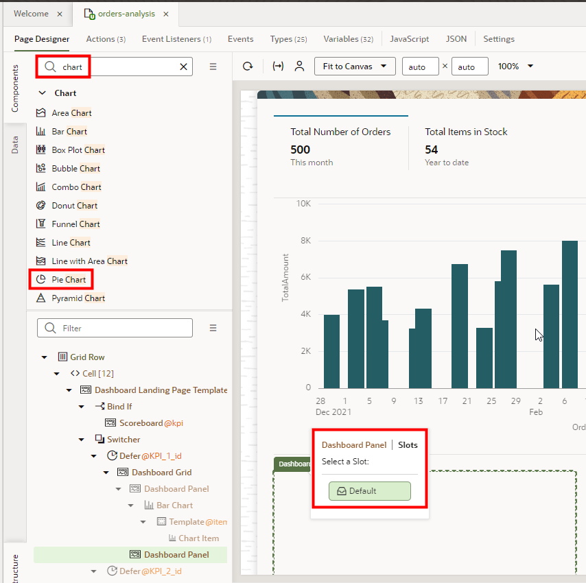
- In the Components palette, search for chart.
- Click Pie Chart and drag it over the upper-left corner of the Dashboard Panel region, then drop it.
- If the Dashboard Panel | Slots dialog box appears, click
Default.
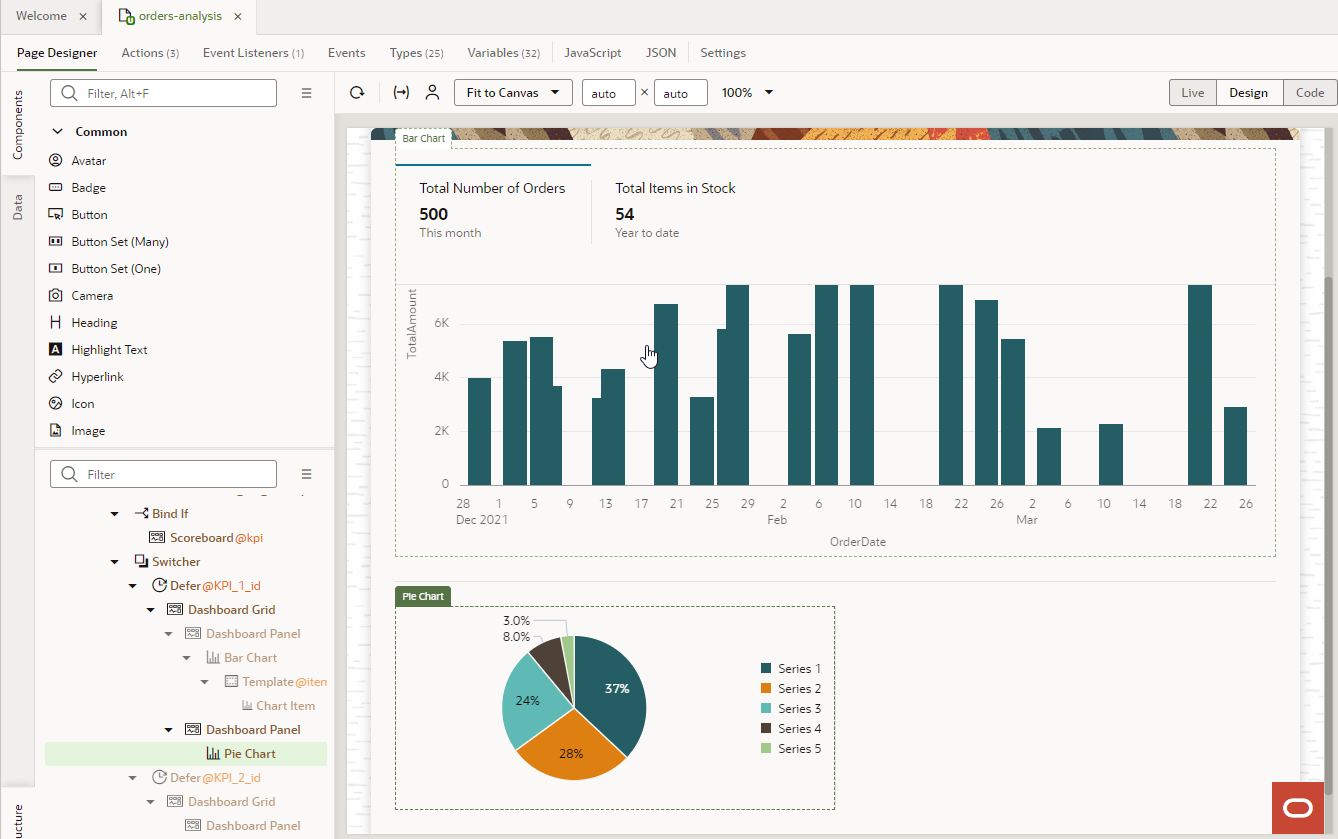 Tip: If the chart appears in the wrong region, check the Structure view. The chart should be a child of Dashboard Panel and not a peer. If you see it's a peer, as shown in this screenshot, click Pie Chart and drag it over Dashboard Panel, then drop it to make it a child. In the Dashboard Panel | Slots dialog box, click Default.
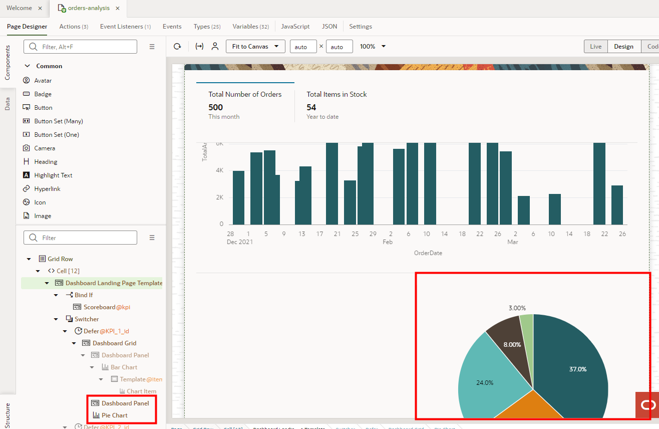
- Locate the data to add to the pie chart.
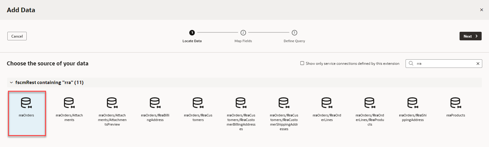
- In the Properties pane for the Pie Chart, on the Quick Start tab, click Add Data.
- On the Add Data dialog box, filter the data sources by entering rra.
- Expand fscmRestcontaining "rra".
- Select rraOrders.
- Click Next.
 You're in the Map Fields stop.
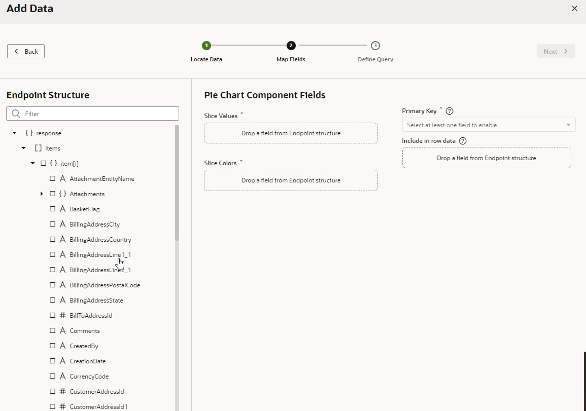
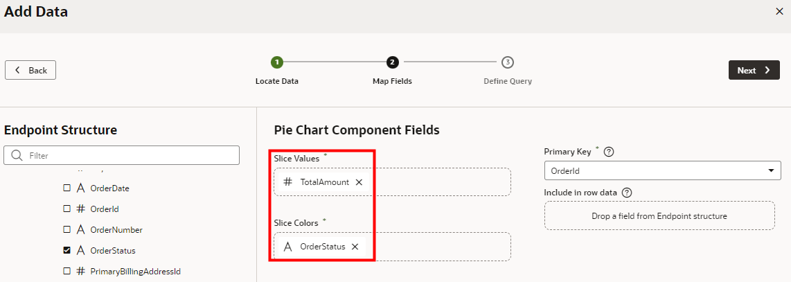
- Map the endpoints to the slice values and colors of the pie chart.
- On the Map Fields stop, in the Endpoint Structure panel, scroll to TotalAmount.
- Click TotalAmount.
It should automatically appear in the Slice Values field. If it doesn't, drag the endpoint over the field and drop it.
- Click OrderStatus.
It should automatically appear in the Slice Colors field. If it doesn't, drag the endpoint over the field and drop it.
- Click Next.
This time you won't set any limits.
- On the Define Query stop, click Finish.
 Tip: If you're not seeing the Pie Chart, or if you are seeing errors related to Total Amount being a String, in the Code view of the editor, add
Number.parseFloatin front of the variable for the Total Amount in the Chart, as follows:<oj-chart-item value="[[ Number.parseFloat($current.data.TotalAmount) ]]" series-id="[[ $current.data.OrderStatus ]]" group-id="[[['Undefined']]]"></oj-chart-item>. If you are still not seeing the Chart in design time Live View after making these changes, try using Preview mode.Note: After this step, you see a series of errors in a notification at the bottom of the page due to string type mismatch. To resolve these errors:- Click the Types tab, expand getallRraOrdersResponse2 > items > item[i], and click TotalAmount.
- In the Properties pane, Type field, replace
String with
Number.
![The Types tab displays with getallRraOrdersResponse2, items, items[i] expanded, and # TotalAmount outlined in red. The Properties pane, Type field is outlined in red.](images/image2022-11-7_12-14-3.png)
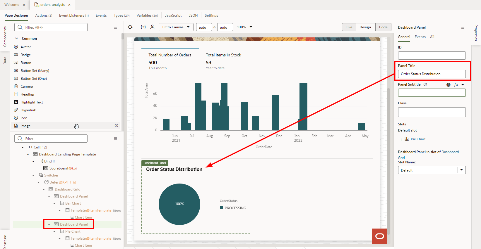
- To address accessibility, add a title to the second dashboard panel.
- If not already there, switch to the Design mode.
- In the Structure tab, under Defer @KPI_1_id, select the second Dashboard Panel component.
- On the Properties pane General tab, in the Panel
Title field, enter Order Status
Distribution.