Chart Styles Explorer
You can apply chart styles to charts shown on reports to change their appearance. You can also create custom chart styles if you have specific display requirements for your charts.
The attributes defined in chart styles vary depending on the type of chart used in a report. Likewise, the chart style options vary depending on the type of chart the style should be applied to.
| Chart Type | Description |
|---|---|
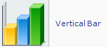 |
Vertical bar charts display data as a series of vertical bars. Subtype options can display the chart with single or stacked bars and as two- or three-dimensional. |
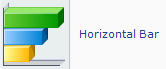 |
Horizontal bar charts display data as a series of horizontal bars. Subtype options can display the chart with single or stacked bars and as two- or three-dimensional. |
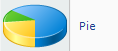 |
Pie charts display data as a percentage of a whole. Subtype options can display two- or three-dimensional pie charts or doughnut charts. |
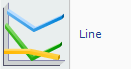 |
Line charts display data as a series of points connected by a line. Subtype options can display the chart as two- or three-dimensional. |
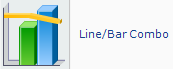 |
Line/bar combo charts display both a line chart and a vertical bar chart. Subtype options can display the chart with single or stacked bars and as two- or three-dimensional. |
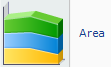 |
Area charts display data as areas on an x- and y-axis. Subtype options can display the chart as two- or three-dimensional. |
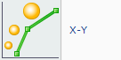 |
X-Y charts display data as a series of plotted points. Subtype options can display the plotted points as points, lines, or bubbles and as two- or three-dimensional. |
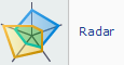 |
Radar charts display data in a radar format. Numeric values are plotted at markers on the perimeter. |
|
|
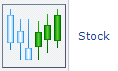
Stock charts display the minimum and maximum values for data. Subtype options can display the chart using squares or lines to represent the high and low points of each plot. |
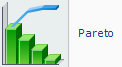 |
Pareto charts display data in descending order with an ascending plot line for cumulative percentage. Subtype options can display the chart as two- or three-dimensional. |
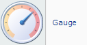 |
Gauge charts display a numeric value as a percentage of a whole. Subtype options can display the chart as a gradation bar or a simple color meter. Gauge charts cannot be used in reports that contain non-aggregate columns. |
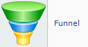 |
Funnel charts display data as areas shown in ascending or descending order. Subtype options can display two- or three-dimensional funnel or pyramid charts. |
 |
Gantt charts display time lines for completion of scheduled tasks. Subtype options can display the chart as two- or three-dimensional. |