- Using B2C Service
- Create or Edit a Chart Style
Create or Edit a Chart Style
Chart styles are customized using the Chart Styles editor.
When creating a chart style, a sample of the currently selected chart type and subtype is shown on the content pane. The sample chart’s display changes depending on the options you select so you can quickly see how a chart that uses the selected settings will appear.
- Click Analytics on the navigation pane and then double-click Chart Styles Explorer.
- To create a new chart style, click New on the ribbon.
- To edit a chart style, right-click the chart style and
select Edit.
The chart styles editor displays a default chart type.
- Click Type on the Home tab to display the chart type menu.
- Select the chart and chart subtype you want to configure
for the chart style.
After you configure your chart style for the selected chart type and subtype, you can select other types to configure your chart style for use with those types. This allows you to use the same chart style regardless of the types of charts you add to reports, while ensuring the charts’ colors, fonts, and other attributes are consistent.
- To configure three-dimensional settings for a chart style
with a 3D subtype, click 3D Depth and 3D Angle on the Home tab to enter values that impact
how three-dimensional charts display.
Tip: You can modify the three-dimensional settings for charts with 3D subtypes by right-clicking the chart on the content pane and selecting Rotate. When you do so, your cursor changes and you can move your mouse or other pointing device horizontally and vertically to change the chart’s three-dimensional values. Click the left mouse button to quit rotating the chart. The right-click menu also gives you options to convert three-dimensional charts to two-dimensional charts, or two-dimensional charts to three-dimensional charts, as long as the chart type includes 3D subtypes. This right-click menu is also available when creating or viewing reports.
Three-Dimensional Chart Subtype Settings
Button Description 3D Depth
Click this button and enter a number for the extent of the chart’s three-dimensional effect. A value of 0 removes the 3D appearance from the chart, where as a setting of 125 maximizes the effect.
3D Angle
Click this button to enter values for the chart’s horizontal and vertical angles.
X Angle
Enter a value from 0 to 180 degrees in this field. This value determines the vertical rotation of the chart.
Y Angle
Enter a value from 0 to 180 degrees in this field. This value determines the horizontal rotation of the chart.
- To configure colors, styles, borders, and other settings
for the bar, line, or gauge elements in charts, click the Home tab
and click Bar Settings, Line Settings, or Gauge Settings.
Bar, Line, and Gauge Settings Descriptions
Button Description Bar Settings
Click this button to customize the display of the bar elements for chart types that include bars.
Bar Outline
Select this option and then select the type of outline you want around the individual bars in the chart. You can choose from the following options:- None—The bars have no outline.
- Lighter—The bar outline is a lighter shade of the bar’s color.
- Darker—The bar outline is a darker shade of the bar’s color.
- Color—The bar outline is a specified color.
Selecting Color enables the Outline Color option. Use this to open the color menu where you can select a color for the outline.
Bar Style
Select this option and then select the style you want for the bars in the chart. You can select Block, Cylinder, Wedge, Emboss, or Light to Dark.
Multicolor Series
Select this option to make the bars in different series use different colors. When this option isn't enabled, the bars in different series are shown using the same set of colors.
Line Settings
Click this button to customize the display of the line elements for chart types and subtypes that include lines.
Line Width
Select this option and then select the number of pixels you want for the line’s width. Options include widths from one to ten pixels.
Symbols
Select this option and then select the symbol you want to place on the line to mark data points. You can select None, Square, Circle, or Triangle.
Gauge Settings
Click this button to customize the display of the gauge for gauge chart types.
Gauge Color
Select this option to open the color menu to select a color for the gauge. You can also select No Value from the menu to use the default color.
Border Color
Select this option to open the color menu to select a color for the gauge’s outline. You can also select No Value from the menu to use the default color.
Show Numeric Identifier
Select this option to display a numeric indicator on the gauge which shows the actual value represented on the gauge.
Color Ranges
Select this option to open the Color Range window where you can define different colors to use for different value ranges on the gauge.
- To define color ranges for a gauge chart, click Gauge Settings on the Home tab and select Color Ranges.
- Click Add Range to add a color range.
- Enter field information.
Color Ranges Window
Field Description Add Range
Click this text to add a range. Before you add a range, the Color Ranges window does not show any ranges and Add Range is the only option available.
Minimum
Enter the percentage value the range should begin at. For example, a gauge with three color ranges could have a range that begins at 34%.
Maximum
Enter the percentage value the range should end at. For example, a gauge with three color ranges could have a range that ends at 66%.
Start Color
Click this box to open the Color window and select a color for the beginning of the range.
End Color
Click this box to open the Color window and select a color for the end of the range.
Remove Range
Click this text to remove the range shown next to the text.
- Click OK to save the color ranges.
Sample ranges are shown in the Color Ranges window here.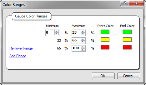
Color ranges are unique to gauge charts and let you show ranges of different values on the chart in different colors.
- To select a color scheme for the chart style, click Color Scheme on the Home tab and select the item you
want from the color scheme menu.
Customizable color schemes are available for all chart types except gauge charts. Color schemes can be used to define the colors used for the chart. See Create a Color Scheme.
- To define the placement of labels, such as titles and legends,
click the Layout tab and click the button in the Labels group that
corresponds to the label you want to configure.
Labels Descriptions
Label Description Title
Click this button to select options for the chart’s title. This label displays the chart’s title defined when you add a chart to a report. You can choose not to show this label, or you can show it at the left, right, top, or bottom of the chart.
Legend
Click this button to select options for the chart’s legend. This label displays a legend to identify the chart’s contents. You can choose not to show this label, or you can show it at the left, right, top, or bottom of the chart.
Category Axis Title
Click this button to select options for the chart’s category axis title. This label identifies the chart’s category axis. You can choose to show it or not show it.
Value Axis Title
Click this button to select options for the chart’s value axis title. This label identifies the chart’s value axis. You can choose to show it or not show it.
Data Labels
Click this button to select options for the chart’s data labels. Data labels can display on the chart’s bars, lines, and other display components to show the actual values represented in the chart. You can choose to show data labels or not show them.
Exception Box
Click this button to select options for the chart’s exception box. This label describes the exceptions shown in the chart if the chart’s data includes exceptions and the report is configured to show exceptions on the chart. You can choose to show this label at the left, right, top, or bottom of the chart.
- To configure scale options for the chart style, click Value Scale on the Layout tab and select from the options
presented.
Value Scale Descriptions
Option Description Primary Scale
The options in this section let you show the primary scale, rotate the scale’s labels, and choose whether to configure the scale’s range manually. You can also choose to have these options configured automatically.
Show
Select this option to display the primary scale on the chart. By default, the primary scale displays.
Automatic
Select this option to automatically determine the range of the scale based on the range of values in the data shown on the chart.
Manual
Select this option to manually configure the range shown on the primary scale. When you select this option and hover over it, Scale Start and Scale End fields appear. Enter the minimum value you want for the scale in the Scale Start field and the maximum value you want in the Scale End field.
Rotate Labels
Select this option and then select a degree to rotate the label text. Your choices are None, 15, 30, 45, 0, -15, -30, and -45 degrees (clockwise).
Secondary Scale
The options in this section let you configure the secondary scale for the line values shown on line/bar chart types.
Show
Select this option to display the secondary scale on the chart. By default, the secondary scale doesn't display.
Automatic
Select this option to automatically determine the range of the scale based on the range of values in the data shown on the chart.
Manual
Select this option to manually configure the range shown on the secondary scale. When you select this option, Scale Start and Scale End fields appear. Enter the minimum value you want for the scale in the Scale Start field and the maximum value you want in the Scale End field.
Rotate Labels
Select this option and then select a degree to rotate the label text. Your choices are None, 15, 30, 45, 0, -15, -30, and -45 degrees (clockwise).
Position
The options in this section let you define where to place the primary scale on the chart.
Primary Scale Right
Select one of these options to place the primary scale on the right or left side of the chart. By default, the primary scale displays to the left of the chart.
These options are enabled only for chart types that display data vertically.
Primary Scale Left
Primary Scale Top
Select one of these options to place the primary scale at the top or bottom of the chart. By default, the primary scale displays at the bottom of the chart.
These options are enabled only for chart types that display data horizontally.
Primary Scale Bottom
Use Logarithmic Scale
Select this check box to use a logarithmic scale based on your report data.
- To configure category and value grid lines shown on the
chart, click Category Grid Lines or Value Grid Lines on the Layout tab.
Category Grid Lines and Value Grid Lines Descriptions
Option Description Scale
The options in this section let you choose whether to use automatic or manual offsets for the major and minor grid lines shown on the chart. The offsets determine the spacing between the grid lines.
Automatic
Select this option if you want the offsets between the major and minor grid lines shown on the chart to be configured automatically.
Manual
Select this option to manually specify the offsets for the chart’s grid lines. When you select this option, Major Offset and Minor Offset fields are displayed. Enter the numeric offset value you want for the major grid lines in the Major Offset field, and the offset you want for the minor grid lines in the Minor Offset field.
Display
The options in this section let you show or hide major and minor grid lines on the chart. Grid lines can make it easier to identify values on the chart.
Show Major
Select this option to display major grid lines on the chart.
Major Color
Select this option to open the color menu where you can choose the color you want for the major grid lines.
Show Minor
Select this option to display minor grid lines on the chart.
Minor Color
Select this option to open the color menu where you can choose the color you want for the minor grid lines.
Show Left
Select this option to show grid lines along the left side of the chart.
This option isn't available on the Value Grid Lines button.
Left Color
Select this option to open the color menu where you can choose the color you want for the grid line along the left side of the chart.
This option isn't available on the Value Grid Lines button.
Bottom Color
Select this option to open the color menu where you can pick the color you want for the grid line along the bottom of the chart.
This option isn't available on the Category Grid Lines button.
- To configure options for tick marks shown on the chart’s
scale, click Tick Marks on the Layout tab,
and select the options you want.
Tick Marks Descriptions
Option Description Scale
The options in this section let you choose whether to use automatic or manual offsets for the major and minor tick marks shown on the chart’s scale. The offsets determine the spacing between the tick marks.
Automatic
Select this option if you want the offsets for the scale’s major and minor tick marks to be configured automatically.
Manual
Select this option to manually specify the offsets for the scale’s major and minor tick marks. When you select this option, Major Offset and Minor Offset fields are displayed. Enter the numeric offset value you want for the major tick marks in the Major Offset field, and the offset you want for the minor tick marks in the Minor Offset field.
Display
The options in this section let you show or hide major and minor tick marks on the chart’s scale.
Major Tick Marks
Select this option to show the major tick marks on the chart.
Minor Tick Marks
Select this option to show minor tick marks on the chart.
- To customize the fonts, borders, and backgrounds of different
sections of the chart, click the Format tab.
- Click the section of the chart you want to configure
on the content pane or, if you know the name of the chart section
you want to configure, select it from the Current Selection drop-down menu.
The following chart sections are available, though not all sections are available for all chart types.
- Chart Area
- Grid Area
- Title
- Legend
- Category Axis Labels
- Category Axis Title
- Value Axis Title
- Primary Scale Labels
- Secondary Scale Labels
- Data Labels
- Exception Box
- Select from the options on the Format tab’s Format group.
Format Tab Descriptions
Button Description Border
Click this button to select a border style for the selected section. The available options are:- None
- Thin
- Medium
- Thick
- Dashed
To select a color for the border, select Border Color from the menu to open the color menu.
Shadow
Click this button to select a shadow style for the selected section’s border. The available options are:- None
- Thin
- Medium
- Thick
To select a color for the shadow, select Shadow Color from the menu to open the color menu.
Background
Click the arrow on this button to open the color menu where you can select a background color for the selected section of the chart.
Transparency
Click this button to enter a percentage to define how intense the background color is for the chart’s grid area. A setting of 100% is completely transparent, which prevents the fill colors from displaying. A setting of 0% has no transparency, resulting in intense background colors. The selected percentage is immediately reflected on the sample chart, so you can easily scroll through the transparency percentages to find a value that best suits your needs.
Gradient
Click this button to select the type of gradient you want for the background of the chart area section. You can use gradient color to customize a background by blending two colors. Your options are:- None
- Left to Right
- Top to Bottom
To select a gradient color to blend into the background color, select Gradient Color to open the color menu.
Font buttons
Select the font, font size, and other attributes from these buttons.
- Click the section of the chart you want to configure
on the content pane or, if you know the name of the chart section
you want to configure, select it from the Current Selection drop-down menu.
- To configure settings for a different chart type or subtype, repeat steps 3 through 14.
- Click Save.
Related Topics