Comparing Favorite Reports
You can do a side-by-side comparison in a single spreadsheet for up to four audience analytics reports that you have saved as favorites to instantly analyze your audiences across product lines, media events, and media execution platforms. For favorite reports that use unsampled data, you can also compare up to four snapshots to evaluate audience trends over time in one report.
With comparison reports, you can do the following:
- Brand comparison: Compare audiences across different brands to analyze how their behavior and demographics vary and then tailor your messaging accordingly. For example, you can select two or more audience profile reports to compare the audiences associated with different brands, and then generate charts per category block to visualize how the audiences skew per brand.
- Persona validation: For example, you can select multiple to verify that you are serving impressions to the high-indexing categories in your converter audience. If you are accurately serving impressions to your converting audience, you will typically observe audience discovery reports for targeted users and converters to filter your high indexes against the same categories.
- Campaign performance analysis: Compare how your campaigns perform across different media execution platforms to determine which ones are generating the best return on investment. For example, you can select multiple media discovery reports and then for converters. You can then compare for converters. You can then compare the number of visitors per converting audience across your different media partners.
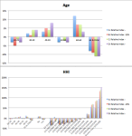
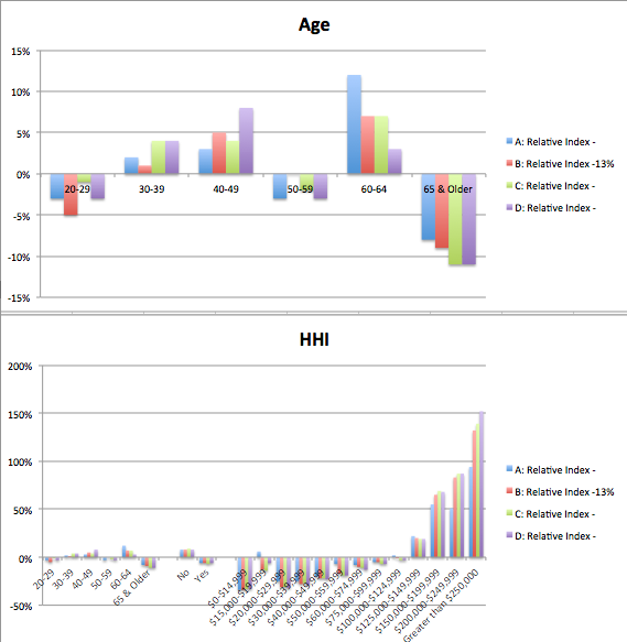
- Trend analysis: Compare month-to-month or season-to-season changes in your audiences to analyze trends over time and then optimize your audience composition and messaging accordingly. For example, you can select monthly or seasonal snapshots of an audience discovery or profile report, and then use the index to generate charts showing how the audience trends over time.
To create a comparison report:
- Verify that you have generated two or more discovery reports or profile reports (audience, container, or media) and saved them as favorites. Currently, you cannot include funnel analysis reports in a comparison.
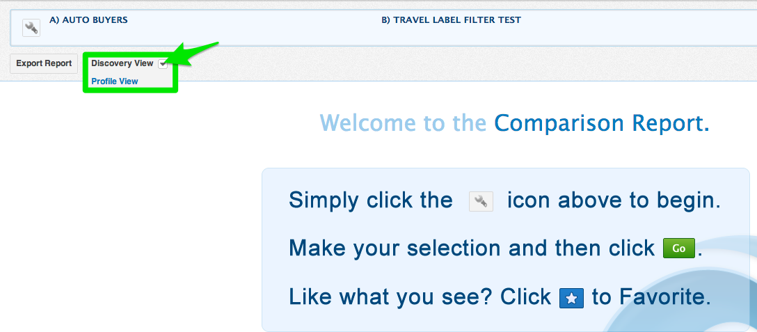
- Select Analyze > Favorites Comparison.
- The Comparison Report page opens.
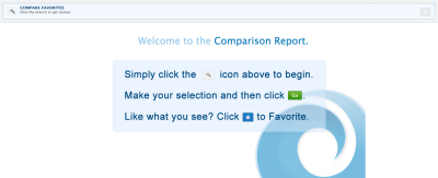
- Click the compare favorites icon (
 ) in the upper left-hand corner. The Create New Comparison Report dialog opens.
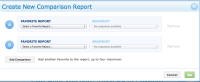
- Under Favorite Report, select an audience, container, or media report that you have saved as a favorite (click here for more information on saving reports as favorites). If the selected report has any snapshots, you can optionally select one from the Snapshot list to include in the comparison (snapshots are generated for reports that use unsampled data). For example, you can select monthly or quarterly snapshots of the same report to analyze the trends of a specific query. If the report uses unsampled data, the latest snapshot is used in the Comparison Report by default. If the report uses sampled data or a snapshot is not available, the current 30-day inventory of users is used.
Repeat this step to select a second Favorite Report. Click Add Comparison to add third and fourth reports to the comparison report, if desired. Click Remove to remove a report from the comparison.Warning: The devices, countries, and universes selected in the individual report queries will be preserved in the comparison report. Any filtering that you have used in a report, however, is not applied.
- Click Go to return to the Compare Favorites page.
- By default, the comparison report will use the discovery view of your reports. To select the profile view, toggle the selected view.
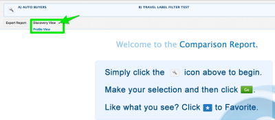
- The Discovery View lists which categories are the most highly related to the audience queries in your selected reports. The discovery view includes an Index that calculates how much more likely a user in query X is to be in a category than another user in the selected universe (the entire population, a set of one or more audiences, or a set of one or more containers). The higher the index, the more similar a category is to your query.
- The profile view lists how your audience skews/biases more towards certain categories when compared to the users in a specific universe. The profile view includes a relative index that calculates the probability of your queried segment to be part of a specific category within a category group. This is then compared against the probability of any user within the selected universe being in that category (for example, Demo > Age > 20-29) within the category group (Demo > Age). The higher the percentage, the more similar a category is to your query.
-
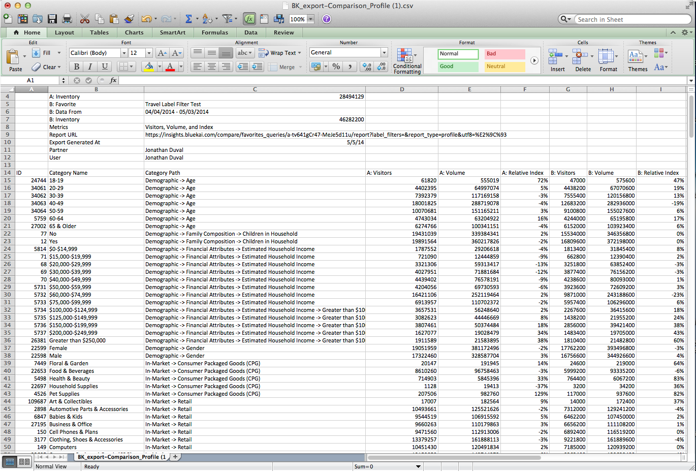
Click Export Report to export the comparison report to a comma-separated value (CSV) file and open your report using a spreadsheet application.
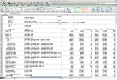
- By default, comparison reports using the discovery view list the categories according to their index (highest to lowest) based on the first report included in the comparison. Comparison reports using the profile view list the categories according to their relative index within each category group based on the first report.
You can evaluate the Visitors and Volume columns to determine which categories would enable you to achieve the desired scale. The Visitors column lists the overlap between your queried segment and this category over the last 30 days. The Volume columns lists the number of unique users the platform has seen in this category over the last 30 days, which forecasts how many users are potentially available to target. - (Optional) You can sort and filter the categories, and generate charts visualizing your report data.