New Sample Data Models and Reports For Oracle Analytical Cloud
Oracle Field Service-Oracle Analytical Cloud integration offers new sample reports , DV projects and dashboards as reference. These reports and dashboards help you learn how to use Oracle Field Service Cloud raw data in Oracle Analytical Cloud.
You can generate reports using Oracle Analytical Cloud analytics and data visualization tools to get different insights about your business.
-
Sample data models including daily and real-time fields
-
XML file configuration that defines those configurations that you require to work with the sample data models and reports in Oracle Field Service Cloud
-
Sample reports and dashboards generated using Oracle Analytical Cloud analytical data and data visualization tools
-
Sample DV projects
You can download these objects from Oracle Technology Network and use them as reference. You can download and use these reports and dashboards in Oracle Analytical Cloud using Oracle Field Service data. You can also leverage the sample data set to create and consume models on your own.
New Reports in Oracle Analytical Cloud
As part of Oracle Field Service-Oracle Analytical Cloud integration, new reports and DV projects are available as a reference in Oracle Analytical Cloud.
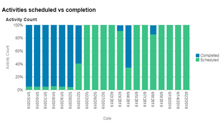
Activities Scheduled Versus Activities Completed Report
This example report shows how activity attributes such as Status can be presented with different analytical perspectives in Oracle Analytical Cloud. The Activities Scheduled versus Completed report displays the comparison of activities with status Completed against activities with status Scheduled in Oracle Field Service Cloud.
The image displays Activities Scheduled versus Completed report.
Collaboration Charts
In Oracle Field Service Cloud-Oracle Analytical Cloud integration, Collaboration is a real time entity. You can use Collaboration charts to understand how to use real-time entities in Oracle Analytical Cloud to get different analytics on Collaboration.
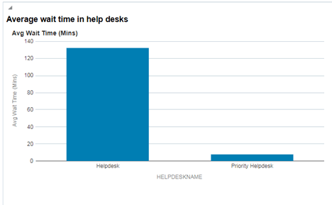
Average Waiting Time in Help Desks Chart
This chart is an example displaying the analysis to determine the waiting time for chats- how long mobile workers/users have to wait at a help desk for operator assistance.
The image displays the Average waiting time in a help desk report.
Data Visualization Graphics
As part of Oracle Field Service-Oracle Analytical Cloud integration, data visualization graphs are available as a reference in Oracle Analytical Cloud. Oracle Data visualization is an advanced visualization tool that helps you gain new insights through visual analysis.
DVCS provides an easy and automatic data blending technique that allows you to combine data from a variety of sources — Oracle and other SaaS applications, on-premises systems, external sources, and personal files.
Average Travel Time By Location
Here is an example about how you can perform geospatial analysis in Oracle Analytical Cloud using Oracle Field Service data. This visualization provides an insight about average travel time in selected regions. You can see the activity locations (city and states) and the average travel time in each location from the Map view.
The image displays Map view showing Average travel time by location.

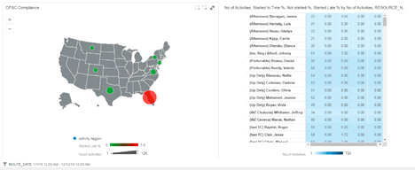
Compliance Analysis
This report provides a comparison of the activities completed late versus the total activities scheduled in a region. You can use such analysis to measure activity time performance of different business regions of your organization.
The image displays the Map view showing compliance analysis.
Who is Chatting With Whom More Chart
This chart is an example displaying information about top 5 users with whom a specific collaboration user is interacting with in terms of number of chats initiated with another user.
The image displays the Who is chatting with whom more report.
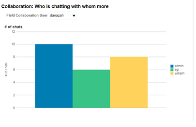
Such analysis helps organizations to take decisions on how to optimize collaboration usage within the organization