Forecasting Charts
You can view the Actual Workload, Forecasted Workload, plan, and Available Resources data in line-chart mode.
| Line | Description |
| Available Resources | The number of man-minutes that were available for the specified date and bucket. The Available Resources line is always shown in orange. This line is displayed only at the bucket level and not at the capacity category or time slot level. The legends are displayed on the right of the chart. |
| Actual Workload | The number of man-minutes used for the specified date, capacity category, and time slot. Only activities with a valid time slot and an associated valid capacity category are considered in calculating the Actual Workload. The Actual Workload line is always shown in green. The legends are displayed on the right of the chart. |
| Forecasted Workload | The number of man-minutes predicted for the specified date, capacity category and time slot. The data is calculated based on the past values of Actual Workload. The Forecasted Workload line is always shown in yellow. The legends are displayed on the right of the chart. |
| Forecasted Min. Workload | Shows the minimum forecasted workload that needs to be completed on each day in case, there are SLA based activities. The data is calculated based on the past values of Actual Workload. The Forecasted Min. Workload is always shown in yellow. The legends are displayed on the right of the chart. |
| Forecasted Max. Workload | Shows the maximum forecasted workload that can be completed on each day in case, there are SLA based activities. The data is calculated based on the past values of Actual Workload. The Forecasted Max. Workload is always shown in brown. The legends are displayed on the right of the chart. |
| Booked Workload | The number of man-minutes that have been booked for future dates in the Quota page. The Booked Workload is always shown in blue. The legends are displayed on the right of the chart. |
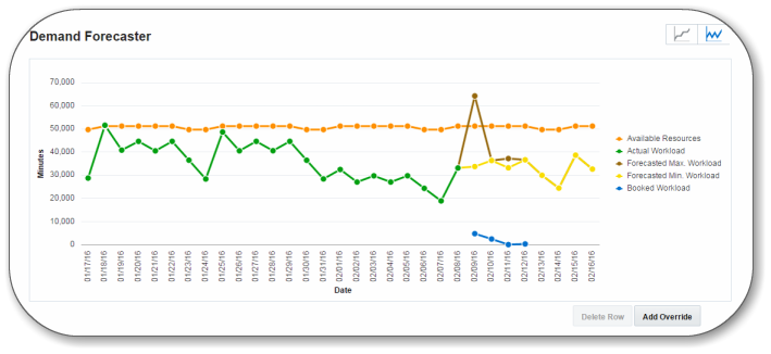
You can select any or all of the check boxes located in the upper right to display the type of data to be shown in the line chart. When you select a check box, the corresponding line in the diagram is highlighted. When any of the lines are shown or hidden, the chart is rescaled to fit all data, and the lines are dynamically redrawn according to the new scale.
Hovering over a line displays a the line name and the time and values that correspond to the selected point in that line.
Manage Resources in Service Planner
Click the cumulative view icon to display all data for future dates in a cumulative form, starting from the current date. Past data is not displayed in this view. Data in the table view is also updated accordingly.
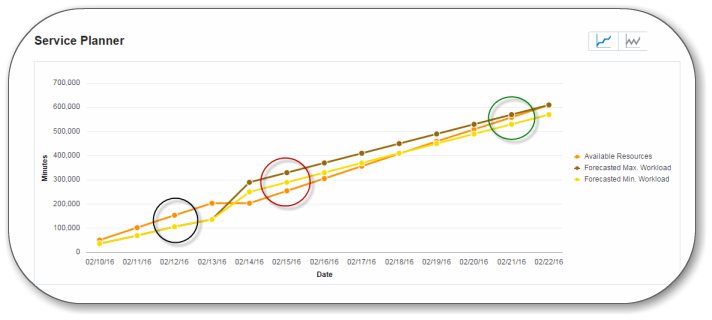
If the Available Resources line is above the Forecasted Max. Workload, it indicates that there is not enough workload for the available resources and hence, there will be some idle time. (Circled in black)
If the Available Resources line is below the Forecasted Min. Workload/Forecasted Workload, it indicates that there is more work to be completed than available resources. Hence, there is a resource constraint and some activities may miss their SLA windows. (Circled in red)
If the Available Resources line is above the Forecasted Min. Workload but below the Forecasted Max. Workload, there is no resource constraint or idle time. (Circled in green)