Concepts in Designing Dashboard 2.0 Dashboards
This topic contains helpful information as you design Dashboard 2.0 dashboards:
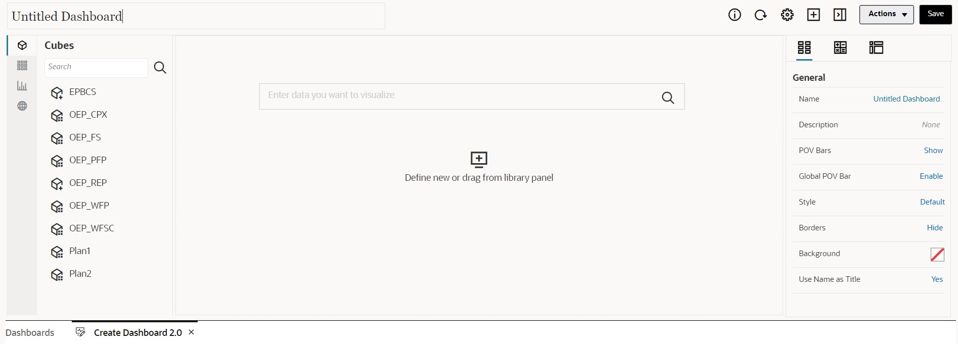
About the Dashboard 2.0 Designer

The Dashboard Designer consists of the following dashboard components:
Opening the Dashboard 2.0 Designer
As a reminder, Dashboard 2.0 dashboards on the Dashboards page are identified by one of the following icons:
-
 (Dashboard 2.0 icon in the standardized interface)
-
 (Dashboard 2.0 icon in the legacy interface)
To open the Dashboard 2.0 Designer:
-
From the Home page, click Dashboards.
-
Select one of the following options:
-
To create a dashboard, click Create, and then select Dashboard 2.0.
-
To edit a dashboard, in the Actions column to the right of the Dashboard 2.0 dashboard you'd like to edit, click
 (Actions), and then click Edit.
If you don't need to work with data while editing a Dashboard 2.0 dashboard; for example, you'd like to realign the dashboard components and tiles, click
 (Actions), and then click Edit without Data.
-
-
If the Dashboard 2.0 dashboard is open in the runtime environment, you can switch from the runtime environment to the Dashboard Designer environment.
Click Actions, and then select Edit or Edit without Data.
Data Sources for Charts
Dashboard 2.0 supports ad hoc grids, forms, and cubes for choosing the data. You pick the data sources from the object palette.
Note:
You can include a maximum of 12 components in a Dashboard 2.0 dashboard.
-
The properties panel provides full data source information for a dashboard component on the Chart tab
 . Select the dashboard component, then click
  (Chart). The data source information is displayed under the
Visualization heading.
-
When using a cube as the data source for quick analysis, drag and drop a cube from the object palette to the dashboard workspace, then click in the Search box and either enter the member name or launch the member selector to choose members. The Layout tab will then display in the properties panel where you can pivot the dimensions and choose which dimensions appear on the POV, row, or column axis. See About Quick Analysis.
Note:
There is an upper limit of 50 members across all dimensions that can be selected to create a chart using quick analysis. This limit together with the number of dimensions in the cube will determine the maximum size of the grid that is supported for a chart based on quick analysis.
-
When the data source for a dashboard component is a form or an ad hoc grid, the data is fetched using the form definition.
-
You can change the source form in the properties panel by clicking the Form property in the
 (Chart) tab of the properties panel.
-
The total amount of form data that's allowed to be visualized in a chart is 10,000 cells. By default, this is 100 rows and 100 columns. However, you can change the number of rows and columns to any combination that totals 10,000 cells or less; for example, if you reduce the number of rows to 5, then you can increase the number of columns to 2,000 (5 x 2000=10,000).
-
If a form's precision is set, displayed values after conversion to Dashboard 2.0 are based on the form's precision setting. If the precision value on a form is not set, then the values displayed after conversion to Dashboard 2.0 might change.
Note:
When the data source for a dashboard component is a form, and the form has rows that contain blank header cells or empty formula rows that are not configured, then the corresponding chart legends will not display.
-
-
For Doughnut, Pie, and Gauge chart types, you can add multiple charts to one component. To add multiple charts, click Single or Multiple in the chart's Display property. If Single is selected, the chart displays only the first column of the underlying form's data. If Multiple is selected, a chart is displayed for each column of the underlying form's data.
Note:
For dashboards with Doughnut, Pie, and Gauge chart types that are converted from Dashboard 1.0 to Dashboard 2.0, the default option for the Display property is Multiple. For newly created Dashboard 2.0 dashboards, the default option for Display is Single.
More Helpful Information About Dashboard 2.0
-
As you create a dashboard, click Actions and then select Save and Run to immediately see how the dashboard looks and works to a dashboard user. To return to designer mode to continue designing the dashboard, click Actions and then select Edit or Edit without Data.
-
By default, missing or suppressed data is plotted as zeros. For selected chart types (Area, Bubble, Combination, Line, Radar, and Scatter), you can disable this setting by selecting the Plot Missing Values as Zero option in the chart's settings. When this option is disabled, the missing or suppressed data is ignored and is no longer plotted as zeros for those chart types.
-
To review Dashboard 2.0 considerations, see Considerations for Dashboard 2.0.
Videos
| Your Goal | Watch This Video |
|---|---|
|
Learn how to create a dashboard with multiple components in the Dashboard Designer for Dashboard 2.0. |