Anatomy of an Infolet
Infolet Views
An infolet supports up to three views:
-
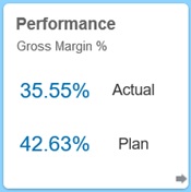
Front view (required)

-
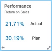
Back view (optional)

-
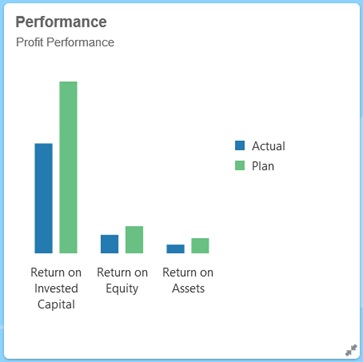
Expanded view (optional)

The front view is required, and:
-
Provides a quick look or glimpse at high-level information that has a direct effect on your work; for example, the front view can display status, counts, totals, or the most recent updates
-
Promotes a glancing action that helps you identify important information that you may want to explore a bit more
-
Uses all infolet sizes except 3x2 (see information about infolet sizes below)
-
Returns the expanded view to its original size in the front view or back view
-
Includes an Actions menu icon available only on hover and either a (optional) flip to back icon or an expand icon in the lower-right corner
Note:
If only one view is presented, it must be a front view.The back view is optional, and:
-
Presents analytical information (for example, a graph)
-
Promotes a scanning action that helps you explore or become more familiar with the information represented on the front view
-
Is sized the same as the front view
-
Includes an Actions menu icon available only on hover, a flip to front icon in the lower-left corner, and an (optional) expand icon in the lower-right corner
The expanded view is optional, and:
-
Presents even more detailed information about the single data point or interdependent data set presented in the front and back views; for example, the expanded view can display more details about an object or a list of recent items than what's displayed on either the front or back view
-
Provides enough information to help you decide if you're ready to take action and move to a focused context on a work area page
-
Transitions smoothly from other views. You see a smooth, seamless expansion, as one infolet pushes others into new positions.
-
Must be sized bigger than the front or back views
-
Includes an Actions menu icon available only on hover, and a collapse icon in the lower-right corner
Infolet views honor the access permissions assigned to the underlying forms and dimensions. Therefore, the same infolet may display varying views from user to user if they have different access permissions.
Infolet Sizes
Infolets can be sized as follows:
Note:
1x1 refers to a box that spans one column and row width (170 pixels).
-
1x1
-
2x1
-
3x1
-
2x2
-
3x2 (expanded view only)
The size of the front and the back views are always the same. Changing the size of the front view will automatically reset the size of the back view. Because the size of the expanded view must always be greater than the size of the front/back views, if the size of the front/back view of an infolet is enlarged, the expanded view automatically resets to a larger size than the front/back view.
Note:
Front and back views cannot use the 3x2 size. This size is applicable for the expanded view only.The size, title, and subtitle of a view is set by the designer in the properties panel. See Using the Infolets Designer.
Navigating Between Infolet Views
An infolet can be created with one of the following view combinations:
-
Front view only
-
Front and back views
-
Front and expanded views
-
Front, back, and expanded views
Switching from one view to another is controlled by clicking a flip icon, an expand icon, or a collapse icon available in the bottom-right or bottom-left corner of the infolet. Hovering your cursor over the bottom corners reveals a flip, expand, or collapse icon.