Readability
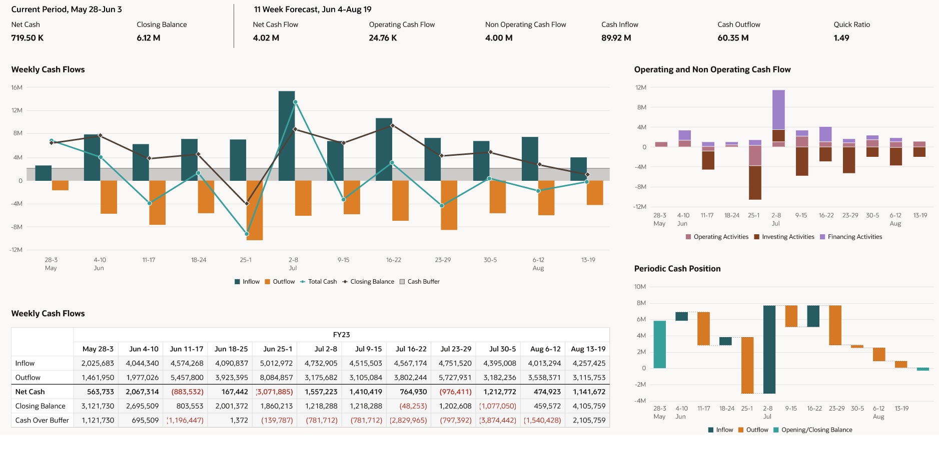
Here are some best practices to follow to make dashboards more readable:
-
Left-align text rather than centering text or setting it to align right.
-
Use grid lines in all charts.
-
Use red for negative numbers.
-
Use the same chart types for similar information; for example, Inflow and Outflow should both be visualized as the same type of chart.
Figure 11-5 Example Dashboard: Periodic Summary
