App icon design guidelines
When designing your app's icon, it is important to follow the recommended design guidelines to ensure your app icon displays correctly for your users. Each app requires:
- AppCloud catalog icon
- App-specific icon (the size requirement depends on where the app appears in the Eloqua interface)
Each app has different size guidelines and will appear in different areas of the Eloqua interface:
AppCloud catalog icons
Size requirement:
- 96x96px
An icon to represent your app will be displayed in the AppCloud catalog and on the App Details page.
Menu apps
Size requirement:
- 96x96px
Menu apps are accessed from the cloud menu tab, located at the top right of the screen. These apps should be context specific.
The menu app icon appears within the cloud menu tab and in AppCloud catalog.
Content apps
Size requirement:
- 96x96px
Content apps are accessible from the cloud content popup in the email and landing page editors. The content apps icon appears on this popup and in the AppCloud catalog.
Firehose apps
Size requirement:
- 96x96px
Firehose apps only require an icon in the AppCloud catalog.
Canvas apps (action, decision, and feeder services)
Size requirement:
- 32x32px
- 16x16px
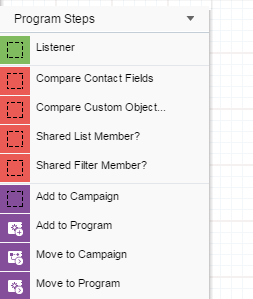
Canvas apps are accessible from the campaign canvas and the program canvas left canvas palette. Two icons are needed for canvas apps:
- The 32x32px icon appears in the left campaign/program step on the canvas
- The 16x16px icon appears in the left canvas palette
Recommendation:
- White icon with transparent background
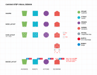
Important: Because color is used to differentiate between audience (green), decision (red) and action (purple) steps and unpopulated state steps (gray), it is strongly recommended that app providers use white icons with transparent backgrounds for canvas apps.
Migrating existing apps to the new interface
In the new interface, your existing apps will be modified accordingly:
- Menu apps: Unchanged, but scale in size.
- Content apps: Unchanged, but scale in size.
- Firehose apps: Unchanged, but scale in size.
- Canvas apps: The dotted line shows placement of the icon within the step:

Left palette:

