Lead Score Model Comparison dashboard
The Lead Score Model Comparison dashboard shows how contacts are distributed in a given lead scoring model and allows you to compare the distribution across different models. Understanding the distribution of your contacts is an important first step to understanding the impact of your lead scoring model. Find out more about lead scoring.
Click a link below to find out more about this dashboard:
Good to know
- The data available on the dashboard is updated every hour.
- A contact is re-scored whenever the following occurs:
- Immediately after the contact's profile changes or the contact performs an activity used by the lead scoring model.
- Immediately after uploading an external activity that the contact is associated with.
- You can compare up to 4 lead scoring models. Only those models that contacts have been scored against can be viewed on the dashboard.
- To access a dashboard report in Insight, click
 . The dashboard reports are available in Insight in the following location: Shared Folders / Dashboard Reports / Lead Score Model Comparison. (Currently, the Contacts by Lead Score Category report is not available in Insight.)
Dashboard filters
By default, the dashboard displays the most recently created lead score model. If your organization has multiple lead score models that contacts were scored against, you can use the Lead Score Model filter to display up to 4 models on the dashboard.
Understanding the charts on the dashboard
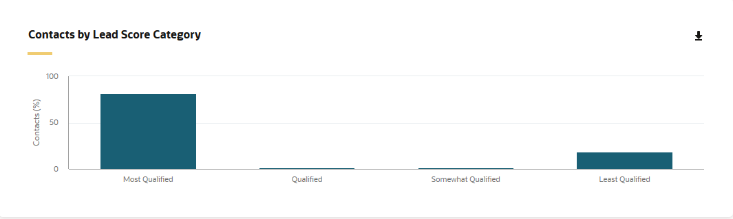
Contacts by Lead Score Category
This chart shows you the percentage of contacts that are the most to least qualified based on the contact's overall lead score.
- Most Qualified: A1, A2, B1
- Qualified: A3, B2, B3, C1, C2
- Somewhat Qualified: A4, B4, C3, D1, D2
- Least Qualified: C4, D3, D4
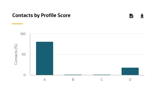
Contacts by Profile Score
This chart shows the percentage of contacts with a profile score of A, B, C, or D. Where A is the most desirable profile and D is the least. The profile criteria is explicit data about the lead, such as title, industry, or company revenues. This type of demographic data helps identify who the prospect is and the prospect's fit.
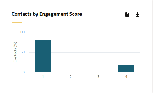
Contacts by Engagement Score
This chart shows the percentage of contacts with an engagement score of 1, 2, 3, or 4. Where a 1 is the most desirable level of engagement and 4 is the least. The engagement criteria is implicit data about a lead, such as visits to your website and responsiveness to promotions. This type of data helps determine a lead's online behavior and can indicate how interested the prospect is.
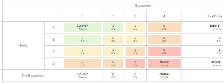
Lead Score Model Summary
This chart shows how contacts are distributed in a given lead scoring model. You can click the total contacts to run the Lead Score by Contact chart in Insight. This chart provides you with further contact details such as email address, name, and address.