Responsive HTML email templates
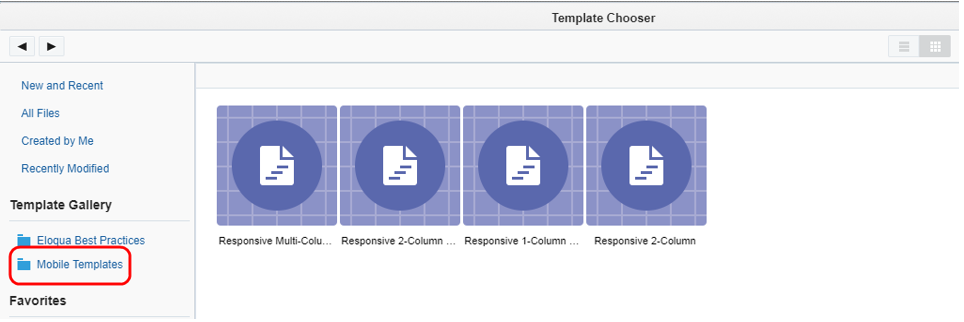
The Design Editor provides various layouts that you can use to build a fully responsive email. However, you can continue to use the responsive HTML templates. Responsive HTML templates are available from the Template Chooser in the Mobile Templates folder.
Note: The responsive HTML email templates rely on CSS media queries. Deleting these from the template will remove the responsive nature of the email.
The following describes the responsive HTML templates:
-
Responsive 2-Column Split Header: This template contains a two-column header (the company logo placeholder on the left and a placeholder for other content on the right, 180x50 px). The body of the email is also divided into two columns. The content within the column sections can be modified when creating your email.
-
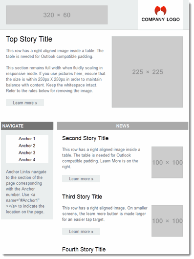
Responsive Multi-Column Top Story: This template is similar to the 2-Column Split Header template, except for the heading which is shown in a single column of 320 x 60 px size.
-
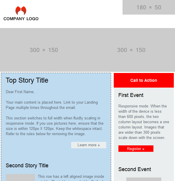
Responsive 1-Column with Callout: This template is geared towards smaller resolution email clients (600 px or lower). Within the email template body there are specific guidelines for what codes and tags to use when adding your content.
Example: In order to ensure that emails viewed in Microsoft Outlook are rendered properly, do not use paragraph tags, only "<br>". It is important to follow the rules provided in order to ensure that your emails render properly in various email clients.
This template also includes a placeholder for a callout. In the example below, there is a section that provides information (and perhaps a calendar callout) for an event. You can customize this section by adding the dates, names and other pertinent information for your email campaign.

-
Responsive 2-Column: Finally, the Responsive 2-Column template is used for creating an email containing text and images divided into a two-column arrangement.
