Customizing forms with CSS in the Classic Design Editor
Important: You can no longer create new assets using the Classic Form Design editor or copy assets created in the Classic Form Design editor. All legacy form assets continue to be editable using the same Classic Form Design Editor. Additionally, classic forms will still function in their landing pages and capture form submission data. Customers can leverage the Save As and Save As Template features for their classic forms to save them as responsive forms in our new Design Editor. Learn more in our product notice.
This topic applies to the Classic Design Editor. If you are working in the Design Editor, see Customizing forms with CSS in the Design Editor.
CSS can be used to heavily customize the layout of forms. Standalone CSS classes allows for more flexibility with form designs and custom styles in both the design and source editors.
See the following common use cases that will help you customize your forms:
Form HTML Structure
The illustration below outlines the structure of the HTML Oracle Eloqua generates when a form is added to a landing page. By targeting the HTML classes highlighted below, you can control the layout of any form on your landing page.
Note: When targeting the styles listed below, you should always target the .elq-form class first in each style declaration. See the examples below for more clarity.
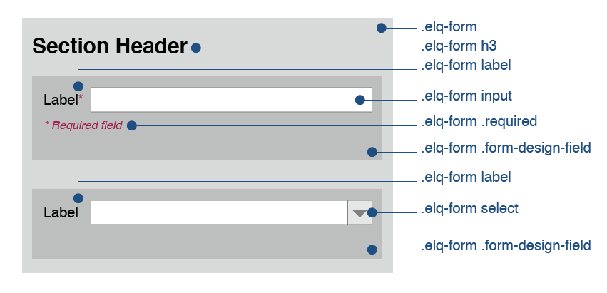
The table below provides detail on each of these HTML tags.
| HTML Tag | Description |
|---|---|
| .elq-form | This class identifies the div tag which encompasses the entire form object on your landing page. All form styles must begin by targeting this Div, and its presence is necessary to create two-column forms. |
| .elq-form .form-design-field | This class identifies the div tags which encompass each row (label and field) of your form. form-design-field will encapsulate the entire field group that was set in the forms editor. |
| .elq-form .field-style | This class targets each individual element independently including each element in a field group. |
| .elq-form .item-padding | Targeting this class with CSS allows you to control the spacing between form fields and the number of fields in each row of your form. |
| .elq-form label | Targeting this HTML tag with CSS allows you to control the alignment and spacing of your form field labels. |
| .elq-form .required | This class identifies the validation messages that appear when a required field is not filled out. Targeting this class with CSS allows you to control the appearance and position of validation messages. |
.elq-form .heading .elq-form H3 |
This HTML tag is used to create section headers. Targeting this with CSS allows you to format your section headers to look like form field labels, allowing you to ask questions longer that 100 characters on your forms. |
| #formElement- | Each form-design-field div tag is assigned a numbered formElement ID when your form is published. IDs are assigned sequentially so the first element (field) on your form will have an ID of #formElement0, the second will have an ID of #formElement1 and so on. Targeting these IDs with CSS allows you to control the appearance of individual fields on your forms. |
.elq-form input .elq-form textarea .elq-form select |
Targeting this HTML tag with CSS allows you to change the look and feel (size, color, borders, and so on) of the form input box, paragraphs text box, or picklist option. |
Sample Code
See the following common form design goals and the corresponding example code samples to achieve these goals.
| Goal | Code Sample |
|---|---|
| Reduce spacing between form fields |
.elq-form .item-padding {
padding:0px;
    }

.elq-form .field-style {
padding:0px;
    }
|
| Treat a section header as a form field label |
.elq-form H3 {
font-size:12px;
}
|
| Add vertical spacing between form elements |
.elq-form .field-style {
      margin-bottom:50px;
      margin-top:50px;
    }
|
|
Allow forms on the landing page to span two columns Note: This works best when all of the fields on the form have their field width set to large in the form editor) |
.elq-form .form-design-field{
padding:0px;
width:47%;
min-height:55px;
position:static;
float:left;
clear:none;
}
|
| Rounded corners |
.elq-form input, .elq-form textarea {
        border-radius:8px;
    }
|
| Increase the height of the paragraph text |
.elq-form textarea {
        height:100px;
    }
|