Adding formatting to your analysis
This tutorial shows you how to apply formatting to the results of your analysis and customize the general appearance of the results. After you create an analysis, default formatting rules are applied to the results.
What you'll learn
In this tutorial, we'll show you how to:
- Apply formatting to a column header and change the name of the header
- Apply formatting to alternate rows in the analysis
What you'll need
- Access to Insight
- Analyzer license
- Completed the tutorial Adding totals to your analysis
Step 1: Applying formatting to a column header
First, we'll apply some formatting to a column header in our analysis.
To apply formatting to your analysis:
- Open the analysis you were working with in Adding totals to your analysis.
- Click the Results tab.
- Click Edit View
 in the Table view.
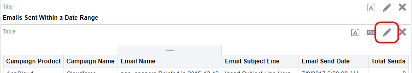
The Layout pane appears.
- In the Layout pane, click
 Options for Campaign Product and select Format Headings.
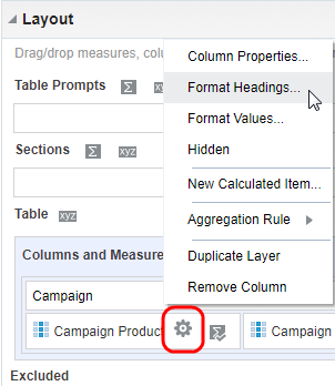
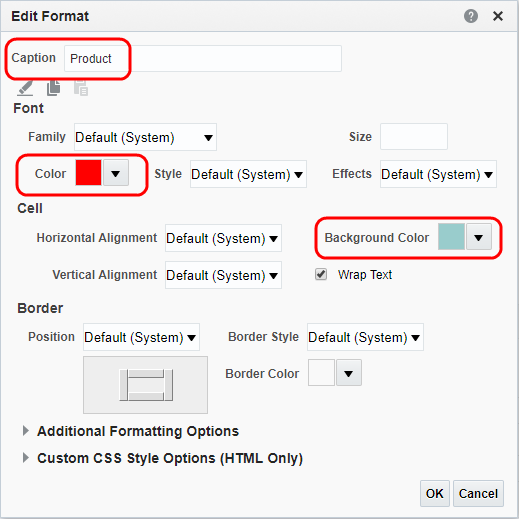
The Edit Format dialog appears.
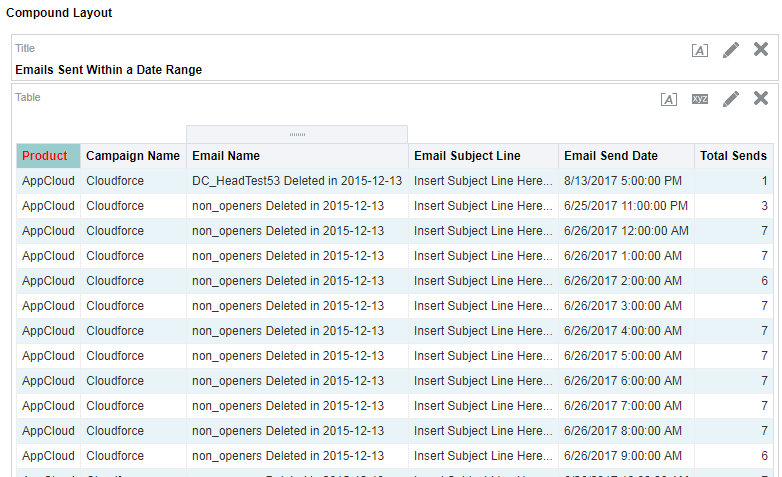
- Enter Product in the Caption field.
- Click the Color list in the Font area. Select a red color from the Color Selector dialog, and click OK.
- Click the Background Color list in the Cell area. Select a light blue color from the Color Selector dialog, and click OK.
The completed dialog should look like this:
- Click OK.
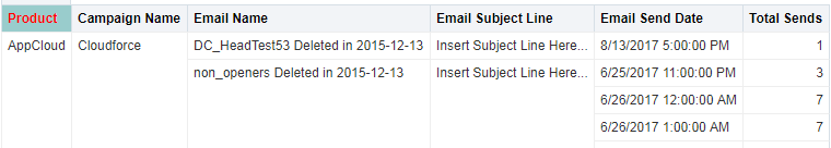
Your changes appear in the Preview pane.
- Click Done and then save your analysis.
Step 2: Applying styles to alternate rows
Now, we'll apply styles to alternate rows in the analysis.
To apply styles to alternate rows:
- On the Results tab, Click Properties
 on the Table view toolbar.
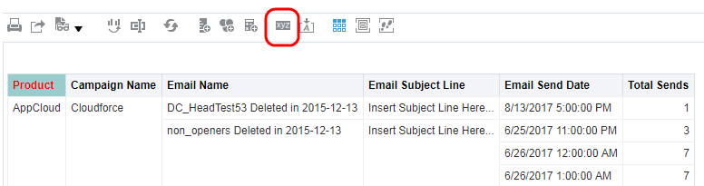
The Table Properties dialog appears.
- Select the Enable alternate styling check box and the Repeat cell values check box.
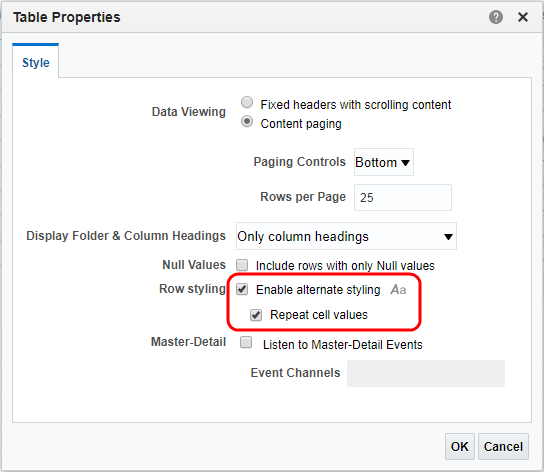
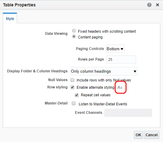
- To change the formatting of the alternate rows, click Styles
 .
.
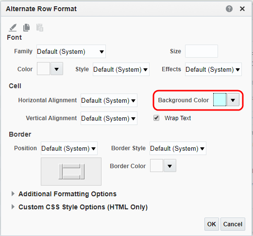
The Alternate Row Format dialog appears.
- Click the Background Color list in the Cell area. Select a light blue color from the Color Selector dialog, and click OK.
- Click Done and save your analysis.
Now that you're done
Now that you added formatting to your analysis, check out the next tutorial Adding a graph to your analysis.