Landing page examples
Give your visitors a good impression with a crisp, professional design and efficient, valuable information that builds trust and compels them to move through your campaign. It is important that your landing pages are persuasive and informative without wasting the viewer's time.
Here are some examples highlighting the features of a good landing page.
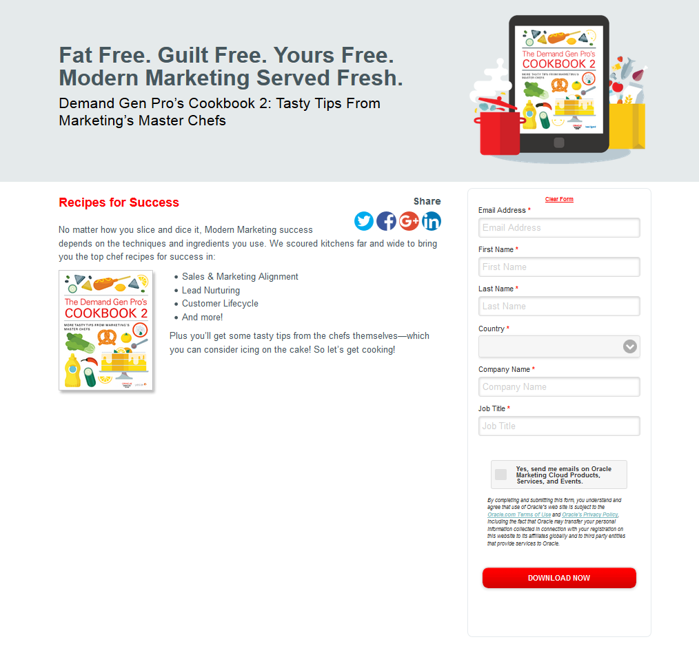
This page acts as a gateway to content that was advertised in the email or PPC as that drove the visitor to this location. The strengths of this page lies in its brevity: the page gets straight to the point without too much textual or visual flare, and the visitor must fill in only a few fields before they can access the desired content.
The following examples provide an idea as to how you can strategically measure the value of your content against the type of service being provided, and then stage your information accordingly.
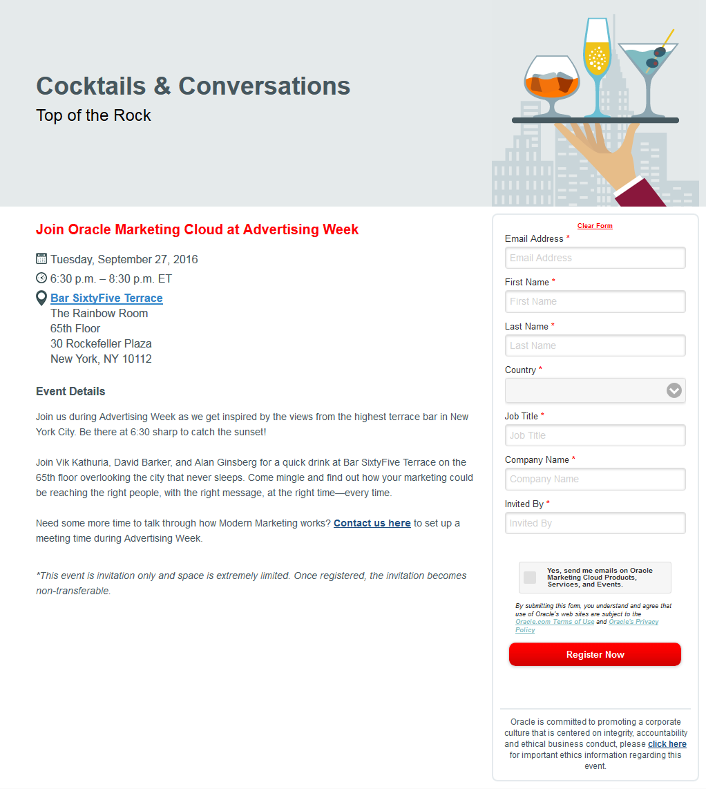
In this first example, the goal is to drive RSVPs for a semi-informal, social networking event. The strength here lies in how the type of event is appropriately framed by an informative yet enthusiastic tone. The page invites potential guests using a language that is appropriate to the type of event.
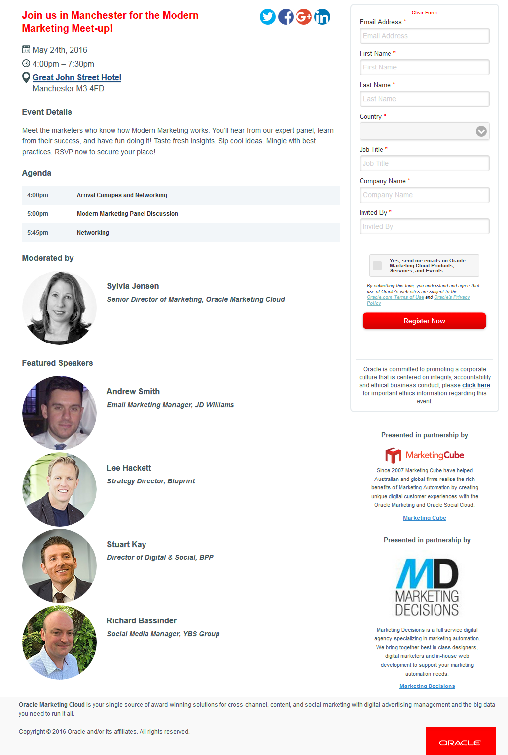
Conversely, this next example aims to drive event registration for a panel discussion and luncheon with industry leaders. While the event description is much more concise than the previous event, brand recognition, trust, and overall importance are fostered by featuring multi-organization partnerships and personable or recognizable identities.
Note the additional company contact information and social media options at the bottom of the page.
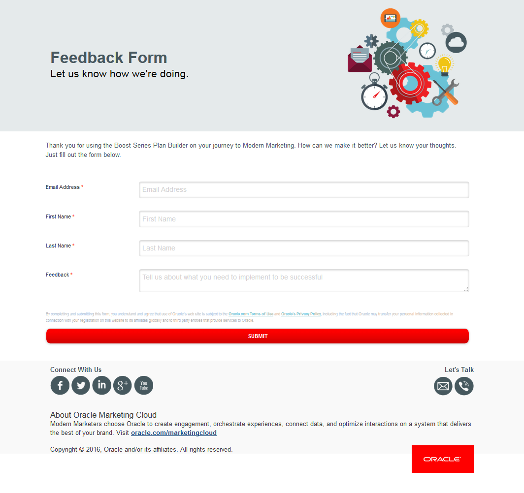
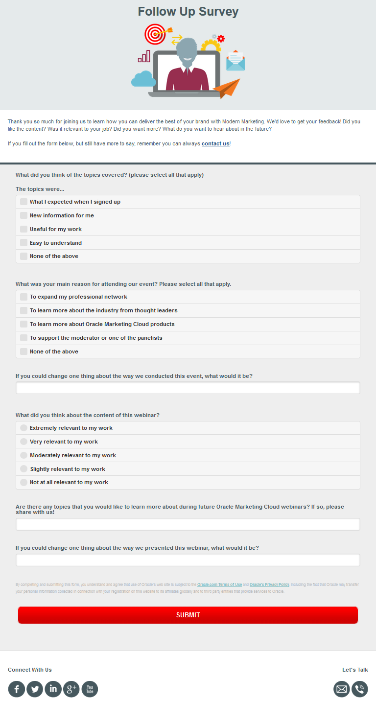
These landing pages highlight a few different ways in which you can use surveys to measure customer satisfaction and drive engagement.
This first example allows customers to explicitly state their information, using a custom contact field for the feedback itself.
A second example gives recent webinar attendees a chance to rate their experience.
You can also break a larger survey down into a landing series of landing pages. This example is from the first of twenty pages in a survey, all meant to form a cohesive customer profile, while explaining key concepts for the participant to think about while they select their answers.
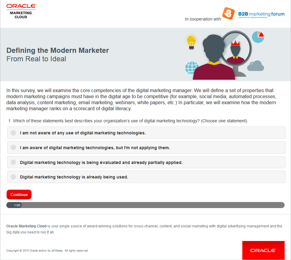
Tip: If a survey is going to require a longer commitment from a contact, you might offer an additional incentive to participate, such additional content, promotional deals, or entering a draw to win a prize once the survey is completed.
You can create multiple versions of the same landing page, and then send them out to different customers based on different audience regions. Alternatively, test alternate landing pages on the same audience, the use campaign reporting to measure which version of the landing page drives more visitor traffic.
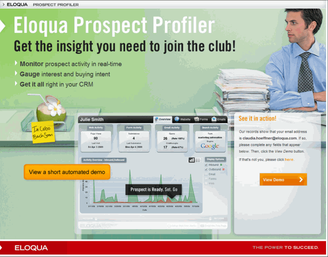
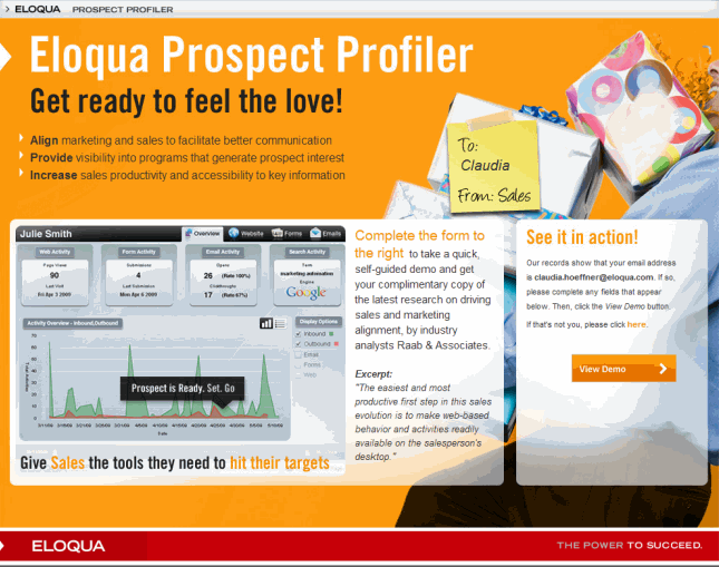
This landing page provides visitors with access to a demo for a new product. The demo is the main driver for this page, so the text on the page is minimal.
Here's a slightly different version of the same page.
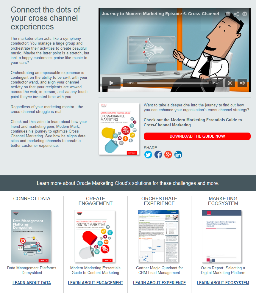
This landing page pulls different elements together to create a navigational hub of sorts. The YouTube video at the top, embedded via the HTML source editor, delivers a brief, compelling introduction to the featured content, and this is accentuated by the bright red call to action, "Download the guide now!" Images and links to associated products at the bottom offer added value for a visitor looking to educate themselves.