Editing Web Page Content with the Visual Editor
The visual editor is a tool that helps non-technical users make modifications directly on a page. It runs on your site, allowing you to edit it visually and verify your adjustments as you make them. You can apply quick changes to a wide variety of content types, including the following:
- Formatting and modifying text
- Replacing images and backgrounds
- Setting colors
- Altering page layouts
- Editing advanced properties (such as HTML, computed CSS styles, and element attributes)
All the functionality is accessible within a single tool. It supports both simple adjustments and more complex modifications as needed.
Getting started
Pre-requisite:
Ensure that the Visual Editor plugin is enabled in the Oracle CX Tag. You can do it by navigating to the Data Collection UI and then the Personalization module settings of your tag.
To start using the visual editor:
-
Create a new content node by selecting the default Visual editor - web page template.
-
Specify the URL of the webpage you want to modify, then press the Launch Page With Visual Editor button. Your webpage will open in a new browser tab within the visual editor tool.
Note: If the QA Tool is opened before launching the visual editor on the same web page, the visual editor will start and function as expected. However, if you have the visual editor open and then attempt to launch the QA Tool, this may cause conflicts. In such cases, please close the visual editor using the "Close" button or clear the browser's local storage before opening the QA Tool.
Element selection and navigation
To begin editing, click the Select New button in the visual editor toolbar. After activating this mode, elements on the page will be highlighted with a frame as you move your mouse over them, making it easy to identify which element you are about to select. When you click on an element, it will remain highlighted with a frame, indicating it is currently selected for editing.

If you need to reset your selection, use the Clear Selection option to remove the current highlight and start a new selection.
The visual editor also provides navigation controls to help you quickly move through the page's structure. You can:
- Move Left to select the next element in the DOM.
- Move Right to select the previous element in the DOM.
- Select Parent to move the selection to the parent element.
- Select First Child to select the first child within the currently selected container.
Editing a webpage
The visual editor provides the following editing options that give you control over the appearance and structure of your page elements:
- Design: Easily update the most frequently used properties based on the selected element type. This includes editing text, adjusting font family, size, and color, changing background color or image, updating image sources, managing links, and hiding or deleting elements.
- HTML: View and edit the outer HTML of the selected element. This tab is useful for making structural changes, such as adding new elements or reorganizing the layout.
- Attributes: View, add, update, or remove any HTML attribute for the chosen element, providing granular control over its behavior and properties.
- Style - Inspect and modify the computed CSS styles applied to the selected element, allowing for advanced visual customization beyond the options offered in the Design tab. When opening existing content in the visual editor, any styles previously added through the CSS code block will be automatically applied to the page and will also be visible and available for further editing within the Styles tab.
- Summary: Review a comprehensive list of all changes you have made in the current content stage, including which elements were modified and what changes were applied.
Note: When you open existing content in the visual editor, all previously made changes such as updates to elements or styles will be automatically rendered on the page. This allows you to easily review and refine your earlier edits within a single editing experience.
Design
The Design section gives you quick access to the most commonly used styles and attributes, tailored to the type of element you select.
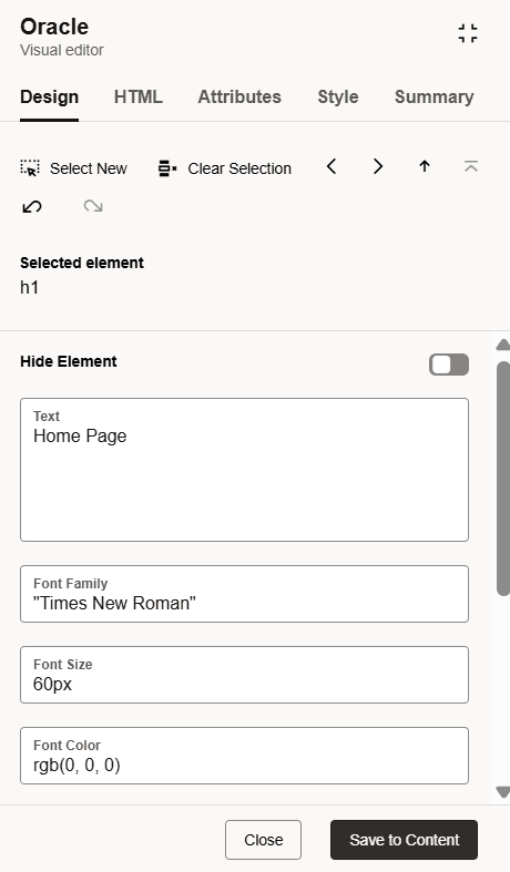
The available properties and actions are described below:
|
Property name |
Description |
Style/Attribute |
Generated code example |
|---|---|---|---|
|
Text |
Edit text |
Changing of innerHTML |
{
    "selector": ".button:nth-child(4)",
    "type": "text",
    "value": "New text"
}
|
|
Font Family |
Set the font for text elements |
|
{
    "selector": ".button:nth-child(4)",
    "type": "style",
    "attribute": "font-family",
    "value": "\"Times New Roman\""
}
|
|
Font Size |
Adjust the size of text |
|
{
    "selector": ".button:nth-child(4)",
    "type": "style",
    "attribute": "font-size",
    "value": "16px"
}
|
|
Font Color |
Specify the color of the text |
|
{
    "selector": ".button:nth-child(4)",
    "type": "style",
    "attribute": "color",
    "value": "rgb(255, 255, 251)"
}
|
|
Background Color |
Set the background color of the element |
|
{
    "selector": ".button:nth-child(4)",
    "type": "style",
    "attribute": "background-color",
    "value": "rgb(28, 135, 2011)"
}
|
|
Background Image |
Add or update background images, including no-repeat and cover settings by default |
|
{
    "selector": ".button:nth-child(4)",
    "type": "style",
    "attribute": "background-image",
    "value": "url(https://test.com/image.gif)"
},
{
    "selector": ".button:nth-child(4)",
    "type": "style",
    "attribute": "background-repeat",
    "value": "no-repeat"
},{
    "selector": ".button:nth-child(4)",
    "type": "style",
    "attribute": "background-size",
    "value": "cover"
}
|
|
Add or Edit Link |
Define or update the destination URL for clickable elements |
|
{
    "selector": ".button:nth-child(4)",
    "type": "attribute",
    "attribute": "href",
    "value": "https://test.com"
}
|
|
Image URL |
Change the source address for image elements |
|
{
    "selector": "img",
    "type": "attribute",
    "attribute": "src",
    "value": "https://new_image.jpg"
}
|
|
Hide Element |
Make the element invisible on the page |
|
{
	"selector": ".button:nth-child(4)",
	"type": "style",
	"attribute": "display",
	"value": "none"
}
|
|
Delete Element |
Permanently remove the element from the HTML structure |
Element removal from DOM |
{
	"selector": ".button:nth-child(3)",
	"type": "html",
	"value": ""
}
|
Depending on the type of element you select (text, image, container, etc.), the available options may vary. These options allow you to modify the appearance, layout, and functionality of your page elements, with all changes displayed for easy review.
pictureelements can only be modified using the HTML view and cannot be edited via the Design options.- Shadow DOM elements cannot be selected or edited.
- iFrames are not supported for selection or editing.
HTML
This section allows you to directly edit the outer HTML of the selected element, making it possible to restructure the page or add new content as needed.

Note: The visual editor uses an HTML sanitizer to ensure that only safe, trusted content is rendered on your web page. As a result, certain attributes such as inline event handlers (for example, onclick) will be removed when your changes are saved.
Attributes
Access, add, modify, or delete HTML attributes assigned to the selected element, enabling in-depth customization and behavior adjustments.

Style
View and update all computed CSS styles for the selected element. This section is especially useful if you want to make visual changes that are not available in the Design tab.

Summary
The Summary provides an overview of all modifications made during your editing session. You can review which elements were changed and the specific updates applied before saving your changes.

Saving changes and closing
After finishing your updates, click the Save to Content button followed by the Close button. This will close the visual editor tab and automatically add the generated code to your content node, along with the appropriate date and time information so you can see when the changes were made. To ensure your changes are fully applied, remember to save the content itself.