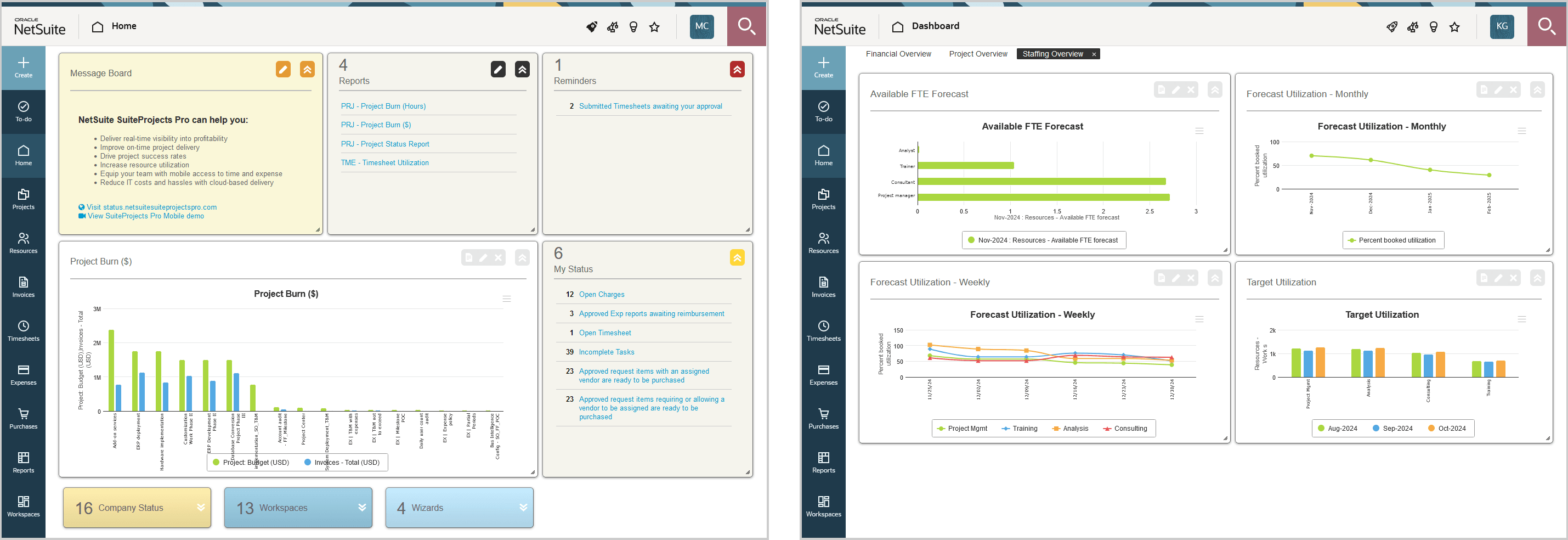
Homepage and Dashboards
Your homepage shows content in a variety of portlets. Portlets are panels that show dynamic content updated either in real time or at regular intervals. Your homepage includes standard portlets and you can add or remove portlets showing report data as a table (reports) or in a visual way (charts).
Depending on your access profile, the Home application also includes a dashboard page. Your dashboard shows content in portlets arranged in multiple tabs. For example, you may have one tab for financial information and another tab for resource utilization information. Your dashboard may include tabs and charts that your account administrators have set up for you. You can add or remove tabs to your dashboard, and add or remove portlets showing report data as a table (reports) or in a visual way (charts) in each tab.
Depending on your access profile, a dashboard is also available for each project. The project dashboard shows content relevant to a specific project.
For more information, see the following topics:
Navigation
You can go to your homepage and your dashboard from anywhere in SuiteProjects Pro.
-
To go to your homepage, go to Home > Home.
-
To go to your dashboard, go to Home > Dashboard.
-
To go to a project dashboard, go to Projects > Projects > [Select a project stage] > [Select a project] > Message board
Portlet Controls
You can change the position and size of the portlets on your homepage, dashboard tabs, and project dashboards.
-
Drag the title bar of a portlet to change the position of the portlet. Moving a portlet respects grid alignment and changes the position of other portlets depending on where you move it from and to.
-
Drag the lower-right corner of the portlet to change the portlet size. In some cases, the content adapts automatically to the new portlet size. If the content is larger than the portlet, you can scroll through the content.
Portlets include two parts: title bar and content. You can also collapse portlets so that only the title bar is visible and expand them by clicking the collapse ![]() and expand
and expand ![]() icons.
icons.
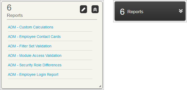
The title bar of expanded portlets may show additional action icons, depending on the type of portlet:
-
Click the Edit icon
 to change the portlet settings to controlling the information shown.
 -
(Chart and report portlets) Click the View report icon
 to view the report associated with the portlet in the Reports application.
 -
(Chart and report portlets) Click the Close icon
 to delete the portlet.
Standard Homepage Portlets
Depending on your account configuration and access profile, your homepage shows a combination of the following standard portlets:
-
Message board - Your company can use the message board portlet to communicate important information to all users in the company or in your department. The message board portlet is always in the upper left corner of your homepage canvas. You can collapse, expand and resize it, but you cannot move it.
-
Reminders - The reminders portlet includes information about workflow tasks that require your action such as timesheets, expense reports, or other information you need to review and approve. Click a link to go to the corresponding list of items to approve.
-
My status - Your status portlet can include information about work (tasks and issues) that is assigned you and needs to be completed, depending on your account configuration, and other items that you are responsible for and need to submit such as open timesheets, expense reports or other information that is routed for approval.
-
Company status - The company status portlet can include information about work (tasks and issues) that needs to be completed, depending on your account configuration, and information at various stages of the approval process. Typically, you would not have access to this portlet unless you are an account administrator or in a management role.
-
Reports - The reports portlet lists a selection of reports you have access to and lets you run any of the listed reports from your homepage. Click the edit icon to modify the selection of reports. Click a link to run the corresponding report.
-
Workspaces - The workspaces portlet lists workspaces you have access to. Click a link to go to the corresponding workspace.
-
Wizards - The wizards portlet lists the wizards you have access to. You may have access to the American receipt import wizard which enables you to connect to an American Express online statement and download your receipts into a preexisting expense report. Typically, you would not have access to other wizards unless you are an account administrator or in a management role. Other wizards enable account administrators to perform advanced bulk change or maintenance tasks.
All standard homepage portlets except the message board portlets show the content as a list of links. The number of list items is indicated in the title bar.
It is not possible to remove a standard portlet that is visible on your homepage.
The to-do list introduced in SuiteProjects Pro 2024.2 includes all workflow tasks from the Reminders portlet, and some workflow tasks from the My status portlet. Workflow tasks in the My status portlet for which you cannot take direct action are not included in the to-do list. For more information about the to-do list, see To-do list.
Report Portlets
Report portlets enable you to show your report data on your homepage or dashboard.
The report portlet lets you:
-
Sort you report data by one column in ascending or descending. To sort the data by a column or change the sort order, click the column header. Click Clear sort to revert to the default sort order.
-
Filter the report data. Enter a search string in the box under the column header to show only the rows with values containing the search string. You can use filters in multiple column.
-
Change the width of columns. Drag the white line separating column headers toward horizontally to change the width of the column to the right of that separation line.
Review the following guidelines:
-
Report portlets can only display a limited number of rows for performance reasons. The maximum number of rows depends on your account configuration. You should use filters to reduce the number of rows in your report to ensure that the report portlet shows the full report data.
-
A report runs automatically when you go to your homepage or dashboard tab showing that report data, if the report did not run in the last 12 (or 24 hours ago, depending on your account configuration). The report also runs automatically whenever you click Save in the portlet setup.
To add and set up a report portlet:
-
From your homepage or your dashboard tab, click the Create button, then New report.
A new report portlet appears on the canvas of your homepage or dashboard tab.

-
Enter a Report title. This is the text in the title bar of your report portlet. If not specified, the name of the selected report is used.
-
Select the Saved report that you want to show in the portlet.
-
Under Column width, select
Auto widthto change the column width automatically depending on the portlet width, orFixed widthto keep the same column width when you resize the portlet. -
Click Save.
The portlet loads your report data.
-
Move and resize the portlet as required.
Chart Portlets
Chart portlets enable you to show report data in a visual way so that it is easier to interpret and compare.
The chart portlets let you interact with your data:
-
Click the legend for the series to hide or to show again the series.
-
Point to or near a data point to show a tooltip with information about the data point (Series, category and value).
-
Click the menu icon
 to download the chart as a JPG, PDF, PNG or SVG file.
A report runs automatically when you go to your homepage or dashboard tab showing a chart using that report as data source, if the report did not run in the last 12 (or 24 hours ago, depending on your account configuration). The report also runs automatically whenever you click Save in the portlet setup.
Chart Types
Chart portlets currently support the following chart types:
-
Area - Area charts, like line charts, show information as a series of data points connected by a line, but in an area chart, the area between the X-axis and the line segments is filled with color or a pattern. Three types of area charts are available:
-
Area - Single-series area chart where data points in a series are connected by straight line segments.
-
Area spline - Data points in a series are connected by smooth curves. Multiple series are plotted in front of each other.
-
Stacked area - Multiple series are plotted on top of each other instead of in front of each other.
-
-
Bar - Bar charts visualize data as a set of rectangular bars, their lengths being proportional to the values they represent. Five types of bar charts are available:
-
Horizontal - Single-series bar chart where the horizontal axis shows the values, and the vertical axis shows the categories they belong to.
-
Vertical - Single-series bar chart where the vertical axis shows the values, and the horizontal axis shows the categories they belong to.
-
Multi-horizontal - Multiple-series horizontal bar chart where all series are represented by a rectangular bars placed side by side.
-
Multi-vertical - Multiple-series vertical bar chart where all series are represented by separate rectangular bars placed side by side.
-
Stacked-horizontal - Multiple-series horizontal bar chart where all series are stacked across a single rectangular bar.
-
Stacked-vertical - Multiple-series vertical bar chart where all series are stacked across a single rectangular bar.
-
-
Line - Line charts show information as multiple series of data points connected by a smooth line. Two types of line charts are available:
-
Line - Without labels at data points.
-
Line with data labels - With labels at data points showing values.
-
-
Pie - A pie chart is a circular chart looking like a pie divided into slices (sectors). Slices show the percentage each value contributes to a total, the area of each slice being proportional to the quantity it represents, and the circle representing 100%. Three types of pie charts are available:
-
Basic - Pie chart with multiple line labels.
-
Donut - Pie chart with a blank circular area in the center.
-
Pie with one line labels - Pie chart with single line labels.
-
All supported chart types except pie charts have two axes: a value axis that is used to measure data, and a category axis that is used to categorize data. Typically, the category axis is the horizontal axis (x-axis) and the value axis is the vertical axis (y-axis). For horizontal bar charts, the category axis is the vertical axis and the value axis is the horizontal axis.
Pie charts use slices both to categorize data (category) and to measure data (values) as a percentage of a whole.
All charts except pie charts, single-series area charts and single-series bar charts support multiple series. A series is a set of related data values, such as a line or one set of columns filled with the same color or pattern on a chart.
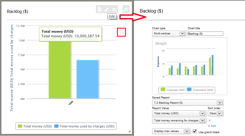
Adding and Setting Up a Chart Portlet
Several factors determine what the chart portlet show. Each chart portlet uses one of your reports as data source. Depending on the data you want to visualize, and how you want to visualize it, setting up your chart portlet starts with identifying, or creating, the report that will provide the data source for your chart. Your data source (report) determines the single or multiple report values you can select when setting up your chart portlet. Your data source (report) also determines the category axis or slices, and the series for your chart.
For more information about reports, see Working with Reports.
To add and set up a chart portlet:
-
From your homepage, your dashboard tab, or your project dashboard, click the Create button, then New chart.
A new chart portlet appears on the canvas of your homepage or dashboard tab.
-
Select a Chart type.
The chart settings form includes a preview of the selected chart type.
-
Enter a Chart title. This is the text in the title bar of your chart portlet and above the chart. If not specified, the name of the selected report is used.
-
Select the Saved report that you want to show in the portlet.
Note:Remember that the report you choose not only determines the single or multiple report values you can select when setting up your chart portlet, but it also determines the category axis or slices, and the series for your chart. Setting up a chart portlet often starts with creating a report for your chart.
-
Choose a Report value and a Sort order.
The sort order determines the order of categories on the category axis based on the first report value selected for all charts except pie charts when the category axis is not a date axis.
For chart types that support multiple series (all charts except pie charts, single-series area charts and single-series bar charts), you can choose multiple report values.
To add a new report value:
-
Click Add.
-
Choose a Report value.
-
-
Select the number of values to plot (for each series). By default, the chart shows the maximum number of values, but you can limit the number of values to include the first few values only.
-
For pie charts, this allows to show the top n values as separate slices and group additional values under a slice labeled "Others".
Note:The Others slice counts as one of the first values. To show the top n values as separate slices and others as a grouped slice, select
Display first <n+1> values. -
For other charts, this allows you to limit the number of categories on the category axis if the category axis is not a date axis, or the number of series, otherwise.
-
-
(Optional) If the chart type supports multiple series, check the Use grand totals box.
-
If you selected multiple report values for the chart, the Use grand totals box changes the series and the category axis,
-
When cleared, the chart uses the first selected report value for the value axis. All other report values are ignored. If your report includes date columns, the dates are used for series, and sub-total rows in your report, are used for the category axis.
-
When checked, the chart uses selected report values as series and the columns that were used for series when the Use grand totals box was not checked (for example, dates) as category. Make sure that all selected report values have the same unit.
-
-
If you selected only one report value for the chart, the Use grand totals box changes the series.
-
When cleared, the chart uses the sub-total rows in your report as separate series.
-
When checked, the chart shows only one series which represents the sum of all separate series that were shown when the Use grand totals box was not checked.
-
-
-
Click Save.
After some time, the portlet plots your chart.
-
Move and resize the portlet as required.
Dashboard Tabs
Your dashboard shows content in portlets arranged in multiple tabs. Your dashboard may include tabs and charts that your account administrators have set up for you. You can add or remove tabs to your dashboard.
To add a new tab to your dashboard:
-
From your homepage or your dashboard tab, click the Create button, then New tab.
Project Dashboard
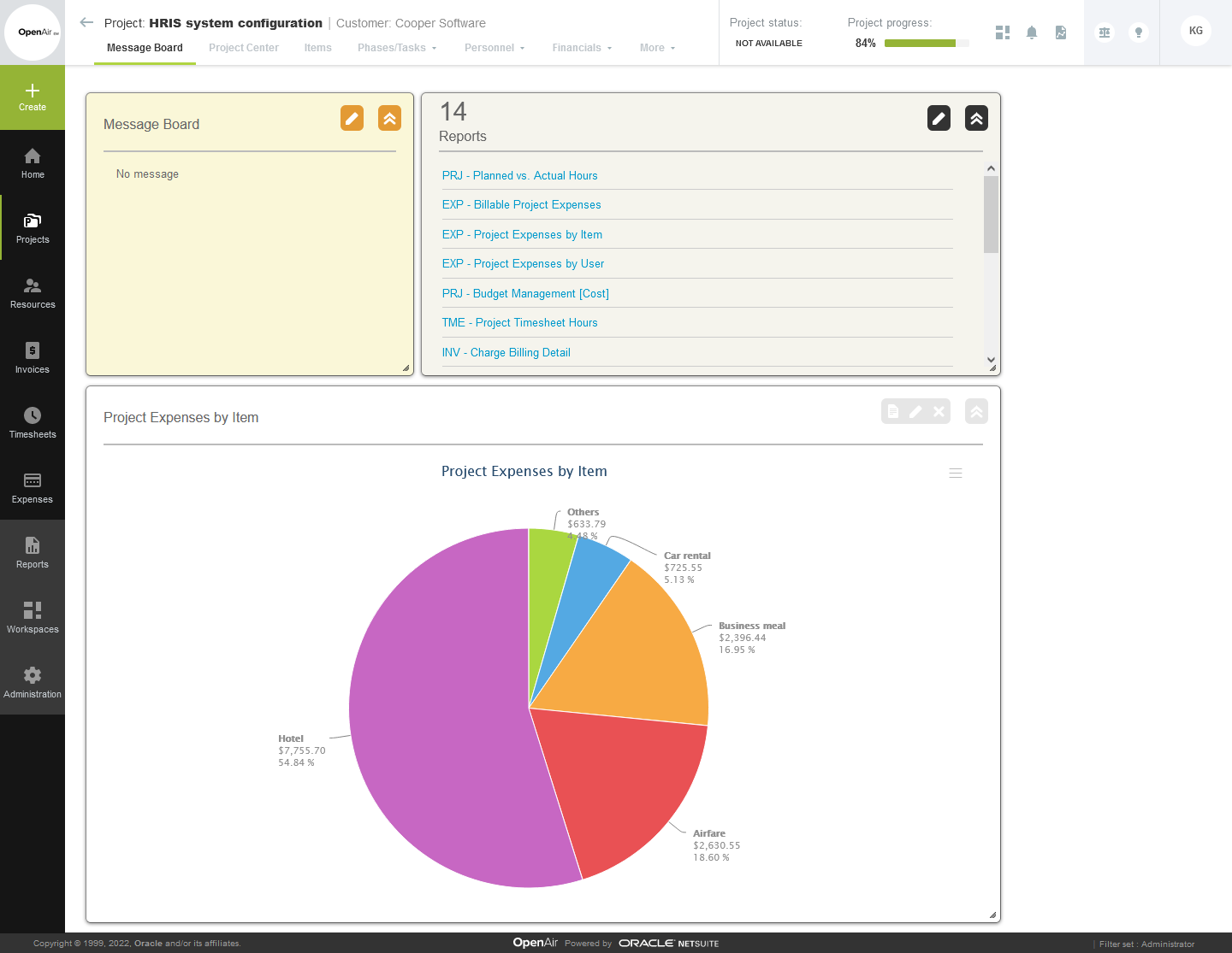
Depending on your access profile, a dashboard is also available for each project. The project dashboard shows content relevant to a specific project.
Project dashboards can include:
-
Message board - Your company or project manager can use the message board portlet to communicate important information about the project. The message board portlet is always in the upper left corner of your project dashboard canvas. You can collapse, expand and resize it, but you cannot move it.
-
Reports - The reports portlet lists a selection of reports you have access to and lets you run any of the listed reports from your project dashboard. Click the edit icon to modify the selection of reports. Click a link to run the corresponding report. When running a report from the project dashboard, the report uses an additional filter to show only the information that is relevant to the current project.
Note:All items displayed on the Project Dashboard are filtered by the specific project. Only saved reports with the 'Make this report available in project-specific situations' option selected are shown in the Reports portlet and available to create Charts.
-
Chart portlets - Chart portlets enable you to show report data in a visual way so that it is easier to interpret and compare. An additional filter is applied to the report to show only the information that is relevant to the current project. For more information, see Chart Portlets.
To be available as data source for report and chart portlets, reports must have the 'Make this report available in project-specific situations' box checked in the report settings.