Use the Search Component to Set the 'url' property of Models
The Search component of the extensibility API (introduced with SuiteCommerce 2021.1) enables you to obtain the URL of the item search API of a SuiteCommerce website.
Basic Usage
The Search component includes the getUrl() method, which you can use to get the URL of the item search API of your SuiteCommerce website. When you call getUrl(), it returns a string that corresponds to the end fragment (everything after the domain name part of the URL) of the item search URL. You can append search parameters to the URL by passing in an object in which the object properties are the search parameters. getUrl() returns the item search URL with the
Here is an example of how to call getUrl() with a search parameter to find items that contain the string 'shirt'. You typically call this method in the mountToApp() method of the entrypoint module in your extension.
            var search = container.getComponent('Search');
var searchParams = {q: "shirt"};

var searchURL = search.getUrl(searchParams);
The URL returned with the above search parameters might look like the following:
api/items?language=en&country=US¤cy=USD&pricelevel=5&use_pcv=F&q=shirt
Note that the returned URL includes data from the site visitor's session, as well as the appended search parameters (q=shirt). The default parameters from the user session are:
-
language
-
country
-
currency
-
pricelevel
-
use_pcv
Using the Search Component with Models and Collections
Basic usage of the getUrl() method of the Search component allows you to get the item search API URL. You could then use that URL to make AJAX requests. However, a more integrated approach in which you can use this component is to set the returned URL as the value of the url property of a model or a collection of models.
The url and urlRoot properties of the SCCollection and SCModel components point to service files. You can set the item search URL as the value of these properties, simplifying the integration of item data in your extensions.
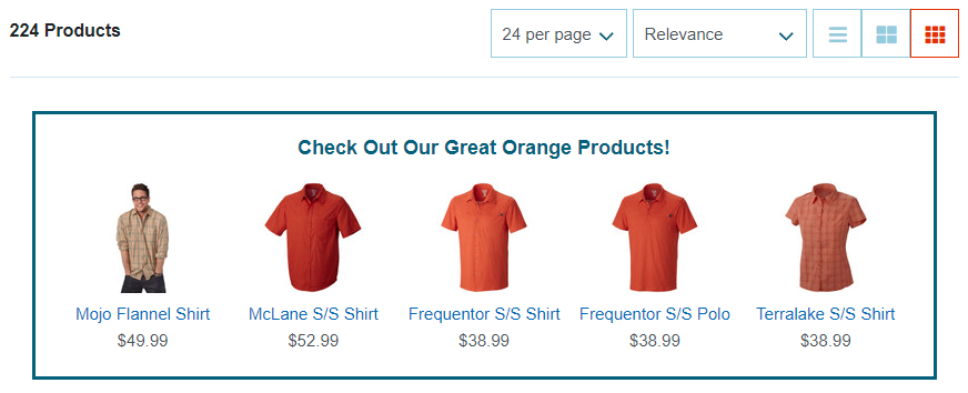
Example - Displaying Specific Items on the Product List Page
The following example explains how to use the Search component to find specific items, assign the item search URL to models in a collection, and use a collection view to display the items at the top of the product list page.
The steps to fully implement the Search component in this example include the following:
-
Create the entrypoint file - The entrypoint file is created as part of the baseline extension with the extension developer tools.
-
Create a collection view - Create a collection view based on the SCCollectionView component. A collection view simplifies displaying models in a grid or layout pattern.
-
Create a collection - You will use the Search component in this file to specify the search parameters and retrieve the item search URL.
-
Create a cell view - A cell view is required for each model in the collection.
-
Create the templates - You must create templates for both the collection view and cell view. The collection view template is like a container that includes a placeholder in which the cell views are inserted. The cell view template holds the HTML for each item displayed on the website.
-
Create a Sass file - Define the styles to match the look and feel of your website.
To get started with the extension, create a baseline extension with the extension developer tools - see Create a Baseline Extension. A baseline extension creates the basic folder structure of an extension and provides a set of starter files, including the entrypoint file, model files, and view files.
At completing the steps in this example, you should be able to load the extension on your website and view the five items returned by the item search API.
Create the EntryPoint File
Every SuiteCommerce extension has an entrypoint file, which is the first file that is loaded by the application. You only need to specify the collection view as a dependency; the collection view has other dependencies including the collection, and the cell view in which each item will be displayed.
In the mountToApp() method, create an instance of the PLP and Search components. Then, after checking that both components were correctly instantiated, use the addChildViews() method to insert the collection view into the Facets.Items element.
By specifying a low childViewIndex for the inserted view, it will appear at the top of the facets layout. Finally, in the childViewConstructor callback, pass in the container object to be able to access the extensibility API components later in the collection view.
JavaScript/MyCompany.OrangeZoneExtension.js
              define(
  MyCompany.OrangeZoneExtension',
  [
    MyCompany.OrangeZoneExtension.Collection.View'
  ],
  function(MyCompanyOrangeZoneExtensionCollectionView) {
    'use strict';

    return {
      mountToApp: function mountToApp (container) {

      var PLP = container.getComponent('PLP');
      var Search = container.getComponent('Search');

      if (PLP && Search) {
        PLP.addChildViews(PLP.PLP_VIEW, {
          'Facets.Items': {
            'MyCompany.OrangeZoneExtension.CollectionView': {
              childViewIndex: 1,
              childViewConstructor: function () {
                return new MyCompanyOrangeZoneExtensionCollectionView({
                  application: container
                })
              }
            }
          }
        })
      }
    }
  }
Create a Collection View
Define a custom collection view with the SCCollectionView component. In this extension, the collection view is what will be rendered on the website. Two important aspects of a collection view are the methods getCellViewsPerRow and getCellViewInstance, which are used to set the number of cells per row and specify the view used for each cell respectively.
JavaScript/MyCompany.OrangeZoneExtension.Collection.View.js
              define(
  'MyCompany.OrangeZoneExtension.Collection.View',
  [
    'SCCollectionView',
    'MyCompany.OrangeZone.Collection',
    'MyCompany.OrangeZone.Cell.View',
    'mycompany_orangezone_collection.tpl'
  ],
  function (SCCollectionViewModule, MyCompanyOrangeZoneCollection, MyCompanyOrangeZoneCellView, mycompany_orangezone_collection_tpl) {
    'use strict'

    var SCCollectionView = SCCollectionViewModule.SCCollectionView;

    function MyCompanyOrangeZoneExtensionCollectionView (options) {
      SCCollectionView.call(this, options.collection);

      this.application = options.application;
      this.collection = new MyCompanyOrangeZoneCollection([], options);
      this.template = mycompany_orangezone_collection_tpl;
    }

    MyCompanyOrangeZoneCollectionView.prototype = Object.create(SCCollectionView.prototype);
    MyCompanyOrangeZoneCollectionView.prototype.constructor = MyCompanyOrangeZoneCollectionView;

    MyCompanyOrangeZoneCollectionView.prototype.getCellViewInstance = function (model) {
      return new MyCompanyOrangeZoneCellView({
        application: this.application,
        model: model
      })
    }

    MyCompanyOrangeZoneCollectionView.prototype.getCellViewsPerRow = function () {
      return 5;
    }

    MyCompanyOrangeZoneCollectionView.prototype.render = function () {
      var self = this;
      this.collection.fetch().done(function () {
        SCCollectionView.prototype.render.call(self);
      })
    }

    MyCompanyOrangeZoneCollectionView.prototype.getContext = function () {
      return {}
    }

    return MyCompanyOrangeZoneCollectionView;
  }
First, declare the dependencies for the collection view, including SCCollectionView and the collection itself. Then define the constructor function of the collection view - when the collection view is instantiated, the application calls the constructor function first.
In the constructor function, call the constructor function of SCCollectionView to get SCCollectionView's properties. Set some properties of the extension's collection view, including the collection for the view and the template.
After the constructor, create a copy of the parent class's prototype and apply it to our custom class and then set the constructor to point to our newly created constructor. Next, override getCellViewInstance() to specify which view to use for each model in the collection. In this case, the view is the cell view called MyCompanyOrangeZoneExtensionCellView (see Create the Cell View) to which you pass the application and model objects. Then, to specify the number of cells to display in each row, override cellViewsPerRow() and return 5.
Because the view requires data before it is rendered, override the render() method to make sure the data is available. Inside the render() method, call fetch() on the collection to get the item information and then use done() on the returned promise to call the parent class' render() method.
Call the getContext() method as the final step in the collection view subclass. getContext() is used to pass data to the template, but because the collection view template does not require any data, you return an empty object - this is because getContext() is a required property when subclassing SCCollectionView.
Create the Collection
A collection holds the array of models. In this example, each model corresponds to an item returned from the item search API. The collection is required by the collection view defined previously.
JavaScript/MyCompany.OrangeZone.Collection.js
              define(
  'MyCompany.OrangeZone.Collection',
  [
    'SCCollection',
    'SCModel',
    'underscore'
  ],
  function(
    SCCollectionModule,
    SCModelModule,
    _
  ) {
    'use strict';

    var SCCollection = SCCollectionModule.SCCollection;
    var SCModel = SCModelModule.SCModel;

    function MyCompanyOrangeZoneCollection(models, options) {
      SCCollection.call(this, models, options);

      this.model = SCModel;

      var searchParams = {
        'custitem31': 'orange',
        'limit': '5',
        'fields': 'displayname,itemimages_detail,onlinecustomerprice_formatted,urlcomponent'
      }

      var searchUrl = options.application.getComponent('Search').getUrl(searchParams);

      this.url = function url () {
        return searchUrl
      }

      this.parse = function parse(response) {
        return _.compact(response.items) || []
      }
    }

    MyCompanyOrangeZoneCollection.prototype = Object.create(SCCollection.prototype);
    MyCompanyOrangeZoneCollection.prototype.constructor = MyCompanyOrangeZoneCollection;

    return MyCompanyOrangeZoneCollection;
  }
)
MyCompanyOrangeZoneCollection() on line 18 is the constructor function of the class. As with all collections that extend SCCollection, you must first call the parent constructor function with call(). You then declare the collection's model.
To specify the items you want to find with the item search API, create an object that contains the search parameters. searchParams contains three properties: custitem31 refers to a field that specifies an item's color, limit restricts the number of items to retrieve, and fields specifies the item fields to return.
The properties and field names in this example are specific to a particular NetSuite account. Check the properties and field names of your account and change them accordingly to suit your needs.
Pass the search parameters object into the getUrl() method and assign the returned URL as the value of the url property of the collection. When the collection view calls fetch() on this collection, it will use the assigned URL.
The parse() function is called when a response is returned from the fetch and is a processor that determines how to handle the returned results. You don't usually need to override this function, but because the item search API returns its items as a property of the response object (rather than as the response object itself), we need to pluck out those results and set the array of results as the collection.
The remainder of the class is concerned with setting the prototype object to a copy of the parent class', and then setting the constructor property to that of the newly created one.
Create the Cell View
The cell view is used to display each item in the collection. The main purpose of defining the cell view is often to determine the context data that will be passed to the cell view template. However, depending on the response from the item search API, you may need to perform logic on the data to ensure it is valid and correctly formatted.
In this example, the cell view class includes a custom function (getThumbnail()) to determine which item image to show. When you get item information with the item search API, it returns the item images in a nested property called itemimages_detail. The getThumbnail() function gets the appropriate image information from the property. Note that image information returned for your SuiteCommerce website may differ depending on the account settings and the website configuration.
JavaScript/MyCompany.OrangeZoneExtension.Cell.View.js
              define('MyCompany.OrangeZoneExtension.Cell.View',
  [
    'SCView',
    'Utils',
    'mycompany_orangezoneextension_cell.tpl'
  ],
  function(
    SCViewModule,
    Utils,
    mycompany_orangezoneextension_cell_tpl
  ) {
    'use strict';

    var SCView = SCViewModule.SCView;

    function MyCompanyOrangeZoneExtensionCellView(options) {
      SCView.call(this, options);

      this.model = options.model;
      this.template = mycompany_orangezoneextension_cell_tpl,
      this.Environment = options.application.getComponent('Environment');

      var self = this;

      this.getThumbnail = function getThummbnail(item) {
        var images = item.get('itemimages_detail');
        var separator = 'media';

        var color = 'orange';

        var thumbnail = {
          alt: item.get('displayname'),
          url: Utils.getThemeAbsoluteUrlOfNonManagedResources(
            'img/no_image_available.jpeg',
            self.Environment.getConfig('imageNotAvailable')
          )
        };

        if (images && images[separator] && images[separator][color]) {
          var image = images[separator][color].urls[0];

          thumbnail.url = image.url || thumbnail.url;
          thumbnail.alt = image.altimagetext || thumbnail.alt;
        }

        return thumbnail;
      }
    }

    MyCompanyOrangeZoneCellView.prototype = Object.create(SCView.prototype);
    MyCompanyOrangeZoneCellView.prototype.constructor = MyCompanyOrangeZoneCellView;

    MyCompanyOrangeZoneCellView.prototype.getContext = function () {
      return {
        name: this.model.get('displayname'),
        price: this.model.get('onlinecustomerprice_formatted'),
        thumbnail: this.getThumbnail(this.model),
        url: this.model.get('urlcomponent')
      }
    }

    return MyCompanyOrangeZoneCellView;
  }
);
The cell view is based on the SCView abstract class. Include SCView as a dependency and then in the constructor function call the constructor function of the parent class. After declaring the model and template, define a custom function to parse the raw image information and return an object that contains nicely formatted image information.
To pass the required context information to the cell view template, use the getContext() method of SCView. getContext() must return an object that contains the item information as property/value pairs. Note that the thumbnail property calls the custom function to get a valid image.
Create Templates for the Collection View and Cell View
The collection view template is a simple template that holds the content of the collection view. It must contain a HTML element that has a data attribute called data-type with the value backbone.collection.view.rows. The application will render the rows inside the element.
Templates/mycompany_orangezoneextension_collection.tpl
              <div class="mycompany-orangezone-collection"
  <h3 class="mycompany-orangezone-heading"{{translate 'Check Out Our Great Orange Products!'}}</h3>
  <div data-type="backbone.collection.view.rows"</div>
</div>
The cell view is rendered once for each item in the collection. The template for the cell view references several context properties defined previously in the cell view. Note that because the size of the view is expected to be relatively small, you can wrap the image URL in the resizeImage custom Handlebars helper, which modifies the image URL to include additional parameters for the image resizing service.
Templates/mycompany_orangezoneextension_cell.tpl
              <div class="mycompany-orangezone-item">
  <a href="{{url}}"<img height="100" src="{{resizeImage thumbnail.url 'tinythumb'}}" alt="{{thumbnail.alt}}"</a>
  <a href="{{url}}" class="mycompany-orangezone-item-name"{{name}}</a>
  <p>{{price}}</p>
</div>
Create the Sass File
If you want to adjust the styling of your extension, you can modify the SCSS file that was created with the baseline extension. The most notable aspects of the styling in this example include a thick border around the content and a media query that only shows the item name on devices with larger screens.
Sass/mycompany-orangezone.scss
              .mycompany-orangezoneextension-collection {
  border: 3px solid $sc-color-secondary;
  margin: 0 $sc-margin-lv4 $sc-margin-lv4 $sc-margin-lv4;
  padding: $sc-padding-lv4;
  text-align: center
}

.mycompany-orangezoneextension-heading {
  margin-bottom: $sc-margin-lv4
}

.mycompany-orangezoneextension-item {
  box-sizing: border-box;
  display: inline-block;
  max-width: 20%
}

.mycompany-orangezoneextension-item-name {
  display: none;

  @media (min-width: $screen-xs-min) {
    display: inline-block
  }
}
Test the Extension
You should now be able to test the extension locally by running the gulp command gulp extension:local.