About the Layout Editor Interface
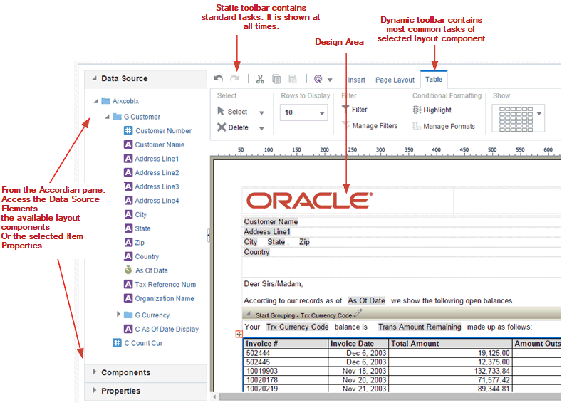
The illustrated figure shows the layout editor interface.
The Layout Editor interface comprises the following:
-
The top of the Layout Editor contains two toolbars:
-
The Static toolbar is always available and contains common commands such as save and preview.
-
The Tabbed toolbar includes the Insert tab, the Page Layout tab, and a dynamic tab that shows the most commonly used actions and commands for the selected layout component. You can collapse this toolbar to make more room to view the design area. See About the Tabbed Toolbar.
-
-
The accordion pane on the left contains the following:
-
Use the Data Source pane to select the data fields to drag to the layout components.
-
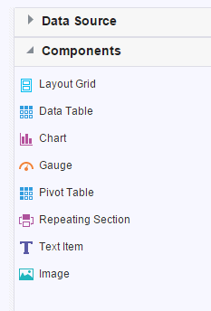
Use the Components pane to select layout components and drag them to the design area. You can also use the Insert tab to insert components when this pane is collapsed.
-
Use the Properties pane to modify properties for the selected layout component.
You can expand and display each control by clicking the title of the control or the plus sign next to the title of the control. You can collapse the entire accordion pane to allow more room to view the layout.
-
-
The lower right region is the design area for building the layout.
About the Data Source Pane
The Data Source pane displays the structure of the data model and the data elements that are available to insert into the layout.
To insert a data element, select and drag it from the Data Source pane to the component in the layout.
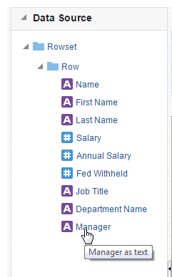
The data type for each field is represented by an appropriate icon: number, date, or text.
The following figure shows the data source pane. The icon beside each element indicates the data type.
The JOB_TITLE element is shown as text, the SALARY element is shown as a number, and the HIRE_DATE element is shown as a date data type.
Note that when you enter dates in the Layout Editor (such as a data comparison for a filter or for conditional formatting), use one of the following XSL date or time formats: YYYY-MM-DD or YYYY-MM-DDTHH:MM:SS.
About the Components Pane
The Components pane contains the layout components that you can insert into a report. These components include charts, pivot tables, and images. To insert a component, simply drag and drop it to the layout.
You can also use the Insert menu to add components to the layout.
About the Properties Pane
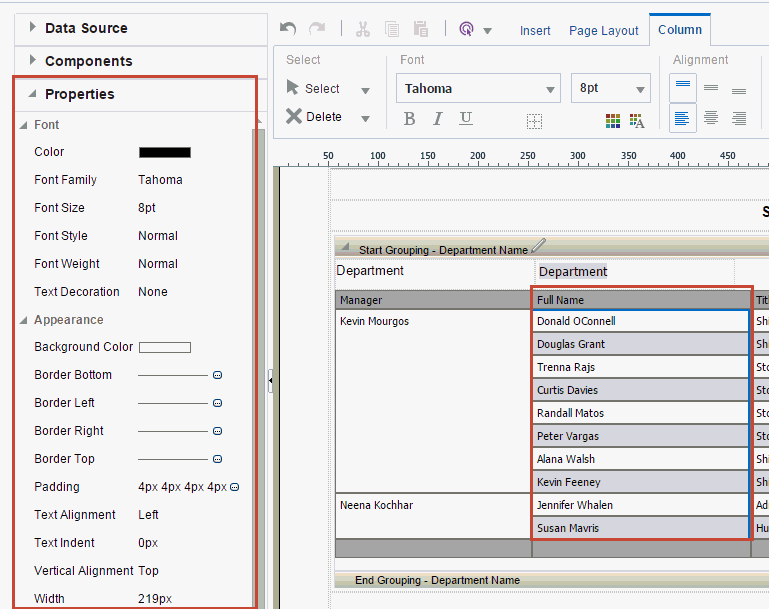
The Properties pane displays the properties for the selected component. The properties displayed are determined by the selected component. Some of the properties available in the Properties pane are also editable in the dynamic tab for the component.
Click a property value to edit it. The change is applied to the component when you move the cursor out of the field. Collapse or expand a property group by clicking the plus or minus signs beside the group name.
The properties available for each component are discussed in detail in the corresponding section for that component in this chapter. If a property field is blank, then the default is used.
The following figure shows a sample Properties pane for a table column header.
About the Tabbed Toolbar
The section defines the tabs and their functions in the Tabbed toolbar.
The Tabbed toolbar contains the following tabs:
-
The Insert tab provides the components and page elements that can be placed on a layout. See Insert Layout Components.
-
The Page Layout tab provides common page-level tools and commands. See Page Layout Tab.
-
The component-specific tab provides the most commonly used commands and properties for the component that is selected in the layout. For example, when you select a chart, the Chart tab displays. See the section on a specific component for details on the commands.
To set or control more properties for the selected component, open the Properties pane in the accordion pane, as described in About the Properties Pane.
Select and Delete Layout Objects
You can select layout objects to set the focus or remove the object entirely
Each of the component-specific tabs include the Select region.
-
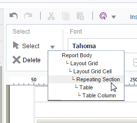
The Select tool enables you to control precisely which component on the layout has focus. This ability is particularly helpful when working with a complex layout where components overlap. For example, to select a table, it's sometimes difficult to click the correct spot to select the table and not a column, or header cell. To avoid unnecessary clicking, use the Select tool to precisely select the Table component from the list.
The following illustration shows the Select tool.
-
The Delete tool provides a similar function to the Select tool to enable you to precisely select the component to delete.
About the Insert Tab
Use the Insert tab to insert report components and page elements.
The Components group displays the report components that you can insert into the layout. To insert a component, select and drag the item to the desired location in the design area. For more information about each component, see its corresponding section in this chapter.
The Page Elements group contains page-level elements for the report. To insert a page break, the page number, or the total page number calculation, select and drag the component to the desired position in the layout. Note that Page Elements are intended for paginated output types, such as PDF and RTF. Using them in interactive or HTML output may have unexpected results.
