Edit Various Types of Views
This topic identifies additional information for editing various types of views.
Topics:
Edit Table and Pivot Table Views
Tables and pivot tables are commonly used views, and you can edit them in similar ways to display data the way you want.
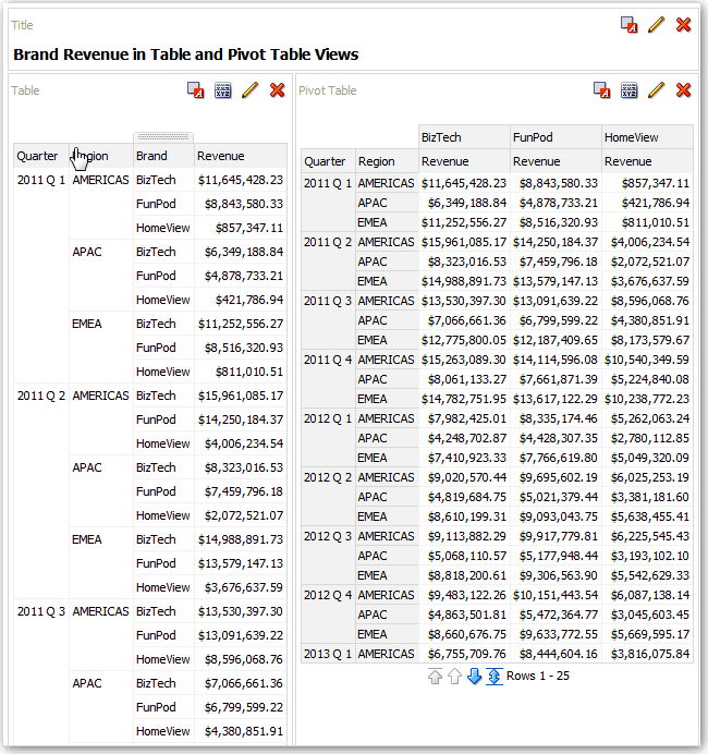
For example, you can edit a pivot table in an analysis by moving the Brand column to the row edge to display its corresponding Revenue data for each Quarter and Region. You could also display the same data in a more conventional way by adding a table next to the pivot table in a compound layout, as shown below.
Edit Performance Tile Views
Performance tile views focus on a single piece of aggregate data. They use color, labels, and limited styles to show status and use conditional formatting of the background color or measure value to make the tile visually prominent.
By default, the first measure in the analysis on the Criteria tab is selected as the performance tile measure. To ensure the correct measure value is displayed in the tile, set up aggregation and filters on the Criteria tab. To include additional performance tile views for each measure in an analysis, add a separate view for each measure.
For example, you might want to edit a performance tile view to use Revenue as the measure. You can specify that the values and labels utilize the available space. This example shows performance tiles on a dashboard page.
Edit Treemap Views
Treemaps organize hierarchical data by grouping the data into rectangles (known as tiles). Treemaps display tiles based on the size of one measure and the color of the second measure.
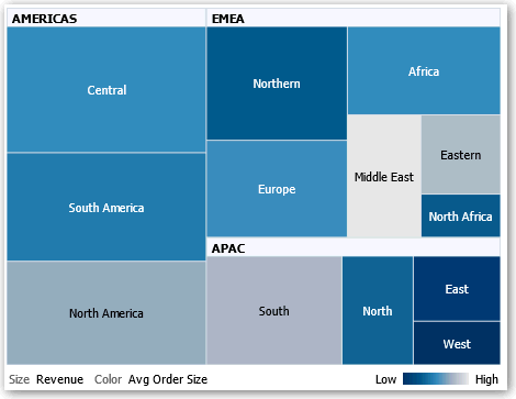
The following figure shows an example of a treemap view. The country names are grouped by region and area. This treemap shows the correlation of revenue for a country (based on average order size) across different regions for an area.
By default, the first measure of the analysis in the Criteria tab is selected as the Size By measure, and the second measure is selected as the Color By measure. If there is only one measure in the analysis, this measure is the default for both Size By and Color By options. Additionally, the Style element defaults to Percentile Binning with "quartile" as the value for the number of bins.
Treemaps have the following characteristics:
-
Tiles are colored by percentile bins or continuously.
-
First Group By dimension is displayed as the group (header) label.
-
The order of the Group By dimensions implies the nesting order within the treemap. The last dimension in the Group By is the lowest level and this dimension name is displayed as the tile label. If the label is too long to fit on the tile, then it’s truncated. Full values for the labels display in the tooltip.
Edit Heat Matrix Views
A heat matrix view visually represents the relationship between data values as a gradient of colors in a table format. You can edit properties such as view size, the display of header and data cells, and the display of a legend.
About Heat Matrix Views
A heat matrix view shows you a two-dimensional depiction of data in which values are represented by a gradient of colors. A simple heat matrix provides an immediate visual summary of information that is well suited for analyzing large amounts of data and identifying outlier values.
A heat matrix displays data from one measure. Colored cells are formed by the grouping and intersection of the columns and rows placed in the Prompts, Sections, Rows, Columns, and Color By drop targets. Cells are displayed as percentile bins or as a continuous color. You can hover over a cell to display its value or display values in cells all the time.
By default, the first measure of the analysis in the Criteria tab is selected as the Color By measure and represents the measure's value. The Style element defaults to Percentile Binning with "quartile" as the value for the number of bins. Cells display uniformly, in that each cell has the same width and the same height. Cell height and width don’t have to be the same. A "transparent" diagonal pattern of stripes indicates null values.
You can display a legend below the heat matrix that includes:
-
One measure (selected in the Color By list) and its corresponding label.
-
The number of specified bins (for example, quartile), color-coded and labeled, or a gradient bar that is displayed as a continuous color fill and is labeled "low" to "high."
Here is an example of a heat matrix view on a dashboard page. Each sales representative's revenue is displayed by region and product and prompted by product type. Sales revenue is binned by year. This heat matrix depicts the product revenue outliers for each sales representative (for example, in 2008, Angela Richards has no sales revenue for Bluetooth Adaptors or MP3 Speakers Systems for any region.)
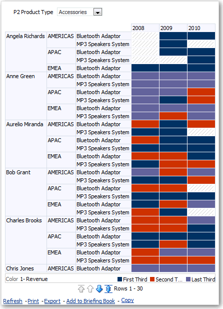
Description of the illustration heat_matrix1.gif
Edit Trellis Views
A trellis view is a type of graph view that displays a grid of multiple graphs, one in each data cell.
A trellis view can be simple or advanced. A simple trellis displays a core inner graph multiplied across row sets and column sets, displaying many small multiples that are ideal for comparing and contrasting. An advanced trellis displays a grid of small spark graphs that are ideal for monitoring trends and spotting patterns in a dataset.
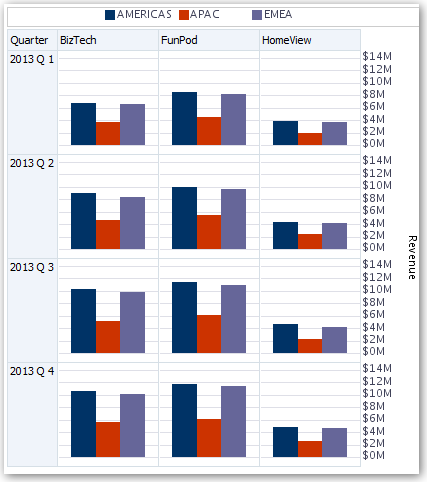
The following figure shows a simple trellis view:
The trellis view ( also referred to as a trellis graph) is similar to a pivot table except that the data cells within the trellis contain graphs. Whereas a standalone graph type such as a single bar graph or a single scatter graph works on its own, the trellis graph works only by displaying a grid of nested graphs, known as inner graphs. So a bar graph trellis view is actually comprised of multiple bar graphs.
About the Functions of Trellis Views
For the most part, a trellis view behaves like a pivot table. The main difference between a trellis and a pivot table is the way the data cells are displayed.
In the row and column label cells of a trellis, you can:
-
Right-click to hide or move measure labels.
-
Right-click to sort data.
-
Drag to reposition rows and columns.
In the data cells of a trellis, you can hover the mouse pointer to display related contextual information. Numeric data cells in a trellis behave the same as numeric data cells in a pivot table. The ways in which the behavior of a trellis view differs from the behavior of a pivot table are the following:
-
Graph data cells — There is no right-click functionality for the data cells in simple trellises, nor drilling in trellis graph data cells (left-click functionality).
-
Microchart data cells — When you hover the cursor over the data cells in spark graphs, you’re shown contextual information (such as first, last, minimum, and maximum values) that otherwise isn’t displayed as it’s in a pivot table view.
About Simple Trellis Versus Advanced Trellis
A trellis view can be a Simple Trellis or an Advanced Trellis.
The Simple Trellis displays a single type of inner visualization, for example, all bar graphs. The inner visualization always uses a common axis, so that all inner graphs are viewed on the same scale. Having a common axis makes all graph markers easy to compare across rows and columns.
This figure shows a simple trellis view:
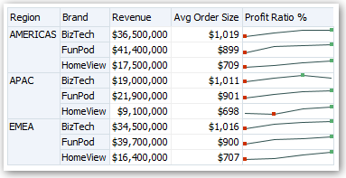
The Advanced Trellis accommodates the display of multiple visualization types within its grid. An advanced trellis that illustrates sales trends might show a grid that contains numbers in the cells of one column (revenue, for example). Another column alongside the numbers column displays Spark Line graphs in its cells. Next to that column, a different microchart might be displayed, such as a column of Spark Bar graphs that visualize a different measure, such as unit totals.
This figure shows an advanced trellis view:
Each measure that is visualized is assigned a different inner graph type. Each cell of the grid is scaled independently.
Think of an advanced trellis as a pivot table with spark graphs inside its data cells. But, for each measure that you add, you can optionally associate a dimension and display it as a microchart visualization. This makes an advanced trellis very different from a simple trellis. In a simple trellis, all of the measures are displayed in the same visualization, along with additional dimensions.
Design Considerations for Trellis Views
Consider the following points when designing trellis views.
For all trellis views:
-
For comparisons, select the Simple Trellis.
-
For trend analysis, select the Advanced Trellis.
-
Make the inner graphs that comprise a trellis readable and not too dense. A trellis view isn’t especially useful for displaying multiple series or multiple groups. If you can’t easily target a data point with the mouse (to display a tooltip), then the inner graph is likely too dense to be readable.
-
For the Simple Trellis:
-
The total number of cells displayed is less than in a pivot table.
-
You can associate one or two of the dimensions with the visualization. You add fewer dimensions to the outer edge than in a pivot table.
-
Try to use a small number of outer-edge dimensions. The entire graph series should be visible at once (for easy comparison of like to like) with no need to scroll. If you must show additional dimensionality, then consider adding the dimensions to the graph prompt.
-
When determining which data to show in column headers and row headers, make sure that the column headers show one or two dimensions (each dimension with a small number of members).
-
-
For the Advanced Trellis:
-
A common use case for an advanced trellis is to show trend graphs alongside numeric values, in a compressed form. So a typical advanced trellis contains a combination of spark graphs alongside number representations of the same measure.
-
Ideally, include no dimensions in the column headers. Include the measure in the column headers.
-
The dimensionality typically associated with a spark graph is time. Because a spark graph includes no visible labels, it’s important that the data visualized is intrinsically ordered. For example, a spark graph that visualizes regions is meaningless, because the ordering of the regions (which would be the specific bars, in a spark bar graph) isn’t intuitive.
-
Just as when designing pivot tables, you generally display time on the horizontal axis, with the other dimensions displayed on the vertical axis. The eye then scans from left to right to see how the dimensionality changes over time.
-
-
Hierarchical columns don’t work well with the simple trellis. When a hierarchical column is displayed on the outer edge, parents and children (such as Year and Quarter) are shown by default using a common axis scale. However, because Year and Quarter have different magnitudes, the markers in child graphs might be extremely small and hard to read against the parent scale. (Hierarchical columns do work well with the advanced trellis, because each data cell is a different scale.)
Edit Gauge Views
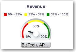
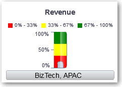
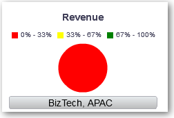
You use gauge views to compare performance to goals. Due to their compact size, gauges can be more effective than graphs for showing a single data value. Results show as a dial, bar, or bulb gauge. For example, you can use a gauge to see whether Actual Revenue falls within predefined limits for a brand.
The following figures show the same value in a dial, bar, and bulb gauge:
- Open the analysis for editing.
- Click the Results tab.
- Click View Properties on the gauge you want to edit.
- Edit the gauge properties.
- Use Gauges Per Row to specify the number of rows of gauges to display and placement of labels.
- Use Listen to Master-Details Events to link the gauge to a master view. In the Event Channels field, enter the case-sensitive name of the channel the gauge view listens to for master-detail events. Separate multiple channels with commas.
- Use Gauge Style to change the width and height of gauges.
- Use Marker Type to specify the marker type for a dial gauge, such as Needle, Line or Fill.
- Use Gauge Limits to specify the scale of gauge limits. For example, you can specify a custom gauge limit. You can specify a static value such as 1000 as either an actual value or as a percentage. The value that you specify depends on the range of data points. You must ensure that the maximum gauge limit is more than the maximum data point. Do so to ensure that all data points are displayed on the gauge.
- Use Titles and Labels to schange the appearance of titles and footers and the format of labels.
- Click OK.
- Click Edit View.
- Click the Gauge Type button on the toolbar and select the type of gauge.
- Optional: Define thresholds for the gauge.
- Click Done.
Edit Map Views
Map views present data in spatial form and use location context to uncover trends and transactions across regions. For example, a map view can show a map of the United States with the states color-coded by sales performance.
You create a map view after selecting columns to display in that view. The administrator can specify multiple background maps. Initially, the map view is displayed with the first background map that has at least one layer associated with a column that you selected. You can edit a map view by selecting a different background map, applying layers to the background map, and formatting the layers.
About Map Views
You use map views to display data on maps in several different formats and to interact with the data.
When data is visualized on a map, relationships among data values that might not have been obvious previously can be displayed in a much more intuitive manner. For example, a map view can show a map of a city with the postal codes color-coded by sales performance, while an image marker displays the average discount given per order.
Map Components
A map consists of numerous components including a background or template map and a stack of layers that are displayed on top of each other in a window. A map has an associated coordinate system that all layers in the map must share. The map can be an image file, the object representation of an image file, or a URL that refers to an image file.
- Main Content - The main content is the background or template map, which provides the background geographic data and zoom levels. The main content can be an image such as the floor maps of office buildings or the appearance and presence of items such as countries, cities, and roads.
- Layers - One or more interactive or custom layers can overlay the main content.
- Toolbar - The toolbar is visible by default and you can click its buttons to manipulate map contents directly. The map view itself has a toolbar. The content designer specifies whether to display the toolbar for the map view on a dashboard page. On a dashboard page, the toolbar is displayed directly over the map and contains only the Pan, Zoom Out, and Zoom In buttons.
The toolbar in the Map editor contains additional options for modifying the map view.
- Zoom Controls - These controls adjust the detail of the geographic data that is shown in the map view. For example, zooming in from a country might show state and city details.
The administrator specifies which zoom levels each layer is visible for. You can have multiple zoom levels for one layer, and you can have a single zoom level associated with multiple layers. When you zoom, you change the map information at that zoom level, but you do not affect the display of BI data at that level. You affect the display of data by drilling.
The zoom controls include a zoom slider that is displayed in the upper left-hand corner of the map view with a thumb for large scale zooming and buttons for zooming a single level. When the zoom control is zoomed-out all the way, the zoom level is set to 0 and the entire map view is displayed.
You determine the visibility of the zoom control. When you create a map view, by default the map is initially zoomed into the highest zoom level that fits the entire contents of the top-most layer. For example, if the highest ordered layer contains data only in the state of California, then the map zooms to the highest zoom level that still shows all of California.
- Scale Tool - Also known as the Distance Indicator, this tool provides a key to distance interpretation of the map and consists of two horizontal bars that display in the lower left-hand corner of the map view below the information panel and above the copyright. The top bar represents miles (mi) and the bottom bar represents kilometers (km). Labels are displayed above the miles bar and below the kilometers bar in the format: [distance] [unit of measure]. The length and distance values of the bars change as the zoom level changes and as the map is panned.
- Legend - The legend is a semi-transparent area in the upper right-hand corner of the map view that you can display and hide. The legend shows the information that relates to the current zoom level. The legend provides a read-only visual key for symbols, layers, and formatting on the map and displays all visible formats that are applied to the map. If a format is turned off, then the corresponding legend item is hidden also. If a format is turned on but zoomed out of view, then it is not displayed in the legend. The legend displays text such as "No formats defined for current zoom level" if you have no formats defined at the current zoom level.
When you select a format on the map, the corresponding legend item is highlighted. Highlights have varying granularity, depending on the selected formats (for example, a pie graph does not have the level of granularity that color fill has).
Use the Expand Map Legend and Collapse Map Legend buttons in the upper right-hand corner to control the display of the legend.
- Overview Map - The overview map consists of a miniature view of the main map
that is shown in the lower right-hand corner of the main map. This overview map
provides regional context.
The reticule displays as a small window that you can move across a miniature view of the main map. The position of the reticule in the miniature map determines the viewable area of the main map. As you move the reticule, the main map is updated automatically. You can also pan in the overview map without using the reticule.
The overview map is automatically hidden if the reticule can't be shown. This hiding generally happens when the scale difference between successive zoom levels is too small to show the miniature view in the overview map.
- Interactive Panel - The top section of the interactive panel enables you to
create and edit BI data formats in the analysis editor. If a format has editable
thresholds, then a slider is displayed in the Map editor that enables you to
edit thresholds by dragging the slider. The interactive panel enables you to
rearrange formats within a geographic layer. For example, if the States layer
has three formats, then you can select the order in which the formats are
displayed.
When displaying a tooltip by hovering the cursor over a map area, the corresponding detail is updated and highlighted in the interactive panel.
Dashboard users can control the visibility of formats (by turning them on or off) and can adjust format thresholds if the content designer has allowed them to.
The lower section of the panel includes the Feature Layer area, where you can select non-BI layers to add to the map. A non-BI layer is one that has not been associated with a BI column. You can't apply formats to non-BI layers.
About Formats and Layers in Map Views
These topics describe how formats and layers interact in map views.
About Formats in Map Views
A format for a map view defines display properties for a feature such as a point or a line that represents a city or a river.
For example, if the feature is a polygon that shows a county, then the format can define the fill color for the county or can define a pie graph to be drawn over the county. Formats are tied to a particular geographic level such as continent, country, region, state, or city.
About the Types of Formats that Apply to Map Layers
A map view uses columns of BI data. Each column has a set of properties that define its characteristics, such as for formatting and interaction. Any formatting that is applied to a column isn’t applied to the map, except for the settings for interaction. Any formatting that originates from the map thresholds is applied.
You can apply various kinds of formats to map views and BI layers. You can’t apply formats to non-BI layers. You can define various formats to apply to BI layers.
| Field | Description |
|---|---|
|
Color Fill |
Displays the Color Fill (Layer) dialog, which you use to display areas in fill colors that indicate that an area meets a particular condition. Color fill formats apply to regions or polygons. For example, a color fill format might identify a range of colors to represent the population in the states of a region or the popularity of a product in the states of a region. A map view can have multiple color formats visible at different zoom levels. For example, a color fill format for the layer at zoom levels 1-5 might represent the population of a state, and the county median income for the layer at zoom levels 6-10. You can also specify different colors to identify a range of data values. |
|
Bar Graph |
Displays the Bar Graph (Layer) dialog, which you use to display a series of data as a bar graph within an area. Graph formats can show statistics related to a given region such as states or counties. For example, a graph format can display the sales values for several products in a state. Even though you can create multiple graph formats for a particular layer, such creation isn’t recommend as the formats might overlap on the layer and the displayed results might be undesirable. |
|
Pie Graph |
Displays the Pie Graph (Layer) dialog, which you use to display a series of data as a pie graph within an area. |
|
Shape |
Displays the Variable Shape (Layer) dialog, which you use to display a measure column that is associated with an area by drawing markers or shapes within the region. You can also specify different colors for the shape to identify a range of data values. |
|
Bubble |
Displays the Bubble (Layer) dialog, which you use to display a bubble within an area, similar to the shape format. |
|
Image |
Displays the Image (Layer) dialog, which you use to display an image within an area, similar to the shape format. You can specify different images to identify a range of data values. You select images that have been specified by the administrator. |
|
Line |
Displays the Line (Layer) dialog, which you use to display a line on a map. You can include lines on maps to display paths such as highways, railway lines, and shipping routes. You can specify the width of lines and you can use the Map Wrap-Around feature on the Map Properties dialog to allow lines to be unbroken, such as when showing an airline flight path from San Francisco to Tokyo. You can vary the width of a line by each measure to accentuate a feature. |
|
Custom Point |
Displays the Format Custom Point (Layer) dialog, which you use to display a point format, such as a bubble, image, or shape in a layer. Custom points are displayed at all zoom levels and on top of all other map formatting. When you create a Custom Point format, you select columns to specify the latitude and longitude |
About the Visibility of Formats in Map Views
The visibility of a format in a map view depends on various factors.
The factors on which visibility of a format depends:
- The zoom level on the map and the "zoom range" of the format. For example, a Color Fill format for States is visible when state boundaries are visible and it’s turned on, but is no longer visible when the map is zoomed out to the Continent level.
- The data point limit. Formats are generally visible when they are zoomed into view and are turned on, but they might not be displayed if a particular layer has exceeded its maximum number of data points.
Custom point formats are unique in that they are displayed on the map always, for all zoom levels.
Format data is displayed in the legend only when the format is both turned on and zoomed into view. A format is turned on when the box beside its name is selected in the Map Formats area.
The map can’t display multiple non-point formats at a time (at a single zoom level) but can display multiple point formats simultaneously, if they don’t share the same latitude and longitude location. If multiple graph formats are specified at the same geographic layer, then they are displayed on top of each other.
About the Application of Formats in Map Views
There are various guidelines which apply to formats in map views.
- The Color Fill, Bubble, Pie Graph, and Bar Graph formats apply to geographic areas such as polygons.
- The Bubble, Variable Shape, Image, and Custom Point formats are based on a single latitude and longitude location (a point).
- The line format is displayed only when a line geometry is present. Line formats are the only format that you can create for line geometries.
- When you define formats, you can specify that different formats apply to different measure columns in a layer.
About Layers in Map Views
A layer in a map view is any collection of features and formats that have a common set of attributes and a location.
For example, a layer that shows US states can include color coding of states by sales, and a pie graph that shows sales per brand for that state. In addition to the US states layer, you can use a layer that displays stores within a state as individual points, with popup notes that show sales for each store.
Layers are displayed on a background or template map. When you zoom in and out on the map, various layers are hidden or displayed. Some layers must be enabled for data, so you can display it in the map. Other layers, such as one that shows roads, aren’t related to data.
Layers can be either predefined or custom. A predefined layer is one whose geometry is defined in a spatial table in an Oracle Database. The administrator makes predefined layers available, as described in Configuring How Data Is Displayed on Maps. A custom point layer is one that you define while editing a map view.
Layers can be of different types. A polygon layer represents regions, such as states. An example is a New England layer for the United States that consists of Connecticut, Maine, Massachusetts, New Hampshire, Rhode Island, and Vermont.
A point layer represents specific points on a map, based on a coordinate system. For example, a point layer might identify the locations of warehouses on a map. The layer can use a different image for the type of inventory (electronics, housewares, garden supplies) in a set of warehouses to differentiate them from each other.
You can create a custom point layer that applies points to a map using longitude and latitude coordinates. For example, suppose that your company is headquartered in New York City. You can create a custom point layer that displays your company icon over New York City, and that icon is always displayed whenever a map that includes New York City is shown. The custom point layer is always on top of the other layers and isn’t affected by zoom levels. The custom point layer is used only by the current map view in the current analysis; it isn’t used by other map views, even for the same analysis.
You can select layers to be visible or hidden on a map, but you can’t modify predefined layers. You also create formats to apply to the layers, such as colored regions, bubbles, points, lines, or bar or pie graphs. Not all formats are available for all layer types. For example, point layers can’t have color fill formats.
Edit Formats and Layers in Map Views
You can edit the formats that are displayed on layers of a map view.
Apply Formats to Layers in Map Views
You can format a map view, including with colors, bar graphs, pie graphs, variably sized bubbles, images, lines, or colored shapes that help you to apply binning and other formatting options.
- Click the Create a new map format link, if no layers are specified in the Map Formats list.
- Click the Add new map formats button, either in the Map Formats title bar or beside a layer name.
Move Around in Map Views
This topic describes various techniques in map views for moving around, modifying thresholds, and showing and hiding formats.
Pan in Map Views
You pan using the map's toolbar and can pan on the main map or on the overview map. You can also use the reticule in the overview map to move around.
Pan is the default mode for the map view, and the pan mode is indicated by a hand cursor. With the Pan tool selected, you can move in various ways:
-
Click and drag on the map background.
-
Hover over a region of the map to display an information window for that region for the data that is directly below the cursor.
-
Click to display an information window. The information window can be used to drill or update a detail view.
-
Double-click the map to zoom.
Zoom in Map Views
Zooming the map adjusts the detail of the geographic data that is shown on the map.
Zooming in from a country level might show state and city details. Zooming out from a street-level view might show cities but not street-level information. For master-detail linking, the map view focuses on the detail feature that was selected in the master view.
You can zoom in various ways:
-
Click on the map background. To zoom by clicking, you must first select the zoom mode from the toolbar. The default mode is pan, which is indicated by a hand cursor. When you’re in zoom mode, the mouse pointer changes to a magnifying glass and you can click-zoom directly on the map itself.
When you’re zooming in, you can either single-click or click and drag to use marquee zoom. You can draw a box that delineates the area in which you want to zoom.
-
Hover over a region of the map to display an information window for that region for the data that is directly below the cursor.
-
Click to zoom in and out. When you click, the map zooms in one "increment" using the click location as the center point.
Zooming and drilling aren’t synonymous. When you zoom, no drill is performed (that is, no new query is issued). However, if you drill on a map layer, that drill likely results in a new zoom level being displayed, if a new layer is added to the map. If a new layer isn’t added, then the zoom level doesn’t change.
You can zoom using either the buttons on the toolbar or the zoom slider. When you use the zoom slider, you zoom in or out of the map as it’s currently displayed. When you hover over the zoom slider, the names of the map layers are displayed beside their mid-range zoom level. Click the names to zoom the map to that level. When you zoom, a new query isn’t issued.
Modify Thresholds for Formats on a Map View
You can modify the thresholds that are used for displaying formats on the map view.
You know that you have this ability if you see a slider under a format name in the Map Formats pane. Modifying thresholds is sometimes referred to as "what-if analysis." Format ranges are displayed as color fills on the slider background, with a "thumb" for each threshold that you can edit.
Show or Hide Formats on a Map View
Content designers can superimpose multiple layers of information (sometimes known as themes) on a single map view. They can create formats to enhance the layers. You can display or hide the formats for a map.
- In the Map Formats pane, from the View menu, select either View All Formats or View Visible Formats.
- In the Map Formats pane, deselect the box beside a format's name.
Edit Narrative Views
A narrative view displays data results as one or more paragraphs of text. You use a narrative view to provide information such as context, explanatory text, or extended descriptions along with column values.
You can perform various tasks in the narrative view editor:
-
Type a sentence with placeholders for each column in the results.
-
Specify how rows are separated.
-
Apply cosmetic formatting to the fonts used in the narrative view, or import the font formatting from a previously saved view.
-
Add references to variables.
Edit Non-Data Views
You usually edit views that display data, such as tables, graphs, and gauges, but you can also edit views that don’t contain data.
You can include the following types of non-data views in analyses and dashboards:
- Column Selector
- Filter
- Selection Step
- Static Text
- Title
- View Selector
About Column Selector Views
A column selector view is a set of drop-down lists that contain pre-selected columns. Users can dynamically select columns and change the data that is displayed in the views of the analysis.
One drop-down list can be attached to each column in the analysis, and multiple columns can be attached to each drop-down list. Updates that you make in the column selector view affect all the data views in the analysis.
You add columns to drop-down lists from the Subject Areas pane. When you add columns in this way, they aren’t added to the Criteria tab for the analysis. Instead, when you display the Criteria tab, you see that the column is now referred to as a "Column Group" with the default column for the list specified also. The default column is the one on which you created the drop-down list.
About View Selector Views
A view selector view enables users to select a specific view of the results from among the saved views for an analysis. When placed on a dashboard, the view selector is displayed as a list from which users can choose the view that they want to display below the selector.
Generally, you include views in the view selector that aren’t being displayed in the Compound Layout view. For example, you might create a table, graph, gauge, and view selector view for an analysis, but include only the table and view selector view on the Compound Layout view. When the analysis is displayed on a dashboard page, users can select the graph or gauge view from the view selector view.
About Filters Views
A filters view displays the filters in effect for an analysis.
Filters, like selection steps, allow you to constrain an analysis to obtain results that answer a particular question. Filters are applied before the query is aggregated. See Creating Filters for Columns.
About Selection Steps Views
A selection steps view displays the selection steps in effect for the analysis. Selection steps, like filters, enable you to obtain results that answer particular questions. Selection steps are applied after the query is aggregated.
You don't modify selection steps from this view editor. To modify the selection steps, exit the Selection Steps editor and use the Selection Steps pane. See Refining Selections of Data.
About Static Text Views
A static text view adds static text to be displayed with the analysis results.
You can include variables in a static text view, as shown in the following example. See Advanced Techniques: Referencing Stored Values in Variables.
[u] Static Text View [/u][br/]
Region: @{variables.myFavoriteRegion} - Year:
@{variables.myFavoriteYear}[br/]
System Time: @{system.currentTime}[dddd,MMMM dd,yyyy][br/]
Product Version: @{system.productVersion}[br/]
[br/]
About Title Views
A title view displays a title, a subtitle, a logo, and timestamps to the results.
If you don’t specify a title, then the name of the saved analysis is used as the title. For unsaved analyses, the Title text box is blank. You can reference variables in the text fields of the Title editor.
