About the Gauge Chart Type for Dashboard 2.0
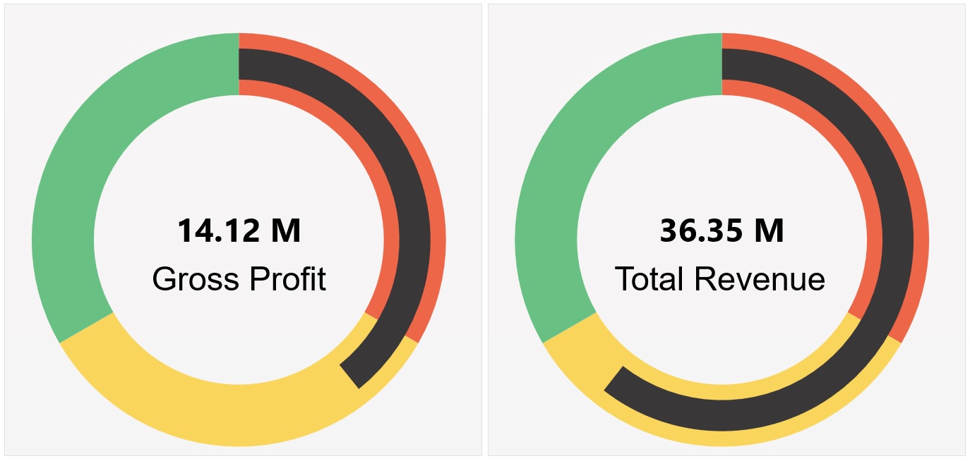
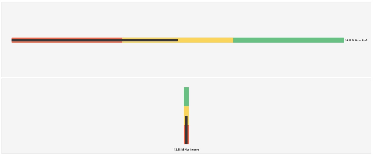
Gauge chart types show you whether data values fall within an acceptable range or not. You set the minimum and maximum values, the range maximums, and the gauge uses red, yellow, and green traffic lighting to help you quickly assess a current value and identify problems in important data points or measures. For Dashboard 2.0 dashboards, you can select circular, horizontal, and vertical gauge types.
Dashboard 2.0 Example - Circular Gauge Type

Dashboard 2.0 Example - Horizontal and Vertical Gauge Types

Dashboard 2.0 Example - Single Gauge Display
For Display, if Single is selected, then the gauge chart displays only the first column of the underlying form's data.

Dashboard 2.0 Example - Multiple Gauge Display
For Display, if Multiple is selected, then a gauge chart is displayed for each column of the underlying form's data.

Dashboard designers can set these gauge chart type properties:
Table 14-12 Gauge Chart Type Properties
| Setting | Description |
|---|---|
|
Scale |
Especially useful for large numbers, you can scale how a value is displayed. For example, if the value is 1,689,000 and you select K - Thousand as the scaling option, the chart displays the value as 1,689K. Your scaling options:
|
| Display |
You can display Single or Multiple gauge charts in a component. If Single is selected, then the gauge chart displays only the first column of the underlying form's data. If Multiple is selected, then a gauge chart is displayed for each column of the underlying form's data. |
|
Gauge Type |
Select from the following options:
|
|
Minimum Value Maximum Value |
The lowest and highest values on the gauge. The dashboard designer sets the values as a default, and then users can temporarily change them at runtime. If the dashboard designer doesn't specify these values, the application automatically sets the minimum value as zero and the maximum value as greater than the value on the gauge. |
|
Desired Goal |
Specify whether High values or Low values are desirable. |
|
Low Threshold Medium Threshold High Threshold |
To visually indicate whether a measure lies in the acceptable range or not, these thresholds enable you to display the gauge in red, yellow and green based on the specified values. Specify a text Label and a number Value for each threshold. |