About the Radar Chart Type for Dashboard 2.0
A radar chart is a two-dimensional chart type designed to plot one or more series of values over multiple quantitative variables. Radar charts are best for determining which variable in the data is doing better than the rest. Hence, they are mostly used for performance analysis.
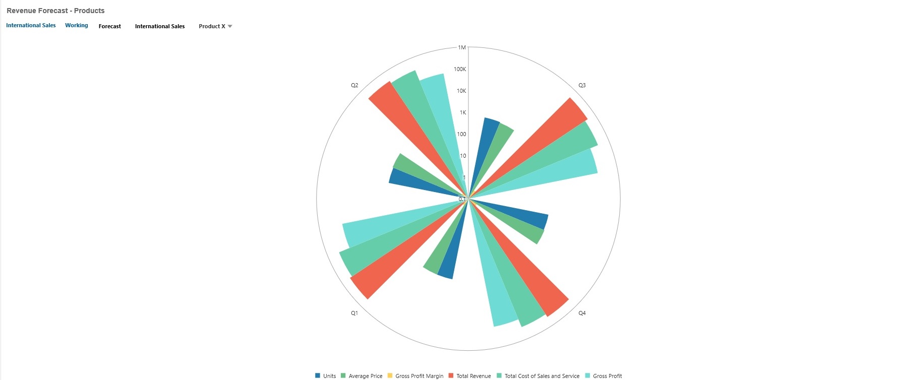
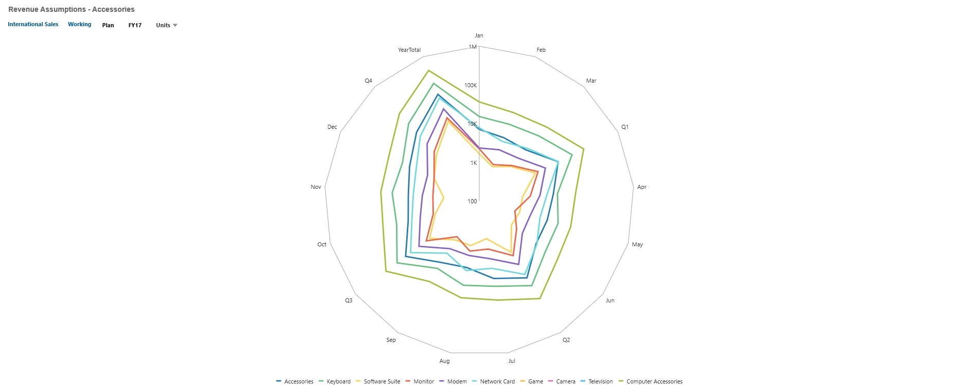
For Dashboard 2.0, you can select bar, line, area, scatter, and bubble radar types.
Dashboard 2.0 Example - Radar Bar Chart Type

Dashboard 2.0 Example - Radar Line Chart Type

Dashboard designers can set these radar chart type properties:
Table 13-12 Radar Chart Type Properties
| Setting | Description |
|---|---|
|
Value Scale |
Especially useful for large numbers, you can scale how a value is displayed. For example, if the value is 1,689,000 and you select K - Thousand as the scaling option, the chart displays the value as 1,689K. Your scaling options:
|
|
Type |
Select from the following options:
|
|
Legend Position |
Choose Left, Right, Top, Bottom, or None. |
|
Grid Lines |
Select Hide or Show. |
|
Logarithmic Scale |
Especially useful for displaying numerical data that covers a wide range of values (typically, the largest numbers in the data are hundreds or even thousands of times larger than the smallest numbers), a logarithmic scale displays these values in a way that is more compact and readable. Select whether to use a logarithmic scale in your radar chart. |
|
Color |
Select Default or click data in the chart and choose a custom color for that data. |