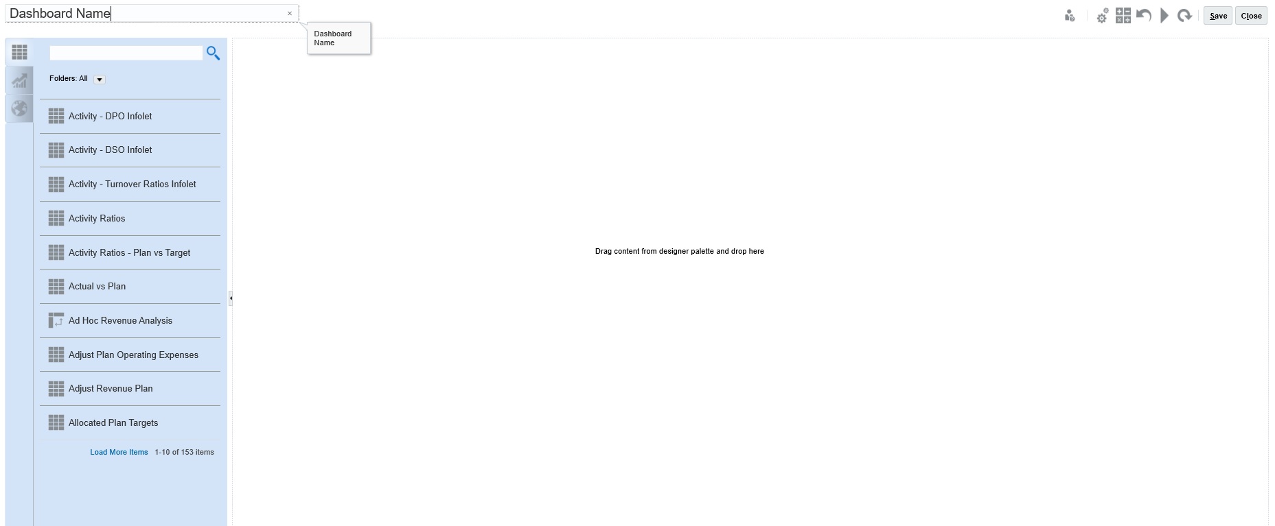
Concepts in Designing 1.0 Dashboards
Helpful information as you design 1.0 dashboards:

-
On the left is the design palette. Simply drag and drop objects from the palette to the canvas.
Tip:
Drag an object to a border line. The drag icon changes to a plus sign when you can drop the object in an allowed space. See About Your Dashboard's Layout - Version 1.0.
-
On the top right are settings for the entire dashboard:

- Click Settings
 to set these general aspects of the dashboard:
Table 14-2 Dashboard General Settings
Option Description Use name as title By default, this option is selected. Clear this option to give the dashboard a title with custom formatting. Borders When you create a new dashboard, borders are hidden by default. To show borders in newly-created dashboards, select Show. Layout Select Fixed (default) or Flexible. POV Bars Select Show (default) or Hide. Global POV Bar Select Enable (default) or Disable. For information about POVs, see About Global and Local POVs in 1.0 Dashboards.
- When you hover over a dashboard object, a toolbar for that object displays in the upper right
corner:

Note:
Dashboard 1.0 hover icons provide options such as Instructions (available only if instructions are configured for a form), Actions, Save, Refresh, Settings, and Maximize, depending on the type of object.
- As you create a dashboard, click Runtime
 so that you can immediately see how the dashboard looks and works to a
dashboard user. To return to designer mode to continue designing the dashboard,
click
  (Dashboard Designer).
- By default, missing or suppressed data is plotted as zeros in graphs. You can clear the Plot Missing Values as Zero setting to ignore missing or suppressed data in certain chart types so it's no longer plotted as zeros.
-
The listing page for dashboards supports folders. Folders enable you to assign permissions to all dashboards within a folder rather than assigning permissions to each individual dashboard. The dashboard listing page uses the same folder hierarchy as infolets and data entry forms and all artifacts and folders reside under a root folder called Library.
Note:
Only administrators can add files (for example, dashboards, infolets, forms, reports, and so on) to the Library root folder.
-
On the listing page for dashboards, you can toggle between viewing dashboards by a Flat View or a Tree View:

Then you can search for dashboards using Search
 . The flat view displays only the dashboards that meet the search
criteria, not the folders that contain them. The tree (or hierarchical) view
displays dashboards in the context of the folders that contain them.
To search on another keyword, clear the search criteria by clicking
 in the Search box.