Creating Dashboard 1.0 Dashboards
Need help deciding which dashboard version to choose? See About Dashboard Versions.
Note:
To create a Dashboard 2.0 dashboard, see Creating Dashboard 2.0 Dashboards.
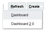
- From the Home page, click Dashboards, and then click Create.

-
From the options provided, select Dashboard 1.0.

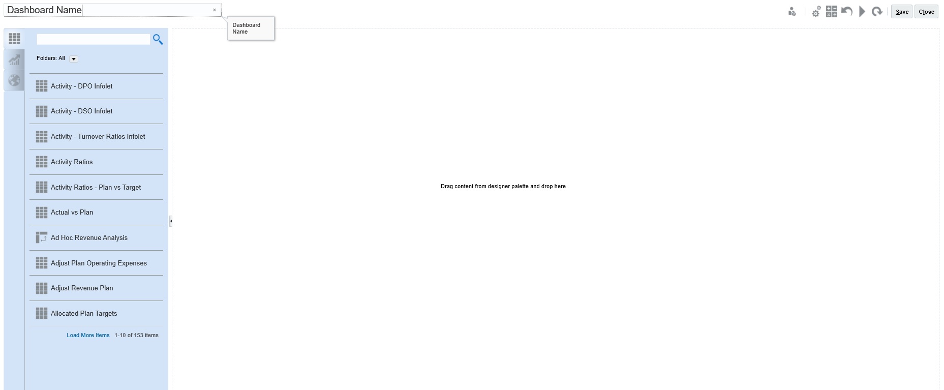
- Enter a name by clicking the default dashboard name and entering a new name in the input box.
You can give the dashboard a title with custom formatting, click Settings, clear Use name as title, and then enter the title and set formatting the dialog box.
- From the design palette on the left, drag and drop objects onto the dashboard canvas.Select from these objects:
Table 14-3 Dashboard Objects
Object Description Forms Select forms to include in the dashboard by navigating to the forms folders or by searching for them by name. To view instructions for forms after they've been added to the dashboard, hover over the form and click Instructions
 .
.
The access permissions set for forms are honored in dashboards.
Chart Types Select the chart types to include in the dashboard. When first added, a selected chart has sample data. You then associate it with a form as its data source. When you link a chart to a form, users can immediately see the impact of changing data in the form on the associated charts.
By default, missing or suppressed data is plotted as zeros. For selected chart types (Area, Bubble, Combination, Line, Radar, and Scatter), you can disable this setting by clearing the Plot Missing Values as Zero option in the chart's settings. When this option is cleared, the missing or suppressed data is ignored and is no longer plotted for those chart types.
The Combination chart type alternates displaying row data with vertical bars and lines in the chart. For example, the data in row 1 of a form is displayed as a bar and the data in row 2 as a line, with alternating chart types for even and odd-numbered rows. Although the Combination chart type can display up to 20 rows of data, it’s particularly useful when you want to compare two categories of data. For example, you want to compare Germany and France’s average exchange rates over several years, so the form has Germany rates in row 1 of the form, and France’s rates are in row 2.
For information on the Gauge chart type, see About the Gauge Chart Type.
The Tile chart type, sometimes called performance tiles, lets you select specific values from the cube to display. See About the Tile Chart Type.
Commentary Select External Artifacts, and then Commentary. Enter text that explains the data or charts. Note that the text limit is 2000 characters, including any formatting tags that are added for rich text.
URL Dynamic web page summary. Select External Artifacts, and then URL. Insert only external site URLs starting with the
https://security protocol. Don't use internal or relative URLs or URLs for unconsenting third party sites such as google.com. - Customize the dashboard using the dashboards settings and the objects’ hover toolbar, and then click Save.