Working with Profit Curves
Profit curves are useful for profitability analysis.
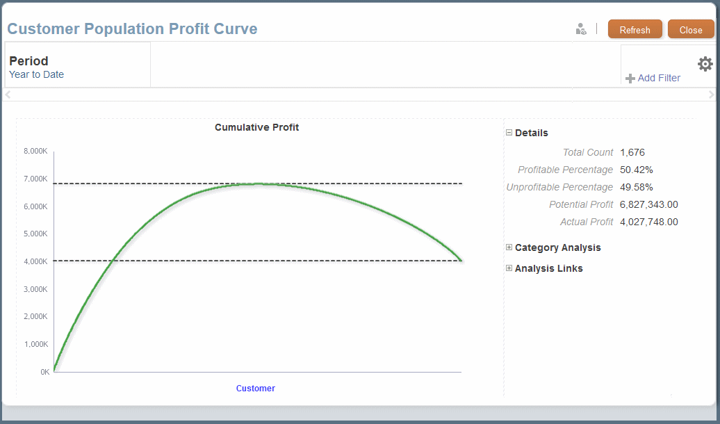
For example, a population dimension, such as Customers or Products, displays along the x-axis in descending order by profit yields.
With customers, the most profitable customer is at the far left and the least profitable at the far right. The y-axis shows cumulative values for the account dimension, such as Profit. The most profitable customer's profit is the first y plot. The second y plot is the second customer's profit added to the first, and so on.
The first part of the curve is the steepest and shows the largest gains in profit. As less profitable customers are added to the curve, it flattens. If profitability goes negative for the least profitable customers, the curve moves downward.
Figure 12-12 Profit Curve of Net Income for All Products

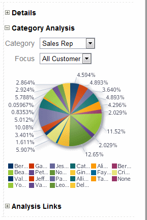
You can click Category Analysis to show the amount contributed by each member of the selected category.
Figure 12-13 Profit Curve Category Analysis

Click Analysis Links, and then Run As Analysis View to run the underlying analysis view.
As with other Profitability and Cost Management analytics features, virtually all users can generate and view profit curves, but only administrators and others with sufficient security provisioning can define them.