Defining Profit Curves
Working with Profit Curves describes profit curves. For an example of a definition and results, see Profit Curve Example.
To display the Profit Curves screen:
-
On the Profitability and Cost Management Home page, click Intelligence,
 .
.
-
Click
 .
.
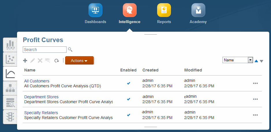
Figure 12-14 Profit Curves Screen

The Profit Curves screen contains the following controls: Create, Edit, Delete, Inspect, and Refresh. The name of each displays when you point to it. You can also Search entered text and Sort selected columns. For control descriptions, see Common Feature Controls.
The Actions menu offers two options:
-
Copy -- Saves the selected graph with a different name.
-
Diagnose -- Displays underlying queries and performance information for you to view and save as a file.
Note:
The control functionality and Actions menu options are also available through the Actions button, ![]() . You can also choose to add the selected profit curve to the Favorites list on the Home page.
. You can also choose to add the selected profit curve to the Favorites list on the Home page.
To define a profit curve:
-
On the Home page, click Intelligence,
 , and then
  .
.
-
In the Profit Curves screen, click Create,
 .
.
Note:
You only see the Create option if your security provisioning enables you to use it.
-
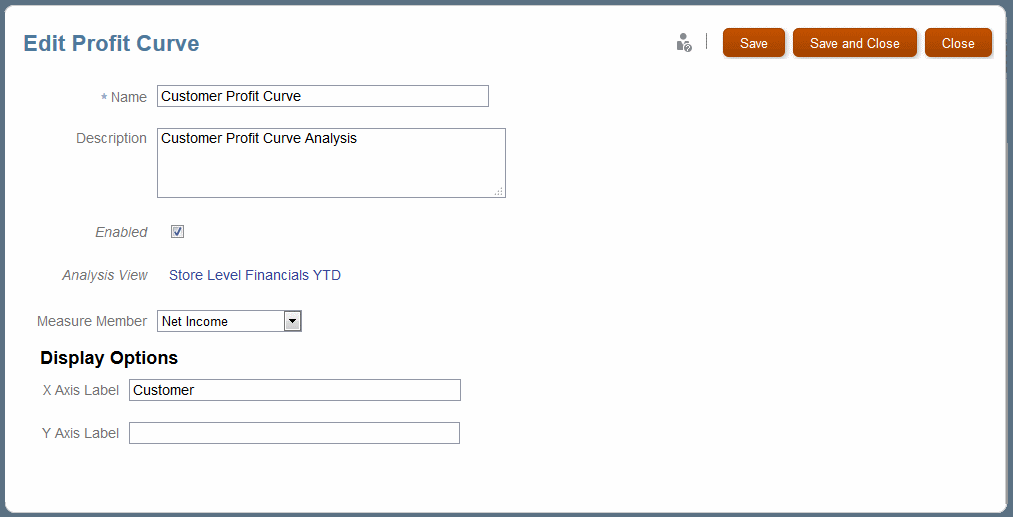
In Create Profit Curve, enter the following:
-
A Name for the profit curve
-
An optional Description
-
The Analysis View to provide data for the graph (Working with Analysis Views)
-
A Measure Member, a member of the analysis view column dimension; its value is accumulated and plotted on the y-axis
The row dimension of the analysis view supplies the member plotted on the x-axis. For example, if the measure member is Net Profit and the x-axis member is Customer, then the first symbol at the left shows where the Net Profit value of the most profitable customer falls on the y-axis, the next symbol shows where the Net Profit value of the most profitable customer added to the next most profitable customer falls on the chart, the third symbol shows the Net Profit sum of the first three most profitable customers, and so on.
-
An optional X Axis Label for the horizontal axis
-
An optional Y Axis Label for the vertical axis, usually Profit, Revenue, or similar
Tip:
For greatest ease of use, create descriptive names and labels to help other users analyze the profit curve.
-
-
When selections are complete, select Enabled, and then Save or Save and Close.
To edit an existing profit curve definition, select its row in the Profit Curves screen, click Edit, ![]() , and follow the previous steps.
, and follow the previous steps.
To permanently delete a profit curve definition, select it and click Delete, ![]() .
.
Profit Curve Example
The following figure shows the definition for a profit curve.
Figure 12-15 Definition for a Profit Curve

When you select and run this definition, the profit curve displays as shown in Figure 12-12. Some customers contribute negatively so the Potential Profit is greater than the Actual Profit.
Click ![]() to further define the display. If attributes or member generations were included in the underlying analysis view, you can click Category Analysis to select an analysis category and narrow the focus interactively to show only a portion of the category. If you click Analysis Link and then Run As Analysis View, the graphed data opens in a table for further analysis.
to further define the display. If attributes or member generations were included in the underlying analysis view, you can click Category Analysis to select an analysis category and narrow the focus interactively to show only a portion of the category. If you click Analysis Link and then Run As Analysis View, the graphed data opens in a table for further analysis.