2Branding
Branding Your Offering
This topic describes how to manage branding themes and set theme attributes so you can create a user interface and experience tailored to your agency.
You can apply the unique branding theme for your organization to your Public Sector Compliance and Regulation offering. A branding theme defines the collection of a set of branding attributes. Examples of branding attributes include logo image, application label, page background color, and so on. Oracle provides a default theme for your initial implementation, but you can create your own themes to match your organizations color choices and labeling.
Initially, Oracle applies a default branding theme with a set of default theme attributes and attribute values. If you apply a custom default system branding theme, any theme attribute you include in your default branding theme overrides the Oracle default for that theme attribute. For example, assume you specify a custom logo image and application label in a custom branding theme that you set as the system default. In this case, the application will display your custom logo and application name, but all other theme attributes, such as header background color, header text color, and so on, will continue to assume Oracle default values.
You cannot modify the delivered branding theme. To make changes, you need to create your own branding theme, and add the attributes you wish to modify. After creating your branding theme, you then assign your branding theme to your implementation. The attributes you add to your own branding theme override the equivalent attributes in the default branding theme once you assign your own theme.
Managing Themes
This topic describes how to access, create, modify, and delete branding themes.
This section describes the tasks related to managing themes.
Accessing Themes
To access theme definitions, select
From the Manage Themes page you create, modify, and delete theme definitions.
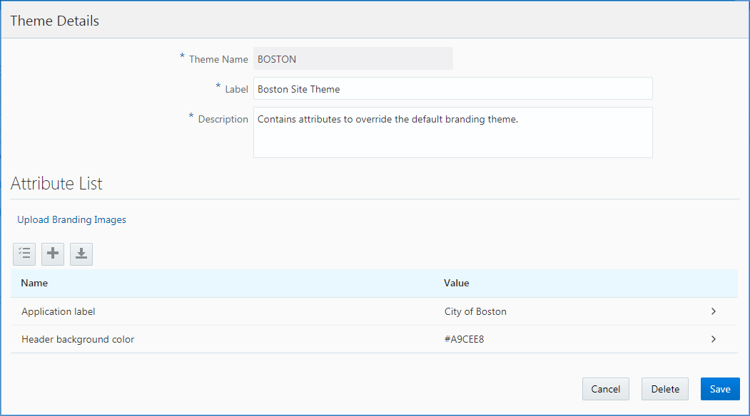
Creating a Theme
You can create multiple themes as needed for your implementation. Themes can be assigned to the system, application, and role level.
On the Manage Themes page, click the Add button.
On the Theme Details page, modify these attributes:
Page Element
Description
Theme ID
System identification for the theme. Use upper case letters, numbers, or underscores only. The Theme ID has a 30–character limit.
Label
The functional display label that you see when selecting a theme.
Description
Provides additional information to describe the purpose of the theme to system administrators implementing your organization’s branding.
Click Save.
Modifying a Theme
On the Manage Themes page, click on the row of the existing theme you want to modify.
On the Theme Details page you modify:
Label
Description
Branding Images
Attributes
Click Save.
Deleting Themes
You delete themes from the Manage Themes page.
On the Manage Themes page, click the Edit button to put the grid in edit mode.
Select the row(s) of the theme(s) you want to delete.
Notice the row becomes selected.
Note: To select all rows, click the check box in the upper-left-hand corner of the themes grid.Click the Delete button.
Click OK to confirm you want to delete the selected items.
Click the Edit button to exit edit mode.
Managing Theme Attributes
This topic describes the tasks related to adding and modifying theme attributes, which define the appearance and branding of your Oracle Public Sector Cloud service. A theme can contain one or more configured theme attributes.
Working with Theme Attributes
A branding theme represents the collection of elements giving your application your customized user experience. Theme attributes represent the particular element that you want to customize within your branding theme, such as the logo image, the application name, or the header font color.
A theme can contain one more theme attributes. A theme attribute is not a standalone definition; it must be associated with a theme.
Each theme attribute is comprised of these properties:
Theme Name: The theme to which you add the theme attribute.
Name: A predefined set of attributes, selected from a drop-down list.
Value: You customized value (label text, color, and so on).
Adding a Theme Attribute
You can add theme attributes when creating or modifying themes.
Select
In the themes grid, click the theme to which you want to add an attribute.
On the Theme Details page, click the Add button in the Attribute List grid.
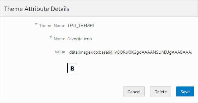
On the Theme Attribute Details page, select the attribute you want to add from the Name drop-down list.
For descriptions of each attribute type, see Configuring Theme Attributes.
For example:
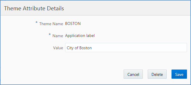
In the Value field for the theme attribute, enter the required value for that attribute.
For example, if you selected Application label, enter your custom label text, or if you selected Header background color, enter the color, a HEX value, or an RGB value.
Click Save.
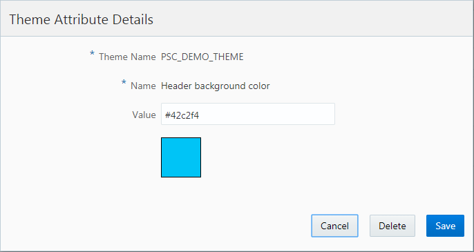
Previewing a Theme Attribute
For color attributes, the system displays a preview of the color value you’ve provided.
This example illustrates previewing a color attribute:
This example illustrates the preview feature for color theme attributes where below the Value field the application displays a square showing the specified color.
Deleting a Theme Attribute
You can delete theme attributes when modifying themes or when modifying a theme attribute.
Select
Open the theme from which you want to remove attributes.
On the Theme Details page, click the Edit button in the Attribute List grid to put the grid into edit mode.
Select the row(s) of the theme attribute(s) you want to delete.
Notice the row becomes selected.
Note: To select all rows, click the check box in the upper-left-hand corner of the theme attributes grid.Click Delete.
Click OK to confirm deleting the selected item(s).
Click the Edit button to exit edit mode.
Configuring Theme Attributes
This topic lists and describes all of the theme attributes you can add to a theme to define the appearance and behavior of your Public Sector Cloud service.
Working with Theme Attributes
The following table contains descriptions of the theme attributes you can add and configure to adjust the display and user experience of the service.
| Theme Attribute |
Description |
|---|---|
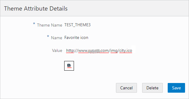
| Favorite icon |
Use to add a “favicon” image for your site. The favorite icon appears in the browser tab, and it also appears as the icon in the favorites list if a user bookmarks the page. Use https:// to reference a hosted image or use base64 encoded images. The favorite icon must be:
Note: Not all browsers support the favorite icon, and not all browsers support base64 encoded icons.
|
| Mobile device home screen icon |
Use to add a home screen image for a browser page from this cloud offering if a user pins the page to the home screen while using a mobile device. Use https:// to reference a hosted image or use base64 encoded images. |
| Application Label |
Enter the title for your application. For example: City of Carlsbad Permits Center By default, the application label only appears as the text on the browser tab. Select the Show application logo in header attribute to have the application logo appear also in the application header. |
| Show application label in header |
Turn on the Value switch to set the application label to appear in the application header.
Note: When displayed, the application label appears to the right of the application logo, and on a smartphone the application label appears in the center of the header.
Note: You can achieve the same by overriding the following CSS style:
pscts-theme-header-text-app-label. See the following section covering free-form styles for more information.
|
| Copyright text |
Enter text displayed in the footer for copyright purposes. |
| Page background color |
Specify the main color for the page. For example:
|
| Header background image |
Use to include a background image for the header. Use https:// to reference a hosted image or use base64 encoded images. |
| Header background color |
Specify the main color for the header color. For example:
|
| Header text color |
Specify the color of the header text, as well as the color of the Application Navigation button and the Search button. |
| Header icon color |
Specify the color of the header icons, such as Home, Page Finder, Alerts, and so on. |
| Content area border color |
Specify the main color for the border of the content area. For example:
|
| Footer background color |
Specify the main color for the footer color. For example:
|
| Footer background image |
Use to include a background image for the footer. Use https:// to reference a hosted image or use base64 encoded images. |
| Footer text color |
Enter the color for the text appearing in the footer. |
| Welcome banner background color |
Specify the background color you want to set for the welcome banner on the public landing pages. |
| Welcome banner text |
Enter the text you want to appear in the welcome banner on the public landing pages. |
| Welcome banner text color |
Enter the color of the text you want to appear in the welcome banner on the public landing pages. |
| Digital assistant launcher icon |
Enter the URL pointing to the image you want to appear on the agency springboard or the user landing page for the Digital Assistant. You click this image to launch the Digital Assistant.
Note: The Digital Assistant is a chatbot feature.
For more information on the Digital Assistant, see Configuring the Digital Assistant Parameters. Use https:// to reference a hosted image or use base64 encoded images. |
| Digital assistant logo |
Enter the URL pointing to the image you want to appear on the left side of the Digital Assistant banner that the user sees after launching the Digital Assistant.
Note: The Digital Assistant is a chatbot feature.
For more information on the Digital Assistant, see .Configuring the Digital Assistant Parameters Use https:// to reference a hosted image or use base64 encoded images. |
| Theme style sheet |
Specify the stylesheet containing the style classes you reference in the theme properties on this page. |
| Free-form styles |
Add any additional Cascading Style Sheet (CSS) style class definitions to further brand your implementation if needed. The styles you add can be used to override styles applied to delivered items not associated with a specific branding attribute, such as landing page tiles. See the following section for descriptions of the elements to which you can apply free-form CSS. |
For more information on branding images, see Applying Branding Images.
Modifying Delivered Style Classes with Freeform CSS Styles
Some elements in the interface are not represented by a theme attribute that you can modify using the Theme Attribute Details page. If needed you can add your own CSS to the Freeform Style theme attribute to override the CSS style applied by default. The following table lists UI elements and their associated style class that you can override with your own CSS.
| UI Element |
Style Class Override Example |
|---|---|
| Background color of the Anonymous User Landing page |
.pscts-theme-page .PSCHM_GUEST_LINK{
background-color: silver;
} |
| Background color of the Search box on the Anonymous User Landing page |
.pscts-theme-page .PSCHM_SEARCH{
background-color: gray;
} |
| Background color of the tiles on:
|
.pscts-theme-page .psc-citizen-svg{
background-color: green;
} |
| Background color of Registered User Landing page |
.pscts-theme-page .PSCHM_PUBLIC_LINK{
background-color: #00FFFF;
} |
| Background color of Agency Springboard |
.pscts-theme-page .PSC_AGENCY_HOME{
background-color: #00FFFF;
} |
| Quick Actions (I Want To) drop-down list on the Agency Springboard |
.pscts-theme-page .psc-home-two-column{
background-color: silver;
} |
| Application label to appear in global header |
.pscts-theme-page .pscts-theme-header-text-app-label {
    white-space: nowrap;
   display: block;
} |
Applying Branding Images
This topic describes how to include images in your branding configuration by using the Fusion Applications Appearance page to upload and store branding images, such as logo, cover image, and background image, or using the Public Sector Compliance and Regulation theme administration pages to reference other images.
Understanding Branding Images
To include images in your branding theme configuration, you use the Fusion Applications Appearance UI tool or your modify delivered theme attributes, depending on the image type. For example, for your site logo, you use the Appearance UI tool, and for the favorite icon, you include the Favorite icon attribute in your theme and reference the desired image. The following table provides a list of the images you can include and where those images are managed.
| Administration Tool |
Image |
|---|---|
| Appearance UI |
|
| Public Sector Compliance and Regulation: Theme Details page
|
|
Using Theme Attributes to Include Branding Images
When using the provided theme attributes to apply images to your branding theme, you reference the image using HTTPS, or you provide a base64 encoded image.
If you have your images stored in a content delivery network (CDN), for example, you can reference the image using an HTTPS reference, such as https://ursrvr.com/img/image.ico.
You can also provide a base64–encoded image using a DATA reference, such as data:image/ico:base64,<encoded image>.
Using the Fusion Application Appearance UI Tool to Upload and Store Images
You use the Oracle Fusion Application Appearance page to upload and store the branding images that you will use for your Public Sector Cloud services. The Public Sector Cloud service, retrieves the uploaded images from the Appearance page at runtime. No other branding attributes, other than the specific branding images discussed in this topic, are retrieved from the Appearance page.
This example illustrates the images you can upload using the Fusion Applications Appearance page.
| Image |
Description |
|---|---|
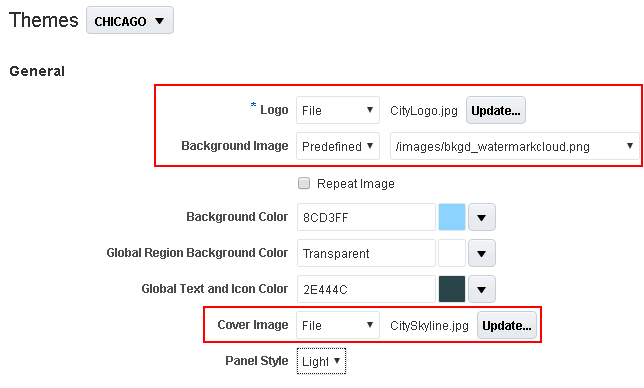
| Logo |
Unique logo for your municipality, which appears in the top left of the header for large form factor devices, such as desktop computers and laptop computers.
Note: The logo does not appear in the header for small form factor devices, such as smartphones.
Note: A logo image should not exceed a height of 50 px or a width of 200 px.
|
| Background Image |
Defines the background color of the content area of selected pages in Public Sector Compliance and Regulation services.
Note: For the current release, only the Apply for Permit page uses the background image.
|
| Cover Image |
On a homepage, the cover image spans the page from side-to-side, just below the header, as a banner image. Typically, this image depicts scenic views of the municipality, such as the skyline, an iconic neighborhood, and so on.
Note: The cover image should be 200 px in height. Images exceeding 200 px in height will not display the full image, while images under 200 px in height will display empty space (black) in the area between the current image height and 200 px.
|
When using the Appearance page to upload images for your Public Sector Cloud service, make sure to keep these items in mind:
The Appearance page is used only for uploading the logo, background image, and the cover image.
No other branding attributes in the Appearance page are referenced by Public Sector Cloud.
To create or modify a theme in the Appearance page requires you to first create a sandbox.
The name of the theme to which you add the Public Sector Cloud branding images in the Appearance page, must exactly match the name of the corresponding theme name in Public Sector Cloud. For example, if your theme in Public Sector Cloud is CHICAGO, then the theme to which you add images to in the Appearance page must also be CHICAGO, using the same spelling and case.
You do not need to set the theme as active by applying the theme from the Appearance page. However, you need to publish the sandbox containing the new themes or theme updates, from the Appearance page in order to make the theme or theme updates available to your Public Sector Compliance and Regulation service.
If you leave the sandbox unpublished and open using the same user ID used to create intake forms in the Intake Form Designer, you may experience issues saving data in the Intake Form Designer.
Accessing the Appearance Page from Public Sector Cloud
To access the Appearance page from your Public Sector Compliance and Regulation service:
Select
On the Manage Themes page, open the theme for which you want to view or add branding images.
On the Theme Details page, click the Upload Branding Images link.
This takes you directly to the Themes tab in the Appearance configuration tool
To access the Appearance page from within Fusion Applications:
Click the Navigator button in the global header.
Select Appearance, under Configuration.
Activating a Sandbox
On the Appearance page on the Themes tab, click the Go to the Manage Sandboxes Page link.
On the Sandboxes page, click Create Sandbox.
On the Create Sandbox page, enter a Name and Description, and select Appearance as the tool.
Click Create and Enter.
After activating a sandbox, select Navigator and select Appearance to return to the Appearance page.
Creating a Theme
The theme you use in the Appearance page to store your Public Sector Cloud branding images must match exactly the name of the theme defined in Public Sector Cloud.
To create a theme:
After activating the sandbox, select a theme to clone by clicking the drop-down list next to the Themes page heading.
Click Actions, Save As.
On the Save As dialog box, deselect the Apply this theme check box, and enter the name of the corresponding Public Sector Cloud theme that will use the graphics you will be uploading with the Appearance page.
Note: The theme name must be exactly the same as the theme name defined within the Public Sector Cloud service Manage Themes page, in both case and spelling.Note: You must not apply the theme defined in the Fusion Appearance page. Public Sector Cloud services only use the Appearance page to upload and store images for internal reference at runtime. If you apply the theme from the Appearance page, that theme will become the active theme used by the Fusion applications after you publish the sandbox. The theme storing the branding images just needs to exist within the Fusion theme collection; it does not need to be applied in order for the Public Sector Cloud service to access the image attributes.
Uploading Images
To upload branding images:
In the General section of the Appearance page, modify one or all of these image types:
Logo
Background Image
Cover Image
When adding an image, select one of these options:
File: Browse and select a file from your local computer.
Predefined: Select a file from the list of predefined images delivered by Oracle.
URL: Enter a full URL for the logo or the watermark.
Publish Your Changes
Items in a sandbox can’t be accessed or referenced at runtime until you publish the sandbox.
To publish your changes:
When you have uploaded the desired images, click the sandbox banner at the top of the browser window.
On the Sandbox Details page, review the list of changes, and click Publish.
Return to your Public Sector Cloud service, and review your changes.
Assigning Themes
This topic describes how to assign branding themes at various levels, such as system, application, and by role.
The service is delivered with a default branding theme that applies to all levels of the application. If you need to apply different branding attributes, you create your own themes which incorporate your modified theme attributes. After defining the themes to be used in your system, you then need to assign themes. The themes you provide override the default theme attributes where specified. Where no user-defined theme or user-defined theme attribute exist, the attributes defined in the default theme prevail.
You can assign themes at these levels:
| Theme Level |
Description |
|---|---|
| System |
Applies system-wide. If you do not specify an application-level theme, the interface displays only the attributes of the system theme for all applications and roles. This is typically the Oracle Default Theme. A system-wide theme is required. |
| Application |
Applies only to a specific application menu, such as Default or Mobile. Default applies to the typical interface, while Mobile refers to mobile applications, such as Oracle Inspector. Application-level themes are optional. A system can have multiple application themes assigned as needed. |
| Role |
Extends the application-level theme assignment to apply to specific user roles. Using role-based themes you can provide different experiences for public users and your agency staff, for example. Role-based themes are optional. An application-level theme can have multiple role-level themes assigned as needed. |
The following sections describe the options for assigning themes at each level.
Viewing System-Level Themes
Select .
On the Assign Themes page, note the Application Default Theme field value.
This is the system-wide default theme, such as Oracle Default Theme.
Assigning Application-Level Themes
Select .
On the Assign Themes page, click Add under Theme Assignments.
On the Theme Assignment Details page, specify these items:
Page Element
Description
Application
Select the application menu.
Default: Use to apply to the general application (not the specific mobile applications).
Mobile: Use to apply a theme to mobile applications, such as Oracle Inspector.
Description
Enter a description of the theme assignment.
Default Theme
Select the branding theme to apply to this application.
Click Save and Close.
Assign Role-Based Themes
You can define different themes for various user roles in your system, such as public users, agency users, and so on. This way, you can control the user experience for the various roles in your system.
Select .
On the Assign Themes page, locate the application theme to which you want to add a role-based theme.
Click Edit.
Click Add under Role-Based Assignment List.
For the role-based theme, specify these items:
Page Element
Description
Priority
In the case of multiple user roles assigned to a user, specify a priority between the role-based themes. The system applies the role-based theme with the lowest priority (closest to 1). For example, assume Role A Theme has a priority of 10, and Role_B_Theme has a priority of 20. In this case, if both of those roles are assigned to the current user, the system applies the Role_A_Theme.
Role
Select the user role to which this theme applies.
Theme
Select the branding theme to apply to the selected role.
Click Save & Close.
Using Third Party Images Provided with Sample Data
The Oracle Public Sector Compliance and Regulation offering includes sample data images that are provided under a restricted use license for demonstration purposes only.
The specific images are listed below along with their owner and media ID. If you want to use these sample images in a production environment, you must contact the image owners directly to purchase the images. You can find contact information for the owners in the Oracle Applications Cloud Licensing Information Guide.
Oracle does not provide a license for you to use the sample images in your production environments or for other non-demonstration uses.
| Image |
Owner |
Owner’s Media ID for Image |
|---|---|---|
 |
Getty |
870535640 |
 |
Getty |
168351010 |