1Configuring Navigation
Configuring Menu Structure
This topic describes the elements of the delivered menu structure, and describes how to change labels for menu folders and menu links.
You can open delivered menus and make minor changes to menu items to meet your needs, such as modify labels and add new links. A menu is delivered with a predefined set of menu items.
Public Sector Compliance and Regulation delivers these common menus:
Product setup: Links all common setup pages.
Products: Links considered to be widely used by agency staff members to process transactions.
And these application specific menus:
Mobile Inspector: Links used in the Mobile Inspector mobile app.
Mobile Code Officer: Links used in the Mobile Code Officer mobile app.
Code Enforcement: Links specific to the Code Enforcement offering.
| Menu Item |
Description |
|---|---|
| Root Folder |
The root of the menu structure. It contains all menu folders and menu links within the menu. A menu has only one root folder. |
| Menu Folder |
Enables you to group menu links. A menu folder can contain one or more menu links. There is only one layer of menu folders within a root folder. |
| Menu Link |
Represents the actual link to the underlying application page. An end user clicks the menu link to access the associated page. |
Working with Menus
To open a menu:
Select
On the Configure Menu Structure page, select a menu from the Menu drop-down list.
Click Open Menu.
To close a menu, click Close Menu.
To view changes to the menu structure, click Refresh.
Selecting a Menu Item
When working with menu items, you have a graphical representation of the structure on the left-hand side of the page, showing all the menu folders and menu links within the menu structure.
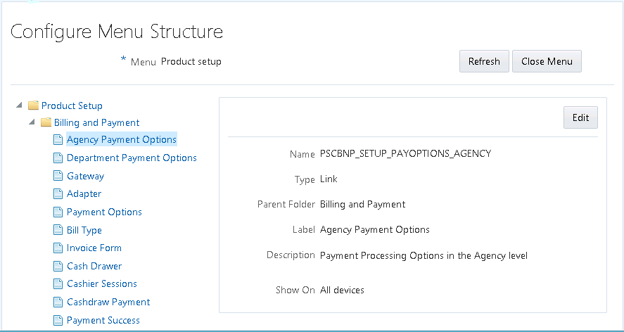
Select an item in the menu structure to view the details related to that menu item. Depending on the item selected, you have these options for configuring the menu.
| Page Elements |
Description |
|---|---|
| Refresh |
Refreshes the menu view to incorporate any recent changes you have made. |
| Close Menu |
Closes the menu currently open. |
| Edit |
Modify an existing menu folder or menu link. |
| Add Link |
Add links to an existing root folder or menu folder. When you click Add Link, the Link Details page includes an additional section of configuration properties to specify the target URL. |
Configuring General Menu Item Properties
Menus contain menu items, which can be menu folders or menu links. Most of the properties you can view and set for menu folders and menu links are the same. Properties specific to a particular menu item type are noted below.
| Page Elements |
Description |
|---|---|
| Name |
Identifies the name of the menu item, as it is identified within the application. You cannot change this value. |
| Type |
Indicates the type of menu item, which can be: root folder, folder, or link. |
| Feature Area |
Indicates the feature area to which the link to a page belongs, if applicable, such as Permits.
Note: Typically, this value is read-only and used internally.
|
| Parent Folder |
Indicates which root folder a menu folder or menu link exists within.
Note: Applies only for menu folders and menu links, not root folders.
|
| Label |
Identifies the menu item as it appears in the interface. |
| Description |
Enter any descriptive text to help document the purpose of the menu item to other administrators. |
| Icon |
Select an image from the drop-down list to display as an icon for the menu item.
Note: This icon appears on these navigation features: the Navigator menu, the agency springboard, and the page finder. However, the icon may be a different size and display different color combinations depending on the navigation feature being used.
|
| Sequence |
In the case of multiple folders or menu links within a folder, set the order a menu item should appear in relation to the others. Any menu items sharing the same sequence number are arranged alphabetically. Otherwise, you can set the sequence: 0, 1, 2, 3, and so on.
Note: The delivered menus use hundreds as sequence values for menus and tens for sequence values for menu items. For example, the eighth menu folder in the menu structure has a sequence value of 800, and the second menu link within that menu folder has a sequence value of 20.
|
| Show On |
Select the device sizes for which the application displays the menu item. This option enables you to expose or hide menu items, as needed, depending on the device size. For example, some pages may be more suitable for larger devices, while others may have been developed specifically for smaller devices.
Note: The application doesn’t determine the actual device type, but uses the viewport size for the Show On option.
|
| Show on Springboard |
Turn on to have the icon for the menu link appear on the springboard, which can be accessed by agency staff only.
Note: Applies only to menu links.
For more information on springboards, see Setting Up the Agency Springboard. |
| Show in Page Finder |
Turn on to have the icon for the menu link appear in the page finder navigation feature.
Note: Applies only to menu links.
For more information on the page finder, see Using the Page Finder. |
| Page Contents |
The edit box appears only for these menu items:
This edit box enables you to manage content links that appear on a landing page or springboard. Enter a comma-separated list of menu item names. For example, the Anonymous Public Landing Page link points to the Anonymous Landing Page Data folder (PSCHM_GUEST), so in the Page Contents edit box, the following is entered: PSCHM_GUEST When the Anonymous Landing Page loads, it displays the menu links contained within PSHCM_GUEST folder.
Note: Delivered menu items for landing pages or springboards can refer to a single menu folder containing menu links. The menu folder, in this case, includes all of the links to appear on the landing page or springboard. Or, you can provide a list of menu links.
|
| Context Menu |
The edit box appears only for menu items that display a menu, such as:
This edit box enables you to manage content links that appear on a drop-down list for the UI widget. Enter a comma-separated list of menu link names. For example: PSCPBL_SETUP_MANAGEACCOUNT, PSCSECUTIL_WIDGET_SIGNIN, PSCNV_HEADER_ORACLE_HELP, The menu link names added to the list appear in the list for that page control or widget. |
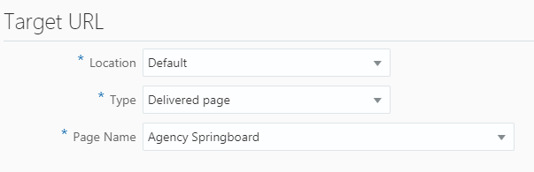
Configuring Target URL Properties
When you are adding a new link, you specify properties that control the link destination and how the link behaves.
This example illustrates the Target URL settings, which are described in the surrounding text.
| Page Element |
Description |
|---|---|
| Location |
Specify where the target content should display:
|
| Type |
|
| Hide from public user |
Applies only if the target type is URL. If turned on, the application displays the menu link only to agency staff (users with the following privilege: PSC_ACCESS_AGENCY_SPRING_BOARD_PRIV). Otherwise, the application displays the menu item link to all users.
Note: This option does not apply or remove security; it only controls if a link is visible to public users or not.
|
| Page Name |
If you selected a target type of Delivered Page, select the page to which you want to link. |
| URL |
If adding a URL target type, add the URL here. Enter a fully qualified URL, including the protocol, such as http://, https://, ftp://, and so on. For example: http://google.com https://confluence.bigcity.gov/permit_info.html |
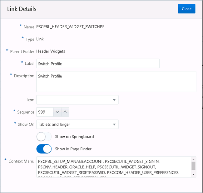
Setting Widget Attributes
Widgets are the user interface constructs the user can view and click, such as the items in the Header Widgets menu folder, the Widget Links folder, and so on. For widgets you can specify custom CSS style classes if needed. You add your CSS using the Free-form styles branding attribute, and then reference it from the Widget Attribute settings.
Depending on the widget and where it is displayed, the system displays one or all of the widget attributes. For example, in the case of the Help widget, by default, you see two widget attributes Style Class and Context Menu Icon. Style Class enables you to apply a style to the overall widget, and because Help appears in the Switch Profile context menu, you can use Context Menu Icon to display the help icon, if desired.
| Page Element |
Description |
|---|---|
| Style Class |
Specify the style you want to apply to the widget. |
| Display Mode |
|
| Icon |
Specify style classes to define the widget icon. |
| Context Menu Icon |
Specify the icon you want to appear for the option in the context menu, if desired. |
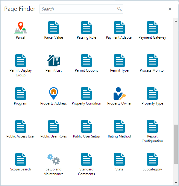
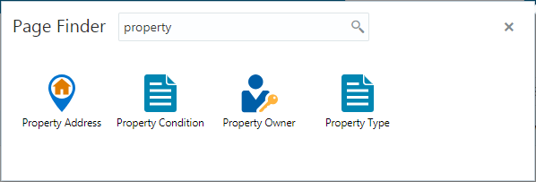
Using the Page Finder
This topic provides an overview of the navigation feature named page finder, and it describes how to use its features.
The Page Finder is a navigation feature an agency user accesses by clicking the Page Finder button in the header.

The Page Finder displays icons:
For all the pages to which a user has access. Users can click the icon to navigate directly to the page.
In alphabetical order.
In a “flattened” format, meaning each page link appears on its own — not within the menu folder/menu item hierarchy like you see in the Navigator menu. The Page Finder does not display menu folders.
This example illustrates the Page Finder interface with a description surrounding the image.
Searching within the Page Finder
Depending on the number of pages to which a user has access, the Page Finder may contain numerous icons within it. To find icons in the Page Finder:
Use the scroll bar on the right-hand side of the Page Finder (when displayed).
Type the full or partial name of the page into the Search field at the top of the Page Finder to reduce the number of page links displayed.
Closing the Page Finder
Once opened, you can dismiss the Page Finder by:
Clicking the Close Page Finder button in the upper-right-hand corner.
Clicking on an icon.
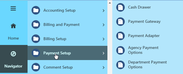
Viewing the Menu Structure in the Navigator
This topic describes how the structure in the menu definition is represented in the navigation feature named the Navigator.
The Navigator menu, displays when the user clicks the Navigation button in the global header.
The Navigator menu displays the menu content in the same hierarchy defined for menu folders and menu items in the menu structure displayed in the Configure Menu Structure page.
The following example illustrates menu folders containing menu items in the Configure Menu Structure page with description surrounding the image.
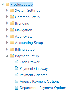
At runtime, the Navigator displays the menu items within the menu folder as defined on the Configure Menu Structure page.
Configuring Header and Footer Navigation Features
This topic describes how to modify your header to include additional features in the header or footer widgets, which can provide more flexible navigational options for end users.
Overview of Header and Footer Navigation Features
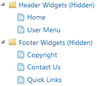
The global header and footer run along the top of the page and the bottom of the page, respectively. The header is delivered with a set of default navigation widgets, such as the Home button. If needed you can modify delivered widgets.
The header and footer navigation widgets definitions are stored within the navigation framework in the Products menu. Header widgets are stored in the Header Widgets menu folder, and footer widgets are stored in the Footer Widgets folder.
A widget can be a singular button taking the user to a destination, such as the home page or another custom location. Widgets can also be lists of multiple related links that display when clicked. You can add custom attributes to the menu item definition to customize the display of the link.
| Link Destination |
Description |
|---|---|
| URL |
Targets an outside URL, such as http://oracle.com or http://facebook.com. Rendered as a button or a link in a related link list. |
| Delivered page |
Specify the name for the page as it appears in the menu item definition on the Configure Menu Structure page. |
In the current release, you cannot create new, custom widgets, but you can modify existing widgets. You can insert links into an existing widget, and you can modify other attributes, such as the label, on what devices it displays, and so on. You can modify these attributes on the Configure Menu Structure page.
For more information on the Configure Menu Structure page, see Configuring Menu Structure.
Inserting Links into an Existing Related Links Widget
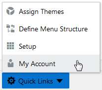
Select Navigation > Configure Menu Structure.
On the Configure Menu Structure page, select Products from the Menu drop-down list.
Click Open Menu.
Locate the Header Widgets folder or Footer Widgets folder, depending if you are modifying the header or the footer navigation widgets.
Select the menu item you want to modify in either the Header Widgets folder or the Footer Widgets folder.
For example, select the Switch Profile menu item in the Header Widgets folder.
Click Edit.
In the Context Menu attribute, add a comma, and enter the name content reference associated with link you want to add to the current link list.
For example, to add the My Account link, add the content reference name PSC_MY_ACCOUNT.
Save your changes.
Confirm the link appears in the related link list.
Creating Free-Form Footers
This topic describes how you can incorporate custom HTML to define your own footer that will display instead of the fixed-form footer.
Footer Configuration Overview
By default, the Public Sector Compliance and Regulation application does not deliver a footer. Public Sector Compliance and Regulation does provide a fixed-form global footer, populated with various links and widgets that you can implement by applying a solution package.
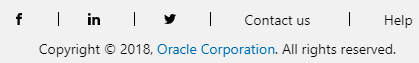
This is an example of a fixed-form footer similar to that provided by a solution package, displaying links to Linked In, Facebook, Twitter, Help, plus copyright text.
You can also insert your own items into the footer area by adding menu links to the Footer Widgets menu folder, which is delivered empty. For more information on footers, see Configuring Header and Footer Navigation Features, and for more information on adding menu links, see Configuring Menu Structure.
If your organization prefers to use its own footer design, you can add free-form footers with the Configure Footers page. You can create these footer definitions:
Default: Displays for the default application, accessed through the browser.
Mobile: Displays for the mobile application, such as Oracle Inspector.
Creating a Free-Form Footer
To create a free-form footer:
Select .
On the Configure Footers page click Add.
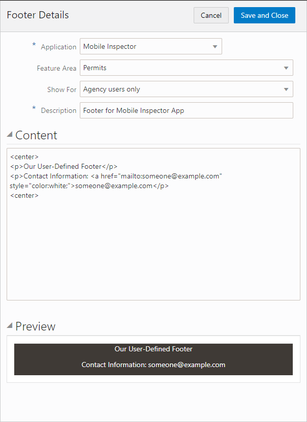
This launches the Footer Details page.
For Application, select how the user accesses the page where the footer will be displayed, as in through the browser or by a mobile application. Options are:
Default: Displays for any user accessing the website from a browser, which could be running on a desktop, laptop, or mobile device. The user enters a URL or clicks a link to access the site.
Mobile Inspector: Displays for any user accessing the website using the Oracle Inspector mobile application installed on a mobile device.
Mobile Code Officer: Displays for any user accessing the website using the Code Officer mobile application installed on a mobile device.
Code Enforcement: Displays for any user accessing the Code Enforcement offering.
Note: You can define only one footer for each application.For Feature Area, select the main feature to which the footer applies, such as Permits, Business Licenses, and so on.
For Description, enter text to describe to other members of the implementation team the purpose of the footer definition.
In the Content edit box, add your footer HTML.
Your HTML needs to include all the required HTML elements with the proper links to images, CSS styles, and so on. Any content you enter will be displayed as is inside the <footer> element at the bottom of the page. It is assumed you already have the required HTML and styles in your agency website that you can copy into the Content edit box.
Note: If you add any JavaScript to the footer content in addition to HTML and CSS, the Public Sector Compliance and Regulation application will run the JavaScript. Make sure you have addressed any JavaScript security issues related to any content you enter. Using any of the delivered CSS or JavaScript APIs is not supported.After adding your HTML content, tab out of the Content field and click Preview to display a preview of your footer.
Click Save and Close.
Note: As soon as you click Save and Close, your footer becomes the new footer for the current site. Make sure to use the preview feature as much as possible while you add the HTML for your footer.
Example: Free-Form Footer Example
This example illustrates how you use the Footer Details page to select where your free-form footer appears, add custom HTML, and preview the footer.
Back Button Behavior
This topic describes how to use and what to expect when using the back button in Public Sector Cloud services.
Public Sector Cloud applications display a Go Back button (back button) in the global header just to the left of the Global Navigation button. The following list describes the characteristics and behavior of the Go Back button.
The Go Back button:
Displays on all form factors, from small (smartphone) to large (desktop computer).
Can be identified by the chevron image, pointing left, just to the left of the Global Navigation button.
When displayed on a small form factor (smartphone), the system does not display the Global Navigation button, when the back button is displayed.
Displays on the header for all application pages, but does not on the springboard or landing page (the first page displayed when accessing the system).
Stores history for end user page-to-page navigation by means of the provided navigation devices (navigator menu, springboard, search, and so on).
Does not store history for in-page navigation (except in certain cases where delivered pages have been specifically designed to track in-page history). For example, the system does not maintain history of switching between various tabs on a single page or drilling into a detail pane from a master list in a single page, and so on.
Configuring the Actions Menu
This topic provides an overview and describes how to configure the Actions menu for a small device, such as a smartphone.
The system displays the Actions menu only on the small form factor, such as smartphones. The Actions menu appears on the right side of the global header displaying three-vertical dots. Selected buttons, such as the shopping cart button, remain displayed on the global header for the small form factor device. Other buttons, such as the Home button display on the Actions menu for the small form factor device, along with the Manage Account and Sign Out button. Moving the buttons to the Action menu saves space on the global header.
If you add any custom navigation widgets to the global header, it is recommended to configure the Actions menu to display the custom navigation widgets on the small form factor device. You will need to create one header navigation widget for the small form factor and one for the larger form factors (tablets and larger).
To configure the Actions menu:
Select Navigation, Define Menu Structure, and open the Products menu.
Create a menu item in the Header Widgets (Hidden) folder for the navigation header widget that the system will display for tablets and larger devices, setting the Display property on the General tab to Medium and Over Only.
For the header navigation widget for the small form factor devices (smartphones), create a menu item in the Widget Links (Hidden) folder, setting the Display property on the General tab to Small Form Factor Only.
This menu item for the Actions menu should open the full transaction page, not a pop-up page (like the Notifications button does when hovering).
Modify the Actions menu item in the Header Widgets (Hidden) folder and add the small form factor menu item name to the RELATED_LINKS attribute.