Configuring Menu Structure
This topic describes the elements of the delivered menu structure, and describes how to change labels for menu folders and menu links.
You can open delivered menus and make minor changes to menu items to meet your needs, such as modify labels and add new links. A menu is delivered with a predefined set of menu items.
Public Sector Compliance and Regulation delivers these common menus:
Product setup: Links all common setup pages.
Products: Links considered to be widely used by agency staff members to process transactions.
And these application specific menus:
Mobile Inspector: Links used in the Mobile Inspector mobile app.
Mobile Code Officer: Links used in the Mobile Code Officer mobile app.
Code Enforcement: Links specific to the Code Enforcement offering.
|
Menu Item |
Description |
|---|---|
|
Root Folder |
The root of the menu structure. It contains all menu folders and menu links within the menu. A menu has only one root folder. |
|
Menu Folder |
Enables you to group menu links. A menu folder can contain one or more menu links. There is only one layer of menu folders within a root folder. |
|
Menu Link |
Represents the actual link to the underlying application page. An end user clicks the menu link to access the associated page. |
Working with Menus
To open a menu:
Select
On the Configure Menu Structure page, select a menu from the Menu drop-down list.
Click Open Menu.
To close a menu, click Close Menu.
To view changes to the menu structure, click Refresh.
Selecting a Menu Item
When working with menu items, you have a graphical representation of the structure on the left-hand side of the page, showing all the menu folders and menu links within the menu structure.
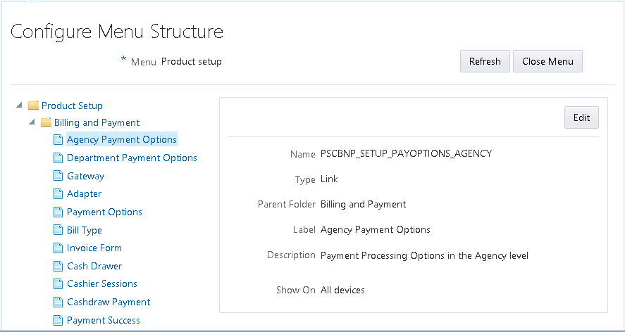
Select an item in the menu structure to view the details related to that menu item. Depending on the item selected, you have these options for configuring the menu.
|
Page Elements |
Description |
|---|---|
|
Refresh |
Refreshes the menu view to incorporate any recent changes you have made. |
|
Close Menu |
Closes the menu currently open. |
|
Edit |
Modify an existing menu folder or menu link. |
|
Add Link |
Add links to an existing root folder or menu folder. When you click Add Link, the Link Details page includes an additional section of configuration properties to specify the target URL. |
Configuring General Menu Item Properties
Menus contain menu items, which can be menu folders or menu links. Most of the properties you can view and set for menu folders and menu links are the same. Properties specific to a particular menu item type are noted below.
|
Page Elements |
Description |
|---|---|
|
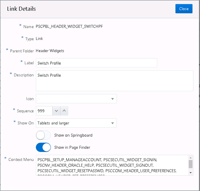
Name |
Identifies the name of the menu item, as it is identified within the application. You cannot change this value. |
|
Type |
Indicates the type of menu item, which can be: root folder, folder, or link. |
|
Feature Area |
Indicates the feature area to which the link to a page belongs, if applicable, such as Permits. Note: Typically, this value
is read-only and used internally.
|
|
Parent Folder |
Indicates which root folder a menu folder or menu link exists within. Note: Applies only for menu
folders and menu links, not root folders.
|
|
Label |
Identifies the menu item as it appears in the interface. |
|
Description |
Enter any descriptive text to help document the purpose of the menu item to other administrators. |
|
Icon |
Select an image from the drop-down list to display as an icon for the menu item. Note: This icon appears on
these navigation features: the Navigator menu, the agency springboard,
and the page finder. However, the icon may be a different size and
display different color combinations depending on the navigation feature
being used.
|
|
Sequence |
In the case of multiple folders or menu links within a folder, set the order a menu item should appear in relation to the others. Any menu items sharing the same sequence number are arranged alphabetically. Otherwise, you can set the sequence: 0, 1, 2, 3, and so on. Note: The delivered menus
use hundreds as sequence values for menus and tens for sequence values
for menu items. For example, the eighth menu folder in the menu structure
has a sequence value of 800, and the second menu link within that
menu folder has a sequence value of 20.
|
|
Show On |
Select the device sizes for which the application displays the menu item. This option enables you to expose or hide menu items, as needed, depending on the device size. For example, some pages may be more suitable for larger devices, while others may have been developed specifically for smaller devices.
Note: The application doesn’t
determine the actual device type, but uses the viewport size for the
Show On option.
|
|
Show on Springboard |
Turn on to have the icon for the menu link appear on the springboard, which can be accessed by agency staff only. Note: Applies only to menu
links.
For more information on springboards, see Setting Up the Agency Springboard. |
|
Show in Page Finder |
Turn on to have the icon for the menu link appear in the page finder navigation feature. Note: Applies only to menu
links.
For more information on the page finder, see Using the Page Finder. |
|
Page Contents |
The edit box appears only for these menu items:
This edit box enables you to manage content links that appear on a landing page or springboard. Enter a comma-separated list of menu item names. For example, the Anonymous Public Landing Page link points to the Anonymous Landing Page Data folder (PSCHM_GUEST), so in the Page Contents edit box, the following is entered: PSCHM_GUEST When the Anonymous Landing Page loads, it displays the menu links contained within PSHCM_GUEST folder. Note: Delivered menu items
for landing pages or springboards can refer to a single menu folder
containing menu links. The menu folder, in this case, includes all
of the links to appear on the landing page or springboard. Or, you
can provide a list of menu links.
|
|
Context Menu |
The edit box appears only for menu items that display a menu, such as:
This edit box enables you to manage content links that appear on a drop-down list for the UI widget. Enter a comma-separated list of menu link names. For example: PSCPBL_SETUP_MANAGEACCOUNT, PSCSECUTIL_WIDGET_SIGNIN, PSCNV_HEADER_ORACLE_HELP, The menu link names added to the list appear in the list for that page control or widget. |
Configuring Target URL Properties
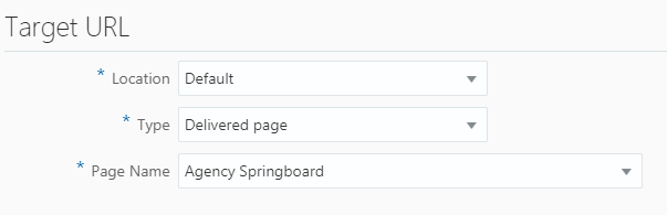
When you are adding a new link, you specify properties that control the link destination and how the link behaves.
This example illustrates the Target URL settings, which are described in the surrounding text.
|
Page Element |
Description |
|---|---|
|
Location |
Specify where the target content should display:
|
|
Type |
|
|
Hide from public user |
Applies only if the target type is URL. If turned on, the application displays the menu link only to agency staff (users with the following privilege: PSC_ACCESS_AGENCY_SPRING_BOARD_PRIV). Otherwise, the application displays the menu item link to all users. Note: This option does not
apply or remove security; it only controls if a link is visible to
public users or not.
|
|
Page Name |
If you selected a target type of Delivered Page, select the page to which you want to link. |
|
URL |
If adding a URL target type, add the URL here. Enter a fully qualified URL, including the protocol, such as http://, https://, ftp://, and so on. For example: http://google.com https://confluence.bigcity.gov/permit_info.html |
Setting Widget Attributes
Widgets are the user interface constructs the user can view and click, such as the items in the Header Widgets menu folder, the Widget Links folder, and so on. For widgets you can specify custom CSS style classes if needed. You add your CSS using the Free-form styles branding attribute, and then reference it from the Widget Attribute settings.
Depending on the widget and where it is displayed, the system displays one or all of the widget attributes. For example, in the case of the Help widget, by default, you see two widget attributes Style Class and Context Menu Icon. Style Class enables you to apply a style to the overall widget, and because Help appears in the Switch Profile context menu, you can use Context Menu Icon to display the help icon, if desired.
|
Page Element |
Description |
|---|---|
|
Style Class |
Specify the style you want to apply to the widget. |
|
Display Mode |
|
|
Icon |
Specify style classes to define the widget icon. |
|
Context Menu Icon |
Specify the icon you want to appear for the option in the context menu, if desired. |