Displaying Form Elements Conditionally
This topic describes how you can show or hide elements on your forms depending on selections users make on other form elements.
You can configure some form elements to be either displayed or hidden, depending on the value of other fields in the form. Displaying form elements conditionally enables you to streamline and simplify the form to show only information that is relevant for the current intake form being filled out.
For example, assume you want to display a page tab displaying fields related to a solar panel project only if the public user selected a the "Solar" single-item check box in a “Building Options” section of a permit application form. In this case, you can set the Solar single-item check box as the controlling element for the Solar page tab, having the Solar page (the controlled element) display only when the Solar single-item check box is selected.
Form elements that can control the display of other elements are controlling elements. Form elements that can be shown or hidden based on the value of a controlling element are controlled elements. The following table describes the elements involved in conditional display.
|
Display Type |
Element Types |
Description |
|---|---|---|
|
Controlling Element |
|
Form elements that determine whether another form element is displayed, depending on the value selected by the user. Note: Fields contained in delivered field
groups, can't be selected as controlling elements.
|
|
Controlled Element |
|
Form elements that can be displayed conditionally, depending on the value of the associated controlling element. To control when these elements appear, click the Control Display button in the Display section on the Attributes tab. The Control Display button appears only for these element types. |
Procedure: Configuring Conditional Display
To configure conditional display for a form element:
Add the controlling element to a group box in your application form.
Note: The controlling element must be located before the controlled element in the sequence of the form layout. The controlling element must reside on the previous page tab or, if on the same page tab, above the controlled element.-
Add the form element that you want to display or hide conditionally (the controlled element).
Select the controlled element you just added so that it is the active element in the layout.
In the Attributes panel, expand the Display section, and click Control Display.
On the Control Element Display dialog box, click Add to add a row to the grid, then double-click in the newly added row to activate it.
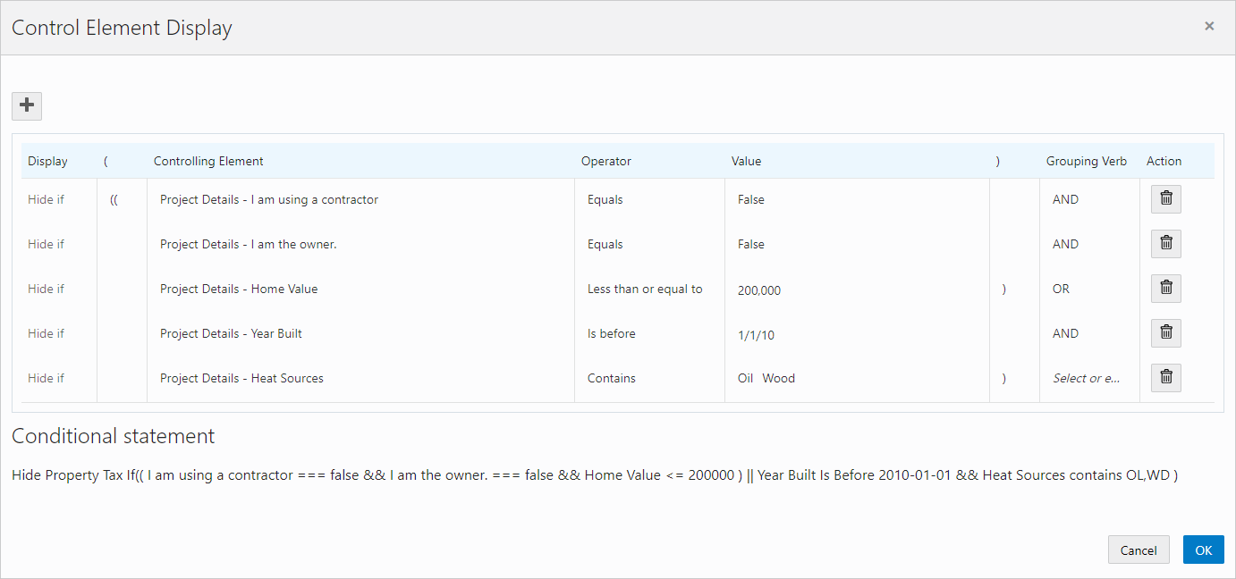
Note: Once you add a row to the grid and activate it by double-clicking, you must enter a value before clicking OK.This example illustrates the Control Element Display dialog box set to show a set of condition expressions of a controlling element, using multiple expressions that are evaluated to determine of a controlled element is displayed or hidden.
Element
Description
Add
Click to add a new row to the grid.
After adding a row, double-click the row to make it active.
Opening Grouping
Use the opening parentheses to establish the beginning of a grouping of one or more conditions in the expression. You can nest groupings up to three levels using (, ((, and (((. Make sure to balance (pair) the opening and closing groupings. That is, you need the same amount of left parentheses as you do right parentheses.
Controlling Element
Select the form element that will control the display of the selected predefined form element or group box.
The drop-down list displays all eligible controlling elements that exist on or before the current page tab in the form.
Selecting the controlling element appearing before the controlled element adheres to the logical sequence a user would take when completing the application form.
Operator
Select the operator to be used when evaluating the expression for each row in the condition grid. Depending on the field’s data type, the list of operators changes to show only those that apply. For example, if you are evaluating a date field, the operators you can select are different for those available for a number field.
-
Equals
-
Not equal to
-
Greater than
-
Less than
-
Greater than or equal to
-
Less than or equal to
-
Contains
-
Does not contain
-
Is before
-
Is after
Value
Select or enter the value selected on the controlling element the expression uses to compare and evaluate.
Depending on the data type of the field, the controls you use to specify the value will differ. For example, for a date field, you use a date picker control, for number fields you enter the value manually, for drop-down lists you select the value from a drop-list, and so on.
Note: For multi-select lists and check box sets you can select multiple values.Closing Grouping
Use the closing parentheses to establish the end of a grouping of one or more conditions in the expression. You can nest groupings up to three levels using ), )), and ))). Make sure to balance (pair) the opening and closing groupings. That is, you need the same amount of left parentheses as you do right parentheses.
Grouping Verb
Select AND or OR to include a logical operator. All condition rows in the grid require a grouping verb, except for the last condition in the sequence, which can't have a grouping verb selected.
Action
Displays the Delete button to remove the row from the grid.
Condition Statement
As you build your set of conditions by adding individual expressions on each row, the Condition Statement dynamically displays the entire logical expression enabling you to visualize the statement and verify your logic.
-
Click OK.
Save your form.
Identifying Controlled and Controlling Elements
The controlled element appears with an icon below the element label to indicate it is an item whose display is controlled by another element in the intake form.
This example illustrates the icon displayed for a controlled element.
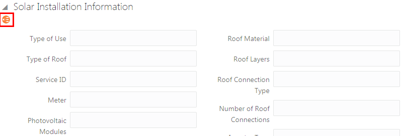
When you have selected a controlled element or a controlling element, you can see a list of the associated elements in the Attributes panel. Expand the Display section and look beneath the Control Display button.
For example, for a controlling element, you can see text similar to:
Controls the display of:
<page tab name> - <element name>
And, in the case of a controlled element, you can see text similar to:
Controlled by:
<page tab name> - <element name>
Working with the Conditional Display of Pages
This section describes items to consider when using the conditional display feature with pages, which includes:
Hiding a page based on a controlling element.
Hiding all elements on a page.
You can control the display of an entire page based on the value of a controlling element in the intake form. Doing so introduces dynamic display features to your intake form that can streamline the form significantly. Based on the user’s previous field selections can determine whether a page displays or is hidden, providing users an improved experience. Using this feature, only the pages relevant to the user’s transaction would be displayed. As selections are made, the pages appear or become hidden accordingly.
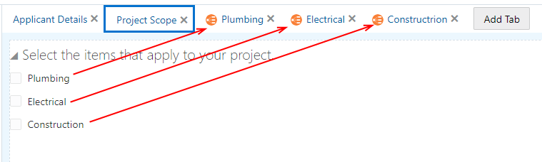
This example illustrates single-item check boxes controlling the display of the corresponding intake form pages.
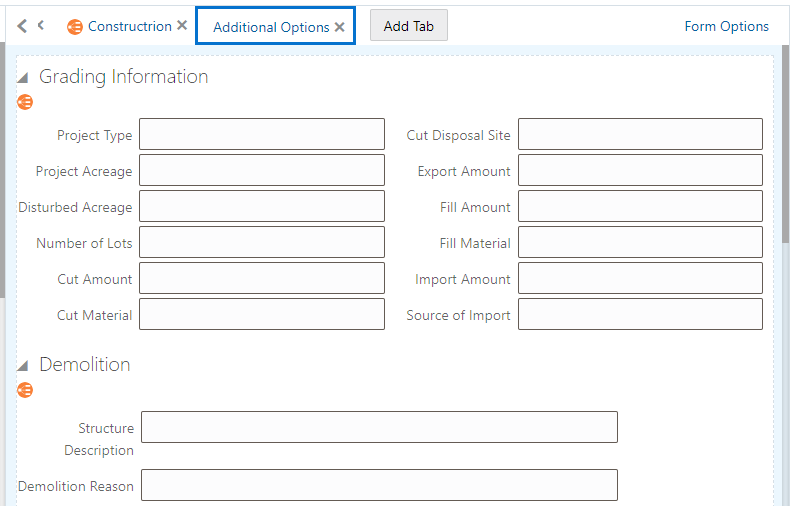
In cases where all of the elements on a particular page are controlled elements and each element’s controlling element’s display conditions cause all the elements on the page to be hidden, the system will hide the entire page.
In the following example, each element on the page is a controlled element. If each element becomes hidden as a result of the values selected for the controlling element, the entire page becomes hidden.
This is an example of all elements on a page being controlled elements. Details are in the surrounding text.