Flexible Reporting in Redwood Dashboards
You can now define Oracle Transactional Business Intelligence (OTBI) content to use as a data source for Redwood Analytics in certain Fusion pages. These pages will appear in this and future release documentation. This document centrally describes the feature.
In summary, the process for defining your own Redwood Analytics is as follows:
- Create OTBI reports that provide the necessary data to present to your users.
- Create a Visualization Configuration for each Redwood Analytic you require.
- Use the Edit Page Layout feature to drag and drop new Redwood Analytic KPIs and Visualizations onto your dashboards.
This document does not cover the creation of OTBI reports.
Please refer to the Tips & Considerations section for guidance on how to make the most of this new feature.
VISUALIZATION CONFIGURATION
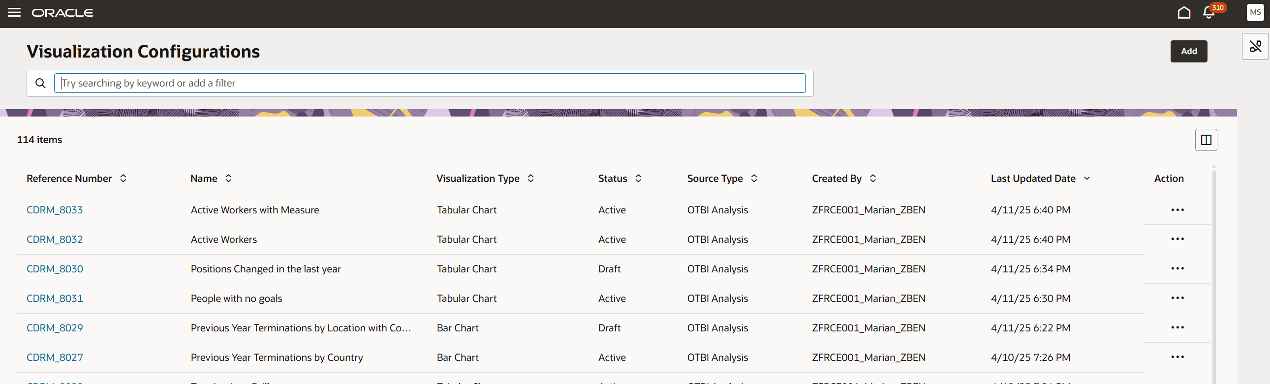
Redwood Analytics: Visualization Configurations
You can find this page by appending /fscmUI/redwood/cx-analytics/application/container/dvconfig after the ".com" of your pod. New KPIs and Visualizations are added using the Add button.
Redwood Analytics - Add Visualization
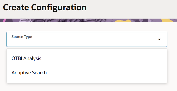
Select the OTBI Analysis source type.
Redwood Analytics - Add Visualization
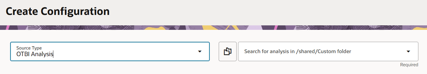
Select the folder where your OTBI analysis is saved, search for your OTBI analysis and select it from the LOV.
Redwood Analytics - Add Visualization
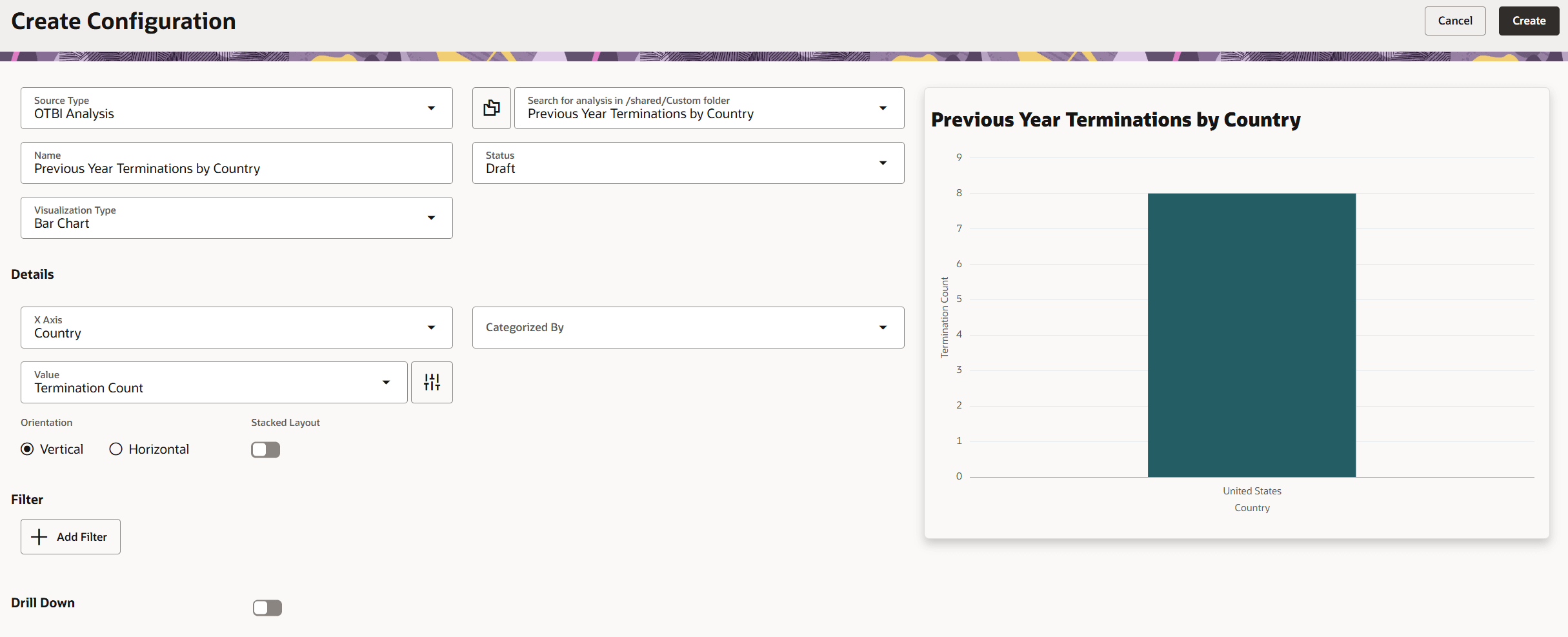
The page will automatically select a Visualization Type based on the data in your OTBI report. The Details fields will be populated for you, and the Redwood Analytic will be displayed on the right. The fields in Details vary depending on the visualization type. The following visualization types are available:
- Bar Chart
- Combo Chart
- Area Chart
- Pie Chart
- Donut Chart
- Funnel Chart
- Scatter Chart
- Bubble Chart
- Line Chart
- Metric Card
- Meter Gauge Chart
- Tabular Chart
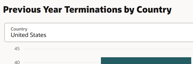
All types, except for Metric Card, will create a visualization. Metric Card will create a KPI, optionally with a color coded badge which can be based on static values (for example a red badge denotes high turnover if it exceeds 10%). Other visualizations provide the ability to define report parameters based on the columns available in the OTBI report, these are called Filters. For CX users, you can also drill from a visualization to a CX page.
Redwood Analytics - Add Visualization - Filter
We recommend exploring the opportunities that these Redwood Analytics offer, but please review the Tips & Considerations section to get the most out of this feature.
Finally, when you are happy with your visualization, change the status to Active. Note that if you need to change anything later you must inactivate the status, save the visualization and then change the status back to Draft.
ADDING VISUALIZATIONS TO A DASHBOARD
You will be notified (in future What's New documents) of the pages that support these visualizations in each product as they are released. The examples shown here are from the (HCM) Recruiting Activity Center.
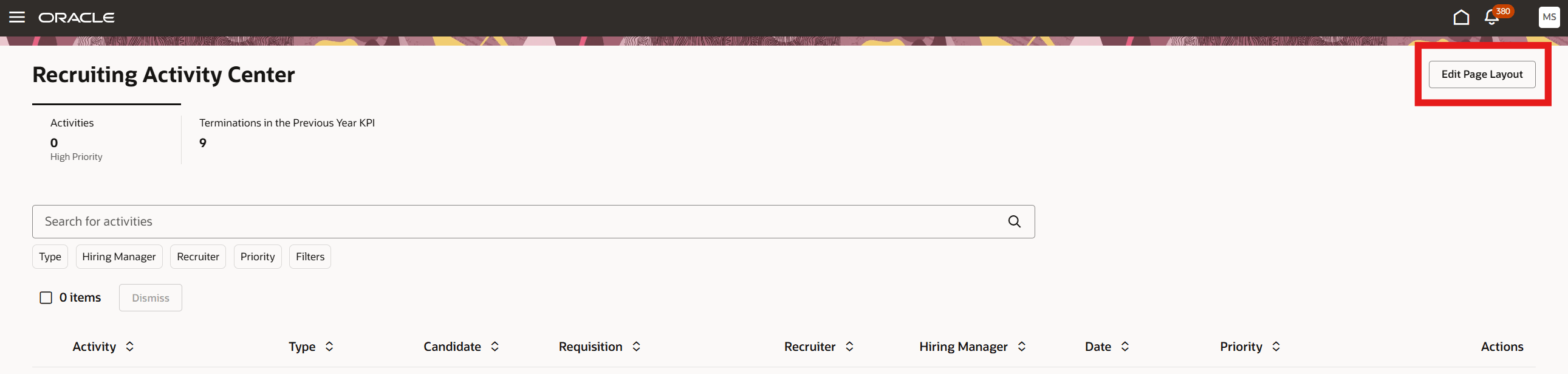
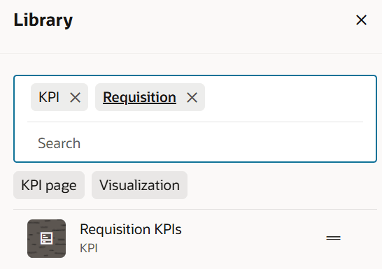
Clicking on Edit Page Layout will open a panel on the right containing a library of all the defined Visualizations. This content library contains all the visualizations (KPIs and content) regardless of product or context of where it is meant to appear.
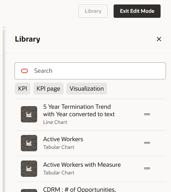
Redwood Analytics - Add Visualization to Dashboard
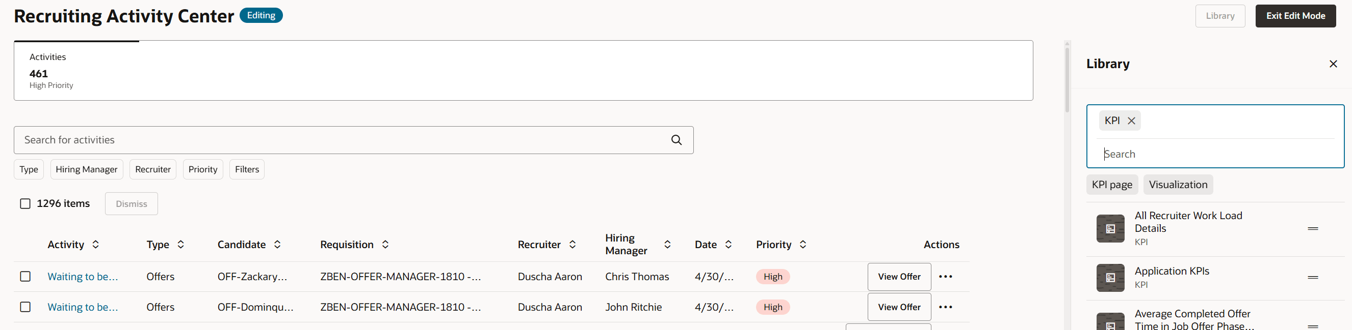
Filter on KPI to create a new tab in the dashboard.
Redwood Analytics - Add Visualization to Dashboard
Further filter the list to find the KPI visualization you are interested in.
Redwood Analytics - Add Visualization to Dashboard
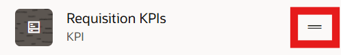
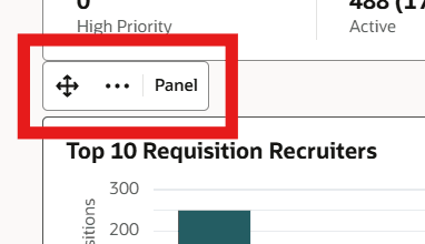
Select the movement anchor and drag and drop your KPI to the dashboard tab line.
Redwood Analytics - Add Visualization to Dashboard
Redwood Analytics - Add Visualization to Dashboard
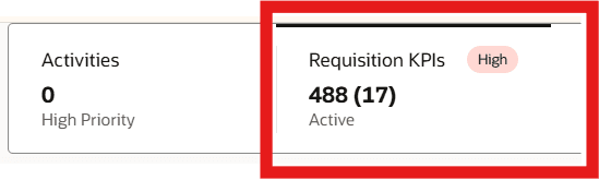
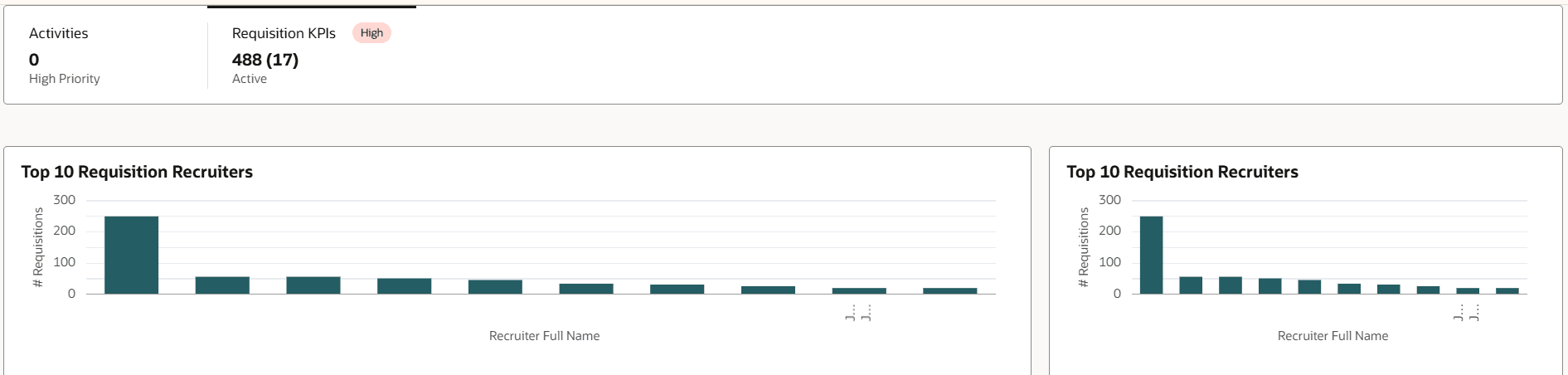
A new empty dashboard tab will be displayed when this tab is active. You can now remove the KPI filter and add the Visualization filter. You can drag and drop up to three visualizations into a dashboard tab page.
Redwood Analytics - Add Visualizations to Dashboard
Hover over a visualization and use the floating control to move it, or to remove it.
Redwood Analytics - Add Visualization to Dashboard
Finally, you can exit edit mode.
You are able to define your own dashboard to present your own KPI tabs and analytics that are relevant to the line manager.
Steps to Enable and Configure
These are covered in the description and access requirements.
Tips And Considerations
This may not be a comprehensive list of tips and considerations, but it should cover the most common ones.
- A line chart cannot handle numeric values on the x-axis. You must CAST the value to CHAR in OTBI for it to work. This limitation may also apply to other chart types. In the Visualization Configuration tool, you may also need to clear the Category field.
- The Tabular Chart type in the visualization tool may display the error: "Select values for all the required fields to generate the visualization." The solution to this issue is currently unknown.
- The X-Axis LOV in the configuration tool will only display the first 8 columns in the OTBI report. Therefore, please reorder the columns in the OTBI report as needed.
- Several OTBI features are not supported by the visualization tool. The following features are not supported, though this list may not be complete:
- View Selector
- Column Selector
- Drills
- Prompts
Access Requirements
The following privileges are required:
- Visualization Configurator:
- To view the dashboard: ZCA_VIEW_DATA_VISUALIZATION_CONFIGURATION_PRIV
- To configure the dashboard: ZCA_MANAGE_DATA_VISUALIZATION_CONFIGURATION_PRIV
- To edit and save KPIs and visualizations: HRC_MANAGE_SYSTEM_SEARCHES_PRIV
- Edit Page Layout is controlled via a different privilege for each dashboard and therefore these will be described on the What's New entries for each specific dashboard.