Redwood: Configure Pivot Tables and Graphs Using a New User Experience
You can select and configure the details of pivot tables and graphs to analyze data dependencies, constraints, performance, and other planning issues effectively. The configuration page fragment identifies the measures to be displayed, their levels of aggregation, filters, axes, and visualization types.
Configuring a table or graph
You can configure a visualization using the Actions menu at the top right corner. You can create or duplicate a visualization.
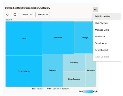
Actions Menu of a Visualization
Edit Properties
The edit properties option opens a drawer where you can change the properties, data, and layout of a visualization.
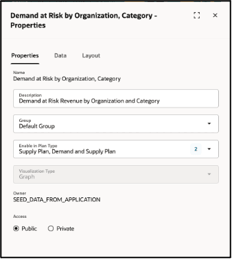
Edit Properties
Changing the properties
You can change the properties of a visualization using this option. The editable attributes are:
- Description: Description of the visualization.
- Group: Select the group for the visualization. All out-of-box visualizations are part of the Default group. However, you can select other user-defined groups.
- Enable in Plan type: Select the type of plan where you want this visualization to appear. When you are creating a new visualization, by default it’s enabled for the current plan type. However, you can enable it for other plan types, so that it’s visible in the specified plan types. The measures and hierarchies specified in the visualization must be available in the plan types for it to be rendered correctly.
- Owner: User who created the visualization. Application administrators with a special privilege (MSC_MANAGE_PLANNING_OBJECTS) can reassign the visualization to a different owner.
- Access: Access to everyone or only you. Private access means that the visualization will not be visible to any other user. Public Access means that the visualization will be visible to all users but can only be edited by its owner.
Changing the Data
You can change the measures, hierarchies, time members, and other filtered dimension members and measure criteria that are applicable to a visualization.
- Measures: By default, the current visualization displays only the selected measures. To view both selected and unselected measures, click the Show All option in the menu. You can select measures using a keyword search or by choosing from the available list. The available measures are based on the measure catalog of the currently selected plan. To filter the list, enter a keyword. For example, if you enter Demand, the list will narrow down to measures containing the keyword, such as Demand at Risk and Total Demand, grouped under their respective measure categories.
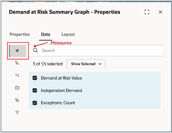
Measures
- Hierarchies: Click the Hierarchies icon to select dimensions, hierarchies, and levels to include or exclude in the table or graph. The available dimensions and hierarchies are based on the plan's dimension catalog, but only those relevant to the selected measures are displayed. Choose the appropriate levels within the hierarchies for your visualization. To view and select from all available hierarchies, select Show All from the menu.
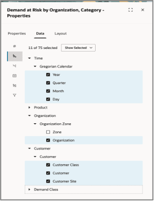
Hierarchies
- Show Unassociated: Click this icon to display the measure values that aren't associated with a specific dimension in the table or graph.
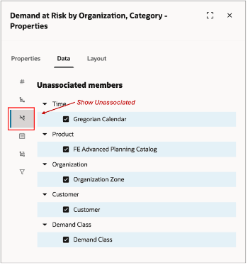
Show Unassociated
For example, a table could include Net Forecast and Planned Orders measures and Organization, Category, Item, and Customer as the levels. Customer level is relevant only for Net Forecast measure and not the Planned Orders measure. Here’s how the data is displayed when the Show Unassociated isn’t selected for customer dimension and when it’s selected for customer dimension.
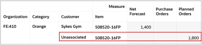
Unassociated Member
- Calendar: Click this icon to choose the type of calendar. There are two ways to filter the data based on time. You can either apply filters based on time range or pick specific months, periods, or other time levels.
The following options are available to define a time range:
- Automatic: This is the default option. This option automatically applies the date filter based on the plan options. For example, in supply plans, this is typically from the Plan Start Date to Plan End Date except in the case that the current plan has a value specified for the plan option Days in the Past for Measure Display. In this case, the start date is calculated as Plan Start Date - Days in the Past for Measure Display. Different plan types have different options of how the automatic filters are applied.
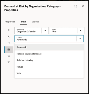
Time Range: Automatic
- Relative to Plan start date: You can specify the date filter with reference to the plan start date as an anchor date in the Before and After fields. The system calculates and shows the date filter accordingly. This filter is then dynamically recalculated after plan runs with reference to the new plan start date.
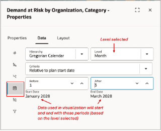
Relative to Plan Start Date
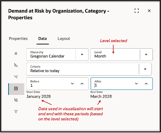
- Relative to Today: You can specify the date filter with reference to the current date as an anchor date in the Before and After fields. The system calculates and shows the date filter accordingly. This filter is then dynamically recalculated every time the visualization is opened to recalculate the date filter.
Relative to Today
- Range: Specify an absolute date range manually.
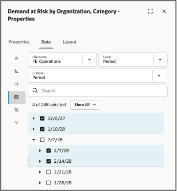
- Year: You can specify a date filter by manually selecting the time periods. You can search and select the months, periods, or weeks using the level and search options. When you search for a level, the level members and their children are shown. This allows you to easily pick members at different levels. For example, you can specify periods 1 and 2 and then only first two weeks in period 3.
Time Range
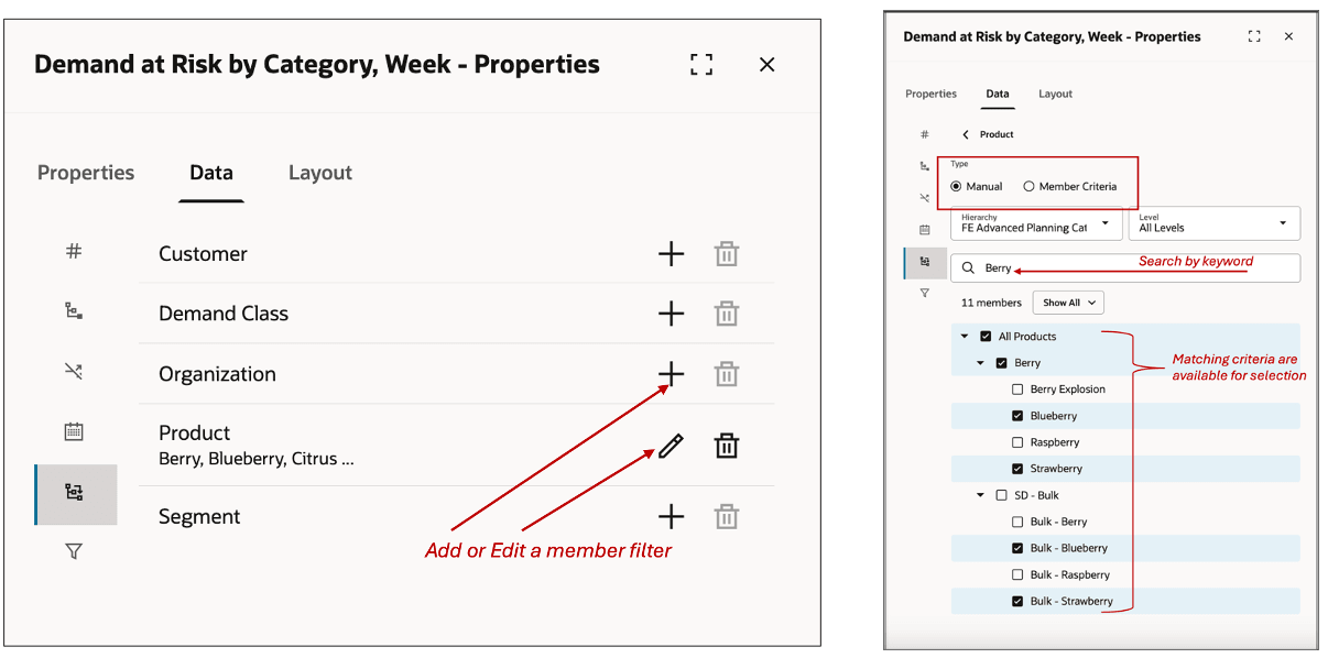
- Members: Click this icon to select member filters for the selected dimensions. You can do this manually by selecting the Manual option or defining member criteria for each dimension. For the dimensions that already have selected filters, an edit icon is shown with a brief indicative list of filtered members.
Adding Members
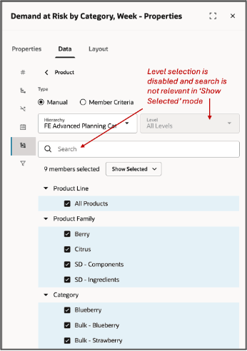
- In Show Selected mode, Levels is disabled, and the search is not relevant. The level and search are used in Show All mode to find and select members. Toggle the Show All/Selected option to review the selected members or to select more members respectively. When searching for members, the search is done for the selected level and all the children of those levels and automatically expands the levels to show the results. The list of members that are shown are not dependent on the measures selected. Instead, all members in the plan that match the search are shown irrespective of whether they have data for the selected measures.
Selecting Members Manually
Instead of manually selecting the members, you can search for them using the following criteria:
- Attribute of the selected level such as Item's name, description, Planner, or lifecycle phase. Level attributes enabled for analytics in the Configure Planning Analytics task are available.
- Parent level criteria such as include all items of Berry Category.
The displayed results reflect the current plan setup. However, when using criteria-based selection, only the criteria are saved, not the resulting member list. These criteria are reevaluated each time the visualization is rendered, so the results may change dynamically. Additionally, you cannot enter multiple criteria conditions for a single dimension.
Some important considerations:
- Only member criteria can be specified for a given dimension.
- The member criteria option does not apply to Order Type and Exception Type dimensions.
- Switching from the member criteria option to manual selection clears all existing criteria for that dimension.
- Measure Criteria:You can use measure criteria to filter members by specifying conditions on one or more measures. If multiple measure criteria are defined, you can choose whether they should be evaluated using an AND or OR condition. This choice is available only for the first measure criterion and applies to all subsequent criteria. Mixing AND and OR conditions within the same visualization is not supported. By default, measure criteria are always evaluated for the entire visualization scope rather than a defined subset.
Measure criteria can be defined in the following ways:
-
- Value-Based or Comparative Conditions: Compare a measure’s value directly or against another measure within the visualization. For example, Projected Available Balance less than Safety Stock.
- Ranking Conditions: Filter based on rankings, such as the top 10 items by value or percentage.
You can specify the levels at which each criterion is evaluated. For example, if the levels are defined as Week, Category, and Organization, measures are aggregated to these level combinations before applying the condition.
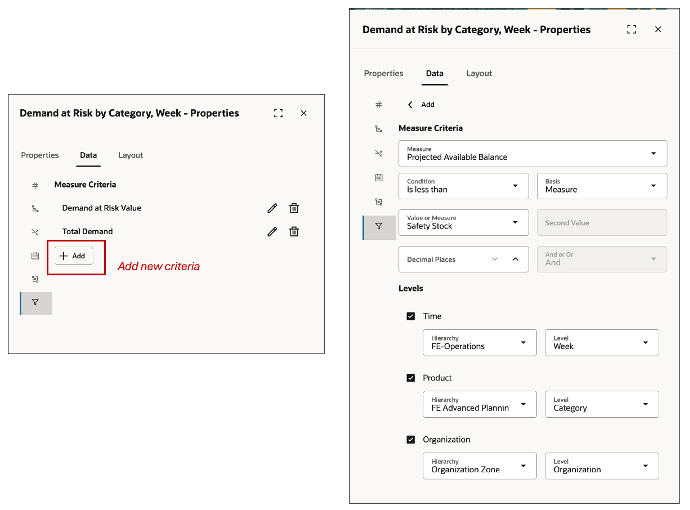
Measure Criteria
Changing the Layout
You can configure the layouts of pivot tables and graphs here.
Configuring Levels in the Pivot Table
- The levels selected from the Hierarchies section in the Data tab are displayed here. You can arrange them in the rows, columns, and filter sections of the Pivot table alongside Measures.
- Reordering Levels: Drag and drop levels using the = icon to adjust their order.
- Hiding Levels: Drag levels into the Hide section to remove them from the Pivot table.
- Apply vs. Save: Click Apply to preview changes without saving. Click Save to permanently store your edits.
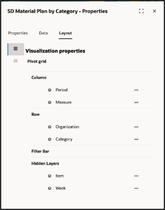
Pivot Table Layout
The new Redwood user experience to configure graphs currently supports 18 different types of graphs. These are:
- Vertical Bar Graph
- Vertical Dual Y-Axis Bar Graph
- Vertical Split Dual Y-Axis Bar Graph
- Vertical Stacked Bar Graph
- Vertical Stacked Dual Y-Axis Bar Graph
- Vertical Stacked Split Dual Y-Axis Bar Graph
- Vertical Percent Bar Graph
- Horizontal Bar Graph
- Absolute Line Graph
- Absolute Line Dual Y-Axis Graph
- Absolute Area Graph
- Treemap
- Sunburst
- Pie
- Combination Graph
- Combination Dual Y-Axis Graph
- Bubble
- Radar
For Vertical, Vertical Stacked, Vertical Percent, Horizontal, Horizontal Stacked, and Horizontal Percent Bar Graphs you can configure which dimensions (or all the selected measures) are shown on X or Y axis.
In addition, you can pick one or more specific levels as graph filters. You can also turn on or off the display of the visualization name as title, configure axis label rotation, and axis scale options to be scaled automatically or manually.
In the visualization details section, you can configure the legend position their interaction pattern and turn on or off the data labels in the graph. For Dual Y-Axis Graphs - an additional Hierarchy and Measure selection is available as shown in the bar graph.
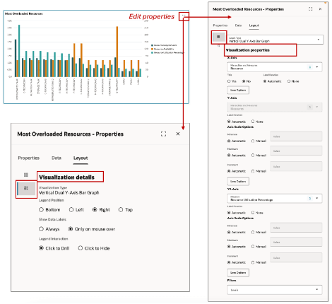
Bar Graphs
For Line, Stacked Line and Absolute Line you can configure which dimensions (or all the selected measures) are shown on X or Y axis.
In addition, you can pick one or more specific levels as graph filters. You can also turn on or off the display of the visualization name as title, configure axis label rotation, and axis scale options to be scaled automatically or manually. The lines on the graph can be formatted to be dashes, dotted or solid lines. For Dual Y-Axis line graphs, an additional Hierarchy and Measure selection in available. In the visualization details section, you can configure the legend position their interaction pattern and turn on or off the data labels in the graph.
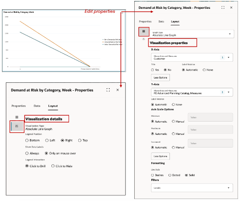
Line Graph
For the Pie graph, you can assign the hierarchy, and choose the title display option as explode or unite pie. You can adjust the labels display options to be either inside or outside the pie. The data label format can be adjusted to be text, value or percentage or a combination with text and value or text and percentage. In addition, you can pick one or more specific levels as graph filters.
In the details section, you can set the position of the legend, and configure mouse actions like whether data labels are shown only mouse over and if a click should allow the user to drill down.
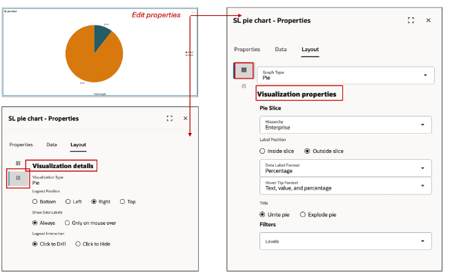
Pie Chart
For Combination graphs, identical to the X, Y and Dual Y-Axis hierarchy selection, where you can assign multiple measures, in bar and line graphs described above, you can also define the style, dashed, dotted or solid to be used for the Line, and which of the measures will appear as an area, bar or line in the combination graph. Similarly, you can provide details for legend and labels display and interaction with mouse over and click actions.
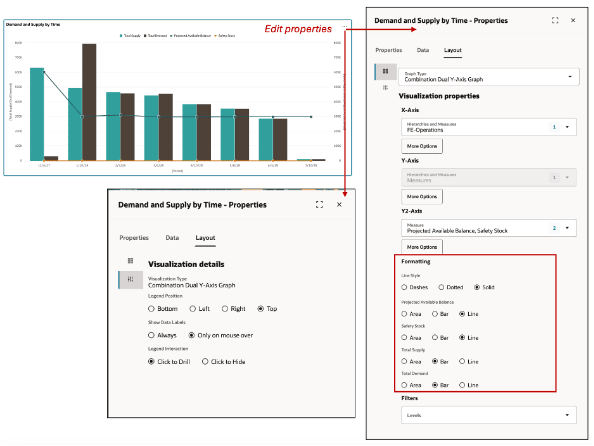
Combination Graphs
Sunburst graphs can be structured in two ways:
- Hierarchy-Based Structure: The graph is generated based on the selected hierarchy, displaying a multi-tiered representation corresponding to its structure.
- Level-Based Structure: You can define primary and secondary levels manually, even selecting levels from different hierarchies. For example, Category can be set as the primary level and Organization as the secondary level.
Filtering and Data Representation
- Filtering: You can apply filters to display a list of members for the selected level, allowing dynamic data selection.
- Sector Sizing and Color Gradient: The sector sizing measure determines how the sunburst is rendered. You can define a separate measure for the color gradient, with configurable minimum and maximum values to visually represent variation across level members.
Label and Interaction Customization
- Label Positioning & Display: Choose where labels appear and whether they are displayed in actual values or percentages.
- Mouse Interaction Settings: In the Details section, configure mouse interactions, such as showing data labels only on hover or always visible.
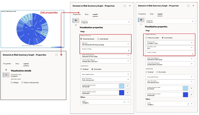
Sunburst Graph
The Bubble Graph is configured similarly to a bar or line graph, with an additional parameter to define the measure used for bubble size. The bubble size adjusts dynamically based on the relative differences in the measure across members of the selected hierarchy.
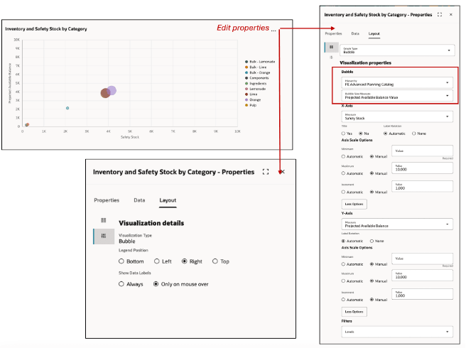
Bubble Graph
Treemap graphs can be structured in two ways:
- Hierarchy-Based Structure: The graph is rendered based on the selected hierarchy, displaying a multi-tiered arrangement of rectangles.
- Level-Based Structure: You can manually define primary and secondary levels, even selecting levels from different hierarchies. For example, Category can be set as the primary level and Organization as the secondary level.
Filtering and Data Representation
- Filtering: Apply filters to display a list of members for the selected level, enabling dynamic data selection.
- Rectangle Sizing and Color Gradient: The rectangle sizing measure determines how the treemap is rendered. You can define a separate measure for the color gradient, selecting colors using a color picker or hex code. The size and color parameters visually represent differences in the two measures across level members.
Label and Interaction Customization
- Label Positioning & Display: Set label positioning and choose to display values as actual numbers or percentages.
- Mouse Interaction Settings: In the Details section, configure mouse interactions, such as displaying data labels only on hover or always visible.
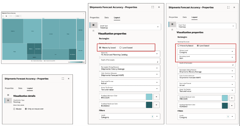
Treemap Graph
The Radar Graph allows you to visualize the performance of a group across multiple measures.
- Define a Group: Specify the data group and the measures to be plotted.
- Apply Filters: Add filters to display a list of member values, allowing interactive selection within the graph.
- Customize Labels and Legends: Configure the position and display settings for labels and legends to enhance readability.
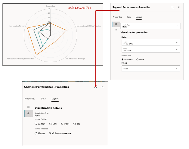
Radar Graph
You can view or edit a visualization’s properties from the Planning Visualizations menu, which opens the Visualizations page in a separate browser window, displaying all available tables and graphs.
Steps to Enable
Use the Opt In UI to enable this feature. For instructions, refer to the Optional Uptake of New Features section of this document.
Offering: Supply Chain Planning
Tips And Considerations
If you want to use the Redwood: Configure Pivot Tables and Graphs Using a New User Experience feature, then you must opt in to its parent feature: Replenishment Planning. If you’ve already opted in to this parent feature, then you don’t have to opt in again.
- The members shown in the members filter are based on a pre-computed search index that is built when the plan runs. If there is an error in the plan run or if there is any other system issue, the search index may not be created. This will be automatically corrected when the plan is run successfully.
- All the pivot tables and graphs (both the standard out-of-box ones and user-defined ones) created prior to this update are automatically migrated and are available in the new Redwood User Experience as visualizations that can be added to a page.
- For the pivot tables and graphs that use features and capabilities that are not supported in the Redwood User Experience such as member criteria of advanced filters, it is recommended to re-configure them with the new equivalent capabilities in Redwood.
- You cannot specify criteria for a subset of the visualization data (e.g., applying a condition to a specific organization or category).
Key Resources
- Refer to What’s New updates for the following features:
- Redwood: Use Graphs to Analyze Plans Using a New User Experience
- Redwood: Manage Visualizations Using a New User Experience
- Redwood: Manage Pages and Page Groups Using a New User Experience
- Redwood: Use Pivot Tables to Analyze Plans Using a New User Experience
- Redwood: Analyze Supply Plans Using a Configurable Redwood Page
Access Requirements
Users who are assigned a configured job role that contains these privileges can access this feature:
- Edit Planning Analytics Configuration (MSC_EDIT_PLANNING_ANALYTICS_CONFIGURATION_PRIV)
- View Planning Analytics (MSC_VIEW_PLANNING_ANALYTICS_CONFIGURATION_PRIV)
- Maintain Planning Tables (MSC_MAINTAIN_PLANNING_TABLES_PRIV)
- Delete Planning Tables (MSC_DELETE_PLANNING_TABLES_PRIV
These privileges were available prior to this update.
- View Planning Objects(MSC_VIEW_PLANNING_OBJECTS_REST_SERVICE_PRIV)
This is a new privilege.