Redwood: Use Graphs to Analyze Plans Using a New User Experience
You can now use the Redwood user experience to visualize planning information in a graphical form. Graph types include bar charts, line and area graphs, treemaps, sunburst and pie charts, bubble and radar charts, as well as combination charts. You can assign the measures to be displayed in each visualization, along with their dimensions, hierarchy levels and time intervals. You can also apply filters and other display criteria to tailor the view.
Visualize planning data with rich graphs and analytics
Use the flexibility and features of graphs to configure your analytics. You can view and analyze the risks and opportunities so that they can be addressed, and you can get insight into how well your plan is working across your planning dimensions and attributes. You can open existing graphs as needed from the Visualizations tab or use the Edit Page Layout option to open the content library and add graphs to the current Page Layout.
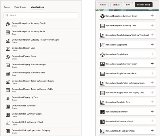
Content Library
You can also create a new graph in the Planning Visualizations page, and it can be configured using the Edit Properties option.
Managing Graphs
Adding, creating, and managing graphs
For list of supported and unsupported graphs refer to Layout section in the What’s New in Redwood: Configure Pivot Tables and Graphs Using a New User Experience.
All supported graphs are available in the Content Library as visualizations that can be added to a page. Refer to the What’s New in Redwood: Use Pivot Tables to Analyze Plans Using a New User Experience on how to add and manage a graph in a page.
To view, create, edit, or duplicate graphs refer to the What’s New in Redwood: Manage Visualizations Using a New User Experience.
Editing a graph’s properties, data, and layout
For details on how to edit a graph’s properties, data, and layout refer to the Configure Table or Graph section in the What’s New in Redwood: Configure Pivot Tables and Graphs Using a New User Experience.
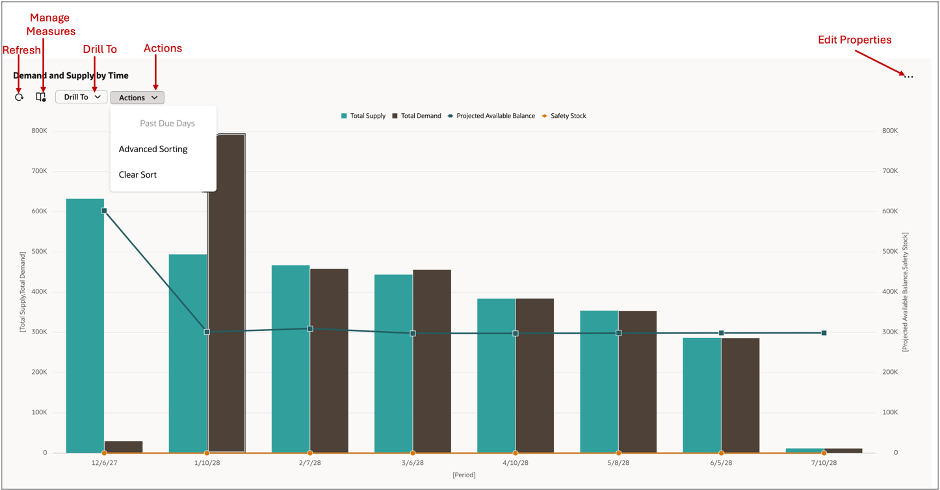
Refreshing the graph
If the graph is open, you can use the refresh option to see the updated data based on user edits or calculations. Any changes done to the graphs properties such as changing the measures, hierarchies, and layout of the graph are refreshed automatically after you select Apply and Close or Save options.
Change measures formats displayed in a graph
The formatting of the measures can be changed in the Measures option for the graph. Selecting this option opens the Measures and Expressions drawer. Here you can change the order of appearance of measures in a graph and format their properties.
Changing the order of measures in a graph
- Use the Show and Hidden sections to include or remove measures from the graph. To hide a measure from displaying in the graph, use the handlebars to move the measure to the Hidden section.
Change the order of the measures in the graph: Use the handlebars for a measure to move its display order before or after that of other measures.
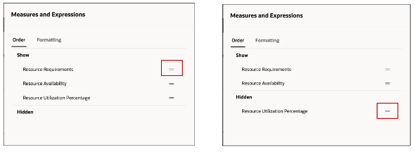
Change Order of Measures in a Graph
Edit measure format
Click the Edit icon in the display to edit the measure format for the different measures used in the graph.
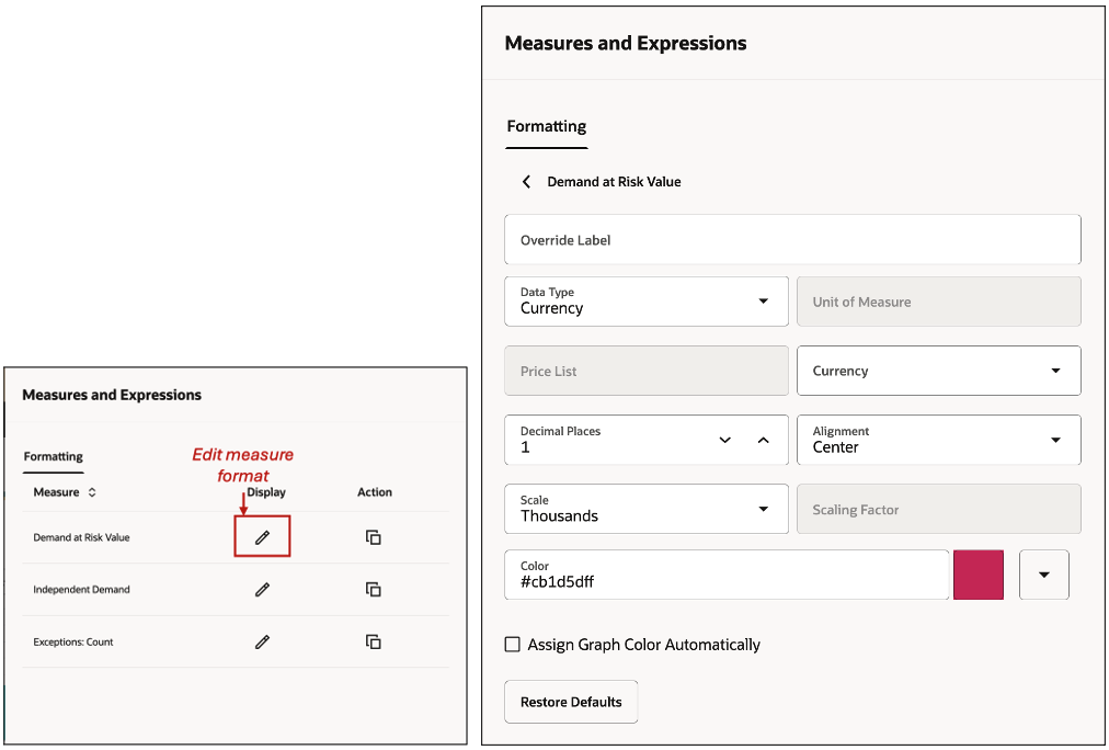
Edit Measure Format
When you configure the graph, the measure display settings will default to the measure definition, but you can override them. Even if you are not the table owner, you can customize the display to match your preferences, with the initial settings based on the owner's configuration. You can:
- Override the measure label. For example, Net Forecast can be labeled as Net FC.
- Change the Data Type. For example, number to currency.
- Define the number of decimal places for a measure.
- Change the scale of the measure. For example, whether the value displayed represents Units, Hundreds, or Thousands.
- Change the Scaling factor.
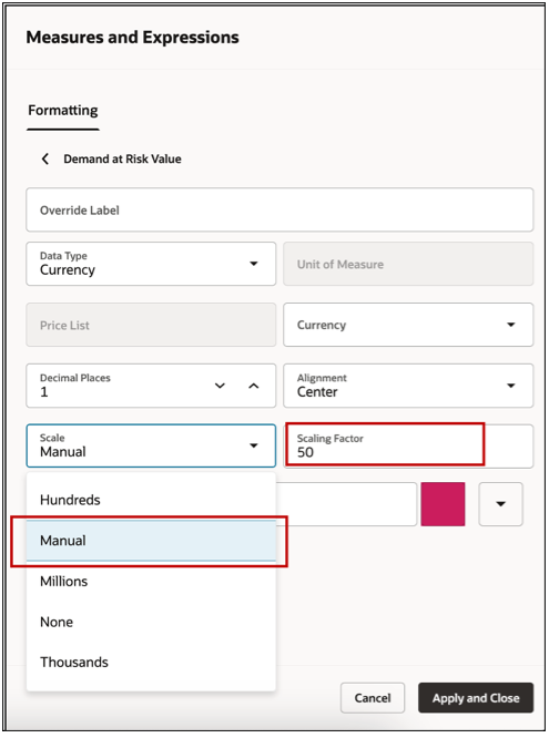
Scaling Factor
To change the Scaling factor, in the Scale section, select Manual. In Scaling Factor, assign a scale. You can choose the display unit of measurement for the measure, which defaults to its primary unit of measurement. If multiple units of measurement are enabled in the measure definition, you can toggle between them. To revert to the default settings, click the Restore Defaults button.
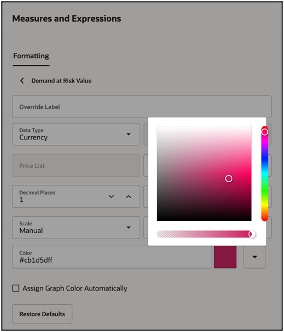
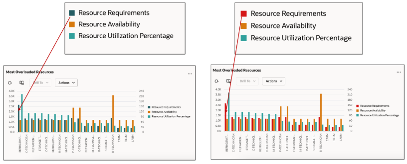
Assign Color: By default, graphs have pre-assigned color themes, but you can customize the measure colors. To change a measure's color, select one from the color picker or enter a hex color code.
Customize Graphs with Colors
For example, for Resource Utilization Percentage in a Resources graph you can assign a red color. If that measure is represented in a bar graph, it would show as a red bar.
Assigning Colors to Measures
To retain or revert to default colors, simply remove the hex color code set for measure.
Alternatively, you can use the option Assign Color Automatically for the graph.
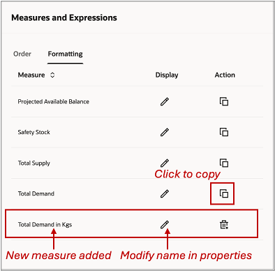
Copying or adding a measure
You can add a measure to your graph by copying the existing ones of the graph. This helps you to create copies of measures to view them in alternate units of measurements.
Copy a Measure
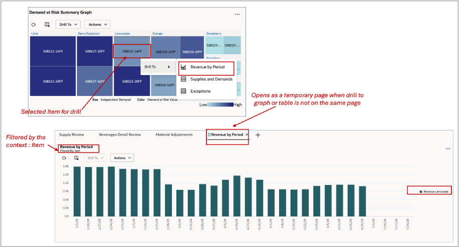
Drilling to a linked table to a page or graph
To enable flexibility in planning and analysis, you can use the Drill to feature that allows you to drill-to a linked Table, Graph, or Page.
Drilling to a Linked Table or Graph
With this you can get an in-depth view your planning data in the following scenarios:
- Drill to another visualization (table or graph) on same page.
- Drill to another visualization that isn’t present on the same page. This opens a temporary page containing only one target visualization. This is identified by a temporary page icon on the tab.
- Drill to another page in another tab. This passes the search context that shows in the filter criteria. All visualizations on the page are refreshed when the linked page is opened.
- Drill to another page that is not open in the current session. Dynamically a new tab is opened and filtered by the search context. The drill context is visible in the header of the opened page
Graph Interaction Actions
The following options are available:
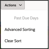
Advanced Sorting
The graph can be sorted by the chosen level members and measures by using the advanced sorting in the Actions button.
Advanced Sorting
For example, the Revenue by Period graph has Week and Category entities.
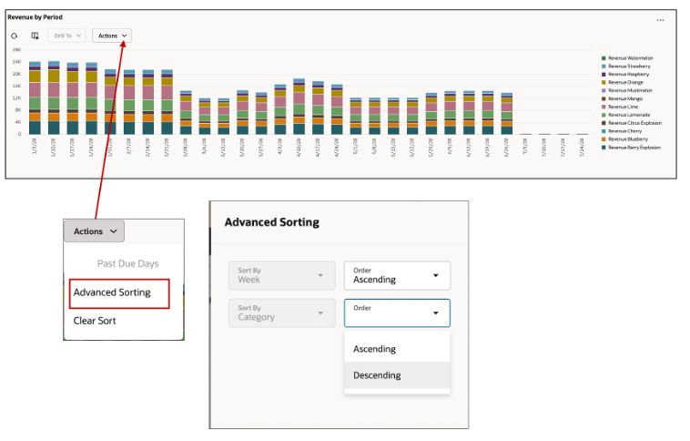
Advanced Sorting
The Clear Sort resets the sort to the last saved layout.
Resetting the layout of the Graph
The Reset Layout action restores the layout to its default state, undoing any changes made to the previously saved layout. Each user's saved layout is unique.
Past Due Days
By default, the graph displays data from plan start date. However, in a supply plan, if the plan option Days in the Past for Measure Display is set to a non-zero value, the graph will display those past due days.
Steps to Enable
You don't need to do anything to enable this feature.
Tips And Considerations
All existing graphs of supported types are automatically migrated from the classic experience to the new Redwood user experience and are available for you to use right away. No other setups are needed.
For performance reasons and for a superior experience each graph is limited to a maximum of 50,000 data points or combinations. You can use graph filters to limit the data as needed to control your data rendered at a time in a graph.
Classic experience features that aren’t supported
Measures and Member filter criteria: The filter criteria definition for measures and members definition in the classic experience have been merged into a single comprehensive user interface.
Label Rotation for graphs
Label rotation, a feature that allows the graphs label to be rotated automatically based the content of the graph is not supported for the following graphs:
- Vertical Dual Y Axis Bar Graph
- Vertical Split Dual Y Axis Bar Graph
- Vertical Stacked Dual Y Axis Bar Graph
- Vertical Stacked Split Dual Y Axis Bar Graph
- For Combination Dual Y Axis - Y-Axis Label Rotation
- For Bubble: Y-Axis Label Rotation
Other Unsupported features
- Printable page in toolbar options isn’t supported
- The title and subtitle free text input in Pie graph isn’t supported
Key Resources
- Refer to What’s New updates for the following features:
- Redwood: Configure Pivot Tables and Graphs Using a New User Experience.
- Redwood: Manage Visualizations Using a New User Experience
- Redwood: Manage Pages and Page Groups Using a New User Experience
- Redwood: Use Pivot Tables to Analyze Plans Using a New User Experience
Access Requirements
Users who are assigned a configured job role that contains these privileges can access this feature:
- View Planning Objects(MSC_VIEW_PLANNING_OBJECTS_REST_SERVICE_PRIV)
- Edit Planning Analytics Configuration (MSC_EDIT_PLANNING_ANALYTICS_CONFIGURATION_PRIV)
- View Planning Analytics(MSC_VIEW_PLANNING_ANALYTICS_CONFIGURATION_PRIV)
- Maintain Planning Tables(MSC_MAINTAIN_PLANNING_TABLES_PRIV)
- Delete Planning Tables(MSC_DELETE_PLANNING_TABLES_PRIV)
These privileges were available prior to this update. View Planning Objects Using REST Service is a new privilege.