Manage Plan Analytics for Inventory Optimization Plans
You can use predefined visualizations to provide actionable insights into supply chain networks, inventory value, safety stock levels, and service level shortfalls. The visualizations dynamically link to and filter each other, enabling identification of inventory optimization opportunities and service level gaps across warehouses and organizations. You can also customize page layouts and save page groups with a set of tables and graphs that help you analyze an inventory optimization plan.
Inventory optimization uses graphical data bars embedded within Redwood pivot table cells to visually represent measure comparisons, making it easier to identify trends and patterns in inventory data. These bars are proportional to the value relative to others in the selected range, highlighting high and low values for selected measures. Multiple comparison criteria can be set up by selecting two measures to compare, either across different plans or within the same plan, with each comparison displayed as a new column in the pivot table. You can also use the Planning Visualizations actions to view, review, add, or delete pivot tables and graphs that apply to an inventory optimization plan.
This update introduces a new plan type, inventory optimization plan, along with enhanced visualization capabilities to support inventory-focused analysis. This update provides tools to analyze inventory performance, identify service level gaps, and drive inventory planning and optimization decisions.
The Supply Chain Planning work area now provides:
- A new plan type for inventory optimization planning
- A centralized workspace with prebuilt pages, layouts, and visualizations for inventory optimization planning
- The ability to analyze inventory across warehouses, organizations, and multiechelon networks
Predefined Visualizations for Inventory Analysis
Oracle Inventory Optimization Planning includes the following predefined visualizations to help you analyze key inventory metrics:
Predefined Visualizations in Inventory Optimization Planning
| Visualization | Description |
|---|---|
| Exceptions | Displays planning issues and alerts that require attention |
| Items | Shows item-level supply, demand, and planning attributes |
| Item Structures | Visualizes bill-of-materials and component relationships |
| Inventory Plan | Provides a time-phased view of supply, demand, and projected balances |
| Days of Supply Analysis | Shows how many days current inventory will last based on forecasted demand |
| Demand and Supply Category Totals by Time Graph | Graphs time-phased demand and supply quantities summarized by category |
| Inventory Turns by Period and Product Category | Shows how often inventory cycles over time, optionally by product category |
| Revenue by Period | Displays revenue trends across planning periods |
| Inventory and Safety Stock by Category | Shows inventory levels and safety stock requirements by category |
| Inventory and Safety Stock by Product | Shows inventory levels and safety stock requirements by product |
| Top 10 Customers by Revenue Table | Lists the 10 highest-revenue customers in ranked, tabular format |
| Top 10 Customers by Revenue Graph | Charts the 10 top customers based on revenue contribution |
| Top 10 Categories by Revenue Graph | Displays the 10 highest-revenue product categories in a ranked table |
| Top 10 Categories by Revenue Table | Displays the 10 top categories by revenue in table format |
| Supply Chain Network | Visualizes the end-to-end supply chain network, showing the value of inventory and safety stock at each node in the network across the echelons and the flow of materials among inventory holding organizations, manufacturing sites, and distribution centers |
| Inventory Value and Safety Stock by Week | Displays weekly inventory values alongside safety stock levels to monitor investment and availability to fulfill demand |
| Inventory Plan | Provides supply-demand alignment and optimizes inventory using projected balances and refined safety stock |
| Top Service Level Shortfalls | Identifies items across categories and locations with the largest gaps between target and achieved service levels, highlighting areas with the highest fulfillment risk |
Accessing Inventory Optimization Planning
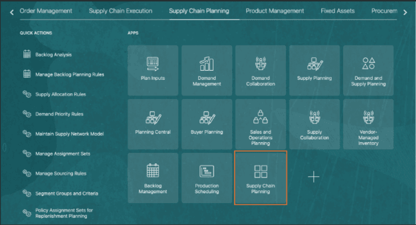
Supply Chain Planning Home Page
The common Supply Chain Planning work area is enhanced to provide access to Inventory Optimization Planning inventory plans, so users can navigate and manage inventory plans in the same work area used for existing planning capabilities.
Inventory Optimization Planner Role
A new role, Inventory Optimization Planner, is introduced to support inventory-focused planning activities within the Inventory Optimization Planning work area.
This role includes the necessary privileges to perform all plan-related actions and access all relevant pages within the work area.
The following table lists the roles within the Inventory Optimization Planner role.
Duty Roles and Description
| Duty Role | Description |
|---|---|
| Plan Analysis | Manages and analyzes supply or demand plans |
| Plan Inputs Reference Data Management | Reviews all reference data entities, such as items and resources, used as input to supply and demand plans |
| Plan Management | Manages demand and supply plans |
| Plan Processing | Manages, publishes, and releases recommendations of demand and supply plans |
| Planning Administration | Configures and manages planning setup, data collection, and order promising server processes |
| Planning Collected Data Management | Manages data collection processes and verifies collected data |
| Planning Item Management | Manages items used in demand and supply plans |
Accessing Inventory Optimization Plans
Plan Switcher
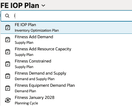
Plan Switcher
The plan switcher now supports the new inventory optimization plan type, with the following capabilities:
- Displays only plans that have completed successfully in the plan selection list
- Defaults to the most recently accessed plan
Inventory Analysis Page
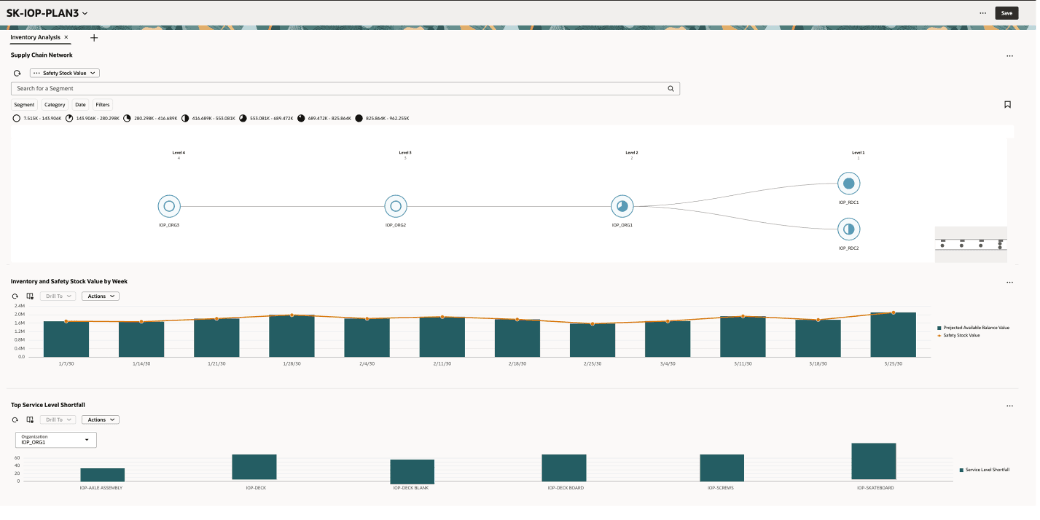
Inventory Analysis Page
When you open an inventory optimization plan, the default landing page is the Inventory Analysis page. The Inventory Analysis page provides a set of visualizations arranged in a structured layout to support both high-level monitoring and detailed analysis. By default, these visualizations include:
- Supply Chain Network
- Inventory and Safety Stock Value by Week
- Top Service Level Shortfall
- Inventory Plan
Supply Chain Network Visualization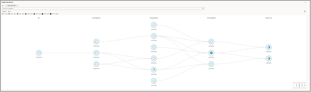
Supply Chain Network
The Supply Chain Network visualization provides a segment-based, product-location view of supply chain echelons. It represents the network using nodes and connecting arcs, where nodes reflect relative values and arcs illustrate the flow of inventory across the supply chain. This visualization provides a network-based view of the supply chain, enabling planners to analyze inventory across multiple levels and organizations.
Measures
You can select which measures to show on the network visualization using the Measure drop-down list. Options are:
- Safety Stock Value (default)
- Achieved Service Level
- Average Safety Stock
- Average Safety Stock Value
- User-defined Safety Stock Quantity
- Safety Stock
- Projected Available Balance Value
The Inventory Optimization measure group also supports additional, user-defined measures with item-organization granularity.
Network Configuration
- Default levels: By default, the network shows all levels in the supply chain.
- Level names: By default, names are Level 1, Level 2, Level 3, Level 4, and so on.
- Organization assignment: Determined by the predefined network visualization logic based on the relationship between the end-item holding location and its sourcing relationships with the upstream organizations.
Inventory and Safety Stock Value by Week Visualization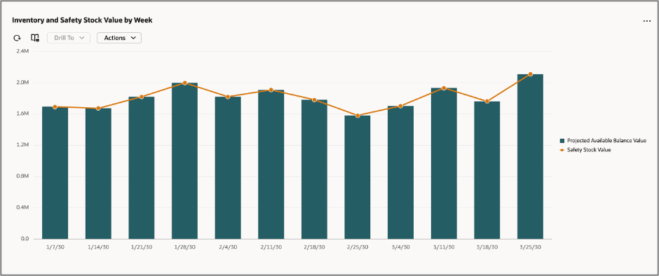
Inventory Value and Safety Stock by Week Visualization
The Inventory Value and Safety Stock by Week visualization provides a time-phased view of inventory and safety stock trends, helping planners identify imbalances over time.
Key Properties
- Visualization type: Combination chart (line and bar)
o X-Axis: Calendar (Week)
o Y-Axis: Measures
Measures
- Projected Available Balance Value
- Safety Stock Value
Interactivity
- Supported with Drill-To from the Supply Chain Network visualization. Drilling from an organization node in the Supply Chain Network filters the graph with the Organization filter.
- Supports configurable links to other visualizations.
Top Service Level Shortfall Visualization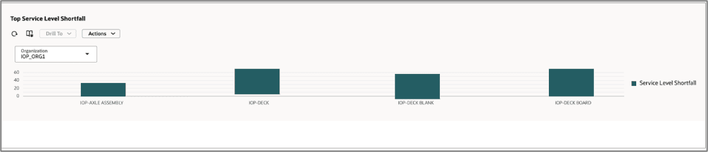
Top Service Level Shortfall Visualization
The Top Service Level Shortfall visualization provides visibility into the top 10 items in a given organization with the highest service level gaps, enabling planners to quickly identify and prioritize areas requiring attention.
Key Properties
- Visualization type: Bar chart
- X-Axis: Item
- Y-Axis: Achieved Service Level
Measure
- Service Level Shortfall
- Calculated as Target Service Level – Achieved Service Level
Filters
- Organization
Interactivity and Linking
- Dynamic linking:
- Selecting a node in the Supply Chain Network or applying an organization filter dynamically updates this visualization.
- Displays the top 10 items with the highest service level shortfall based on the selected context.
Example: When a node (for example, IOP_RDC1) is selected, the corresponding organization and item context is passed to this visualization to display relevant service level shortfalls.
- Manage links:
- Supports configurable links to other visualizations
Drill Capabilities
- Drill From:
- Default drill from the Supply Chain Network visualization.
- Additional drill sources can also be configured.
- Drill To:
- Planning Agent: Inventory Optimization Advisor
- Inventory Plan
Inventory Plan Visualization
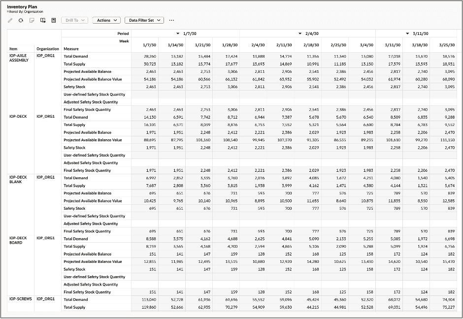
Inventory Plan Visualization
The Inventory Plan visualization provides a detailed tabular (pivot table) view of inventory planning data, enabling in-depth analysis across demand, supply, and safety stock measures. It includes measures specifically required for inventory optimization planning.
Key Properties
- Visualization type: Pivot table
Measures
- Total Demand
- Total Supply
- Projected Available Balance
- Projected Available Balance Value
- Safety Stock – This is the key calculation performed by inventory optimization planning.
- User Defined Safety Stock Quantity
- Adjusted Safety Stock Quantity
- Final Safety Stock Quantity – This is the quantity passed on to downstream applications, such as Supply Planning and Replenishment Planning
Layout
- Optimized layout ensures that measures are displayed as the outermost columns, improving readability and comparison across time and dimensions.
Interactivity and Linking
- Drill From:
- Default drill from the Supply Chain Network visualization
- Drill To:
- Supports configurable links to other visualizations based on user requirements
- Supports configurable links to other visualizations based on user requirements
Measure Comparisons in Pivot Tables
You can now use a visual comparison feature in a pivot table that renders horizontal bar charts embedded directly within table cells. This lets you instantly identify relative comparisons between measures for different members or combinations of members in the pivot table (such as organizations in the following example) or for the same measure across levels.
Each bar's length is proportional to the value it represents, relative to other values in the comparison range, making high and low values easy to identify.
Add a Comparison
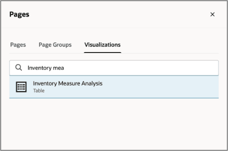
1. Select the Add (+) icon.
- Open a pivot table report from the Visualization tab (for example, Inventory Measure Analysis).
Visualizations Tab
This will open the visualization on a separate page.
2. Select the Measures and Expressions icon on the toolbar.
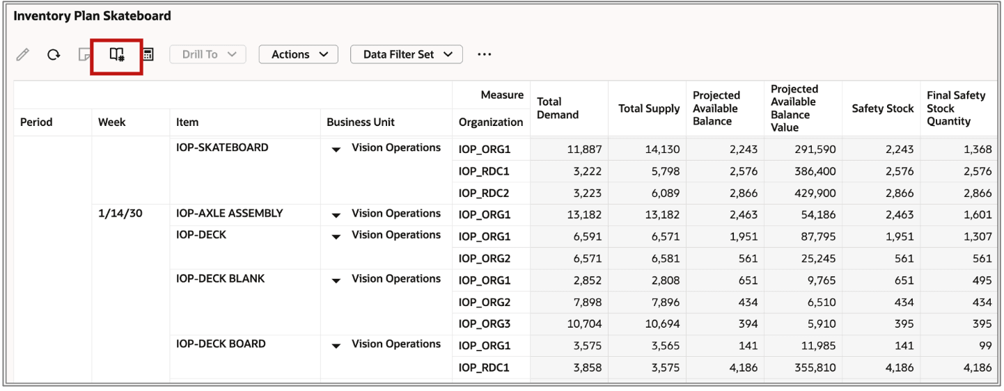
Manage Measures Icon on Toolbar
3. In the Measures and expressions drawer that opens, navigate to the Comparisons tab.
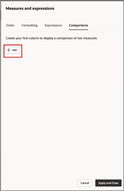
Add a Comparison Criteria
4. Select the + Add button. Additional fields appear, where you can define the new comparison.
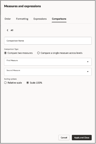
Options in the Comparisons Tab
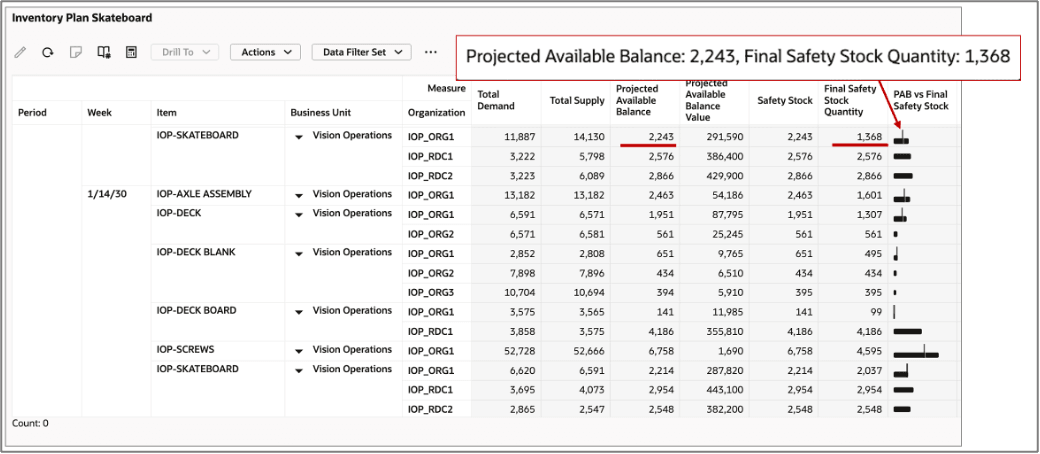
5. Enter a descriptive name for the comparison. This name will appear as the column header in the pivot table. In this example, the comparison name is “PAB vs Final Safety Stock.”
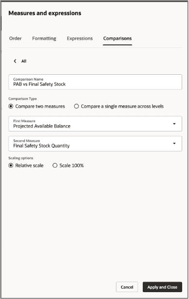
Comparison Details for Comparing Two Measures
6. Select a comparison type and then complete the rest of the fields, as described in the following sections.
Compare Two Measures
This comparison type renders data bars that compare the relative values of two different measures, side-by-side across all rows.
- Select the primary measure from the First Measure drop-down list (for example, Projected Available Balance).
- Select the measure to compare against from the Second Measure drop-down list (for example, Final Safety Stock).
In the example shown in the preceding image, the “PAB vs Final Safety Stock” comparison compares Final Safety Stock Quantity against Projected Available Balance for each organization.
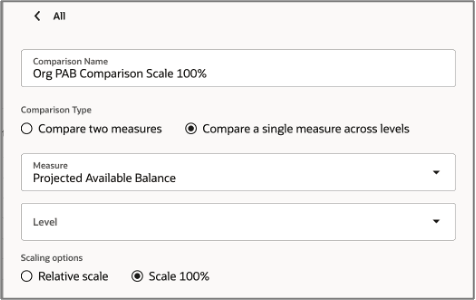
Compare a Single Measure Across Levels
This comparison type renders data bars that compare the value of one measure at a given level. The comparison is done with reference to any specific member that you specify as the base-level member.
- Measure - Select the measure to compare (for example, Projected Available Balance - PAB).
- Base Member to Compare to - Select the base-level member to compare against (for example, Organization or Business Unit).
Note: When comparing with the base member, it should be the innermost column of the pivot table, as shown in the following image.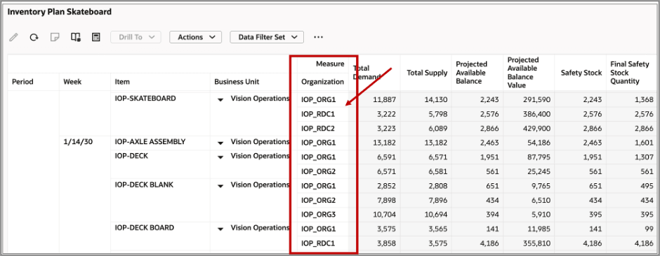
Innermost Column of the Pivot Table To Use for Comparison
In the following example, a comparison named “Org PAB Comparison Scale 100%” compares each organization's Projected Available Balance (PAB) against all organizations that have the same parent (business unit).
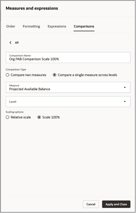
Comparison Details for Comparing a Single Measure Across Levels
If the comparison is to be made with another member, select the member in the Level drop-down list.
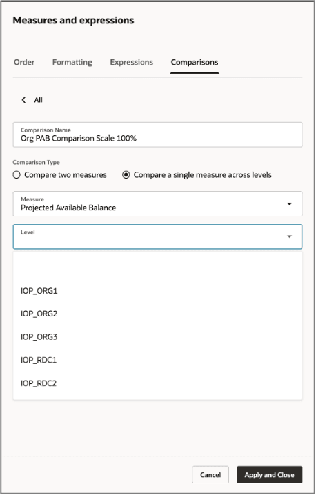
Selecting a Level
- When comparing with another level, the level should be the innermost column of the pivot table. Leaving this value blank will compare to other members belonging to the same level
- Comparison configurations are stored as part of the user’s layout and persist across sessions.
Scaling Options
The scaling options control how bar lengths are calculated:
Scaling Options
| Option | Behavior |
|---|---|
| Relative Scale | Bar lengths scale relative to the maximum value in the visible data set. The largest value gets a full-width bar; all others scale proportionally. |
| Scale 100% | Bar lengths represent each value as a percentage of the total across all rows, always summing to 100%. |
Apply the Configuration
Once all comparisons are defined, navigate to the Order tab to confirm the comparisons appear under the Show list along with the standard measures. You can reorder them by dragging, using the handle on the right if needed.
Select Apply and Close to save all changes and return to the pivot table.
View the Comparison Measures in the Pivot Table
Each defined comparison appears as a new column in the pivot table. Instead of displaying a numeric value, the cell renders a horizontal bar whose length visually encodes the comparison result.
- A longer, darker bar indicates a higher relative value.
- A shorter bar indicates a lower relative value.
- Bars in adjacent rows can be visually scanned to immediately identify which organizations or levels have the highest or lowest values for the compared measures.
Example of Comparing Two Measures
In this example, Projected Available Balance is compared to Final Safety Stock Quantity at relative scale, as shown in the following image: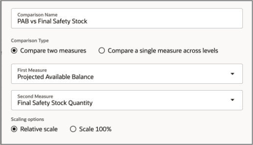
Example Configuration for Comparing Two Measures
The result in the table will look like the following:
Result of Comparing Two Measures Displayed in a New Column
The pivot table generated the measure comparison “PAB vs Final Safety Stock,” which appears as horizontal bar chart columns next to the numeric measure columns, providing an at-a-glance visual summary of inventory values across organizations IOP_ORG1, IOP_ORG2, IOP_ORG3, IOP_RDC1, and IOP_RDC2.
Pivot Table with Data Bars Showing Comparison of Two Measures
Each cell renders two bars comparing Projected Available Balance and Final Safety Stock Quantity.
The bars are sized relative to each other within the row, making it visually obvious whether the projected available balance is above, below, or close to the safety stock threshold.
Key observations in this example:
- Item IOP-DECK BOARD in organization IOP_ORG1 shows a very thin bar for both measures. Both values are small (141 Projected Available Balance, 99 Final Safety Stock), but the two bars are close in length, meaning the projected available balance barely exceeds the safety stock.
- Item IOP-SCREWS in organization IOP_ORG1 shows a noticeably split bar. Projected Available Balance is 6,758 but Final Safety Stock is only 4,595, so the two bars differ visibly.
- Item IOP-SKATEBOARD in organization IOP_ORG1 (1/14/30) shows Projected Available Balance of 2,214 but Final Safety Stock of 2,037, so the bars are nearly equal length, signaling a very close inventory position.
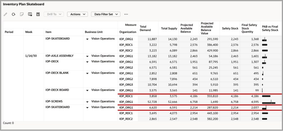
Example of Relative Scale Comparison of a Single Measure Across Levels
In this example, Projected Available Balance is compared across levels at relative scale, as shown in the following image: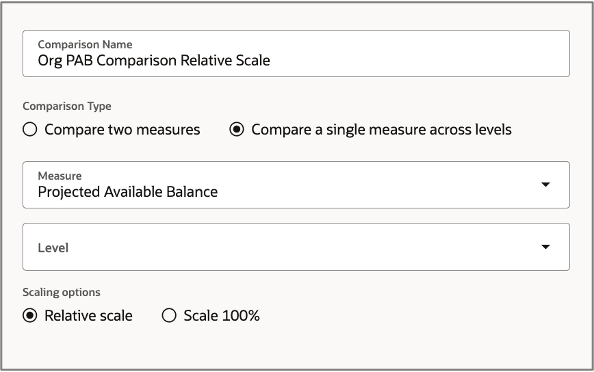
Configuration of Compare a Single Measure Across Levels
The result in the table will look like the following:
Pivot Table with Data Bars Showing Comparison of a Single Measure Across Levels in a Relative Scale
In the preceding illustration, the bar represents each row's Projected Available Balance value relative to the highest Projected Available Balance value across the entire table. The row with the largest Projected Available Balance gets a full-width bar; every other row's bar length is proportional to that maximum.
The global maximum Projected Available Balance in this table is item IOP-SCREWS in organization IOP_ORG1 at 6,820, which would render as the longest bar. All other bars scale lower in comparison.
Key observations in this example:
- Item IOP-SCREWS in organization IOP_ORG1 (Projected Available Balance = 6,820) has the longest bar. It’s the table maximum and anchors the scale.
- Item IOP-SKATEBOARD in organization IOP_RDC2 (Projected Available Balance = 2,866) and item IOP-SKATEBOARD in organization IOP_RDC1 (Projected Available Balance = 2576) have moderately long bars, roughly 60–70% of the maximum.
- Item IOP-DECK in organization IOP_ORG2 (Projected Available Balance = 561) and item IOP-DECK BLANK in organization IOP_ORG3 (Projected Available Balance = 404) have very short bars, their Projected Available Balance values are small relative to the table-wide maximum.
- This data bars column is useful for identifying which item-organization combinations hold the most projected inventory across the entire pivot table.
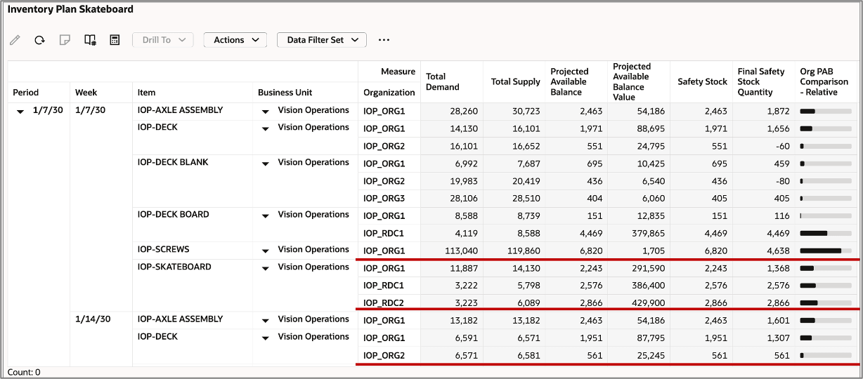
Example of Comparison with Scale 100%
In this example, Projected Available Balance is compared across levels at Scale 100%, as shown in the following image:
Configuration of a Single Measure Across Levels with a Scale 100% Option
The result in the table will look like the following:
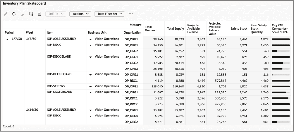
Pivot Table with Data Bars Showing Comparison of a Single Measure Across Levels with a Scale 100% Option
Unlike the Relative scale comparison column for comparing a single measure, the Scale 100% option scopes the comparison within each item's group. For each item, the organization with the highest projected available balance within that item's group gets a full-width bar, and the other organizations in the same group are scaled against it.
Key observations in the example:
- For item IOP-SKATEBOARD in organizations IOP_ORG1, IOP_RDC1, and IOP_RDC2 (Projected Available Balances = 2,243, 2,576, and 2,866, respectively), IOP_RDC1 becomes the base comparison because it’s the largest value in the group. IOP_ORG1 and IOP_RDC2 scale against it.
- For item IOP-DECK in organizations IOP_ORG1 (Projected Available Balance = 1,971) and IOP_ORG2 Projected Available Balance = 551), IOP_ORG1 becomes the base comparison because it’s the largest value in the group. IOP_ORG2 renders a much shorter bar in comparison.
- For item IOP-DECK BLANK in organizations IOP_ORG1, IOP_ORG2, and IOP_ORG3 (Projected Available Balances = 695, 436, and 404, respectively), IOP_ORG1 becomes the base comparison because it’s the largest value in the group. IOP_ORG2 and IOP_ORG3 shrink proportionally.
- For item IOP-DECK BOARD in organizations IOP_ORG1 and IOP_RDC1 (Projected Available Balances = 151 and 4,469, respectively), IOP_RDC1 holds the most value for the Projected Available Balance measure. IOP_ORG1's bar is much smaller, signaling a lopsided inventory between the two locations.
In the Relative column, IOP-DECK and IOP_ORG1 (Projected Available Balance = 1,951) shows a moderate bar because it's measured against the table maximum of 4,469. In the Scale 100% column, the same row shows a full-width bar because 1,951 is the highest Projected Available Balance within the IOP-DECK group. This makes Scale 100% ideal for within-group distribution analysis, while Relative is better for cross-table ranking.
Global (Page-Level) Search
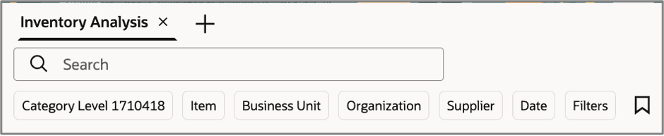
Global (Page-Level) Search Filters and Keyword Search Bar
The Global (page-level) search is the primary filtering control on the Inventory Analysis page. Located at the top of the page, it allows you to narrow the scope of data displayed across all visualizations simultaneously by entering keywords or selecting one or more predefined filter dimensions.
Any selection made in the Global Search immediately refreshes all visualizations on the page—including the Supply Chain Network, Inventory and Safety Stock Value by Week, and Top Service Level Shortfall—to reflect only the filtered data set.
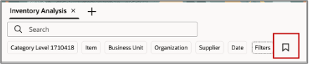
Accessing the Global Search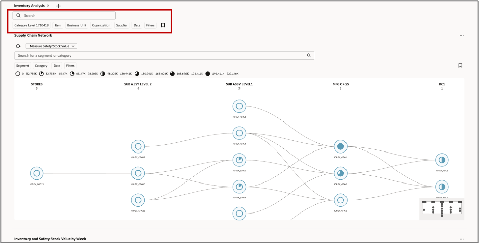
Global Search Bar
The Global Search bar is positioned at the top of the Inventory Analysis page, directly below the page name title. The search panel consists of a keyword search field and search filter chips. You can also save searches for reuse later.
Keyword Search Field
A free-text input field labeled Search lets you type a segment or category name to filter the page. The system performs a real-time lookup and applies matching results to all page-level visualizations, as applicable. For example, only the Category filter chip is used in Supply Chain Network and the others are ignored for that visualization because they aren’t relevant. To reset to the default view, clear the field and select the Search action or click Enter. This restores all data to the unfiltered state.
Search Filter Chips

Global Search Filter Chips
Search filter chips are displayed immediately below the search field. Each filter chip represents a specific dimension by which the data can be scoped.
Filter Chips
| Filter Chip | Description |
|---|---|
| Category | Filters by product category hierarchy level. Selecting a category limits all data to items belonging to that category. |
| Item | Filters by individual item or SKU. Allows targeted analysis of a single product across the supply chain. |
| Business Unit | Restricts data to a specific business unit, enabling analysis within an organizational boundary. |
| Organization | Filters by inventory organization (for example, a warehouse, plant, or distribution center). |
| Supplier | Scopes the data to items or replenishment flows associated with a selected supplier. |
| Date | Applies a date or date-range constraint to the data shown in time-series visualizations. |
The Filters chip opens up the Filters drawer, where you can configure multiple search criteria.
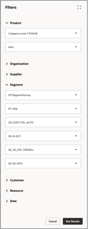
Global Search Filters Drawer
Saved Search
Saved Search Icon
The bookmark icon (located to the right of the Filters chip) allows you to save the current search and filter configuration as a saved search. Saved searches can be recalled in future sessions to restore a frequently used filter state without re-entering each criterion.
New Measures for Inventory Optimization Planning
With this update, the following measures are introduced to support Inventory Optimization Planning.
Measures in Inventory Optimization Planning
| Measure | Description | Functional description of the formula derivation | Measure Granularity |
|---|---|---|---|
| Safety Stock | Quantity of stock planned to have in inventory to protect against fluctuations in demand or supply. | Safety stock quantity for the planning time bucket | Product, Organization, and Time |
| User-defined Safety Stock Quantity | Manual safety stock value provided by planners. | Product, Organization, and Time | |
| Adjusted Safety Stock Quantity | Safety stock modified by planner or system adjustments after initial calculation. | Product, Organization, and Time | |
| Final Safety Stock Quantity | Final value used in planning after all adjustments. | Uses Adjusted Safety Stock if available, otherwise uses the system-calculated Safety Stock | Product, Organization, and Time |
| Safety Stock Percentage for Manufacturing Lead Time Variability | Portion driven by variation in production lead times. | Product, Organization, and Time | |
| Safety Stock Percentage for Procurement Lead Time Variability | Portion driven by variation in supplier delivery times. | Product, Organization, and Time | |
| Safety Stock Percentage for Transit Lead Time Variability | Portion driven by variation in transportation transit times. | Product, Organization, and Time | |
| Target Service Level | Planned percentage of demand to be fulfilled from inventory. Applicable to inventory optimization plans. | Organization and Product | |
| Adjusted Target Service Level | Service level modified based on planning adjustments. | Organization and Product | |
| Final Target Service Level | Final service level used for safety stock calculation. | Uses Adjusted Target Service Level if available, otherwise uses the original Target Service Level | Organization and Product |
| Achieved Service Level | Historical percentage of demand fulfilled. | Product, Organization, and Time | |
| Procurement Lead Time Variability | Variability in supplier delivery lead time. | Product and Supplier | |
| Adjusted Procurement Lead Time Variability | Planner-adjusted procurement lead time variability. | Product and Supplier | |
| Final Procurement Lead Time Variability | Approved procurement lead time variability used in planning. | Uses Adjusted Procurement Lead Time Variability if available, otherwise uses the original Procurement Lead Time Variability | Product and Supplier |
| Transit Lead Time Variability | Variability in transportation transit time. | Organization, Product and Source | |
| Adjusted Transit Lead Time Variability | Planner-adjusted transit lead time variability. | Organization, Product and Source | |
| Final Transit Lead Time Variability | Approved transit lead time variability used in planning. | Uses Adjusted Transit Lead Time Variability if available, otherwise uses the original Transit Lead Time Variability | Organization, Product and Source |
| Manufacturing Lead Time Variability | Variability in production cycle time. | Organization and Product | |
| Adjusted Manufacturing Lead Time Variability | Planner-adjusted manufacturing lead time variability. | Organization and Product | |
| Final Manufacturing Lead Time Variability | Approved manufacturing lead time variability used in planning. | Uses Adjusted Manufacturing Lead Time Variability if available, otherwise uses the original Manufacturing Lead Time Variability | Organization and Product |
| Demand Fulfillment Lead Time | Time required to fulfill demand from available sources. | Organization and Product | |
| Adjusted Demand Fulfillment Lead Time | Planner-adjusted fulfillment lead time. | Organization and Product | |
| Final Demand Fulfillment Lead Time | Final fulfillment lead time used in planning. | Uses Adjusted Demand Fulfillment Lead Time if available, otherwise uses the original Demand Fulfillment Lead Time | Organization and Product |
| Inventory Budget | Financial target allocated for inventory investment. | Organization and Product | |
| Safety Stock Percentage for Demand Variability | Portion of safety stock driven by demand forecast uncertainty. | Product, Organization, and Time | |
| Average Safety Stock | The Average Safety Stock quantity across the selected time buckets in the plan. This measure provides a normalized view of buffer inventory levels over time to support inventory analysis and planning decisions. | Sum of all Safety Stock values divided by the number of non-null time buckets | Product, Organization, and Time |
| Average Safety Stock Value | The Average value of Safety Stock across the selected time buckets in the plan. This measure helps evaluate the financial impact of maintaining buffer inventory over time. | Sum of all Safety Stock Values divided by the number of non-null time buckets | Product, Organization, and Time |
| Service Level Shortfall | The percentage gap between the Target Service Level and the Achieved Service Level, indicating the extent to which actual performance falls below the defined service objective. | If Achieved Service Level is missing, returns blank; otherwise subtracts Achieved Service Level from Final Target Service Level | Product, Organization, and Time |
| Percentage Service Level Sensitivity to Safety Stock Value in Millions | The percentage change in service level associated with a million unit change in safety stock value. | (Percentage Service Level Sensitivity per Thousand Units / Standard Cost) x 1000 | Organization and Product |
| Percentage Service Level Sensitivity to Safety Stock Quantity per Thousand Units | The percentage change in service level associated with a one-thousand-unit change in safety stock quantity. | (Percentage Change in Service Level / Unit Change in Safety Stock Quantity) x 1000 | Organization and Product |
Steps to enable and configure
You don't need to do anything to enable this feature.
Access requirements
Users who are assigned a configured job role that contains this privilege can access this feature:
- MSC_MONITOR_INVENTORY_OPTIMIZATION_PLANNING_WORK_AREA_PRIV
This is a new privilege available as part of this update.