Configure a Child Object
Here's how to add a panel for a child object to the parent and configure the subview for the child object.
Configure the Panel for the Child Object
Configure the panel for the child object using the cx-panel fragment.
To configure the panel region:
-
In Visual Builder Studio, click the App UIs tab.
-
Expand cx-custom > payment_c, then click the payment_c-detail node.
-
On the payment_c-detail tab, click the Page Designer subtab.
-
Click the Code button.
-
Next, let's add the fields that you want to display on the panel.
-
On the PaymentLineCollection_c tab, click the Rule Sets subtab.
-
Click the Open icon next to the default layout.
-
Click the cx-card fragment.
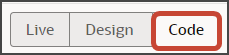
From the list of fields, drag each field to the desired slot.
-
On the Properties pane, click Go to Template.
-
-
On the Templates subtab, click the Code button.
-
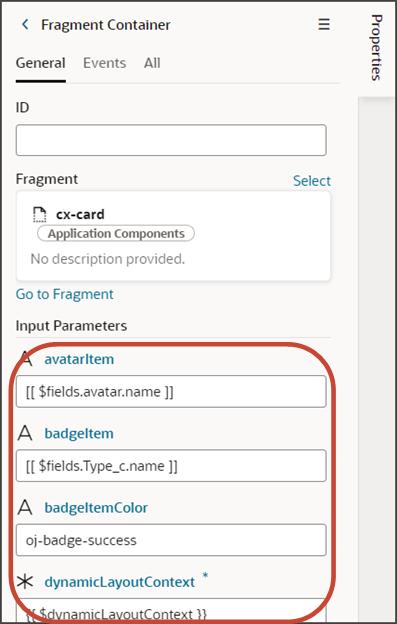
Add the following parameters to the template code.
<oj-vb-fragment-param name="dynamicLayoutContext" value="{{ $dynamicLayoutContext }}"></oj-vb-fragment-param>
    <oj-vb-fragment-param name="style" value="avatar-card"></oj-vb-fragment-param>
    <oj-vb-fragment-param name="enableActions" value="false"></oj-vb-fragment-param>
    <oj-vb-fragment-param name="badgeItemColor" value="oj-badge-success"></oj-vb-fragment-param>
The template code should look similar to the following sample:
<!-- Contains Dynamic UI layout templates -->
<template id="defaultTemplate">
<oj-vb-fragment name="oracle_cx_fragmentsUI:cx-card" bridge="[[ vbBridge ]]">
    <oj-vb-fragment-param name="dynamicLayoutContext" value="{{ $dynamicLayoutContext }}"></oj-vb-fragment-param>
    <oj-vb-fragment-param name="style" value="avatar-card"></oj-vb-fragment-param>
    <oj-vb-fragment-param name="enableActions" value="false"></oj-vb-fragment-param>
    <oj-vb-fragment-param name="badgeItem" value="[[ $fields.Type_c.name ]]">
    </oj-vb-fragment-param>
    <oj-vb-fragment-param name="avatarItem" value="[[ $fields.avatar.name ]]">
    </oj-vb-fragment-param>
    <oj-vb-fragment-param name="item1" value="[[ $fields.RecordName.name ]]">
    </oj-vb-fragment-param>
    <oj-vb-fragment-param name="item4" value="[[ $fields.CreationDate.name ]]">
    </oj-vb-fragment-param>
    <oj-vb-fragment-param name="item2" value="[[ $fields.Amount_c.name ]]">
    </oj-vb-fragment-param>
    <oj-vb-fragment-param name="item3" value="[[ $fields.CreatedBy.name ]]">
    </oj-vb-fragment-param>
    <oj-vb-fragment-param name="badgeItemColor" value="oj-badge-success"></oj-vb-fragment-param>
  </oj-vb-fragment>
</template>
You can add more fields by returning to the default layout and dragging and dropping, as you did earlier.
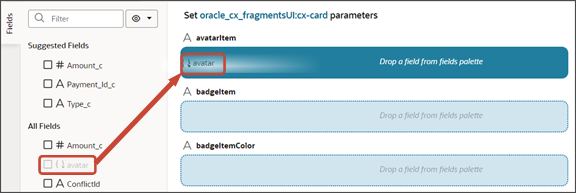
You can also add fields to the panel using the Properties pane. To do this, click the Fragment Container node in the Structure pane.
Then, add your desired custom object fields using the Input Parameter fields on the Properties pane.
-
Test the panel that you added by previewing your application extension from the payment_c-list page.
-
From the payment_c-list page, click the Preview button to see your changes in your runtime test environment.

The screenshot below illustrates what the list page looks like with data.
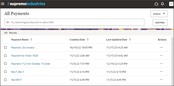
Click any record on the list page to drill down to the detail page.
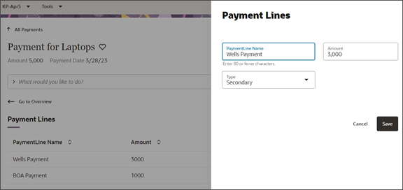
The following screenshot highlights the panel.
Note: In your testing, the panel might be empty.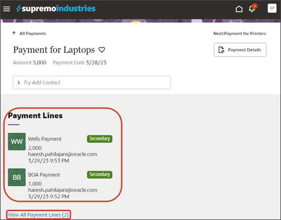
The link at the bottom of the panel navigates the user to the subview. Learn how to configure the subview in Configure the Subview for Child Objects.
-
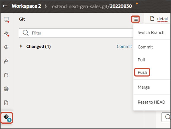
Save your work by using the Push Git command.
Navigate to the Git tab, review your changes, and do a Git push (which does both a commit and a push to the Git repository).
Configure the Subview for Child Objects
This topic explains how to build the subview using fragments.
What's a Subview?
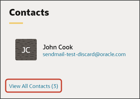
Since the real estate of a panel is small, users can click a View All link to navigate to a second page that displays all records.
Here's a screenshot of a View All Contacts link on a panel. Notice that, in this example, the panel itself has room to display only one contact, John Cook, although a total of three records exist. Users can click the View All Contacts link to see all three contacts.
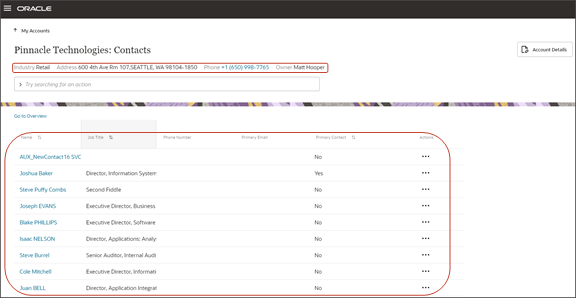
Here's a screenshot of a subview. A subview includes a basic information region at the top and a table. If you create a custom panel for a child or related object, then you must create this page, as well. You can create this page using a fragment.
Create the Payment Lines Subview
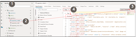
Let's create the subview for our payment records. To do this, we'll add a new dynamic container to the detail page in Page Designer.
-
In Visual Builder Studio, click the App UIs tab.
-
Expand , and then click the payment_c-detail node.
-
On the payment_c-detail tab, click the Page Designer subtab.
-
Confirm that you are viewing the page in Page Designer.
-
Click the Code button.
-
In the Filter field, enter
dynamic container. -
Drag and drop the dynamic container component to the detail page canvas, outside the previous dynamic container that holds the panels. This dynamic container will hold the subview.
-
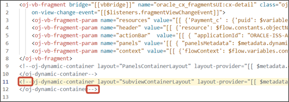
In the code for the dynamic container, replace
containerLayout1withSubviewContainerLayout.
-
On the payment_c-detail tab, click the JSON subtab.
-
In the detail page's JSON, rename the two instances of
containerLayout1toSubviewContainerLayout.The two instances appear in the
"layouts"section and in the"templates"section. Here’s where the instance appears in the"templates"section.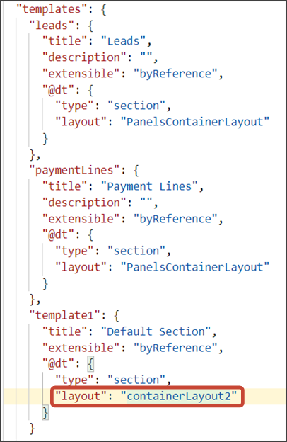
Create the section template that will be used for the subview.
-
On the payment_c-detail tab, click the Page Designer subtab.
-
On the Properties pane, in the Case 1 region, click the Add Section icon, and then click New Section.
-
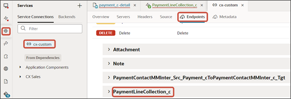
In the Title field, enter a title for the section using the REST child object name, such as
PaymentLineCollection_c. -
In the ID field, change the value to
PaymentLineCollection_c.Note:You can retrieve the REST child object name from the service connection endpoint.
-
Click OK.
-
Delete the
Default Section.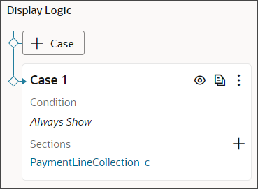
-
Manually update the template's JSON with the correct subview name.
-
On the Payment_c-detail tab, click the JSON subtab.
-
In the section for the SubviewContainerLayout section template layout, replace the
sectionTemplateMapanddisplayPropertiesvalues to match the name of the subview,PaymentLineCollection_c.In our example, this is what the SubviewContainerLayout
sectionTemplateMapanddisplayPropertiesshould look like: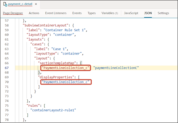
-
Configure the Subview Layout
We previously added the subview dynamic container to the page, as well as the section template.
Build the structure of the subview using the cx-subview fragment.
-
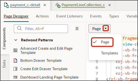
On the Properties pane, click the PaymentLineCollection_c section that you just added.
Page Designer navigates you to the template editor, still on the payment_c-detail tab, where you can design the PaymentLineCollection_c template.
-
Click the Code button.
-
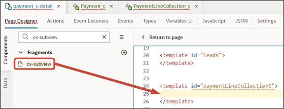
On the Components palette, in the Filter field, enter
cx-subview. -
Drag and drop the cx-subview fragment to the template editor, between the paymentLineCollectionC template tags.
-
Add the following parameters to the fragment code so that the code looks like the below sample. Be sure to replace
Payment__c_IdandPaymentLineCollection_cwith the appropriate values for your custom top level and child objects. Retrieve these values from the service connection endpoint.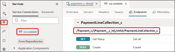
<template id="paymentLineCollectionC">
  <oj-vb-fragment bridge="[[vbBridge]]" name="oracle_cx_fragmentsUI:cx-subview">
<oj-vb-fragment-param name="resource"
      value='[[ {"name": $flow.constants.objectName, "primaryKey": "Id", "endpoint": $application.constants.serviceConnection } ]]'>
    </oj-vb-fragment-param>
    <oj-vb-fragment-param name="sortCriteria" value='[[ [{"attribute": "LastUpdateDate","direction": "desc" }] ]]'>
    </oj-vb-fragment-param>
    <oj-vb-fragment-param name="query"
      value='[[ [{"type": "selfLink", "params": [{"key": "Payment__c_Id", "value": $variables.id }]}] ]]'></oj-vb-fragment-param>
    <oj-vb-fragment-param name="child" value='[[ {"name": "PaymentLineCollection_c", "primaryKey": "Id", "relationship": "Child"} ]]'></oj-vb-fragment-param>
    <oj-vb-fragment-param name="context" value="[[ {} ]]"></oj-vb-fragment-param>
    <oj-vb-fragment-param name="extensionId" value="[[ $application.constants.extensionId ]]"></oj-vb-fragment-param>

  </oj-vb-fragment>

</template>
This table describes the parameters that you can provide for the subview:
Parameters for Subview
Parameter Name Description sortCriteria Specify how to sort the data on the subview, such as sort by last updated date and descending order. query Include criteria for querying the data on the subview. child Enter the REST child object name for the child object that the panel is based on.
Configure the subview layout.
-
Click the Layouts tab, then click PaymentLineCollection_c.
-
On the PaymentLineCollection_c tab, click + Rule Set to create a new rule set for the layout.
-
In the Create Rule Set dialog, in the Component field, select Dynamic Table.
-
In the Label field, enter
SubViewLayout. -
In the ID field, change the value to
SubViewLayout. -
Click Create.
-
-
Add the fields that you want to display in the layout.
-
Click the Open icon next to the default layout.
-
From the list of fields, select the fields that you want to display on the subview table. The fields display as columns in the order that you click them, but you can rearrange them.
-
-
Create an event so that users can be automatically navigated back to the subview after editing the payment.
-
On the payment_c-detail tab, click the Page Designer subtab.
-
Confirm that you are viewing the page in Page Designer.
-
Click the Code button.
-
In the code for the detail page, click the
oj-vb-fragmenttag.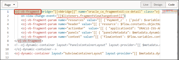
-
On the Properties pane for the cx-detail fragment, click the Events subtab.
-
Click + New Event > On 'viewChangeEvent'.
-
Drag an Assign Variables action onto the canvas.
-
On the Properties pane, next to the Variable field, click the Select Variable icon.
-
In the Variable window, under the Page heading, click view.
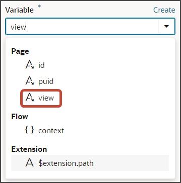
-
In the Value field, enter
{{
                                            payload.view }}
.
-
-
-
Comment out the subview's dynamic container component from the payment_c-detail page.
-
Click the payment_c-detail tab, then click the Page Designer subtab.
-
Click the Code button.
Select Page from the drop-down list.
-
Comment out the dynamic container component that you added for the subview.
-
-
Add an Actions menu to the subview.
To do this, create a custom field,
Actions Menu.-
On the PaymentLineCollection_c tab, click the Fields subtab.
-
Click + Custom Field.
-
In the Create Field dialog, in the Label field, enter
Actions Menu. -
In the ID field, the value should be
actionsMenu. -
In the Type field, select String.
-
Click Create.
Map the custom field to the field template.
-
On the PaymentLinesCollection_c tab, click the JSON subtab.
-
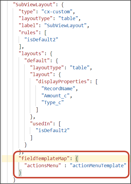
In the
SubViewLayoutsection, add this code:, "fieldTemplateMap": { "actionsMenu" : "actionMenuTemplate" }The resulting code will look like this:
Add the custom field to the subview table.
-
Click the PaymentLineCollection_c tab > Rule Sets subtab.
-
Click SubViewLayout.
-
Click the Open icon next to the default layout.
-
From the list of fields, click the actionsMenu field to add it to the subview table.
-
-
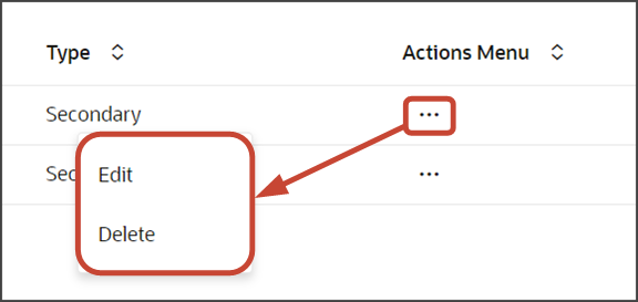
The Actions menu provides both an Edit and Delete action. Users click Edit to edit a payment line.
Create a layout for the edit payment line page.
-
On the PaymentLineCollection_c tab, click < Rule Set to return to the main Rule Sets page where you can create a new rule set.
-
Click + Rule Set.
-
In the Create Rule Set dialog, in the Component field, select Dynamic Form.
-
In the Label field, enter
EditLayout. -
In the ID field, change the value to
EditLayout. -
Click Create.
-
-
Add the fields that you want to display in the layout.
-
Click the Open icon next to the default layout.
-
Click Select fields to display.
-
From the list of fields, select the fields that you want to display on the edit payment line page. The fields display as columns in the order that you click them, but you can rearrange them.
-
-
On the Properties pane for this layout, in the Max Columns field, enter
2.You might need to click < Form to see the properties for the layout.
-
-
Test the subview by previewing your application extension from the payment_c-list page.
From the payment_c-list page, click the Preview button to see your changes in your runtime test environment.
The screenshot below illustrates what the list page looks like with data.
-
If data exists, you can click any record on the list page to drill down to the detail page. The detail page, including header region and panels, should display.
Note:The screenshot below illustrates what a panel looks like with data. In your testing, the panel might be empty.
-
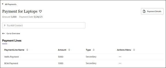
Click the View All link to drill down to the subview.
-
Click the to edit the payment line.
Save your work by using the Push Git command.
Display a Smart Action on a Child Object Subview Only for a Specific Parent Object
When you create a subview for a child object, you might need to create smart actions that apply specifically to that subview.
Suppose, for example, that you used the CX Extension Generator to display a list of shipments on payments, with Shipments being a child object of Payments. CX Extension Generator automatically creates the Add smart action that users enter in the Action Bar to add shipments to payments, but it doesn't create any smart action to remove the entry. Here are the steps to create the smart action and make it available only on the Payment subview.
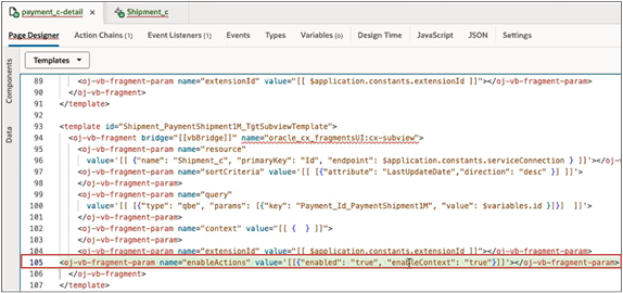
- Create the Remove smart action as a REST-based smart action as described in the topic Create REST-Based Smart Actions. Be sure to enter the name of the parent object in the Context region of the Availability page.
In VB Studio open the parent object's detail page and view the Template code (
Find the template for the subview in the code, and add the following parameter:
<oj-vb-fragment-param name=“enableActions” value=‘[[{“enabled”: “true”, “enableContext”: “true”}]]’></oj-vb-fragment-param>Insert it right before the </oj-vb-fragment> tag.