Configure the Picker
A picker enhances a regular list of values field so that users can quickly find the record they need. Depending on setup, pickers can display either a list of saved searches to pick from, or a list of results most relevant to the user's context. Pickers are already available on certain standard fields and can't be modified, although you can configure new pickers for those fields, if needed. You can also configure pickers for custom list of values fields. Use the cx-picker fragment in Oracle Visual Builder Studio to configure new pickers.
Here's an example of a field without a picker. Without a picker, the field has a button that users can click to view a list of values.
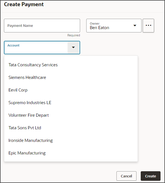
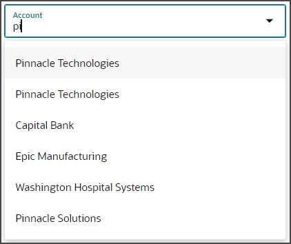
This basic list of values makes it possible to filter on a value that the user enters
into the field. For example, if the user enters pi, then a list of
accounts whose names include pi display for selection.
This basic filtering functionality is helpful, but for better user experience, use the cx-picker template to enable a wider range of search features on a field.
What's a CX-Picker?
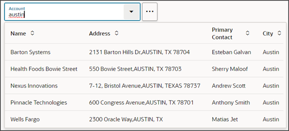
A cx-picker is a special kind of picker on a dynamic choice list field. With cx-pickers, users can search on more than one attribute of a record, not just on a single attribute. For example, in an Account picker, users can search not just on account name, but also on address, and contact name. The screenshot below illustrates a search on city name.
In addition, pickers are more powerful than the standard search on a field because, depending on setup, pickers can display either a list of saved searches or a list of results most relevant to the user's context.
In Sales in the Redwood UX, pickers can be based on either Adaptive Search or ADF REST.
-
Adaptive Search Pickers
Provide enhanced keyword searches on an object and support saved searches.
-
ADF REST pickers
Provide limited keyword searches and don't support saved searches.
CX-Picker Fragment Parameters
The following two tables list the required and optional parameters that you can use to configure the picker.
|
Parameter |
Sample Value |
Description |
|---|---|---|
|
dynamicLayoutContext |
|
This parameter is set by default. If the picker field displays in the Create page or the Edit page, then you don't have to change it. The default value is $dynamicLayoutContext. |
|
resource |
|
Use this parameter to pass the target object name and end point:
|
|
Parameter |
Sample Value |
Description |
|---|---|---|
| extensionId | [['oracle_cx_salesUI']] |
Application ID used in VB Studio that provides prefix for the endpoint. Values can be one of the following:
|
|
pickerLayoutId |
|
This parameter points to the rule set whose layout controls how the picker appears at runtime. The default value, which you don't have to change, is
If you need to create a custom rule set, then create the rule set as a dynamic table and ensure that the values for the Label and ID fields are identical. Then add the ID to this parameter. |
| context |
|
Controls the behavior of saved searches in cx-pickers that use Adaptive Search. When you configure a picker to display a list of saved searches, then the user can speed up searches by selecting a saved search in the picker to filter the records for the search. By default, the picker filters the records using the default saved search enabled for that object using the Manage Saved Searches UI. The saved searches displayed in the list depend on access permissions of the signed-in user. You can use the following properties in the context parameter to control the behavior of the saved searches and specify which saved search is selected as the default when the picker is loaded:
|
| createConfig | [[ {"enabled": false} |
Use this parameter to specify whether you want the Create option in the picker list. This parameter is enabled by default and applies to both ADF and Adaptive Search pickers. |
| isDefaultSavedSearchEnabled | "true" |
If true, then the application uses the List Default saved search by default. A defaultSavedSearchId supersedes this setting. This parameter isn't applicable if the “query” parameter is used to provide a custom query. |
| label | "Custom Picker" |
Label for the picker field. If not provided, the field's label is used. |
| pickerNameField |
Field name displays when a row is selected. If not used, the picker displays the field you specified when you created the DCL in Application Composer. |
|
| query |
Adaptive Search Query Example: Note: The time stamp must use the format:
YYYY-MM-DDTHH:MM:SS.sss+TZ.ADF REST Query Example: |
You can provide one or more custom queries to filter the data shown on the picker. The query can accept either a single JS object or an Array of objects. Each object corresponds to a separate custom query. When an array is provided, each query show up as a separate entry along with the other Saved searches in the saved search menu (the 3 dots icon next to the picker). The JS object takes the following properties:
|
| sortCriteria |
|
Specifies the default sort criteria used for the default view:
|
| value | Use this parameter to specify the default value to be preselected when the picker is loaded. The parameter value is the value of the primary key of the object row. |
Picker Example Scenario
This topic illustrates the setup of a picker based on Adaptive Search. In this example, we'll add an Account picker to a Create Payment page so that users can search for and associate an account with a payment record.
In this example, you'll do the following:
-
In Application Composer, create a custom dynamic choice list field.
-
In Visual Builder Studio:
-
Add the dynamic choice list field to a page layout.
-
Associate the field with a field template that uses the picker fragment.
-
Configure the picker layout.
-
Prerequisites
-
Complete the Adaptive Search setup, if working with a custom object.
If you're configuring a picker for a field on a custom object, then make sure that you've enabled the custom object for Adaptive Search. The operation of a picker depends on what's already set up in Adaptive Search.
A picker searches against all Adaptive Search fields that are enabled for keyword search. To enable additional attributes for search, see the topic Make Additional Fields Searchable.
-
Create your own workspace in Visual Builder Studio if you don't yet have one.
If you're configuring a picker for a custom dynamic choice list field that's not yet published, then make sure your workspace is associated with your Cloud Applications sandbox.
-
Add the Common Application Components dependency to your workspace.
To add a dependency, click the Dependencies side tab in Visual Builder Studio.
Use the search field to find the Common Application Components dependency and then click Add.
-
This example assumes that you've got a custom Payment object with pages already configured in Visual Builder Studio.
You can use the CX Extension Generator to set this up quickly. See Create a New Application Using the CX Extension Generator.
1. Create the Custom Dynamic Choice List Field
To get started, create a custom dynamic choice list field on a custom object, Payment, in Application Composer. This dynamic choice list field displays account records.
Creating a custom field is a data model change. Create all data model changes in Application Composer before creating application extensions in Visual Builder Studio. You don't have to publish your sandbox before working in Visual Builder Studio, however, since your workspace is associated with your current sandbox.
To create the custom dynamic choice list field:
-
Ensure you're in an active sandbox.
-
In Application Composer, navigate to the Payment object > Fields node.
-
Create a custom dynamic choice list field with these values:
Field
Value
Display Label
Account
Name
Account
Related Object
Account
List Selection Display Value
Organization Name
For pickers that don't use Adaptive Search, you can use Application Composer to add a filter to the dynamic choice list field to constrain the values that users see in the picker. For example, you might want the picker to display only accounts that are based in a specific country or city. This type of filter isn't supported in Adaptive Search, so Adaptive Search pickers won't honor them.
When you create a dynamic choice list field in Application Composer, two fields are created:
-
A field for use with classic, non-Redwood Oracle applications. The naming convention for this standard field is customfield_c.
In this example, the Account_c field is automatically created. You can see and modify this field in Application Composer and Visual Builder Studio.
-
A field for use with Redwood Sales. The naming convention for this standard field is customfield_Id_c.
In this example, the Account_Id_c field is automatically created and displays in Visual Builder Studio only. This is the field that you add to Redwood Sales page layouts.
You can now add the Account_Id_c field to a page layout in Visual Builder Studio. We'll do that in the next section.
2. Add the Field to a Page Layout
Let's add your custom field to a page layout. In this example, we'll add the field to a create page. Typically, you'd also add the field to an edit page.
-
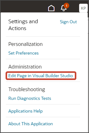
In the Sales in Redwood UX, navigate to the page that displays the area you want to extend. In this example, navigate to the Payments list page.
-
Under the Settings and Actions menu, select Edit Page in Visual Builder Studio.
-
Select the project that's already set up for you. If only one project exists, then you will automatically land in that project.
-
Visual Builder Studio automatically opens your workspace. If more than one workspace exists, however, then you must first pick your workspace.
-
When you enter into your workspace in Visual Builder Studio, click the Layouts side tab.
-
On the Layouts side tab, click the Payment_c node.
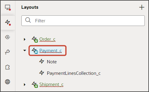
-
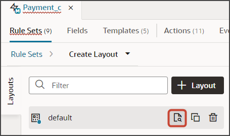
On the Payment_c tab, Rule Sets tab, click the Create Layout rule set.
Note:Optionally repeat these same steps for the Edit Layout rule set.
-
Click the Open icon to edit the default layout.
-
Scroll through the list of fields to find your custom dynamic choice list field. Visual Builder Studio shows the internal API name, not the display name.
Tip:To find your field more quickly, use the Filter field. For example, enter
accountinto the Filter field.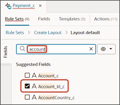
-
Select the field, Account_Id_c, from the field list.
When you select a field, it displays in the list of fields to the right, at the bottom of the list. You can optionally use the field's handle to drag the field to the desired location.
If you were to preview the create page at this point, then the Account field that displays is a simple list with only basic search filtering.
To add a picker to the field, you must associate the field with a field template that uses the picker fragment. Let's do that next.
3. Associate the Field with a Field Template
Let's add a picker to your custom dynamic choice list field to give users enhanced searching functionality. To do this, you associate the field with a field template that uses the picker fragment.
The following steps illustrate the required picker parameters, but you can set other parameters, as well.
-
Make sure that you're still on the Rule Sets tab, viewing the default layout.
-
Click the Account_Id_c field.
-
On the Properties pane, above the Template field, click Create.
Note:If you're doing these steps a second time for the Edit Layout rule set's layout, then in the Template field, you don't need to create a field template. Instead, you can select the template that you're about to create in the next step.
-
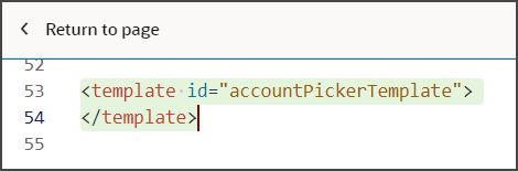
In the Create Template dialog, in the Label field, enter a label for the template.
In this example, enter
AccountPickerTemplate.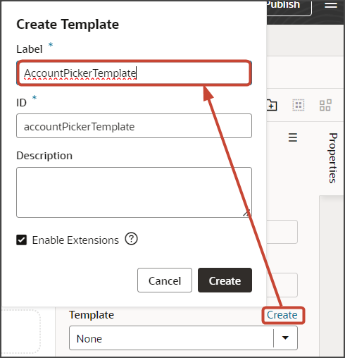
-
Click Create.
Visual Builder Studio creates a placeholder template with a basic structure, including an Input Text node which you can see on the Structure pane.
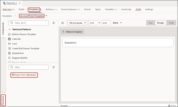
-
Delete the default Input Text node from the Structure pane by right-clicking the node and clicking Delete.
-
Click the Code button.
-
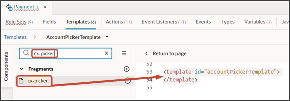
In the template editor, select the accountPickerTemplate template tags.
-
On the Components palette, in the Filter field, enter
cx-picker. -
Drag and drop the cx-picker fragment to the template editor, between the template tags.
-
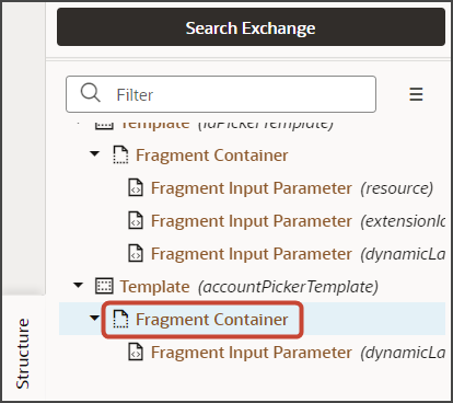
Make sure the fragment code is selected, as illustrated in this screenshot.
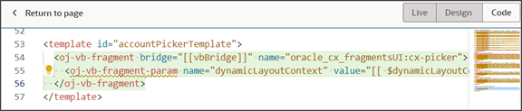 Tip:
Tip:On the Structure pane, selecting the Fragment Container node for the picker template accomplishes the same thing.
-
On the Properties pane for the cx-picker fragment, in the Input Parameters section, set values for the required picker parameters.
For additional parameters that you can set for the cx-picker fragment, see CX-Picker Fragment Parameters section.
4. Configure the Picker Layout
Finally, select which fields display in the picker by modifying the Picker Layout rule set. This rule set's layouts control how the picker looks at runtime.
The Picker Layout rule set and default layout are predefined for each object, including custom objects.
In this example, we're adding an Account picker which means we must modify the Picker Layout rule set for the Account object.
-
On the Layouts side tab, click the node.
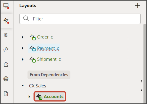
-
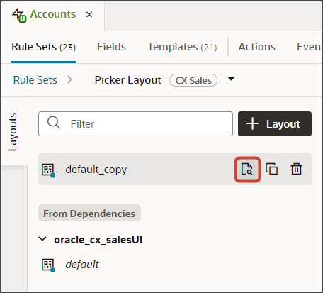
On the Accounts tab, Rule Sets tab, click the Picker Layout rule set.
-
Duplicate the default layout and then click the Open icon to edit the default_copy layout.
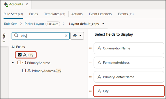
-
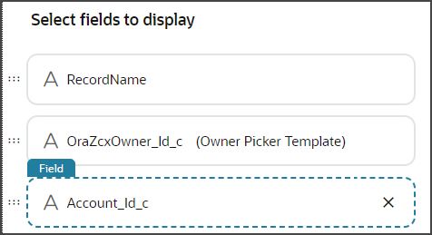
Scroll through the list of fields to add any desired fields to the picker layout.
Tip:To find your field more quickly, use the Filter field. For example, enter
cityinto the Filter field. -
Select the field, City, from the field list.
When you select a field, it displays in the list of fields to the right, at the bottom of the list. You can optionally use the field's handle to drag the field to the desired location.
Test the Picker Flow
You can now test the picker that you added to the list of values field.
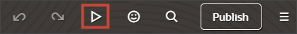
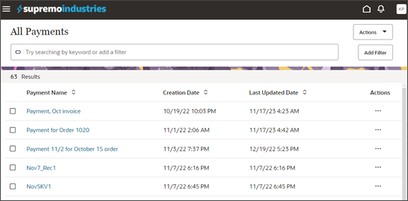
From the payment_c-list page, click the Preview button to see your changes in your runtime test environment.
-
The screenshot below illustrates what the list page looks like with data.
-
In the Action Bar, enter
Create Payment. -
Click Create Payment.
The Create Payment drawer displays.
-
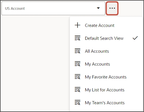
In the Create Payment drawer, click the three dots next to the Account field to view the list of saved searches.
-
If you enter some text into the field, the picker leverages Adaptive Search to return matched results. In the example below, we've entered
pinnacle tech.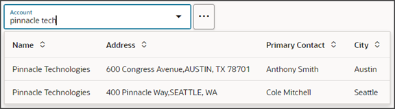
In the picker, try searching on a city, for example,
austin, so you can see how you can search on other record attributes. -
Once you're happy with how the picker looks, repeat these same steps for the edit layout.
When configuring a second layout, you don't have to create a new field template and configure the picker fragment again; you can select the field template that you created in this procedure.
You also don't need to configure the picker layout a second time.
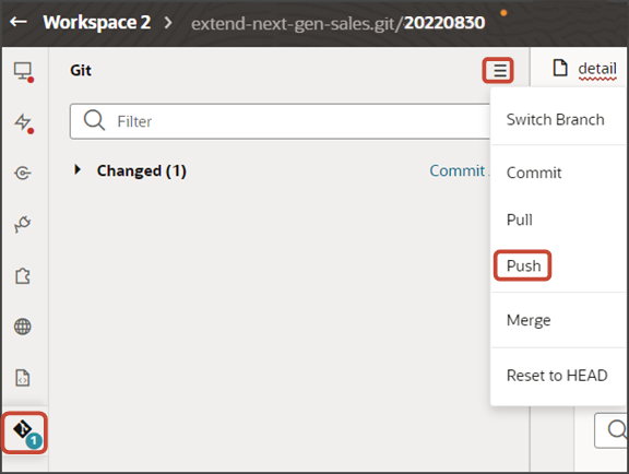
Save your work by using the Push Git command.
Navigate to the Git tab, review your changes, and do a Git push (which does both a commit and a push to the Git repository).