Create a Chart from an OTBI Analysis
Follow these steps to create various kinds of charts from Oracle Transactional Business Intelligence (OTBI) analyses.
-
Make sure that the person creating the visualization can view data in OTBI itself. You can temporarily remove filters from your analysis to ensure you see data as you create the visualization.
- Navigate to .
- Click Visualization Configuration.
- Click Add to create a new configuration.
-
On the Create Configuration page, select OTBI Analysis as the Source Type.
-
Click Select Catalog Folder, the folder icon, and select Custom.
- In the search field, enter the name of your custom analysis.
-
Select the analysis from the search results. All the fields in the analysis are included automatically.
- In the Visualization Type field, select the chart type.
- In the Name field, enter the display title of the chart.
- In the Details section, choose the columns of the report for the chart type you selected. Different types of visualization require you to enter different parameters.
- The Settings section lets you change the orientation of chart, stacking, and the inclusion of a grand total. You can also specify the data label position, along with Grand Total for both Adaptive Search and OTBI based visualizations
- In the Sort section, you can sort the chart data using any of the attributes in your analysis.
Optionally, add a filter that salespeople can use to narrow down the scope of the visualization. The filter appears above the chart.

Enable drill-down functionality and configure the list page that salespeople see when they click a chart section.
You can use the same analysis or choose a different analysis as the source for the list page. For example, you can display an analysis with more details than the original.
The target OTBI analysis must have a prompted filter applied on the same column that will be used for drill-down. For example, if a manager clicks a bar of a chart representing an opportunity owner, then the analysis you specify in the drill-down attribute must have a prompted filter on Opportunity Owner column in the report.
Callout Field Description 1 Drill Down switch Enables users to click a section of the chart to view a page listing the records matching the filters in that section. 2 Search for target analysis Select the analysis you want to open when users click a section of the chart. 3 Drag handle Change the order of columns in the list page 4 Column names Click to enable drill-down on the list page. 5 Hide Hide columns on the list page. A maximum of 15 columns can be selected to display on the list page. 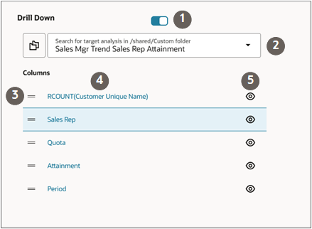
-
Enable drill-down on individual columns on the list page, specify their formatting, and the page they open:
- Click the field name link.
- On the Preferences drawer, turn on Drill Down.
- In the Page field, select the type of record you're opening. For example, opportunities.
- In the PUID field, select the number ID for the object. For opportunities this is the Opportunity Number.
- In the ID field, select the object ID, such as
Opportunity ID.
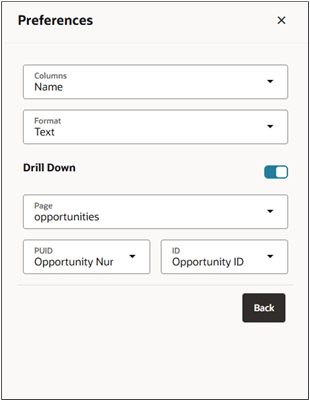
- Click Back.
- Set the Status field to Active.
- Click Create to save the configuration.
- Note the number of the visualization configuration on the list page.