Table and Chart Visualizations at Runtime
Here's how tables and charts created as visualizations display to users.
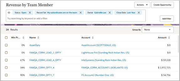
Table Visualizations
A table visualization displays records sorted by how often they've been accessed. The most frequently accessed appear first. You can enable drill-downs to individual records and you can add the Actions list. With the smart actions, salespeople can create tasks, schedule appointments, send emails, and make calls directly from the table, for example.
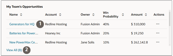
Tables include a View All link (callout 2 in the screenshot) that opens a list page showing all records matching the visualization selection criteria.
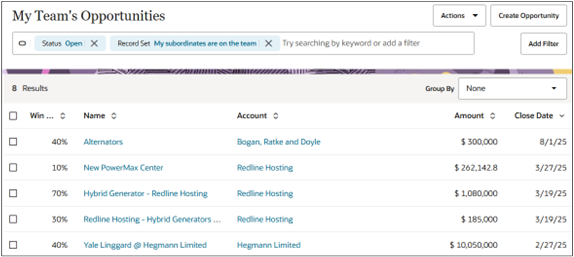
Chart Visualizations
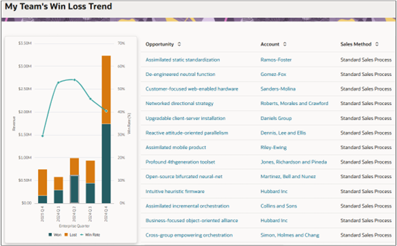
Salespeople can click a section of a chart to view the underlying records.
Drill-downs in visualizations from OTBI analyses open on a page showing both the visualization and the list. Drill-down from Adaptive Search visualizations open up a list page for that object.
Adaptive Search saved search visualizations open a list page.
Metric Cards
You can also use the Visualization Configuration tool to speed up the creation of the sales information that appears at the top of each tab in the sales dashboard. Metric Card visualizations provide a UI where you can specify all of the information you can display, including the title, KPI, and badges.
Because Metric Cards are used for configuring the sales dashboard tabs, their creation is covered in the Configure the Redwood Sales Dashboard chapter topic Create the Metric Card for the Top of the Tab.