What Sources of Sales Information You Can Display in a Sales Dashboard and How
The Sales Dashboard supports various visualizations, including tables, lists, charts, and key performance indicators (KPIs). You can populate dashboard components with data from saved searches, Oracle Transactional Business Intelligence (OTBI) analyses, and Express Reports. Additionally, you can embed reports and visualizations from Oracle Fusion Data Intelligence to gain deeper insights and enhance analytical capabilities.
Key Performance Indicators (KPIs)
In the metric cards that form the top of each tab, you can display KPIs that highlight critical values such as total pipeline, closed revenue, or overdue tasks. They provide an at-a-glance view of performance against goals and help salespeople prioritize actions quickly. KPIs can be created using Adaptive Search saved searches and OTBI analyses.
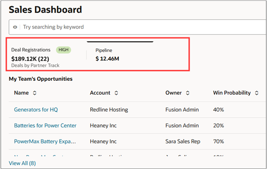
Here's a screenshot of a sample dashboard with 2 tabs. The screenshot highlights the part the tabs defined by metric cards.
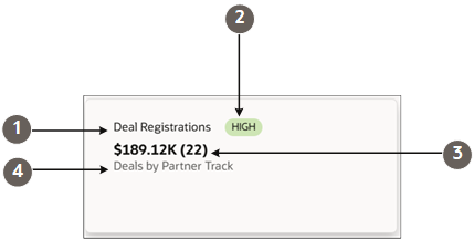
Metric cards can have up to 5 different elements show in the screenshot of a sample partner deal registrations metric card:
| Callout | Field | Description |
|---|---|---|
| 1 | Name | The title of your dashboard tab. |
| 2 | Badge | Displays badges you specify for different value ranges. |
| 3 | Primary Metric (Secondary Metric) | You can display up to 2 metrics. In this example, it's the sum of the Deal Size (Primary Metric) and the count (Secondary Metric). |
| 4 | Description | One-line description that you enter or that's filled in dynamically. |
Tables
Tables present structured sales data such as opportunities, accounts, or tasks in rows and columns, making it easy to scan, compare, and drill down into record-level details. Users can also take smart actions directly from tables, such as updating records or following up on opportunities, without leaving the dashboard. Tables can be built in the Visualization Configuration Tool from Adaptive Search and OTBI sources.
Lists
Lists provide a simplified view information, such as “My Open Leads” and “Upcoming Appointments.” They're compact and easy to navigate, helping sales users stay on top of daily tasks and activities. Like tables, lists support smart actions directly from the dashboard, allowing quick updates and next steps in context. Lists can be created in the Visualization Configuration Tool from Adaptive Search saved searches.
Charts
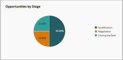
Charts visualize sales data trends and distributions, such as pipeline by stage, revenue by region, or lead conversion rates. They help identify patterns, track progress, and communicate performance clearly. Supported chart types include bar, pie, donut, funnel, scatter, and combo charts. Charts can be created using Adaptive Search, OTBI sources in the Visualization Configuration Tool, and from Express Reports.
Users can also view descriptive insights for any visualization, making it easier to interpret the data presented. From each chart, users can drill down to a record-level list view to explore the underlying data in detail. In addition, charts are interactive, allowing users to change the visualization type in real time to best fit their analysis needs.
Embedded Oracle Fusion Data Intelligence Components
You can also embed reports from Oracle Fusion Data Intelligence. Fusion Data Intelligence is built on top of Oracle Analytics Cloud and includes the same subject areas you find in Oracle Transactional Business Intelligence.
How You Can Display Different Types of Data Sources
Here's a table summarizing how you can display sales data from different sources:
| Sales Data Source | Tab Summary (Metric Card) | Table | List | Charts |
|---|---|---|---|---|
| Saved Search | Yes | Yes | Yes | Yes |
| OTBI Analysis | Yes | Yes | No | Yes |
| Express Report | No | No | No | Yes |
- Saved Searches
A saved search is a reusable query created in Adaptive Search that retrieves data directly from CRM objects such as opportunities, accounts, leads, and tasks. Saved searches are flexible and can be used across multiple dashboard components, including metric cards, tables, lists, and charts. They're ideal for sales users who need quick access to operational data (for example, “My Open Opportunities” or “Overdue Tasks”) and require the ability to drill down into record-level details.
When to use saved searches:
-
For real-time operational sales data
When actionable records are needed in tables or lists
When the same data set will be used in multiple dashboard components
To create visualizations and display tables and lists from saved searches, use the Visualization Configuration tool (http://<server-address>/fscmUI/redwood/cx-analytics/application/container/dvconfig/).
-
- OTBI Analyses
An OTBI analysis is a report created with Oracle’s transactional business intelligence layer. It enables users to combine data from multiple subject areas, apply advanced filters, and create custom aggregations. OTBI analyses can populate metric cards, tables, and charts, but can't directly generate lists. They're ideal for complex reporting, trend analysis, or when KPIs require multidimensional data, such as revenue by product and region.
When to use OTBI analyses:
- To gain analytical insights across multiple objects or subject areas
- To build KPIs needing complex calculations or aggregations
- To support visualizations with advanced analytical queries
-
To create visualizations and display tables and lists from saved searches, use the Visualization Configuration tool (http://<server-address>/fscmUI/redwood/cx-analytics/application/container/dvconfig/).
- Express Reports
Express reports are charts created with Express Reports, a simple tool for quickly creating charts. No tables, lists, or metric cards are supported. The tool is targeted at salespeople without advanced configuration skills. It's ideal for situations where users need quick visual insights without help from administrators or use of advanced reporting tools.
When to use express reports:
- For quick visual analysis
- When a salesperson needs a chart without configuring OTBI or saved searches
To create express reports, use the Express Reports tool (http://<server-address>/fscmUI/redwood/cx-analytics/application/container/report/reports).
To learn more about Express Reports, see the playbook How do I get started with Express Reports?.