About the Combination Chart Type for Dashboard 2.0
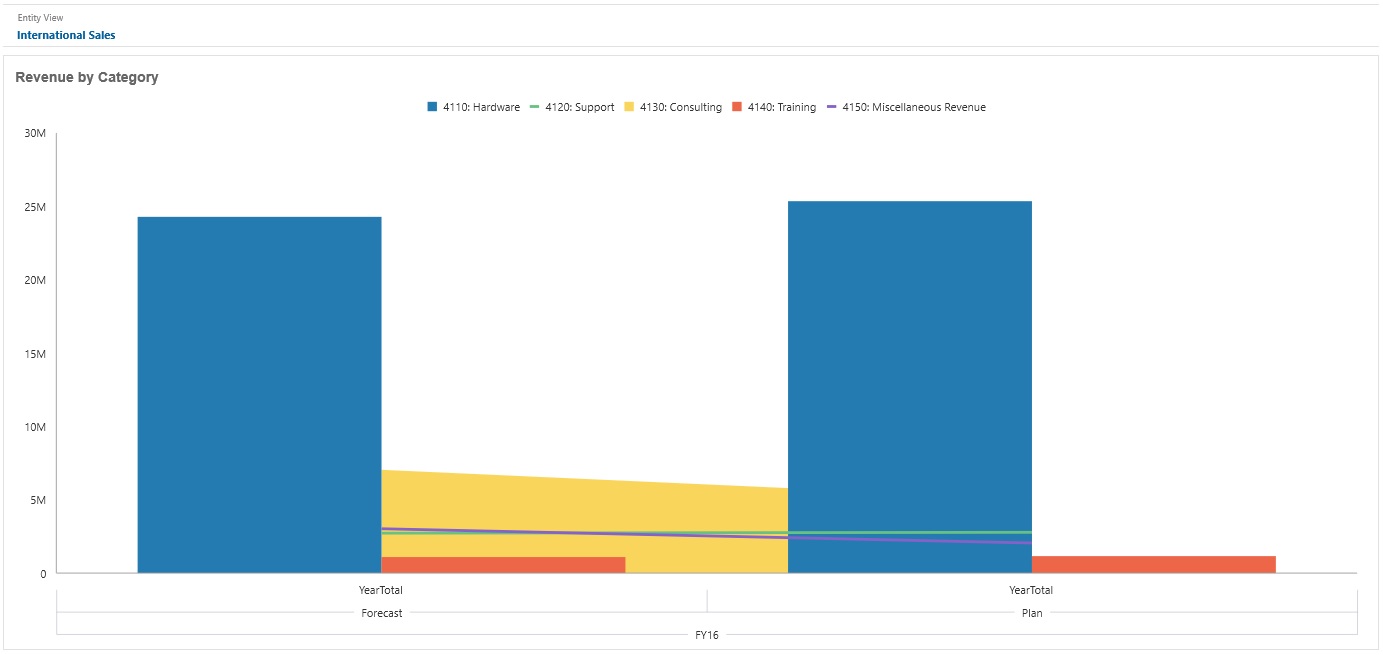
The combination chart is a visualization that lets you merge into one chart any combination of bar, line, and area charts.
You can also add a secondary Y-axis on the opposite side from the primary Y-axis. Adding a secondary Y-axis lets you display the scale for one measure that doesn't scale appropriately with the other measures on the chart; for example, showing a percentage measure and a currency measure on the same chart.
Dashboard 2.0 Example - Area Bar Line Combination Chart

Dashboard designers can set these combination chart type properties:
Table 11-12 Combination Chart Type Properties
| Setting | Description |
|---|---|
|
Value Scale |
Especially useful for large numbers, you can scale how a value is displayed. For example, if the value is 1,689,000 and you select K - Thousand as the scaling option, the chart displays the value as 1,689K. Your scaling options:
|
|
Line Weight |
Click the counter to set the line width. Note that the default width of a line is 5 pixels. You can select from 1 to 12 pixels. |
|
Legend Position |
Choose Left, Right, Top, Bottom, or None. |
|
Label Position |
Set the position of the data labels on the chart. Choose Outside Bar Edge, Center, Inside Bar Edge, or None. |
|
Grid Lines |
Select Hide or Show. |
|
Logarithmic Scale |
Especially useful for displaying numerical data that covers a wide range of values (typically, the largest numbers in the data are hundreds or even thousands of times larger than the smallest numbers), a logarithmic scale displays these values in a way that is more compact and readable. Select whether to use a logarithmic scale in your combination chart. |
|
Secondary Y |
Select which data to plot on a secondary Y-axis which will appear on the opposite side of the chart from the primary Y-axis. When the data values in a chart vary widely from data series to data series, or when you have mixed types of data (for example, currency and percentages), you can plot one or more data series on a secondary vertical (Y) axis. While the secondary Y-axis can be used with any line and bar chart type, it is more commonly used with the combination chart type, which helps to distinguish the data series that are plotted on the secondary Y-axis. For example, use a bar for the primary Y- axis, and line for the secondary Y-axis. |
|
Series |
Select the bar/line/area combination for the chart. |
|
Color |
Select Default or click data in the chart and choose a custom color for that data. |
|
Axes |
Select a Custom Range for the X-Axis, Y-Axis, and Secondary Y-Axis, or select Off. |