About the Gauge Chart Type
Gauge chart types are handy for showing whether data values fall within an acceptable range or not. You set the maximum value, the range maximums, and the gauge displays ranges as red, yellow, and green to help you quickly assess a current value. So, gauge chart types help you identify problems in important data points or measures. For example, you could use a gauge to display the current sales, where the thresholds are set to represent the sales targets.
If the form has multiple values, you can display multiple gauges, up to a maximum of 36 (the values in the first 6 rows and the first 6 columns in the form). The remaining values in the form are ignored. If you want the gauge chart to display only one value, then associate it with a form that has only one cell value.
You can select either a dial gauge or a status meter gauge. You can display a status meter gauge using either horizontal or vertical bars.
Dashboard designers can set:
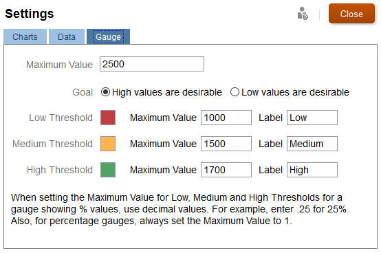
- Maximum Value: The highest value on the gauge. The dashboard designer sets the Maximum Value as a default, and then users can temporarily change it at runtime. If the dashboard designer doesn't specify a maximum value, the application automatically sets the maximum value as greater than the value on the gauge.
- Thresholds:
- Low, Medium, and High thresholds: To visually indicate whether a measure lies in the acceptable range or not, these thresholds enable you to display the gauge in red, yellow and green based on the specified values.
- Thresholds where low values are desirable.
- Appropriate labels for the thresholds that are displayed when hovering over the thresholds in the gauge.

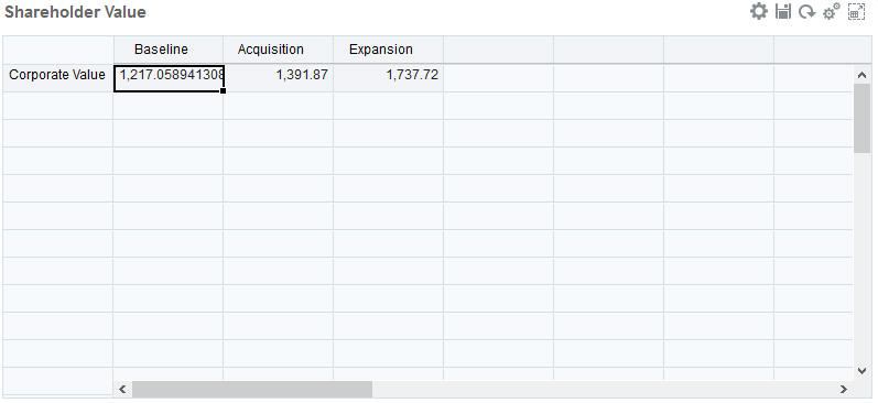
For example, here's a form's data:

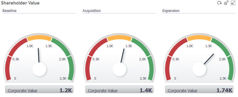
Here's the resulting dial gauge:

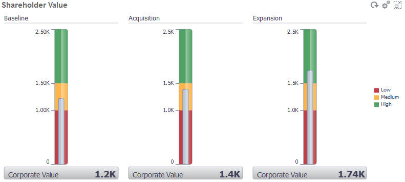
Here's the resulting status meter gauge with vertical bars:

Note:
If a cell in the form is missing a value, no gauge is displayed for that cell. Also, you must specify at least 2 consecutive thresholds. The application needs the middle threshold value to calculate the chart.