Example: Creating a Chart to Display Period and Status (with Description) of the Form Template
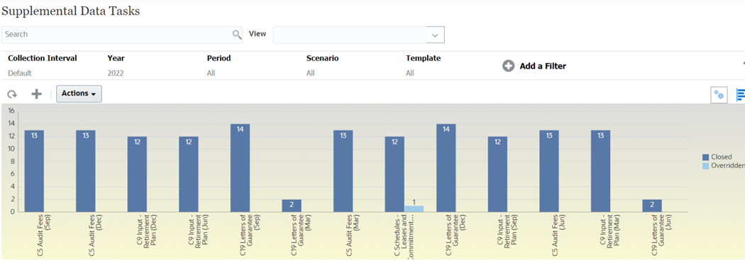
This example creates a chart that displays the period and detailed statuses of a particular supplemental data form.
The generated chart is displayed as shown. Click any area within the chart to drill down and view of the individual records that comprise that aggregated area.

To create this chart:
- From the Home page, click Tasks. Click Supplemental Data Tasks to display the supplemental data task list.
-
From the View Selector at the top-right of the page, select Chart View.
The chart view appears, with a default chart displayed.
- Click Edit at the top-right to display the Edit Chart dialog.
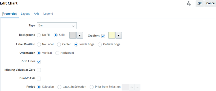
- In the Properties tab, specify the following:

- In Type, select Bar.
- In Background, select Solid. Select the color of your preference from the drop down.
- Select Gradient. Select the color of your preference from the drop-down menu.
- In Label Position, select Inside Edge.
- In Orientation, select Vertical.
- Select Grid Lines.
- Deselect Missing Values as Zero.
- Deselect Dual Y Axis.
- In Period, select Selection.
-
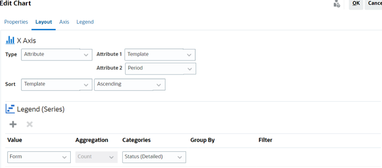
In the Layout tab, specify the following:

- In the X-Axis section, for Type, select Attribute. For Attribute 1, select Template. For Attribute 2, select Period.
- In the Legend (Series) section, enter two values:
- In Value, select Form.
- In Categories, select Status (Detailed).
- In the Axis tab, leave the default settings as is.
-
In the Legend tab, specify the following:
- In Legend Position, select Right.
- In Palette, select Redwood.
- Click OK.