4.3 Developing Accessible Regions
Ensure the regions on a page provide sufficient navigational information for users of assistive technology.
- Accessible Page Structure
- Accessible Report Regions
- Accessible Interactive Grid Regions
- Accessible Interactive Report Regions
- Accessible Classic Report Regions
- Accessible JET Chart Regions
Parent topic: Developing Accessible Apps
4.3.1 Accessible Page Structure
Users of assistive technology require a clearly defined structure on every page. After a page loads, screen reader users review all of the heading elements on the page. Correctly defined headings orientate your users by providing a structural overview of the page. You should nest page headings so that there is one H1 on a page to uniquely identify the page contents, then nest H2s, H3s, and so forth accordingly.
You achieve this structure with regions in Oracle APEX. Follow one or more of the following guidances as best practices for structuring pages in your app.
H1 Headings
Include a breadcrumb region on your pages to create a unique H1. You can use the Create Application Wizard to generate breadcrumbs automatically based on the hierarchy of pages defined in the wizard, or you can configure the breadcrumbs in your app manually. By default, the last breadcrumb entry on a page is the H1.
Alternatively, use the Hero region template in Universal Theme. This region template renders the region title as the H1 text on the page by default, which is useful if your current app layout and design does not warrant breadcrumbs.
Tip:
Only use one Hero region per page to avoid creating more than one H1 element.
H2 Headings
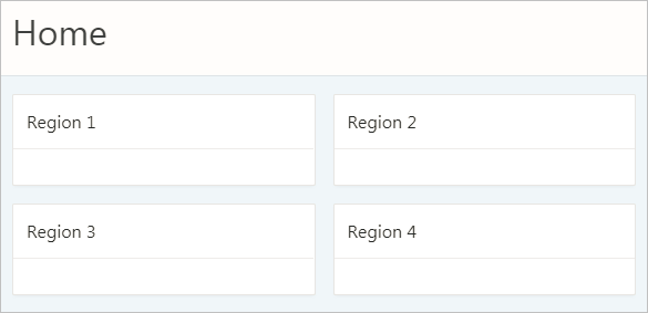
After the H1, most region templates in Universal Theme render other content on the page with an H2 around the region title
H1: Charts
	H2: region 1
	H2: region 2
	H2: region 3
H2: region 4H3 and Other Sub-Region Headings
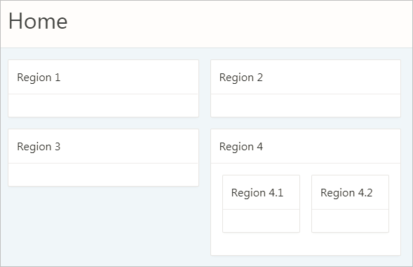
Universal Theme does not automatically support headings beyond H2, such as when you have sub-regions nested within an H2 region.

Description of the illustration h2_regions_with_h3_regions.png
By default, APEX applies H2s to nested sub-regions (regions 4.1 and 4.2 in the above example) in the Standard region template. This creates an accessibility problem because screen reader users may incorrectly believe that these sub-regions are of similar importance to the parent region or that the regions are not ancestral to the parent region.
H1: Charts
	H2: region 1
	H2: region 2
	H2: region 3
	H2: region 4
	H2: region 4.1
	H2: region 4.2
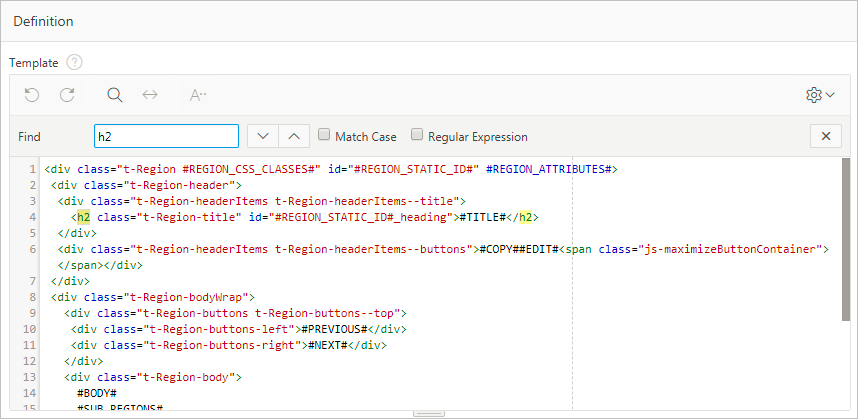
To properly structure these sub-regions, you must duplicate the Standard region template, then use the Code Editor to manually replace the H2 tags with H3s in the template’s definition.
Tip:
To copy a region, see Creating a New Template in Oracle APEX App Builder User’s Guide and select the As a Copy of an Existing Template option.
Changing the sub-regions to H3s only affects the structure of the element (not the style), which is what we want for accessibility.
This results in the following heading structure:
H1: Charts
	H2: region 1
	H2: region 2
	H2: region 3
	H2: region 4
		H3: region 4.1
		H3: region 4.2
Important:
- While a copied template keeps the theme subscription (which enables you to refresh the theme when APEX is upgraded), the copied template does not upgrade automatically on refresh. You may need to manually change or re-copy the template post-refresh if there are any markup changes in that template.
- You must manually add an additional template for every deeper heading level in your app (H3, H4, H5...). We plan to make it easier to control the heading level without requiring an additional template in a future APEX release.
Region Titles
You should define meaningful titles for most region types because Universal Theme uses the region title as the heading text for the region.
Descriptive titles are essential for accessibility. By default, titles are visible on screen. However, sometimes you may not want a title for a region, such as when sighted users can quickly discern the region’s content from surrounding page content at a glance. In such cases, you must still provide heading text for screen reader users. To make such a page accessible, select the region, in Property Editor open the Template Options, and set the Header attribute to Hidden but accessible.
Tip:
You can review and update all region titles in an app with the Grid Edit of all Region Titles page. You should review all titles for accuracy and meaning, especially regions with the same title on the same page which may be an issue depending on the context.
See Also:
Accessing Page Specific Utilities in Oracle APEX App Builder User’s Guide
Parent topic: Developing Accessible Regions
4.3.2 Accessible Report Regions
Classic reports, Interactive reports, and Interactive Grids all provide a way of defining the report row header column(s), which greatly improves screen reader experience. Row header columns are defined using the Value Identifies Row column attribute.
Define the column value, or combination of column values, that help identify the row of data. For person data, this could be the first and last name; for customer data, this could be the customer name, and so on.
When a screen reader user navigates to different rows of the report, the column, or columns, defined as identifying the row are announced as the row header as soon as the users moves to the new row. If Value Identifies Row is not defined, it is much harder for these users to orient themselves when moving around the report.
Parent topic: Developing Accessible Regions
4.3.3 Accessible Interactive Grid Regions
Introduced in Oracle Application Express 5.1, interactive grids combine powerful reporting with grid-based editing in a single component. Users can access all interactive grid functionality with just a keyboard, enabling all users to navigate around the grid and edit their data using the keyboard. For a complete list of keyboard support in interactive grids, see Interactive Grid Region.
Parent topic: Developing Accessible Regions
4.3.4 Accessible Interactive Report Regions
Data Table Accessible Label
Oracle APEX generates the following SUMMARY text for the rendered data table:
Region = [region title], Report = [current saved report name], View = [current View], Displayed Rows Start = [current start of rows displayed, Displayed Rows End = [current end of rows displayed], Total Rows = [total number of rows]
This text identifies the data table, and therefore provides a great deal of contextual information to users of assistive technology.
Edit Icon Link Text
When creating a Report and Form, APEX generates the links between the two pages to allow you to edit specific records. The link text generated for all rows is Edit by default. You should make this text a meaningful label so that screen reader users (who listen to all the links on the current page) can understand the purpose of the link and where it takes them. The link text should be specific to the current row in the report. For example, for a report of customers, the link text could be Edit Customer: SMITH.
You can define the link text of an interactive report region by selecting the Attributes node, then in the Property Editor expand the Link column, set Link Column to Link to Single Row View or Link to Custom Target, and update the alt text in the Link Icon field.
Because there is no visible link text used, the link uses the inline image’s alt text as the text for the link. Note that you can use a substitution string such as #CUSTOMER_NAME# to target the column that best identifies the current row.
Parent topic: Developing Accessible Regions
4.3.5 Accessible Classic Report Regions
Data Table
By default, Oracle APEX generates SUMMARY text equal to the region title. This identifies the data table to users of assistive technology.
Edit Link Text
When creating a Report and Form, APEX generates the links between the two pages to allow you to edit specific records. The link text generated for all rows is Edit by default. You should make this text a meaningful label so that screen reader users (who listen to all the links on the current page) can understand the purpose of the link and where it takes them. The link text should be specific to the current row in the report. For example, for a report of customers, the link text could be Edit Customer: SMITH
You can define the link text of an interactive report region by selecting the Attributes node, then in the Property Editor expand the Link column, set Link Column to Link to Single Row View or Link to Custom Target, and update the alt text in the Link Icon field.
Because there is no visible link text used, the link uses the inline image’s alt text as the text for the link. Note that you can use a substitution string such as #ENAME# to target the column that best identifies the current row.
Parent topic: Developing Accessible Regions
4.3.6 Accessible JET Chart Regions
Oracle Application Express 5.1 introduced charts based on the Oracle JET Data Visualization components (JET charts). Releases prior to 5.1 used charts based on AnyChart, where there were many accessibility issues.
For more information about accessibility of Oracle JET Data Visualization components including support for keyboard and touch, see the Oracle JET documentation.
The following sections detail some chart settings that are particularly useful for ensuring chart accessibility.
Chart Title
The chart title displays in the chart region next to the chart. It is also the accessible label for the chart page section. In Page Designer, the chart title is defined in the chart Attributes node.
If there is only one chart displayed within a region, consider hiding the region title to avoid visual duplication. You can hide the region title by changing the Header region appearance setting in the Template Options dialog to Hidden but accessible. This removes the region title from the page but preserves the heading for assistive technologies (if users scan the current headings on the page to orientate themselves, they can perceive this title).
Tooltip
The tooltip displays when the mouse hovers over a specific chart section or the keyboard has focus on this section. In addition, the tooltip is the accessible label for that section of the chart. For example, when screen reader users navigate around the chart sections, this tooltip is announced.
- Adjust the other attributes displayed in the Tooltip group in Page Designer. This allows you to control display of Series Name, Group Name, Value, and Label information where applicable for your chart. For example, if the chart only has one series, then you may want to exclude the series name in the tooltip, so you would set Show Series Name to No.
- For a highly customized tooltip, set a column in your database table to be used as the source for the tooltip. You can configure this on the individual Series node nested under the chart in the Rendering tree.
Automatic Refresh Functionality
Developers can define an Automatic Refresh, Interval in the chart attributes which causes the chart region to automatically refresh according to the interval defined. Oracle recommends avoiding this functionality for accessibility purposes since this type of automatic refresh is very disruptive for users of assistive technology.
Parent topic: Developing Accessible Regions

