19.2.3 Editing Plug-ins

Edit a plug-in to specify additional custom attributes, upload files such as image, CSS and JavaScript files, or add events.

19.2.3.1 Editing a Plug-in

Edit a plug-in by navigating to Shared Components and selecting it on the Plug-ins page.

To edit a plug-in:

  1. Navigate to the Shared Components page:
    1. On the Workspace home page, click App Builder.
    2. Select an application.
    3. On the Application home page, click Shared Components.

      The Shared Components page appears.

  2. Under Other Components, click Plug-ins.
  3. Click the plug-in you want to edit.

    The Edit page appears.

  4. Make modifications.

    To learn more about each option, see field-level Help.

  5. Click Apply Changes.

19.2.3.2 Adding Custom Attributes to a Plug-in

Add Custom Attributes by editing the plug-in.

Tip:

The maximum number of custom attributes that can be added for an Item-type plug-in is 25.
Custom Attributes specified by the developer might contain items referenced with substitution syntax.

To add custom attributes to the plug-in:

  1. Navigate to the Shared Components page:
    1. On the Workspace home page, click App Builder.
    2. Select an application.
    3. On the Application home page, click Shared Components.

      The Shared Components page appears.

  2. Under Other Components, click Plug-ins.
  3. Click the plug-in you want to modify.

    The Edit page appears.

  4. Custom Attributes - Enable or disable Substitute Attribute Values.

    Custom Attribute Values specified by the developer may contain items referenced with substitution syntax, for example &P1_DNAME. Options include:

    • On - APEX automatically replaces substitution syntax with their actual values.

    • Off - Substitution syntax is written unchanged into the attribute_01 through attribute_15 record type attributes of p_plugin, p_item, p_region, and so on. The plug-in developer is responsible for replacing those substitution syntax references with a call to apex_plugin_util.replace_substitutions or perform similar replacements.

      To learn more and view examples, see field-level Help.

  5. To add an attribute click Add Attribute.

    The Edit Attribute page appears. Edit the appropriate attributes.

  6. Name:
    • Scope - Options incude:
      • Application - The attribute can only be defined once for the application.
      • Component - The attribute can be defined each time the plug-in is referenced in a component.
      • Report - The attribute can only be defined if the region's display attribute is set to Multiple (Report).
    • Attribute - Sequence which correlates with the ATTRIBUTE_XX columns (for example in APEX_APPLICATION_PAGE_ITEMS) and to the PL/SQL types defined in the package APEX_PLUGIN.
    • Display Sequence - Specify the display sequence for this plug-in attribute in the App Builder.
    • Label - Specify the label which is displayed for that attribute in the App Builder.
    • Attribute Group - Specify the group in Page Designer where this attribute displays.
  7. Settings:
    • Type - Specify the type the attribute should have when it is displays in the App Builder. The type is also used to verify the entered data when the developer sets or modifies them and is used by the Advisor as well when checking the application.

      To learn more about a specific attribute Type, see Plug-in Attribute Types.

    • Common - Specify if this attribute should always be display in the Property Editor of Page Designer or only if advanced attributes are displayed.
    • Show in Wizard - Specify if this attribute should display in the Create Wizard if a new component is created based on the current plug-in.
    • Required - Specify if this attribute must contain a value.
    • Translatable - Specify whether or not this attribute is included in the XLIFF translation file.
    • Display Width - Specify the length (in characters) that is displayed for this attribute in the App Builder.
    • Maximum Length - Specify the maximum number of character users are allowed to type into this attribute.
    • Set Text Case - Specify if the entered plug-in attribute value should always be stored in upper or lowercase.
    • Unit - Enter the text to be displayed as the unit (for example, pixels) for the attribute's value in Page Designer.
  8. Default Value:
    • Default Value - Specify a default value for this plug-in attribute. The default value is used when a new component is created that uses this plug-in. Use Y and N for attributes of Type Yes/No.
  9. Condition:
    • Default Value - Specify a default value for this plug-in attribute. The default value is used when a new component is created that uses this plug-in. Use Y and N for attributes of Type Yes/No.
  10. Help Text and Examples:
    • Help Text - Specify help text for this plug-in attribute. The help text is displayed as context sensitive help for the attribute in App Builder.
  11. Submit your changes:
    • Click Create to create the attribute and go back to the Edit page
    • Click Create and Create Another to create the attribute and then create another one.

Note:

If you click Create or Create and Create Another and the Return To Page checkbox on the right panel under Plug-ins is checked, this same Edit Attribute page displays.

19.2.3.3 Plug-in Attribute Types

Review the attribute types supported for item plug-ins.

The following table describes the attribute types supported for item plug-ins.

Attribute Types Description

Checkboxes

Predefined list of checkboxes which allows the user to pick from. The values of all checked checkboxes are stored as colon separated string.

Color

For a HEX color code with Color Picker support in Page Designer (for example: #FF0000 or #000000).

HTML

For HTML data with Code Editor support in Page Designer. The stored value can also be translated.

Icon

For Icon CSS classes with Icon Picker support in Page Designer.

Integer

Number without a decimal component (for example: 15 or -12).

JavaScript

For JavaScript code with Code Editor support in Page Designer.

Link to Target Page/URL

For a link with Link Builder support in Page Designer.

Number

Number with an optional decimal component (for example: 531.98, -363.55, or 214).

PL/SQL Code

An anonymous PL/SQL code block.

For example:

begin
    update emp set sal=sal*1.1;
end;

For example:

case when :P7_CATEGORY='computer' then true else false end

PL/SQL Expression Returning VARCHAR2

Simple PL/SQL code which returns a result string. Example:

For example:

case when :P7_CATEGORY='computer' then 'Y' else 'N' end

PL/SQL Function Body Returning BOOLEAN

Advanced PL/SQL code which returns TRUE or FALSE.

For example:

declare
    l_price number;
begin
    select product_price
      into l_price
      from demo_products
     where id = :P7_ID;

    return case when calculate_new_price(l_price) > 1000 then true else false end;
end;

PL/SQL Function Body Returning VARCHAR2

:

Advanced PL/SQL code which returns a result string.

For example:

declare
    l_price number;
begin
    select product_price
      into l_price
      from demo_products
     where id = :P7_ID;

    return calculate_new_price(l_price);
end;

Page Item

Name of a page item.

Page Items

Comma delimited list of page items.

Page Number

Identifies a page in Oracle APEX.

Page Numbers

Comma delimited list of pages in Oracle APEX.

Region SQL Statement Column

List of columns used in the Region SQL Statement which allows the user to pick from. This attribute type is only available for Region Type plug-ins.

SQL Query

A SQL Statement with the specified number of columns in the statement.

Select List

Predefined list of values which allows the user to pick from.

Text

For alphanumeric data. The stored value can also be translated.

Textarea

For multi-line alphanumeric data. The stored value can also be translated.

XML

For XML data with Code Editor support in Page Designer. The stored value can also be translated.

Yes/No

Predefined select list with Yes/No for boolean decisions.

19.2.3.4 Creating a File to Associate with a Plug-in

Create a file to associate with a plug-in.

To create a file:

  1. Navigate to the Shared Components page:
    1. On the Workspace home page, click App Builder.
    2. Select an application.
    3. On the Application home page, click Shared Components.

      The Shared Components page appears.

  2. Under Other Components, click Plug-ins.
  3. Select the plug-in.

    The Edit page appears.

  4. Locate the Files section.

    File Prefix determines the virtual path the Web server uses to point to the files of the plug-in. Do not specify anything to reference files which are stored with your plug-in definition in the database. For performance reasons you can also store your plug-in files on your Web Server. Use #APEX_FILES# or any valid URL to reference them.

  5. To upload a file, click Create File.
  6. On the Create page:
    1. Directory - Enter the name of the directory where the file should be stored. For example, css or css/images.
      If no directory is specified, the file is stored in the root directory.
    2. File Name - If creating a blank file (for example, script.js), enter the name of the file.
    3. Content - If uploading a file, do one of the following:
      • Drag and drop the file to the Content region.

      • Click the Content region and select the file.

    4. Click Create or Create and Create Another.

19.2.3.5 Automatically Loading CSS and JavaScript Files

Automatically load CSS and JavaScript files when a plug-in is used on a page.

You can have APEX automatically load CSS and JavaScript files when a plug-in is used on a page by configuring the File URLs to Load attributes. To specify which of the uploaded files should be loaded and in what order.

To automatically load a CSS or JavaScript file:

  1. Navigate to the Shared Components page:
    1. On the Workspace home page, click App Builder.
    2. Select an application.
    3. On the Application home page, click Shared Components.

      The Shared Components page appears.

  2. Under Other Components, click Plug-ins.
  3. Select the plug-in.

    The Edit page appears.

  4. Locate File URLs to Load:
    1. Cascading Style Sheet - Enter Cascading Style Sheet file URLs to be loaded with this plug-in. Each URL has to be written on a new line.

      If you provide a minified version of your file you can use the substitution string #MIN# to include .min, or #MIN_DIRECTORY# to include minified/ in your file URL for a regular page view, and an empty string if the page is viewed in debug mode. You also have access to the substitution string #PLUGIN_FILES# to substitute with the value of the plug-in's file prefix.

      File URLs you enter here will be emitted within the #APEX_CSS# substitution string in the page template.

      You do not need to include opening or closing link tags, just the file URL.

    2. JavaScript - Enter JavaScript file URLs for code to be loaded with this plug-in.

      Enter JavaScript file URLs for code to be loaded with this plug-in. Each URL has to be written on a new line. If you provide a minified version of your file you can use the substitution string #MIN# to include .min, or #MIN_DIRECTORY# to include minified/ in your file URL for a regular page view, and an empty string if the page is viewed in debug mode. You also have access to the substitution string #PLUGIN_FILES# to substitute the value of the plug-in's file prefix.

      JavaScript file URLs you enter here will be emitted within the #GENERATED_JAVASCRIPT# substitution string in the page template.

      You do not need to include opening or closing script tags, just the file URL.

    To view examples, see field-level Help.

  5. Click Apply Changes.

19.2.3.6 Creating Attribute Groups

Define plugin attribute groups and assign them to custom plug-in attributes.

You can create attribute groups for the following plug-in types: Item, Region, Process and Dynamic Action. For each attribute group you specify a group Name and Sequence. Then, when you create custom attributes, you select the Attribute Group.

Other features of attribute groups include:

  • Group names must be unique for each plug-in
  • Attributes are ordered within an attribute group according to the value of their display sequence
  • The attribute group Sequence defines the order in which groups are displayed in Page Designer
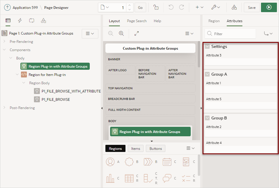
  • Plug-in attributes that are not assigned to an attribute group display directly under Settings in the Attributes tab in Page Designer

The following example shows two attribute groups, Group A and Group B. Note that Attribute 3 is not assigned to an attribute group and displays directly under Settings.
Description of attribute_groups.png follows
Description of the illustration attribute_groups.png

To create an attribute group.

  1. Create a plug-in as described in Creating Plug-ins.
  2. On the Plug-ins page, click the plug-in you want to edit.

    The Edit page appears.

  3. Add attribute groups:
    1. Under Attribute Groups, click Add Group.

      A new row displays under Attribute Groups.

    2. For each attribute group, edit the following:
      • Title - Enter a title for the attribute group.
      • Sequence - Enter the sequence.
    3. Click Apply Changes.
  4. Add custom attributes as described in Adding Custom Attributes to a Plug-in. Under Name, Attribute Group, select a group. In Page Designer, the attribute group Sequence determines where the attribute displays.

19.2.3.7 Adding Events to a Plug-in

Add events to an item, region, or dynamic action type plug-in, to enable them to be exposed to dynamic actions.

For example, suppose you have a Slider plug-in that exposes events such as Start Slide, Sliding, and Stop Slide, and allows the creation of dynamic actions that can react when these events occur.

To add events to a plug-in:

  1. Navigate to the Shared Components page:
    1. On the Workspace home page, click App Builder.
    2. Select an application.
    3. On the Application home page, click Shared Components.

      The Shared Components page appears.

  2. Under Other Components, click Plug-ins.
  3. Click the plug-in you want to edit.

    The Edit page appears.

  4. Locate Events and Click Add Event.

    A new row displays under Events.

  5. Under Events:
    1. Name - The display name under which the plug-in event appears in the dynamic action, for example: Start Slide.
    2. Internal Name - The name of the assigned JavaScript event that triggers the dynamic action, for example: slidestart.
  6. Click Add Event.
  7. Repeat steps 3 through 4 to add another event.
  8. Click Apply Changes.